Agentless
Product, website and brand design for an agent-free homebuying journey.
Agentless is a platform for U.S. homebuyers purchasing without an agent. The design materials cover property research, offer and agreement forms, inspection reports, a responsive website, brand applications and a 25-page buyer guide.
Account access
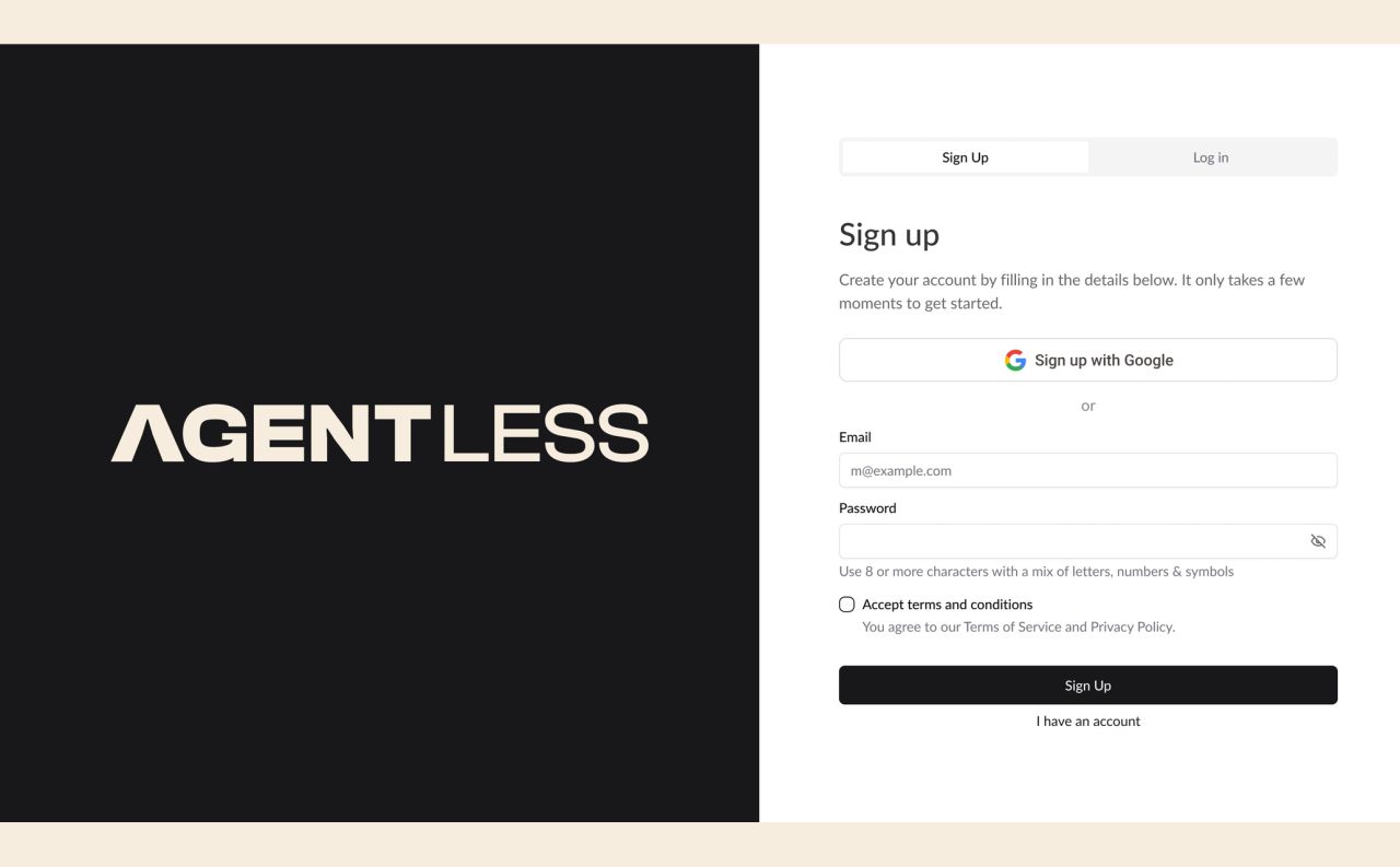
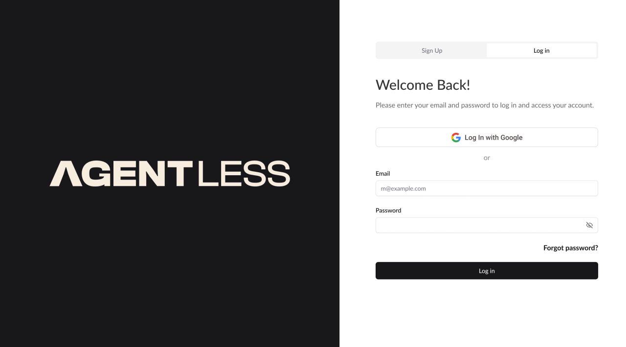
Agentless is a platform for U.S. homebuyers purchasing without an agent. The account flow pairs a bold wordmark panel with focused forms for sign-in, password recovery and confirmation.
Mobile entry points
The mobile materials show a desktop-availability notice alongside the website contact form. These screens communicate the available next steps without adding unshown functionality.
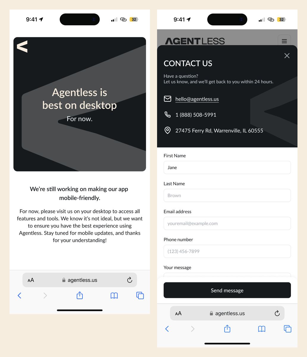
Mobile availability notice and contact form
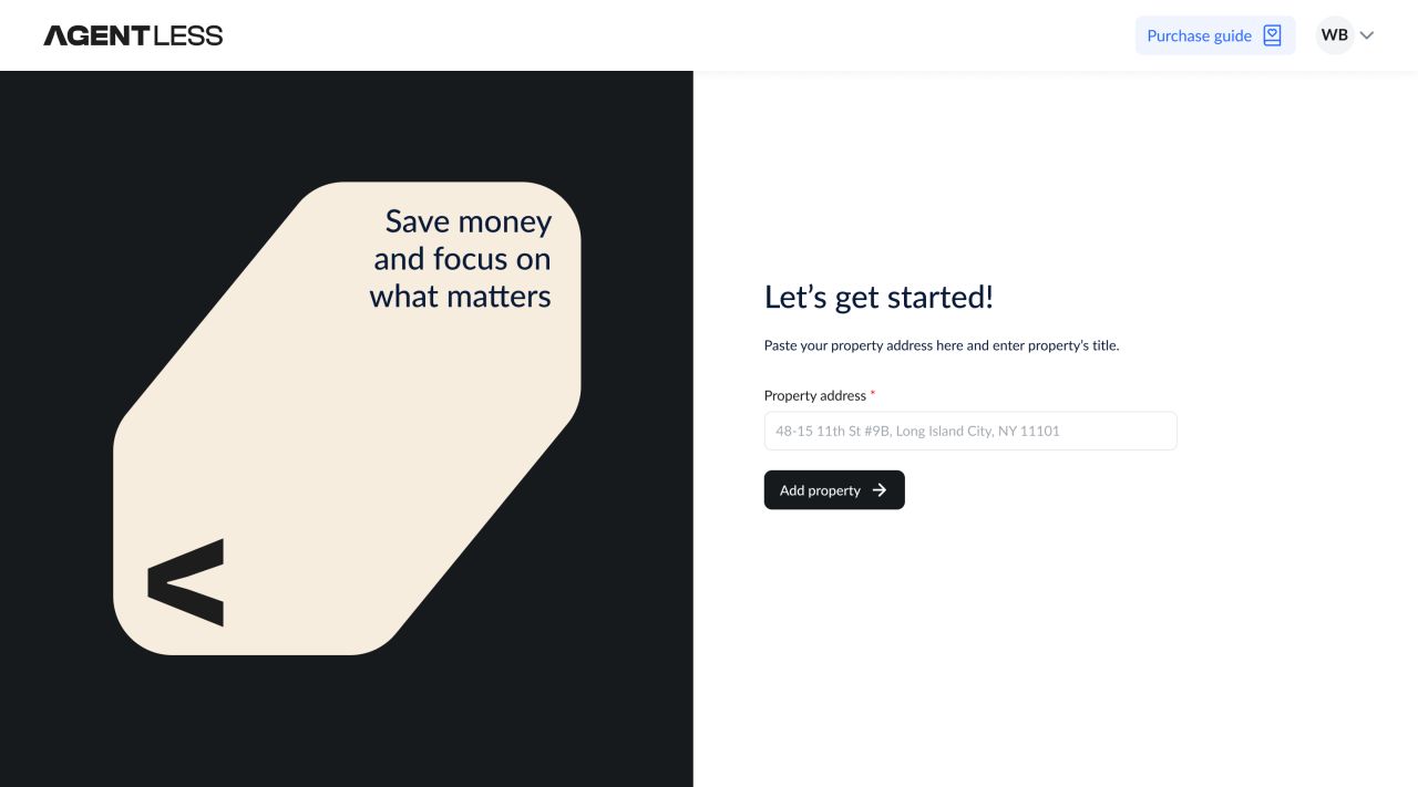
Adding a property
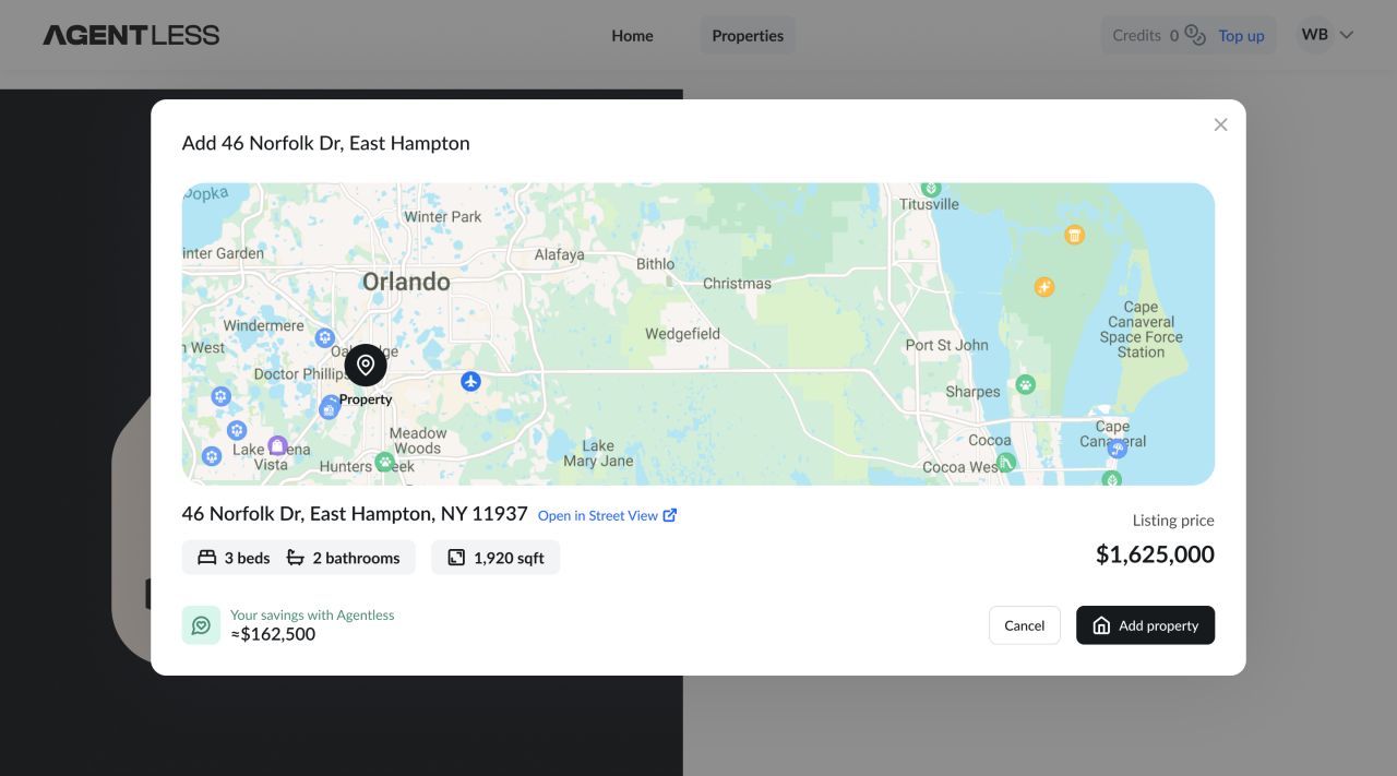
The property flow starts with an address, shows lookup progress and then presents the selected home. Photo, map and mixed-preview states keep the property context visible before confirmation.
Previewing the selected home
Alternative map and photo arrangements show the same property with different visual priorities.
A workspace around the home
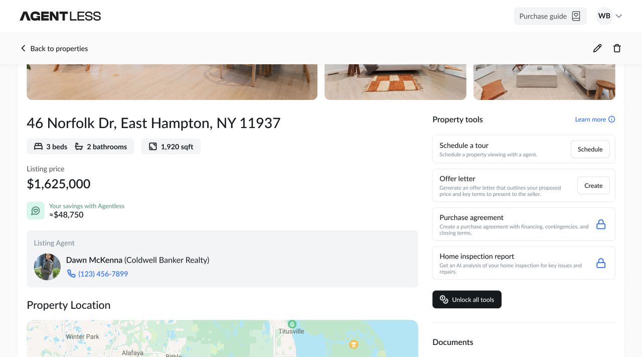
Property details, location, listing information and transaction tools share a single workspace. The property list distinguishes unlocked and locked homes.
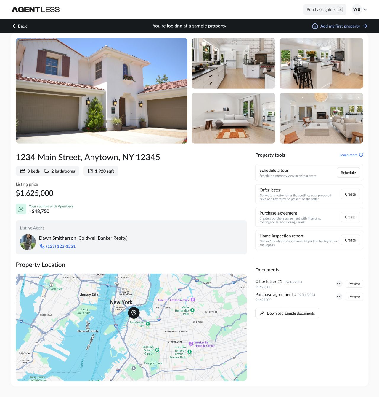
Sample property overview
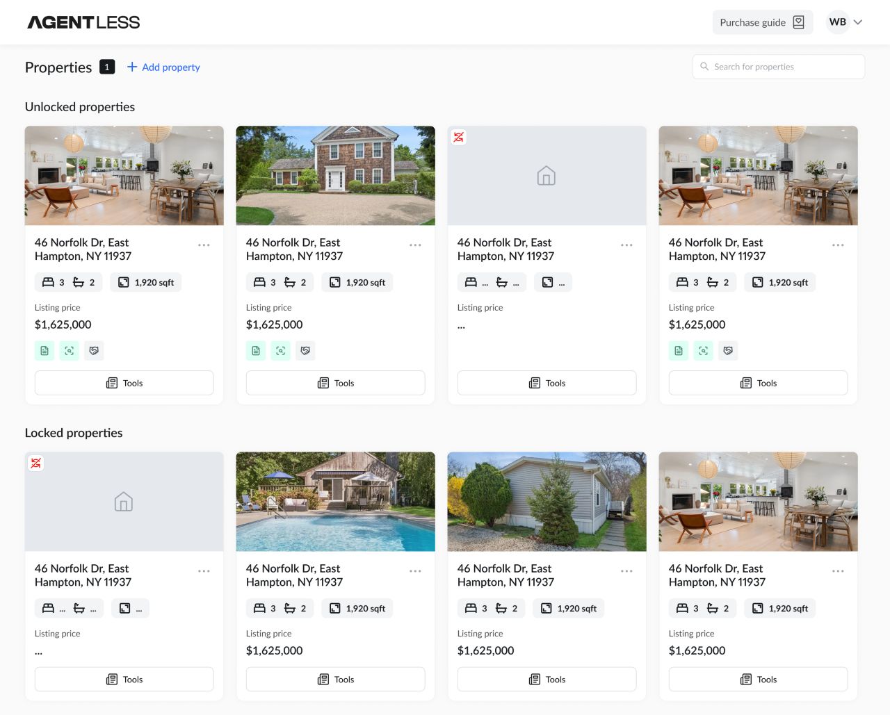
Property list
Offer and agreement forms
Step-based forms organise property details, buyer information and purchase-agreement terms. A persistent progress indicator and section navigation keep the sequence visible.
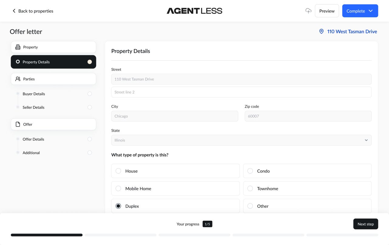
Offer letter — property details
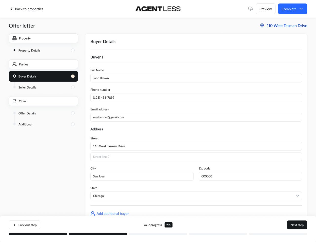
Offer letter — buyer details
Long-form agreement details
Grouped fields and a persistent sidebar organise the longer agreement screen.
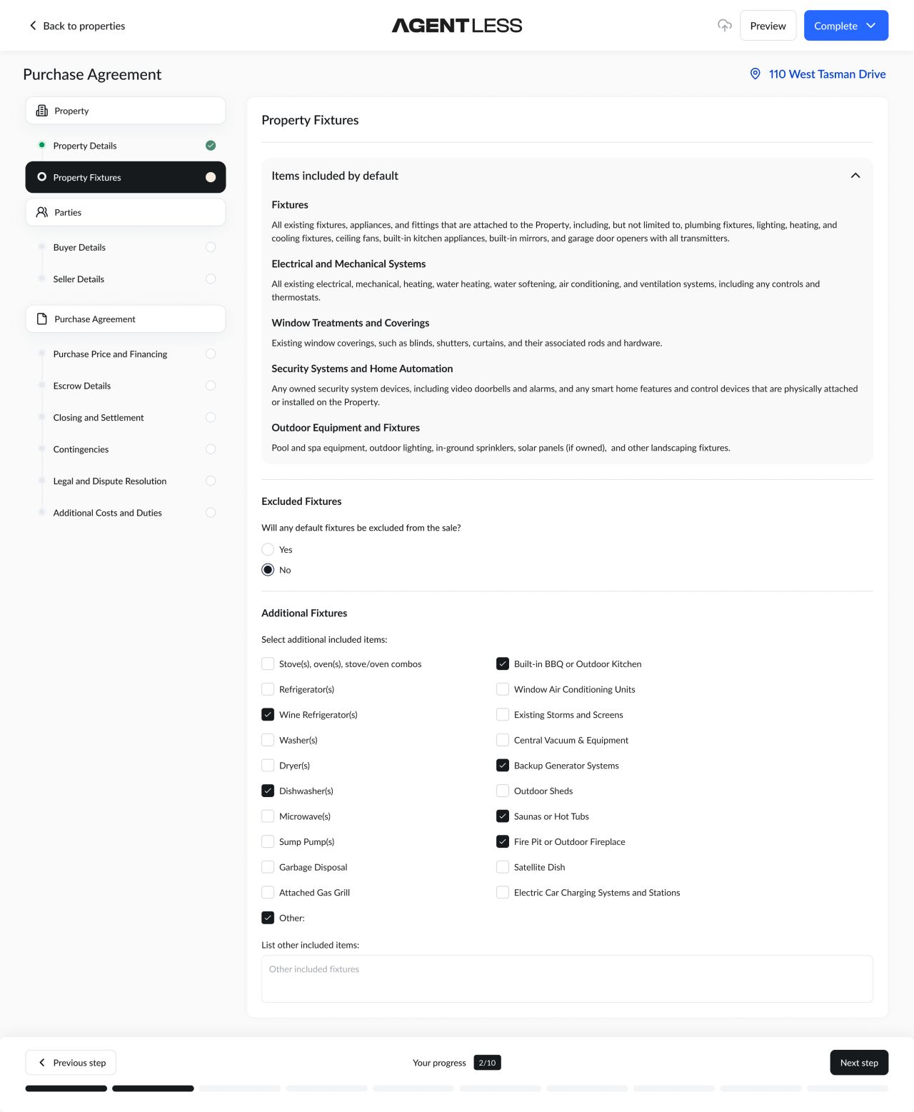
Purchase-agreement form
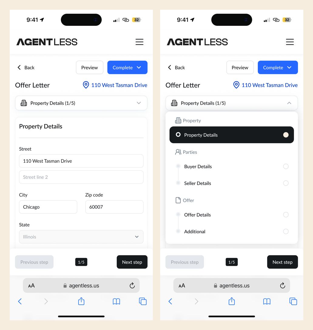
Mobile offer form with closed and expanded navigation
Inspection report states
The inspection interface separates the uploaded report, summary and detailed findings. Distinct desktop states show issue categories and contextual price information; mobile screens show reading, download and upload states.
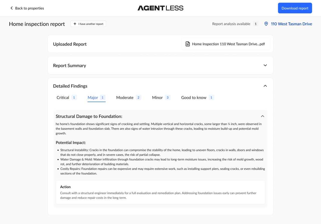
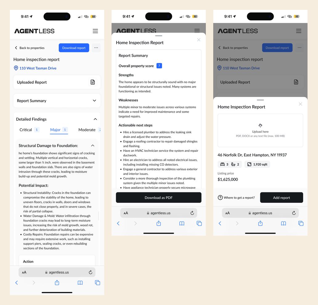
Mobile inspection report, download and upload states
Website and resources
The website combines product explanations, a savings-calculator layout, a company introduction and a homebuying resource hub. Alternating light and dark sections carry the identity through longer pages.
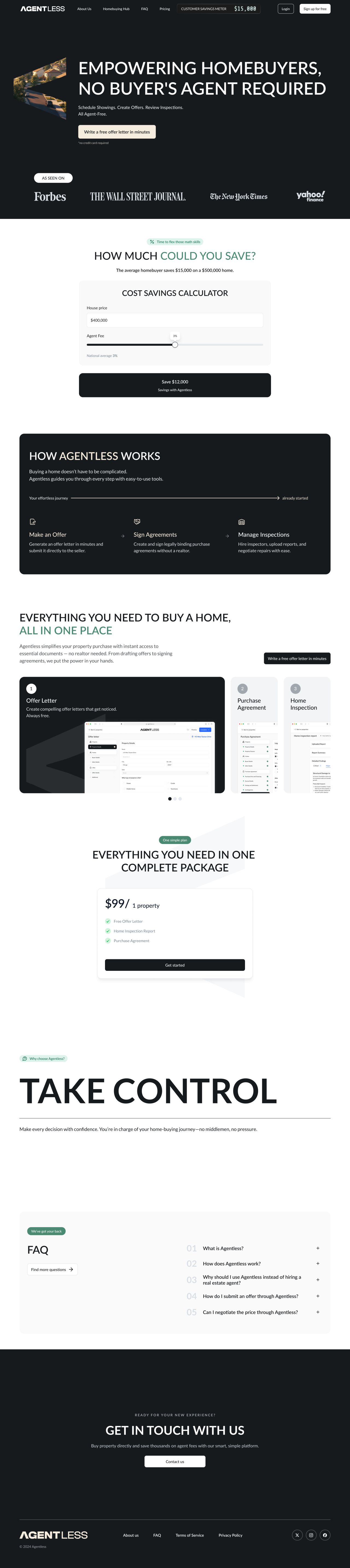
Homepage — full desktop page
Introducing Agentless
The company page uses short statements and property imagery to explain the product's purpose.
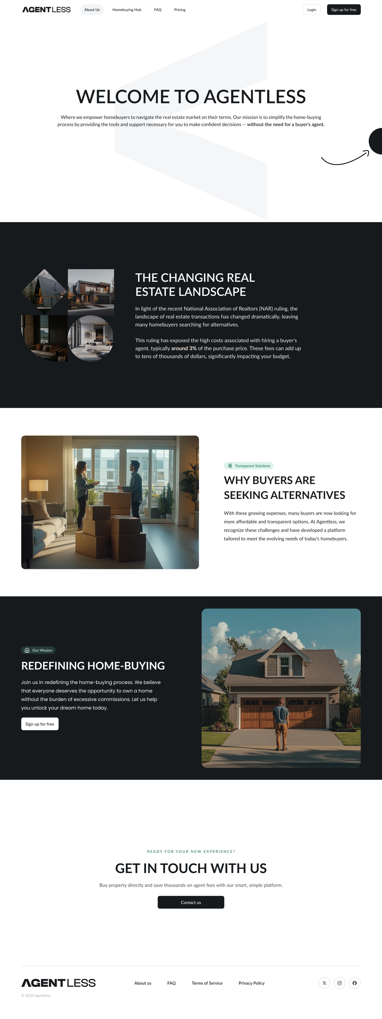
Company introduction — full desktop page
A homebuying resource hub
Featured stories, article cards and guide sign-up panels organise the editorial content.
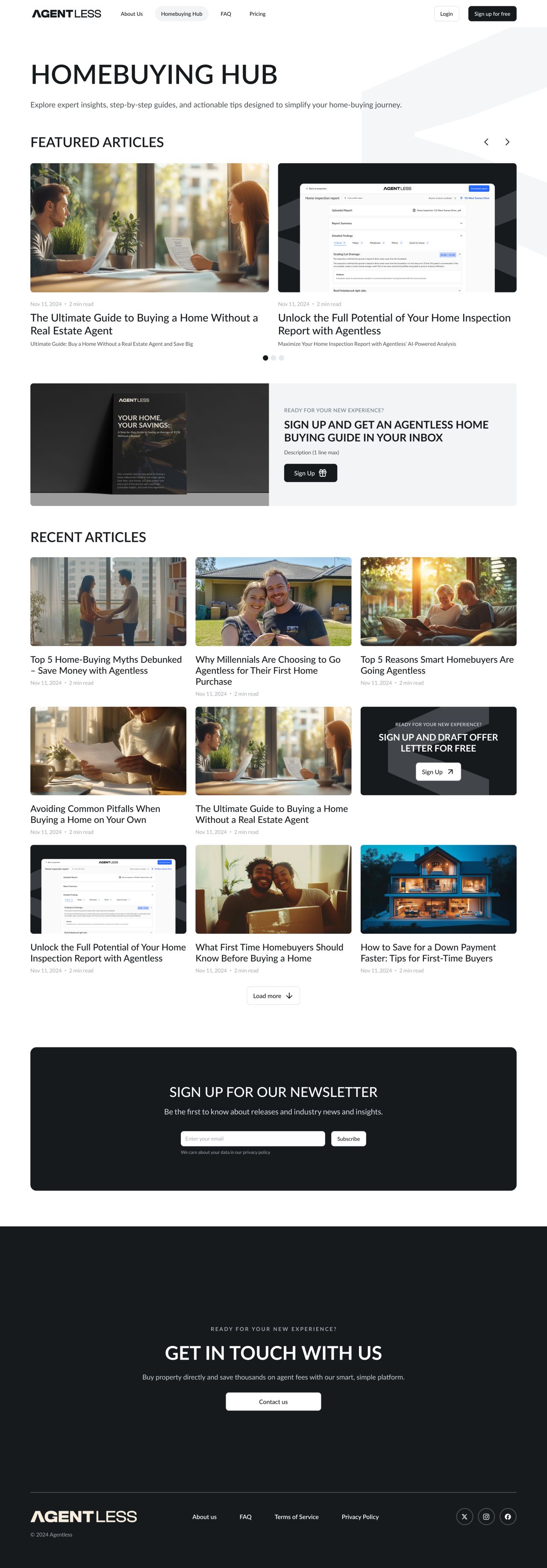
Homebuying hub — full desktop page
Long-form reading
The article layout combines headings, body copy, product callouts and related stories in one continuous reading flow.
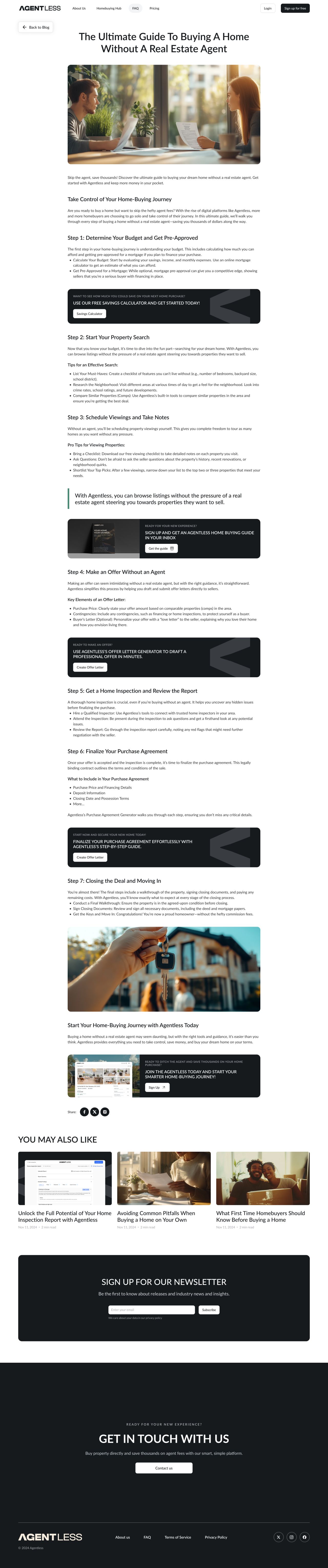
Homebuying article — full desktop page
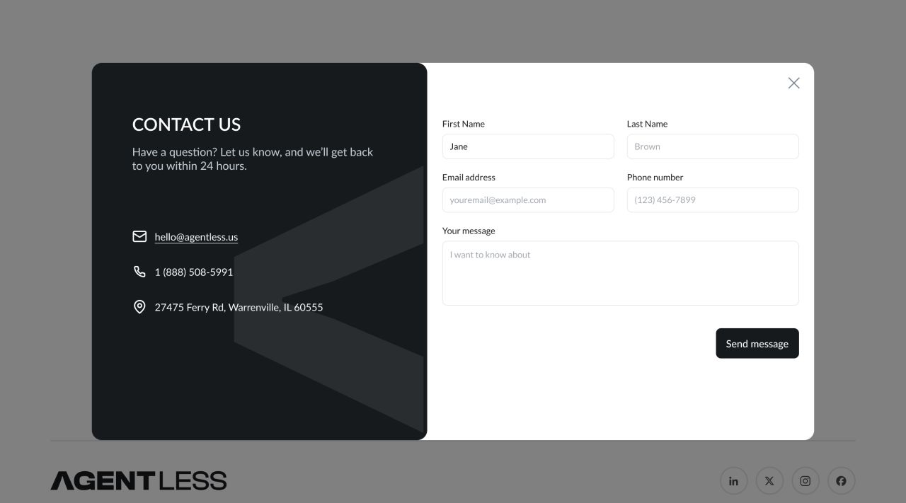
Desktop contact modal
The website on mobile
The mobile pages retain the full content while moving navigation, cards and forms into narrower layouts.

Mobile homepage and article

Mobile company page and resource hub
Brand identity
An angular mark and bold wordmark anchor a palette of charcoal, cream and green. The same identity appears across the product, website and social materials.
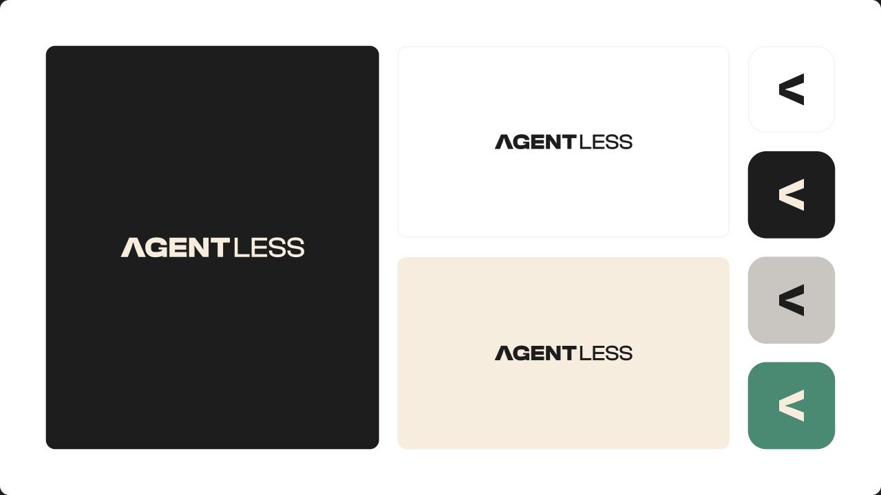
Wordmark, symbol and colour applications
Social applications
Four webinar-post treatments explore light and dark backgrounds, imagery and typographic hierarchy within the same visual identity.
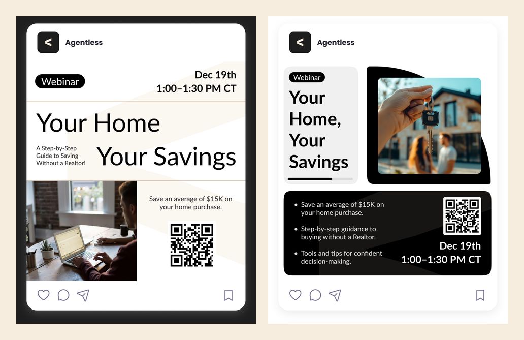
Webinar social posts — first pair
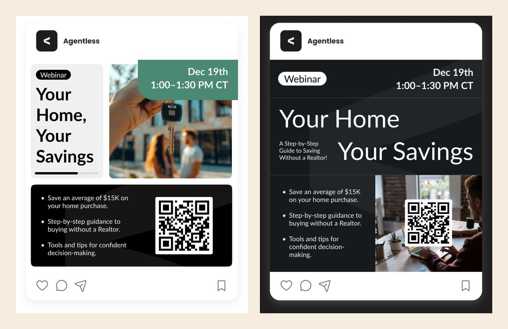
Webinar social posts — second pair
A 25-page buyer guide
The editorial design turns the homebuying journey into a sequence of chapters. Light and dark pages alternate with photography, practical callouts and product illustrations.
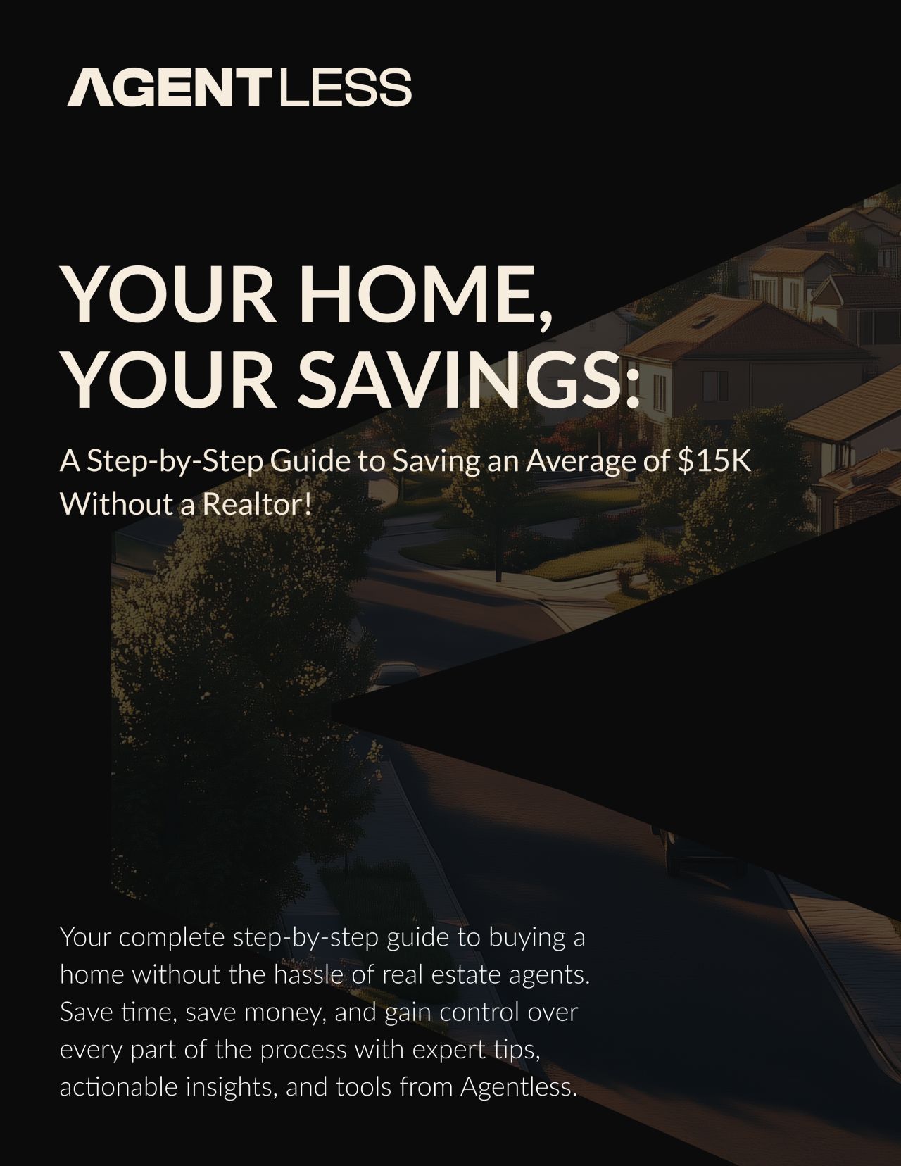
Research and preparation
Budgeting, mortgage research, location and house-hunting topics use recurring headers and highlighted notes.
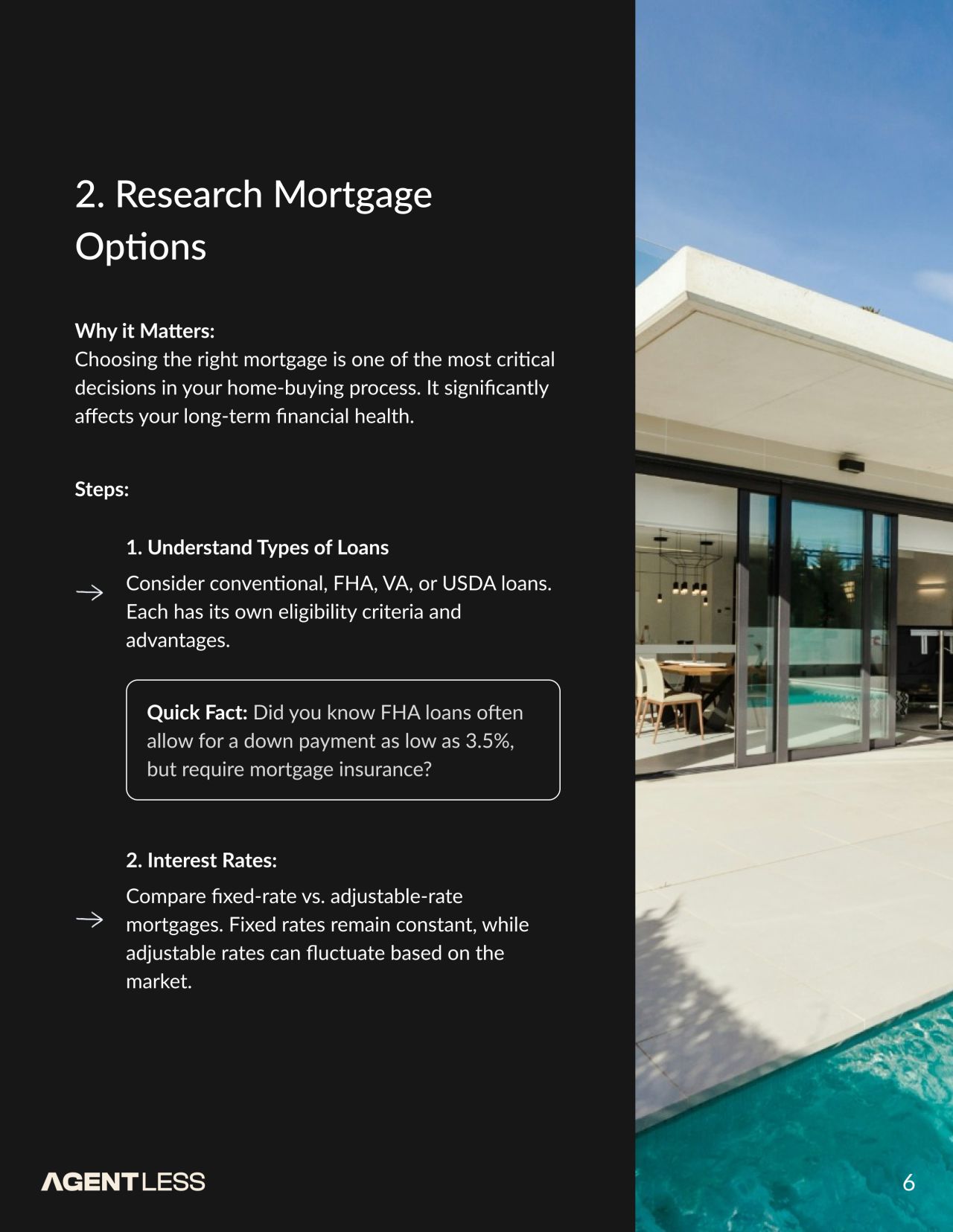
Offers and agreements
The middle chapters combine explanatory text with product illustrations and prominent section titles.
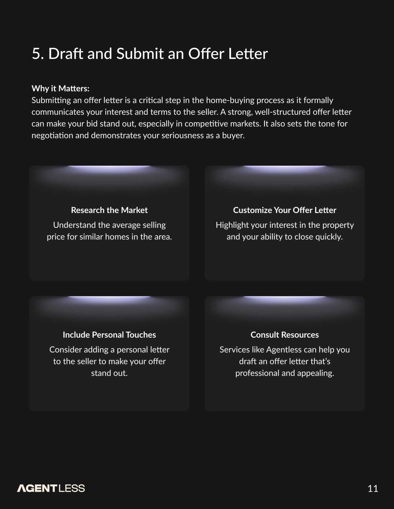
Inspection through financing
Photography, diagrams and contrasting panels organise the next stages of the guide.
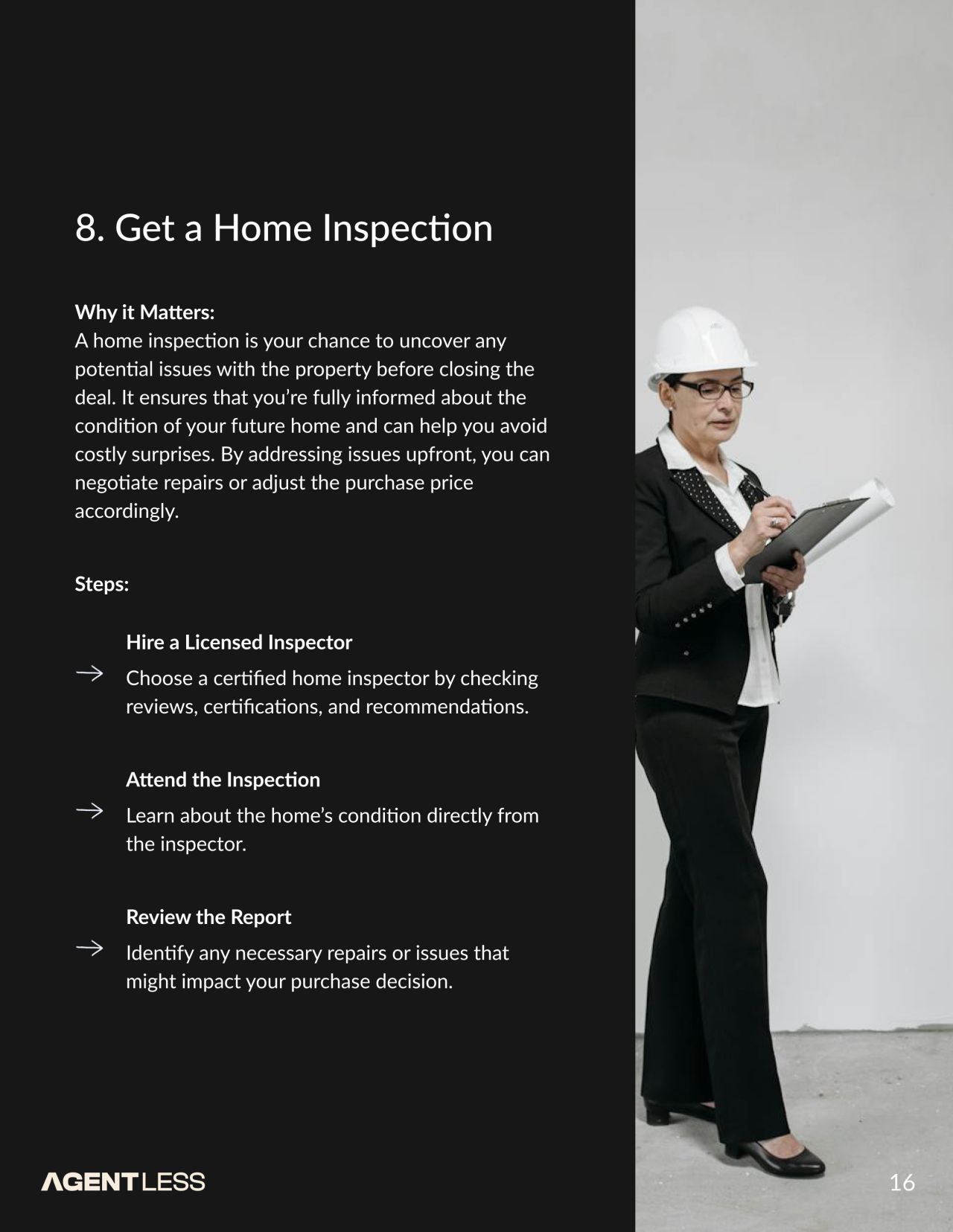
Closing the journey
The final pages cover walkthrough, closing and post-purchase topics, followed by a branded closing spread.
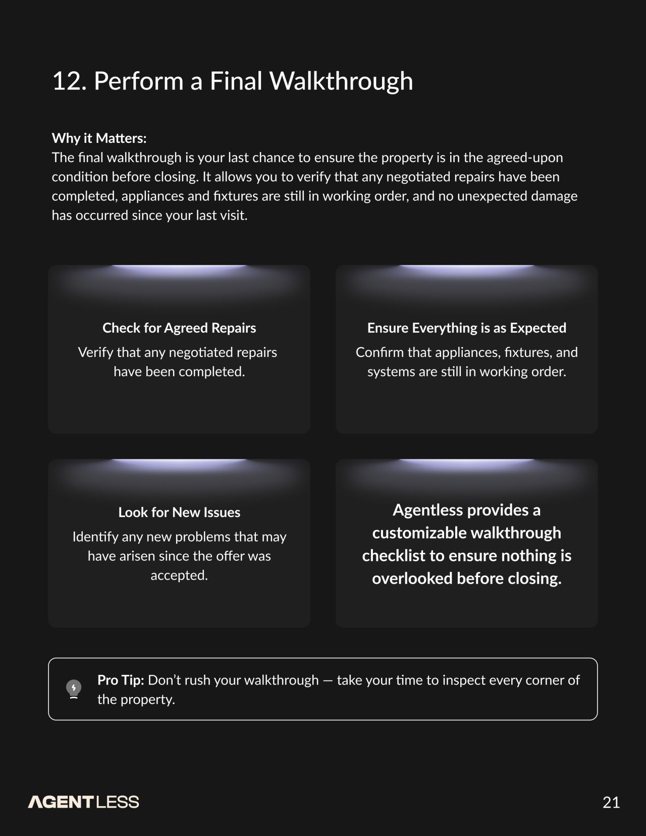
Our approach
Make the sequence visible
Step navigation, progress indicators and focused form groups give the transaction screens a consistent structure.
Keep property context close
Photos, maps, property details and report summaries connect the interface states to the home being considered.
Connect product and editorial design
The angular mark, restrained palette and typographic hierarchy carry across app screens, website pages, social posts and the buyer guide.