ORO
Mobile investing concepts and alternative visual identities.
The concept shows a mobile investing experience in light and dark themes alongside alternative visual-identity directions. Account, wallet and investment views sit beside explorations of logos, colour, typography and branded applications.
Welcome and access
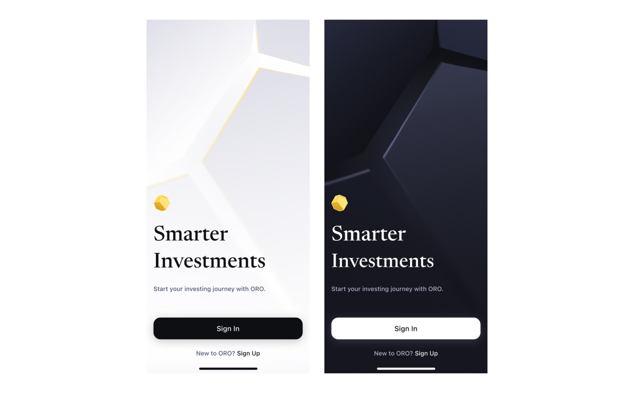
The concept introduces ORO through a golden symbol and geometric artwork. Light and dark states cover the splash screen and screenshot-protection view, while separate operating-system prompts show different update states.

Splash screens — light and dark themes
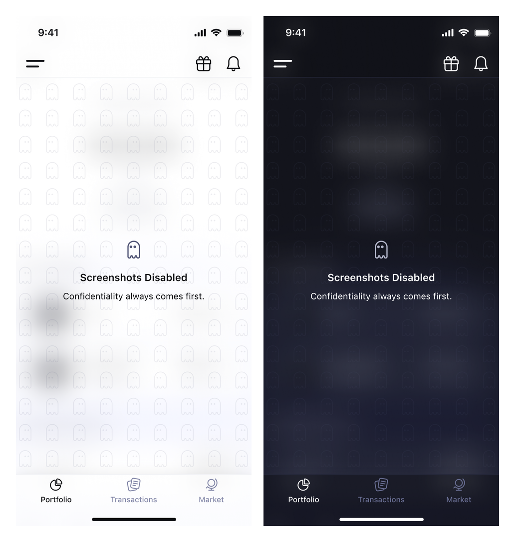
Screenshot-protection states — light and dark themes
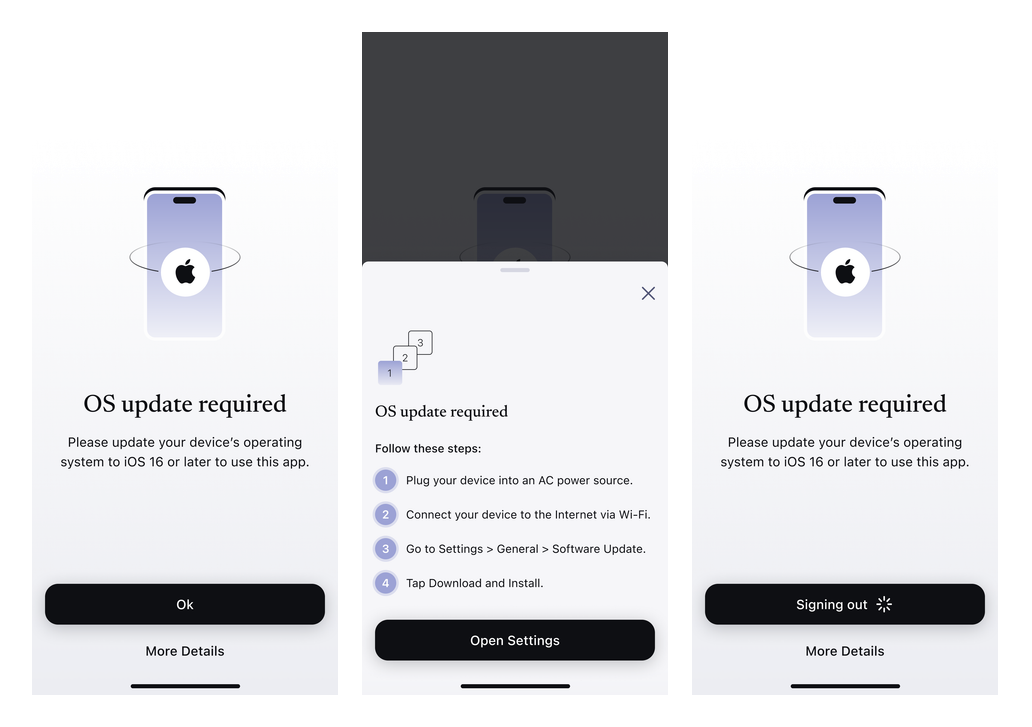
Operating-system update states
Account onboarding
Verification and application-review states use progress indicators, educational cards and a sharing prompt. Matching light and dark screens keep the same content structure.
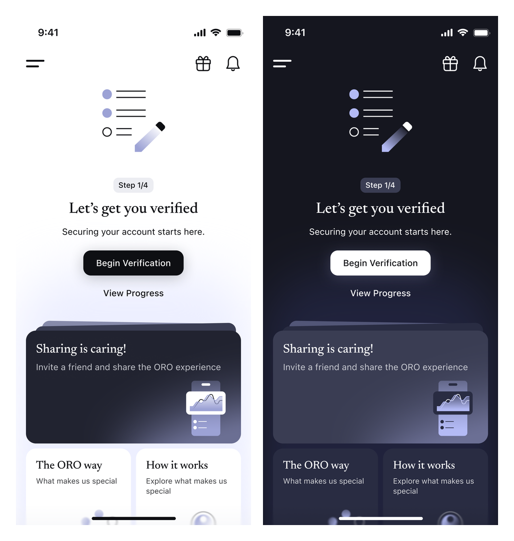
Verification states — light and dark themes
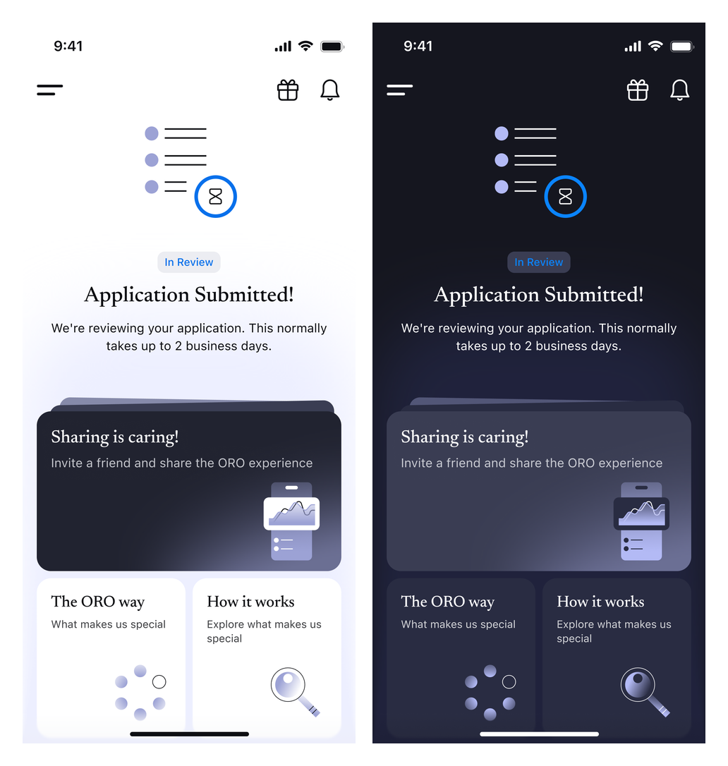
Application review — light and dark themes
Portfolio and accounts
Portfolio concepts organise balances, assets and gains and losses. Account-selection, account-creation and investment-breakdown states show alternative views in both visual themes.
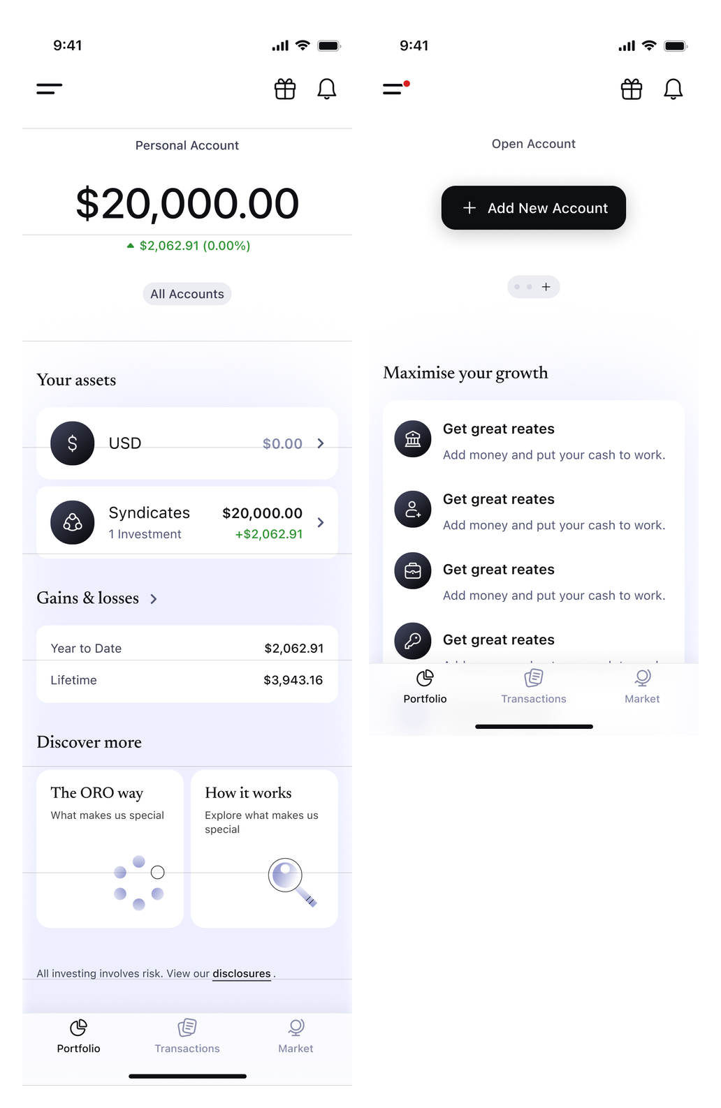
Portfolio and account creation — light theme
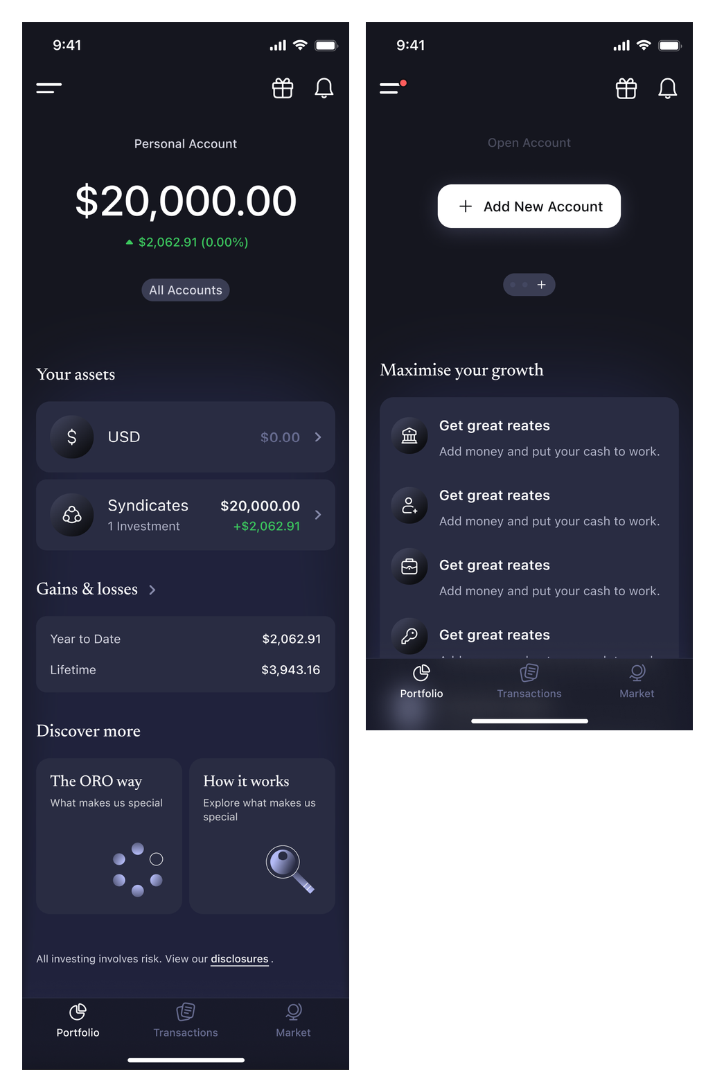
Portfolio and account creation — dark theme
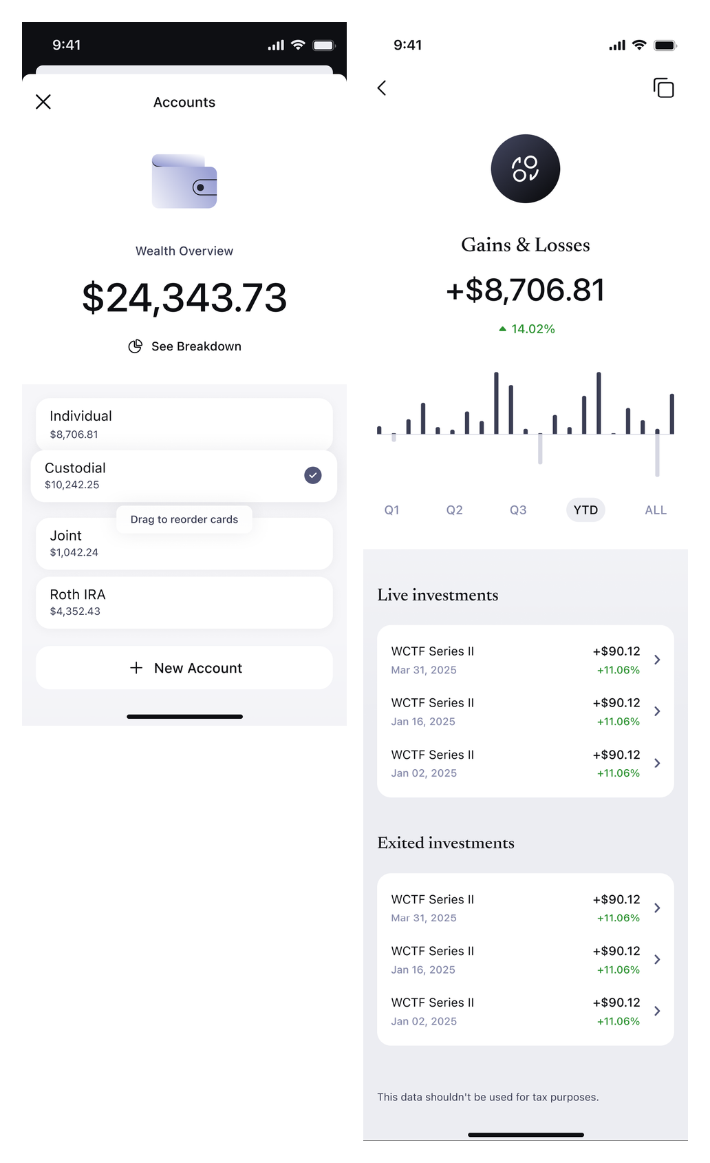
Account selection and gains and losses — light theme
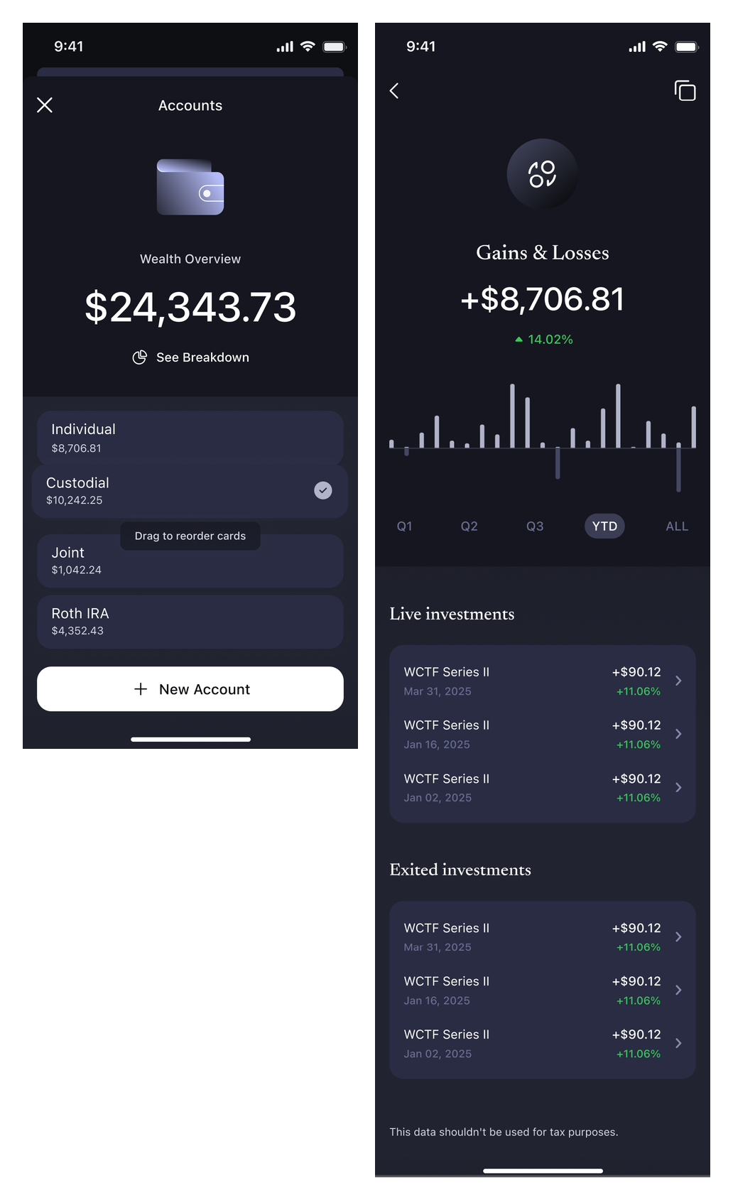
Account selection and gains and losses — dark theme
The USD wallet
The wallet layouts combine a balance chart, account overview and transaction history. Compact and expanded states show different balances and action controls.
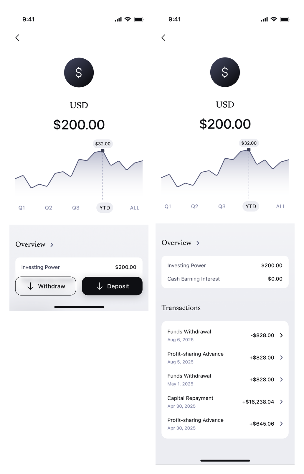
USD wallet and expanded transactions — light theme
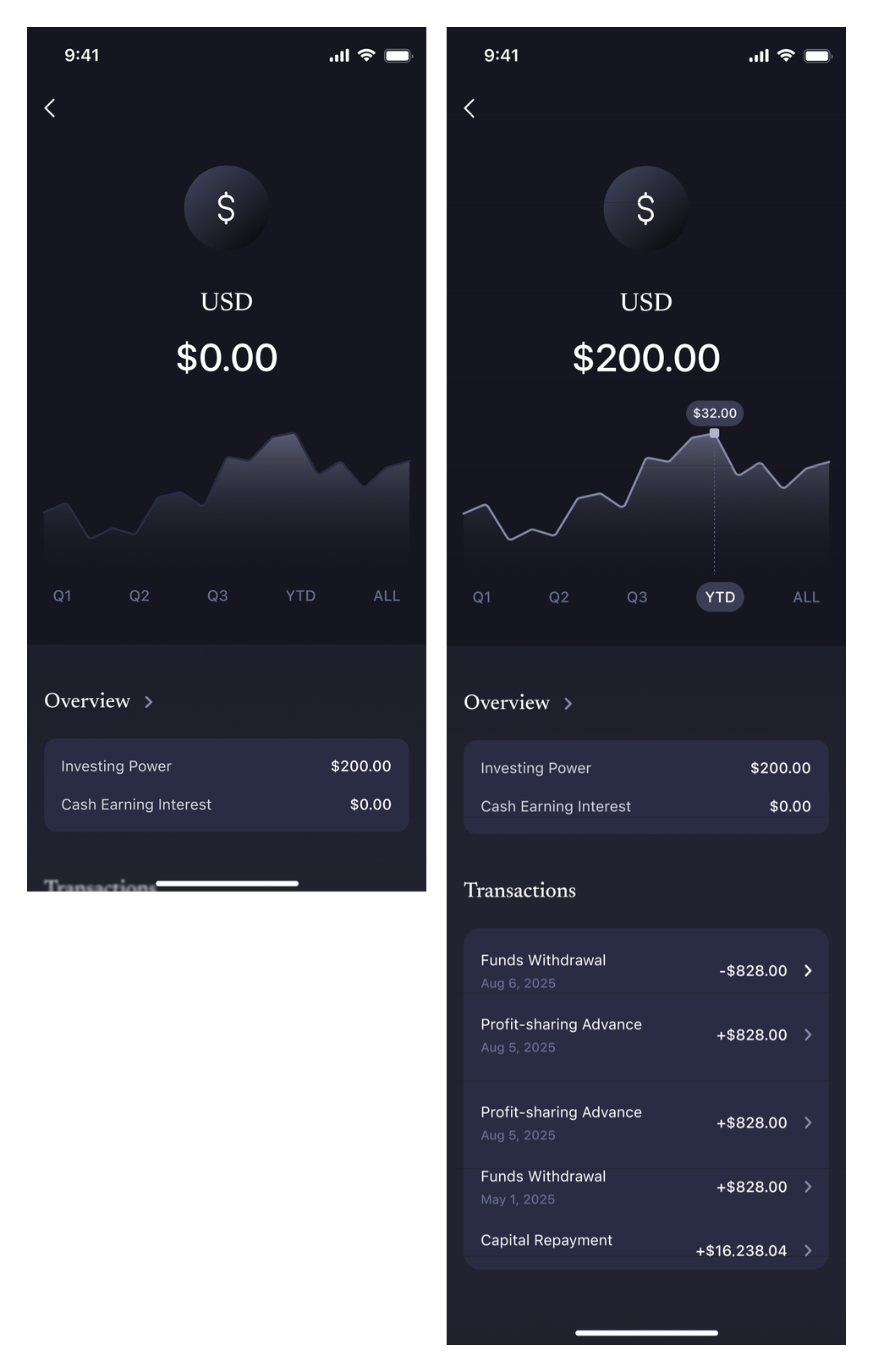
USD wallet and expanded transactions — dark theme
Learning and notifications
An education center presents course progress and suggested topics. Notification views group updates by category and include a prompt to enable alerts.
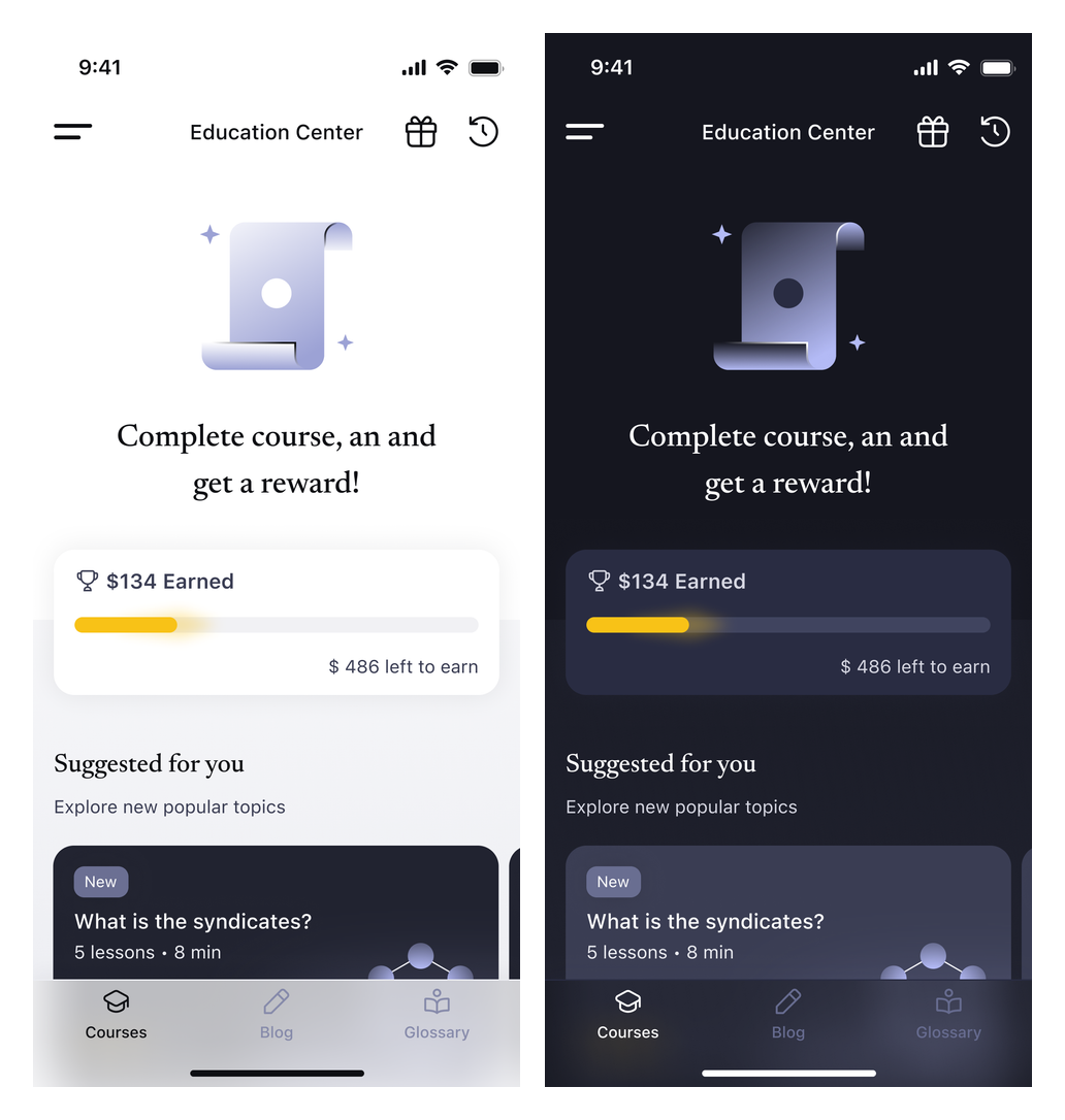
Education center — light and dark themes
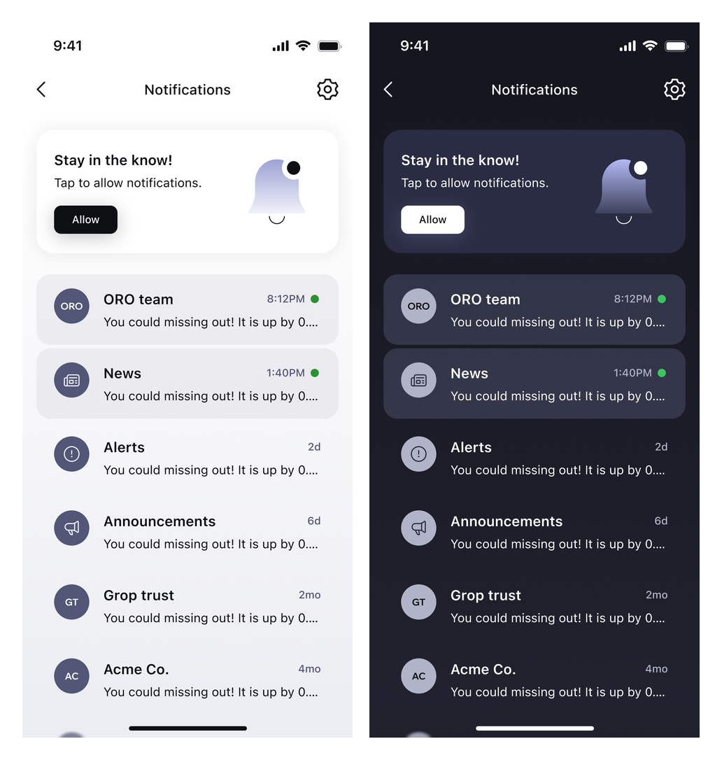
Notifications — light and dark themes
Settings and membership
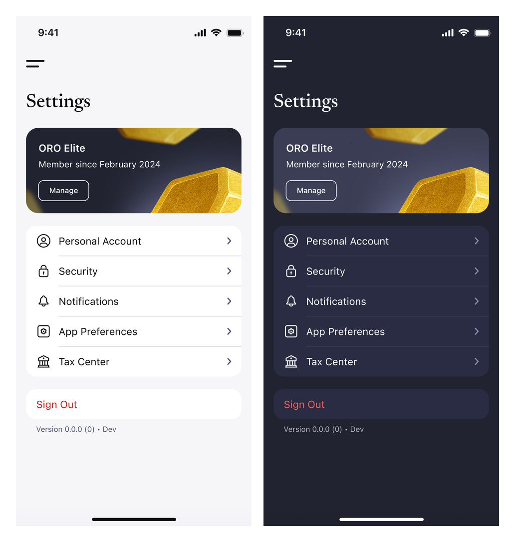
Settings bring together account, security, notification and app-preference options. Separate membership states show an ORO Elite invitation and an active-membership view.
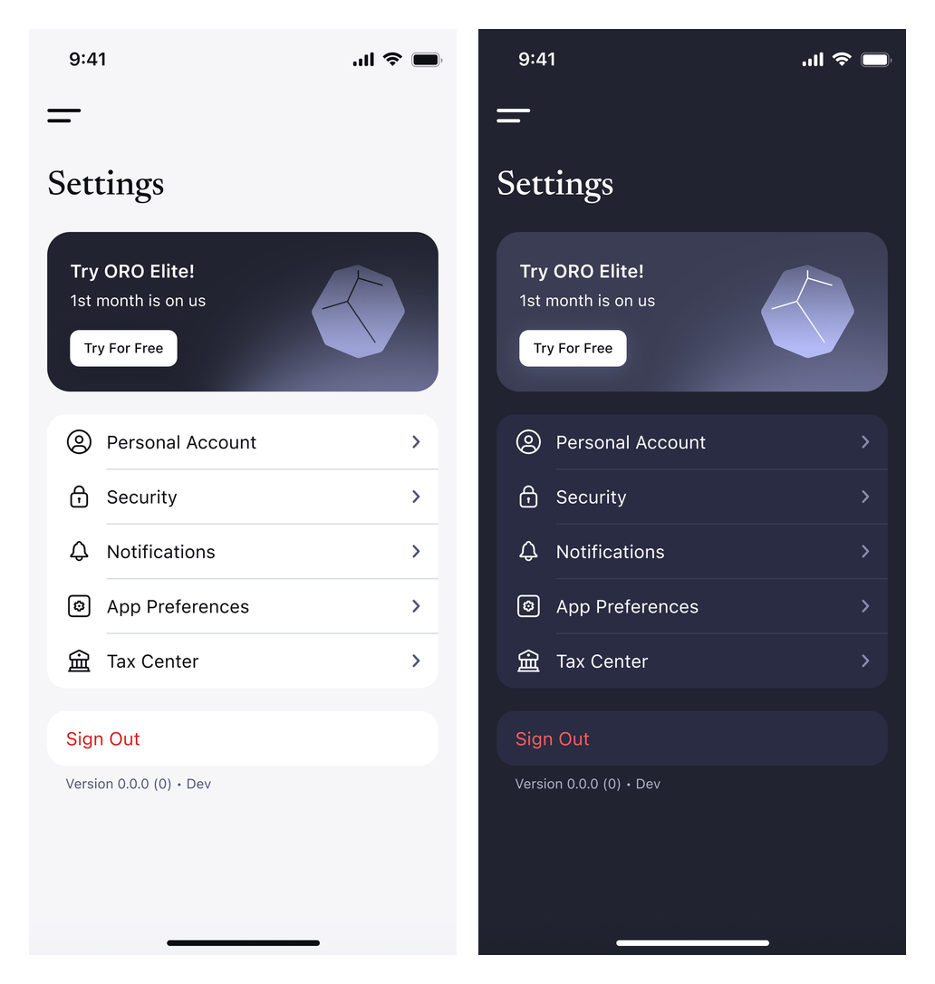
Account settings — light and dark themes
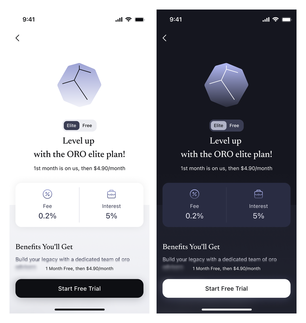
ORO Elite invitation — light and dark themes
Active membership — light and dark themes
Investment information
Investment-detail concepts show a fund overview, highlights and an onboarding gate for further information. A separate ORO Capital profile includes an about section, team information and investment-performance entries.
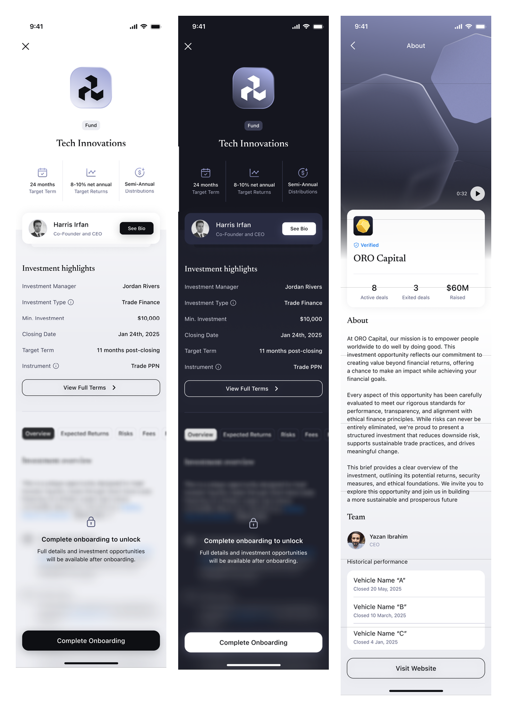
Investment details and the ORO Capital profile
Early identity directions
The concept explores four identity directions through monograms, graphic symbols, colour palettes and type pairings.
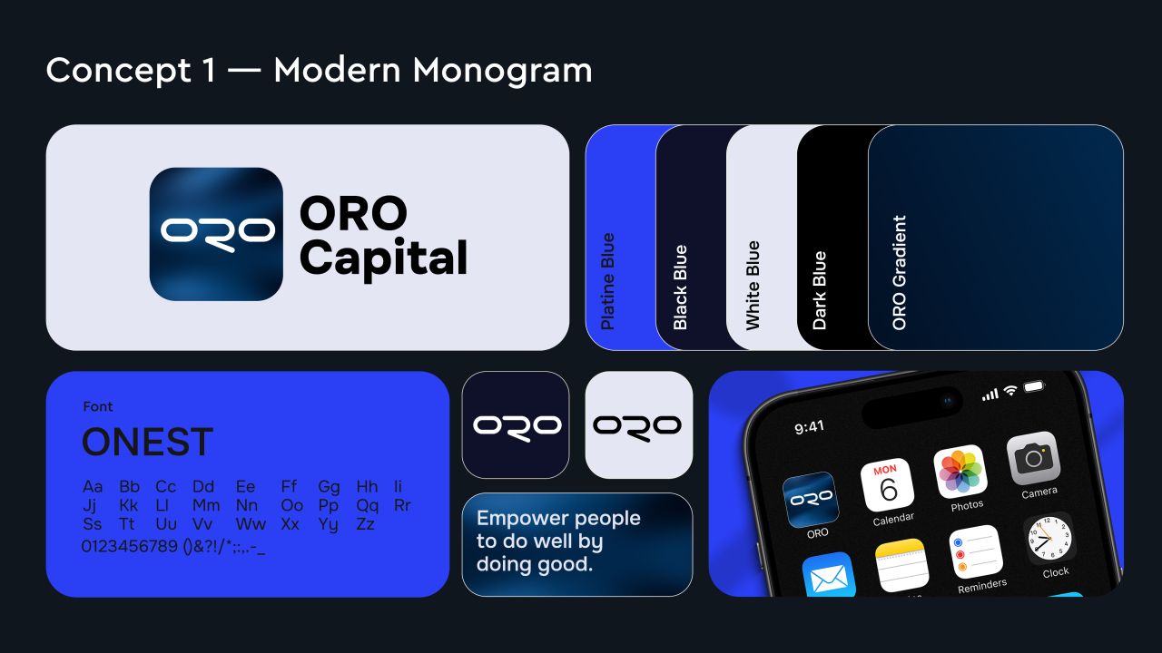
The Cornerstone direction
A geometric stone and cube motif is explored through logo construction, an app icon, mobile mockups and branded applications.
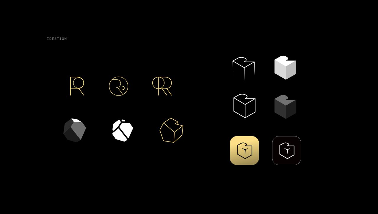
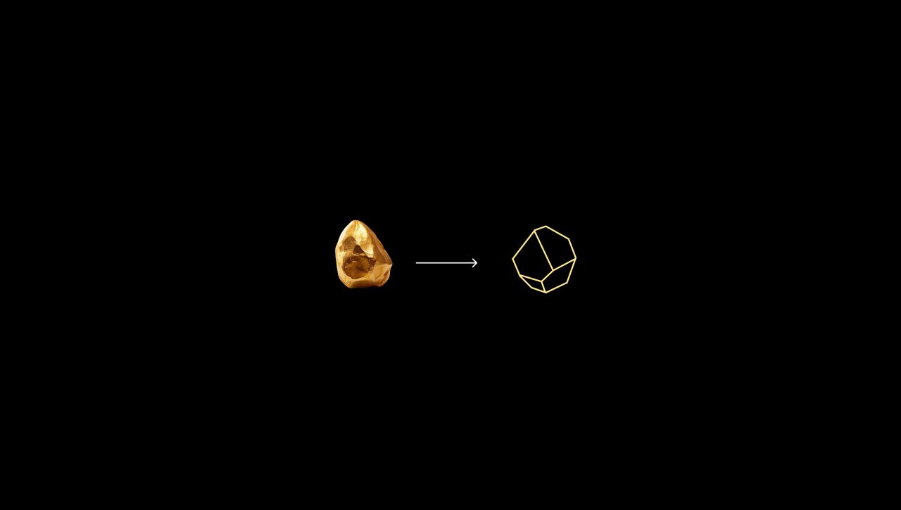
The Golden Stone direction
A faceted golden symbol is paired with contrasting backgrounds, mobile mockups and identity applications.
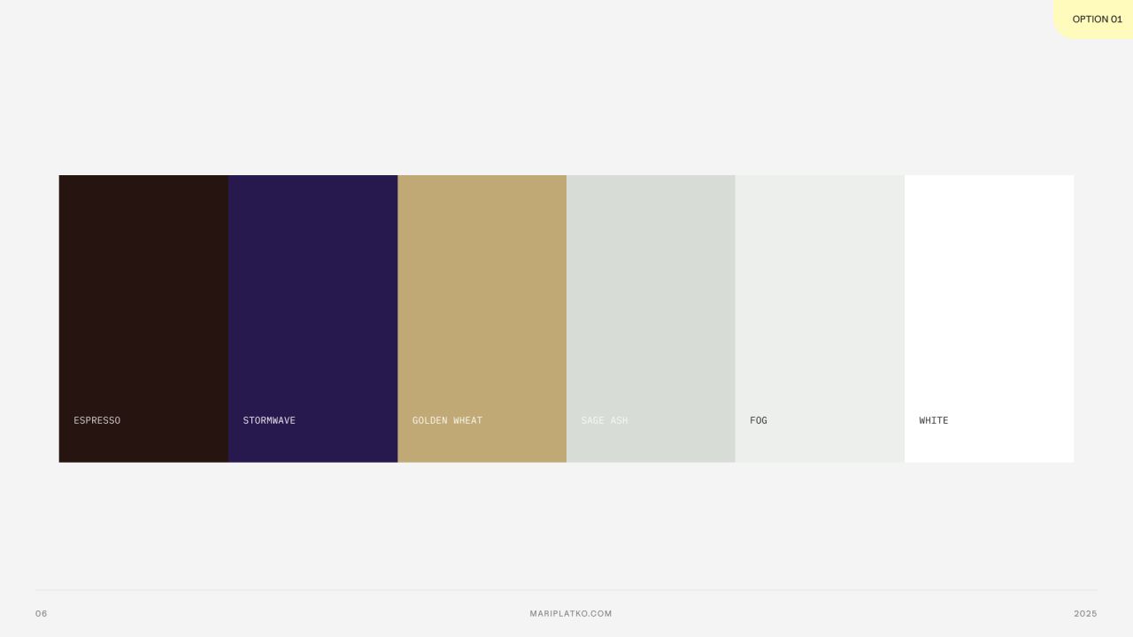
Alternative colour systems
A separate proposal compares two palettes: one with deep purple and muted gold, and another with teal, neutrals and an iridescent gradient.
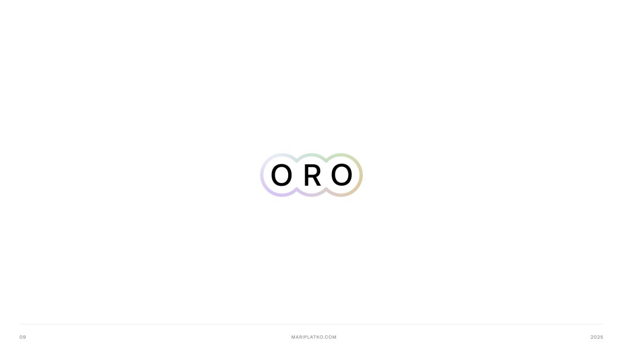
Wordmark exploration
Outlined lettering, connected forms and alternative lockups are tested in monochrome and gradient treatments.
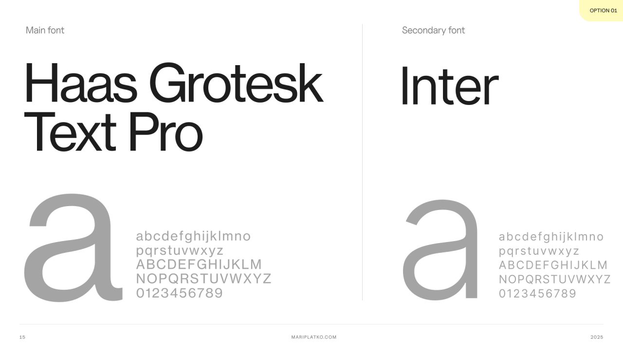
Typography options
Three type pairings explore different balances between distinctive headings and supporting text.
The identity in use
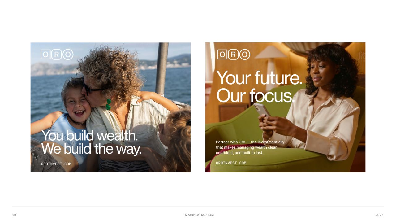
Advertising layouts, business cards and a tote-bag mockup show the proposed wordmark and palette in context.
Our approach
Make states explicit
Light and dark variants keep access, onboarding and account states visible.
Group the information
Portfolio, wallet and investment concepts organise balances, activity and detailed information into distinct views.
Explore the identity
Logo, colour and typography proposals show alternative visual directions across mobile, print and merchandise mockups.