DeCash
[NEEDS REVIEW] P2P trading, website, and account email concepts.
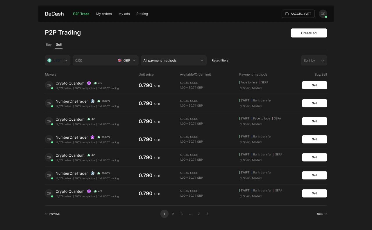
[NEEDS REVIEW] The DeCash concept shows a peer-to-peer crypto trading workspace with offer filters, order states, collateral, and ad setup. [NEEDS REVIEW] The linked designs also include desktop and mobile landing pages and three account email templates.
[NEEDS REVIEW] Comparing trading offers
[NEEDS REVIEW] The concept shows maker details, unit prices, trade limits, and payment methods together in the offer list.
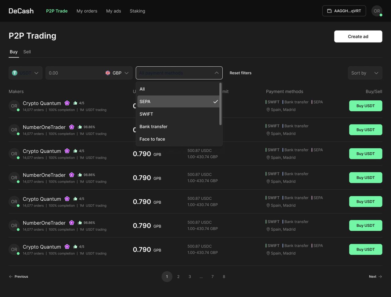
Buy offers — payment-method filter.
[NEEDS REVIEW] Filters in context
[NEEDS REVIEW] Asset, fiat-currency, and sorting menus open above the trading list.
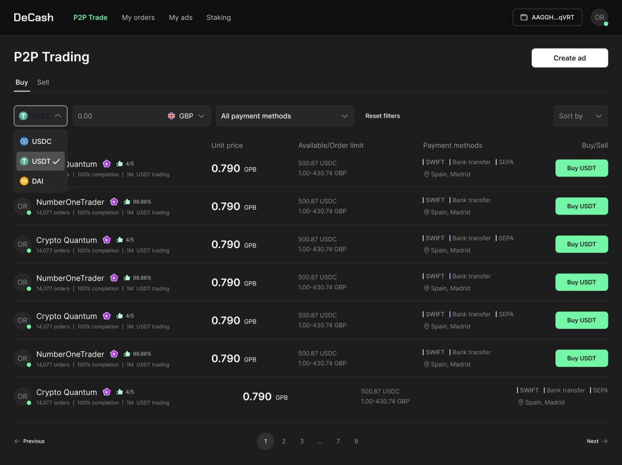
Buy offers — asset selector.
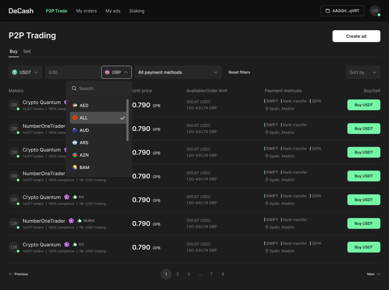
Buy offers — fiat-currency selector.
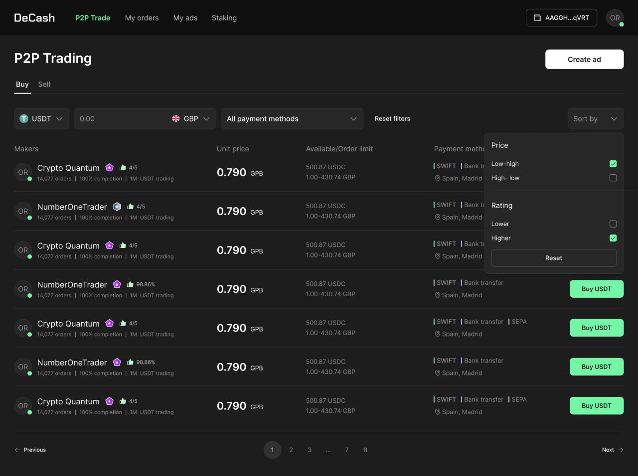
Buy offers — sorting menu.
[NEEDS REVIEW] Order status in one place
[NEEDS REVIEW] The in-progress order table shows order type, amount, currency, maker, date, and chat actions.
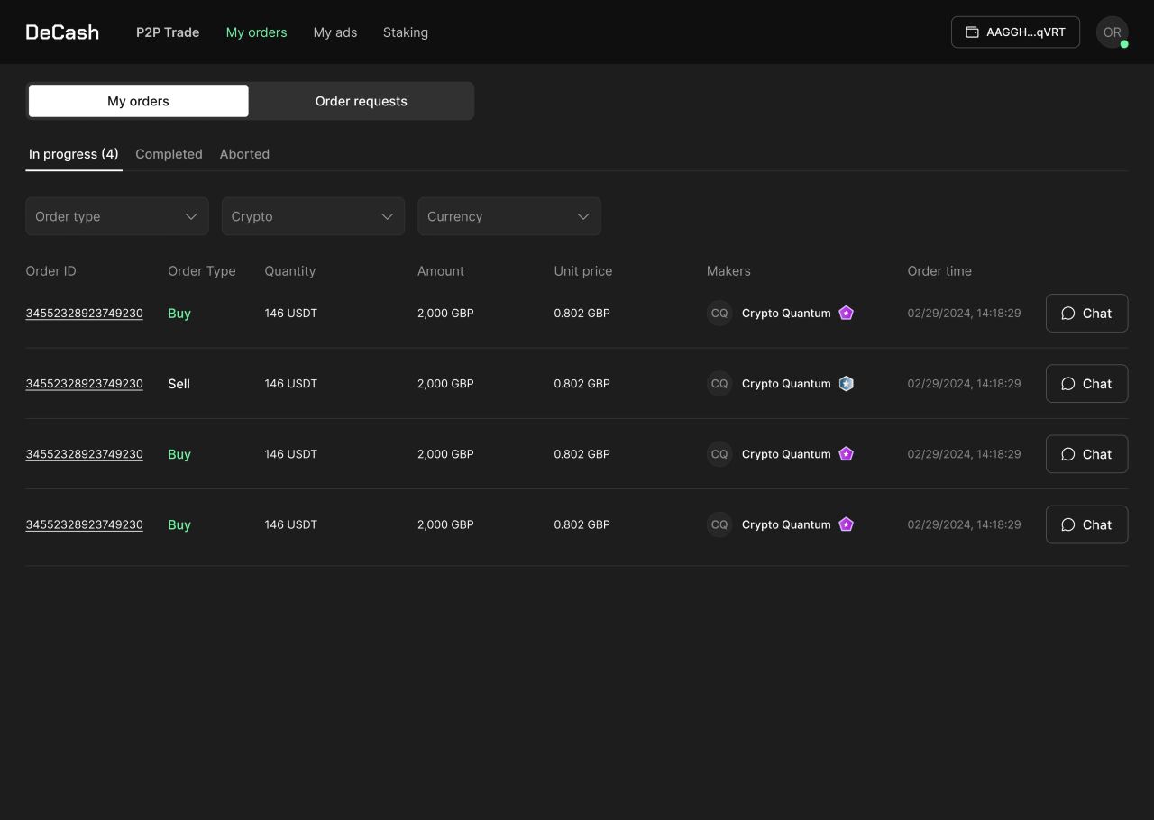
My orders — in-progress state.
[NEEDS REVIEW] A visible collateral step
[NEEDS REVIEW] The submit-collateral screen places order details, collateral status, and the next action in a single card.
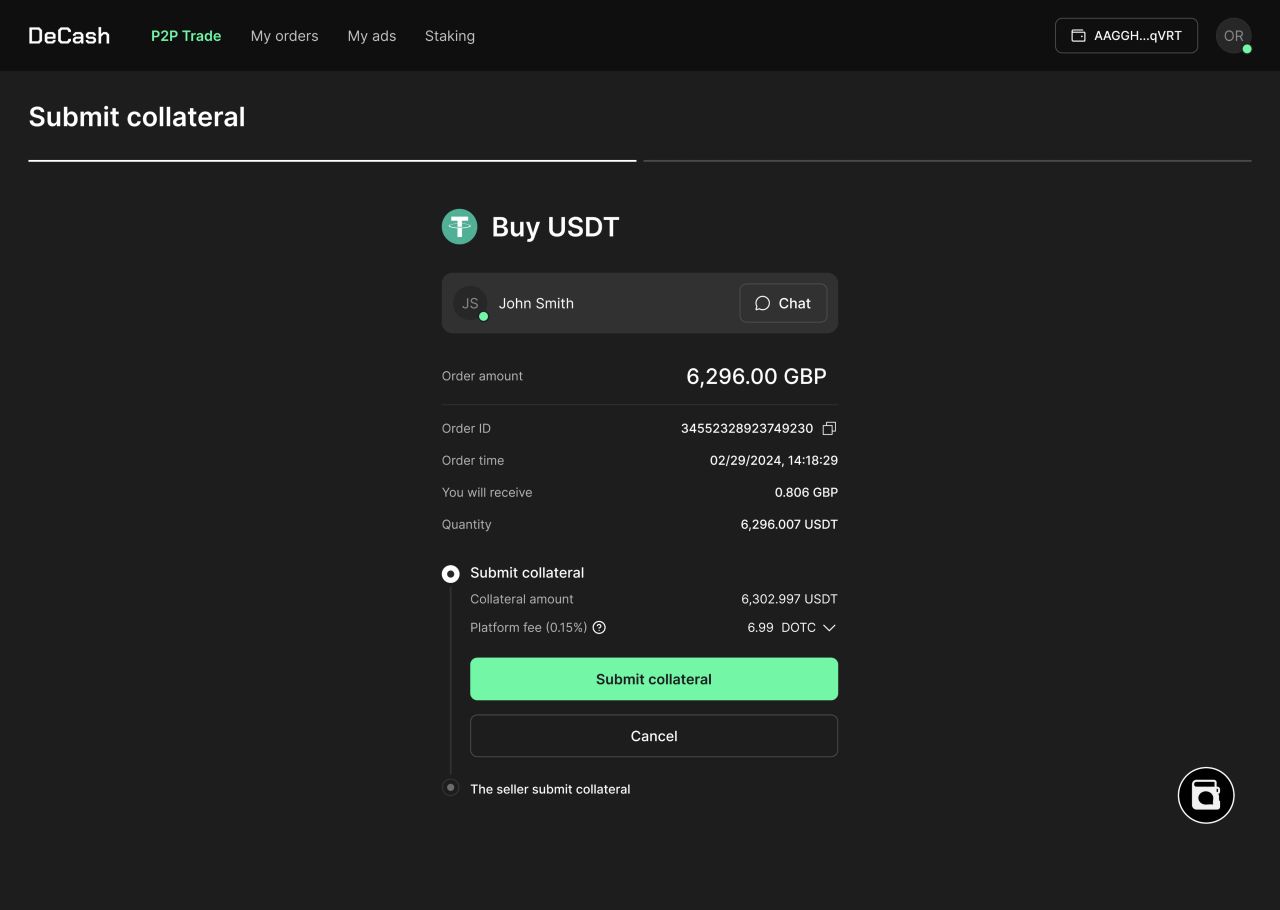
Buy order — submit collateral.
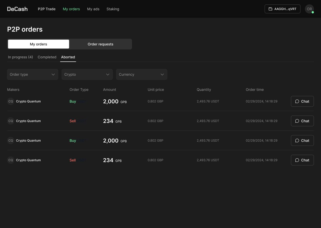
My orders — aborted state.
[NEEDS REVIEW] Setting an ad price
[NEEDS REVIEW] The concept shows buy and sell tabs, asset and fiat selectors, and a fixed-price field before the next step.
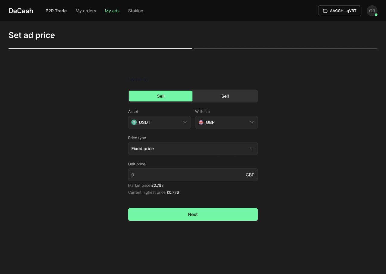
Create ad — set ad price.
[NEEDS REVIEW] Checking the final preview
[NEEDS REVIEW] The final ad preview lists the price type, unit price, order limit, amount, and payment method before posting.
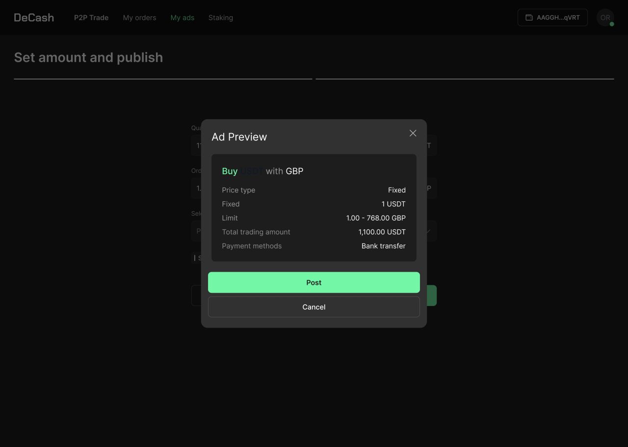
Create ad — final preview before posting.
[NEEDS REVIEW] The desktop landing page
[NEEDS REVIEW] The landing-page concept introduces P2P trading with a product preview, feature panels, and a three-step buying sequence.
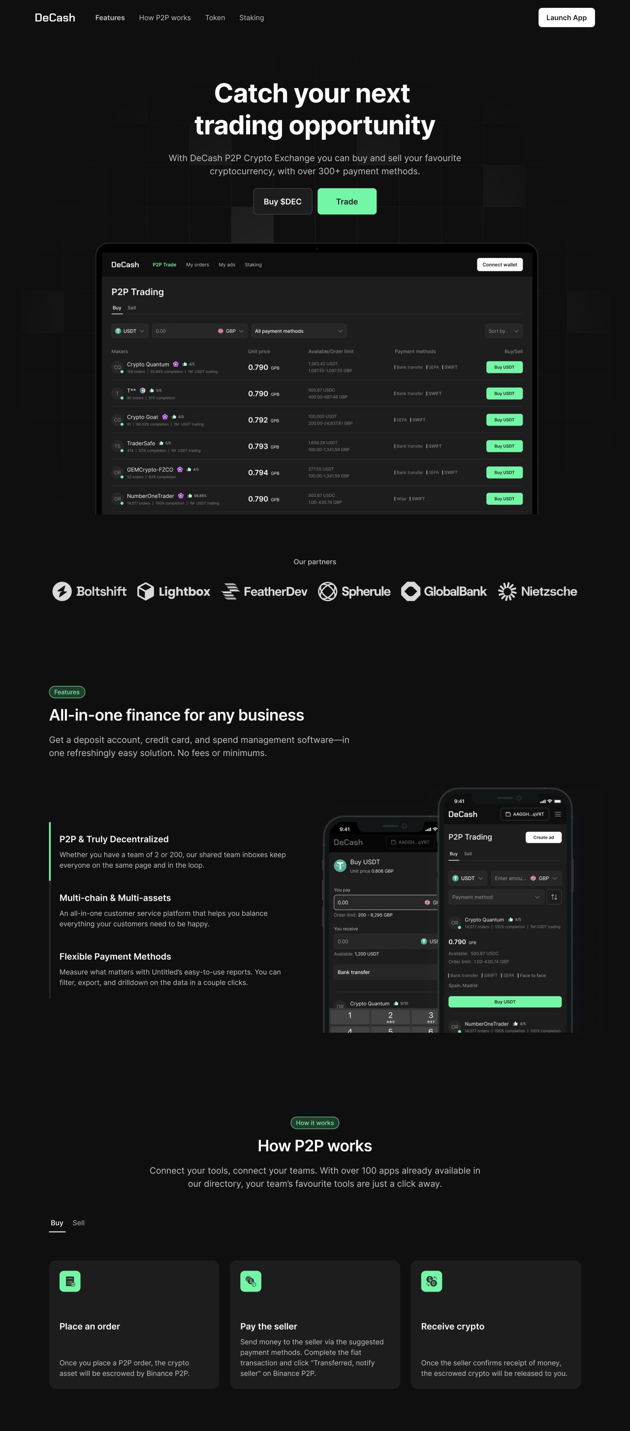
Desktop landing page — hero, feature panels, and how P2P works.
[NEEDS REVIEW] Token, staking, and support sections
[NEEDS REVIEW] The remaining page shows a tokenomics chart, a staking panel, FAQ rows, and the footer.
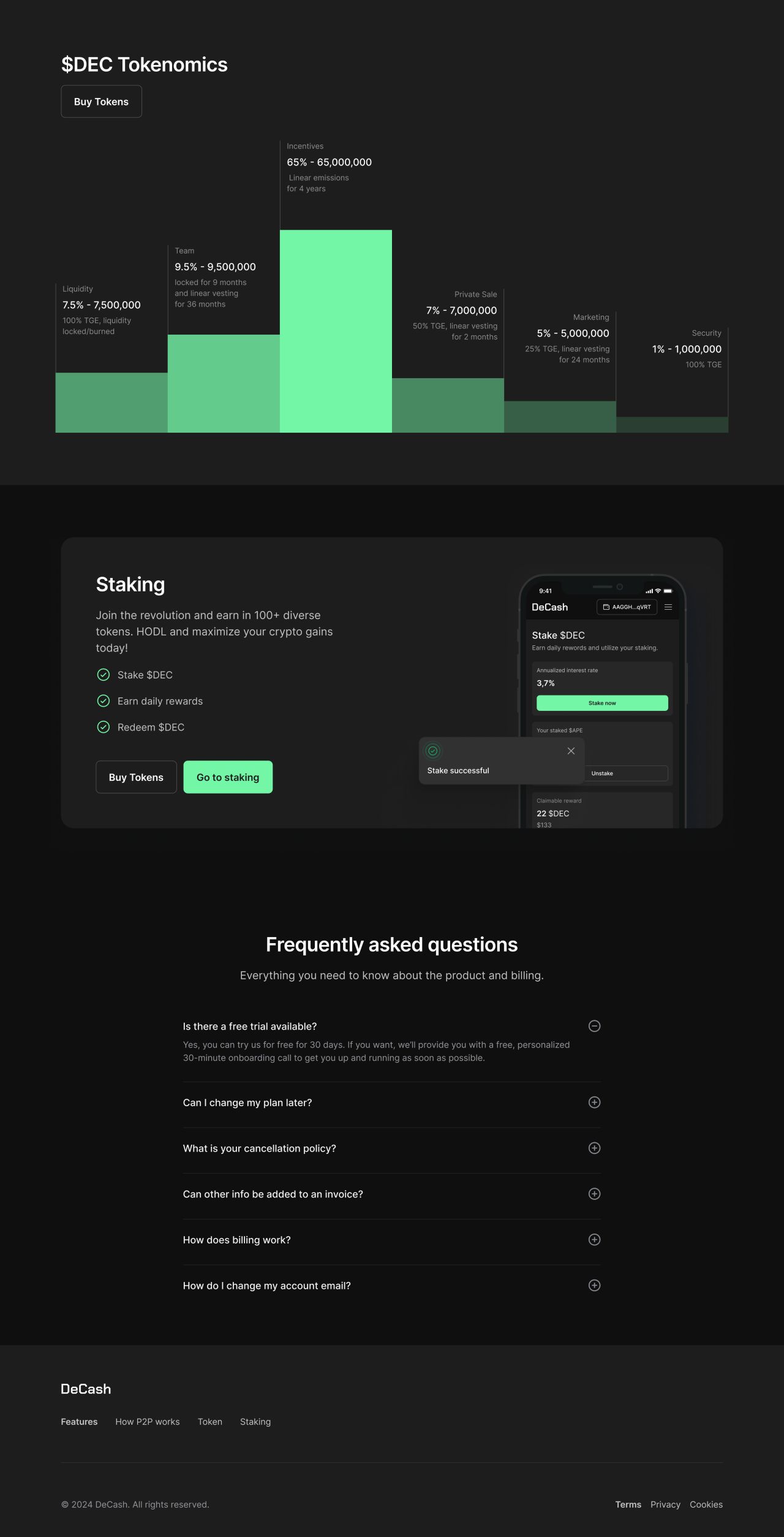
Desktop landing page — tokenomics, staking, FAQ, and footer.
[NEEDS REVIEW] The mobile landing page
[NEEDS REVIEW] The mobile version presents the same page sections in a single-column layout with stacked feature and process cards.

Mobile landing page — all supplied screenshot fragments in order.
[NEEDS REVIEW] Account email templates
[NEEDS REVIEW] The invitation template combines a mobile product preview with an invitation message and a primary action.
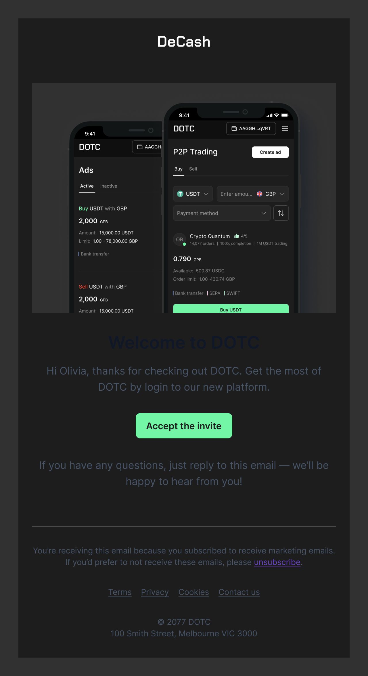
Email template — invitation to DeCash.
[NEEDS REVIEW] Order notifications
[NEEDS REVIEW] The other two templates show an aborted-order notification and a new order request, each with order details and a view-order action.
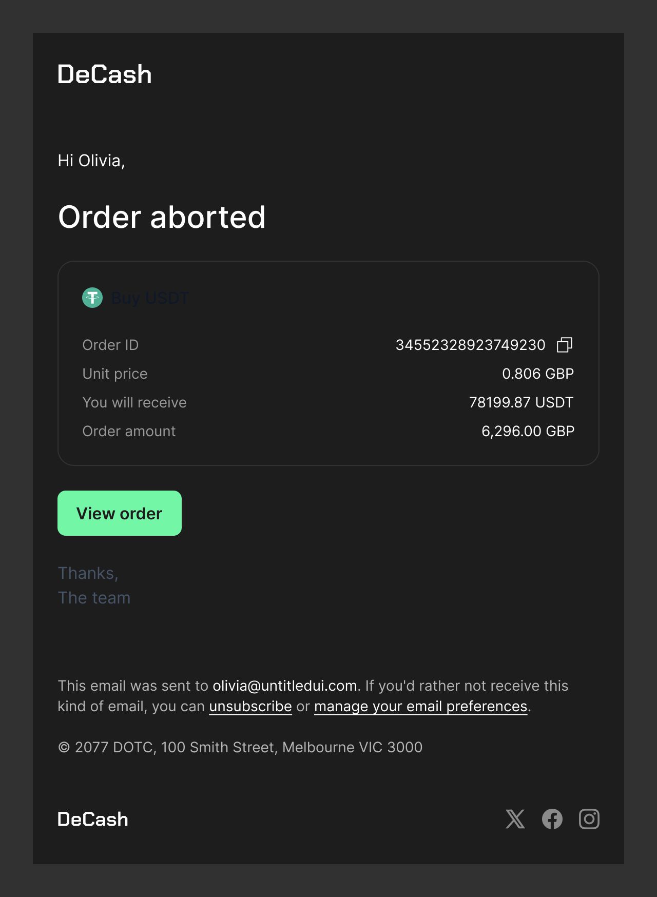
Email template — order aborted.
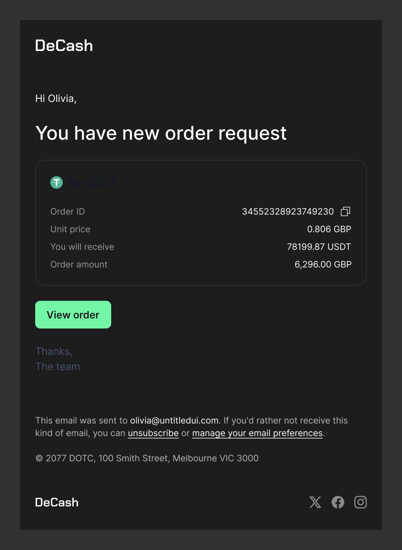
Email template — new order request.
Our approach
[NEEDS REVIEW] Comparable offer rows
[NEEDS REVIEW] The offer list aligns maker details, price, limits, and payment options in repeatable rows.
[NEEDS REVIEW] Explicit order and ad states
[NEEDS REVIEW] Separate screens show active and aborted orders, collateral submission, price setup, and the final ad preview.
[NEEDS REVIEW] A shared visual language
[NEEDS REVIEW] Dark surfaces, white type, and green accents appear across the application, landing pages, and email templates.