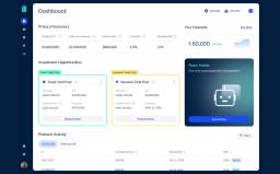
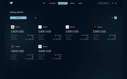
GuardHome Warranty
A protection-led identity and multi-role portal for home warranty services
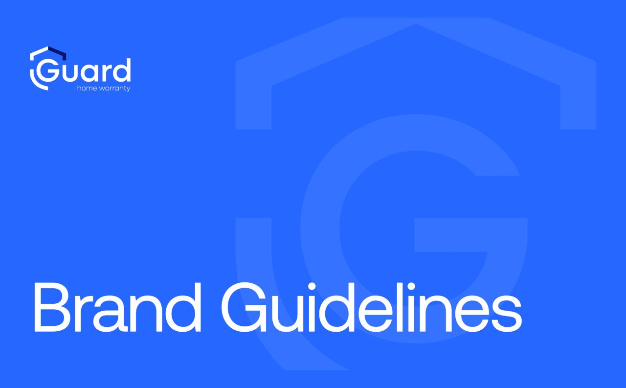
GuardHome Warranty provides home warranty services for homeowners and real estate professionals. The supplied work combines a protection-led visual identity with website and multi-role portal designs for agents, inspectors and homeowners.
An identity built around protection
GuardHome Warranty provides home warranty services for homeowners and real estate professionals. The supplied guidelines combine a roof-shaped symbol, a shield-like G and a clear wordmark, followed by rules for backgrounds and logo use.
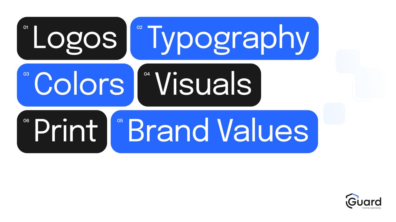
A shared typographic and colour system
Aeonik and Satoshi form the type pairing. Bright blues, deep navy and light neutrals give the identity a consistent visual range across its applications.
From imagery to printed materials
The remaining guidelines cover photography, stationery and the brand's written voice. They bring the same visual language into business cards, documents and messaging examples.
A clear introduction to the service
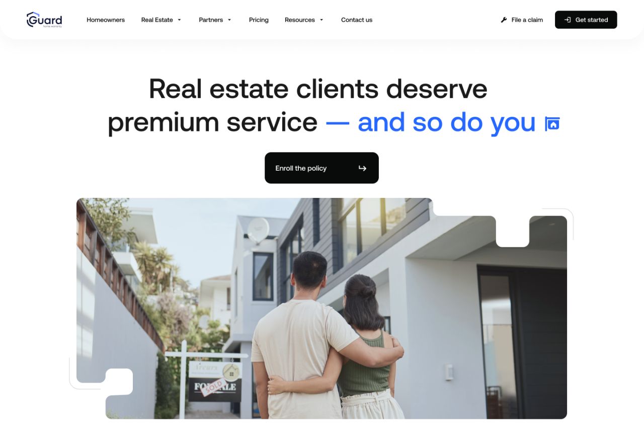
The supplied website screen combines a direct headline, an email entry point and a property-focused photograph within the brand's blue-and-neutral palette.
Website — introductory screen
Entering the portal
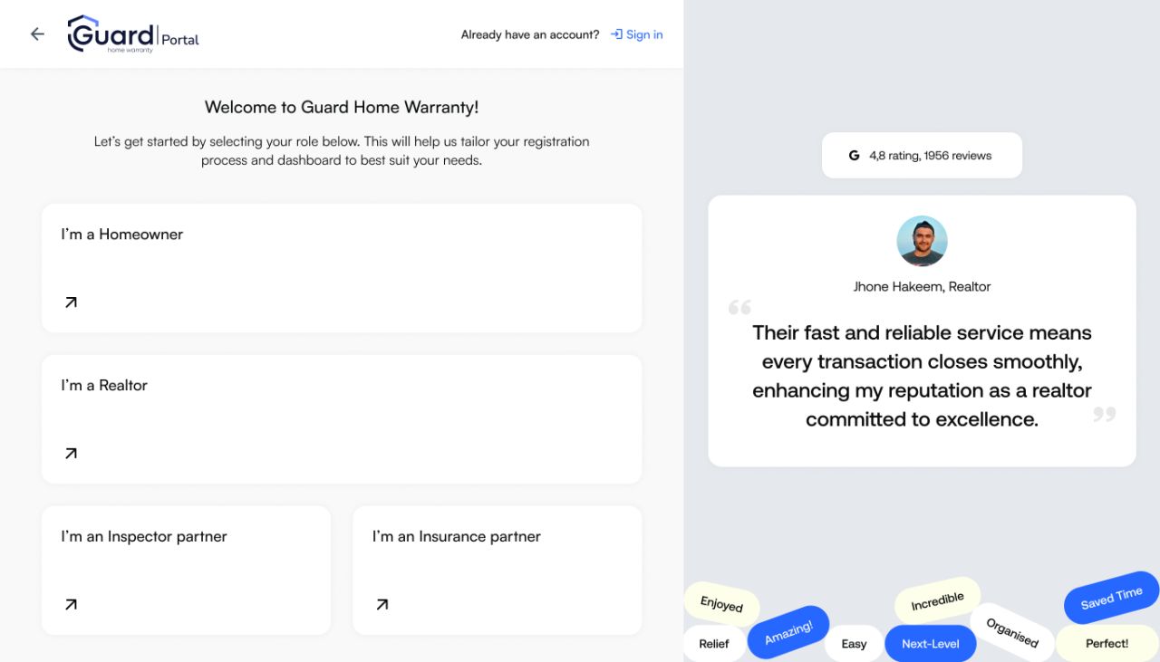
The portal designs cover role selection, sign-in, registration and password recovery. Separate validation and confirmation states make the sequence visible without removing the intermediate screens.
Role-specific workspaces
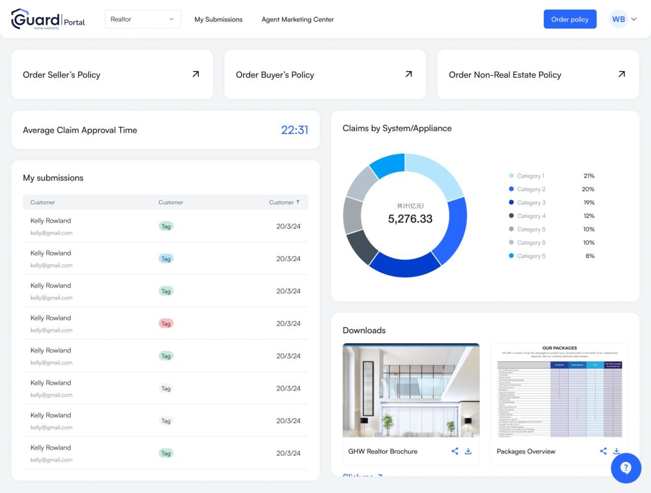
The portal screens show submissions, policy details, ordering steps, account settings, claims and inspector deals. Tables, status labels and grouped forms organise these different tasks.
Account access on mobile
The mobile sign-in and registration screens retain their complete forms and browser context. Both related states are presented at equal width.
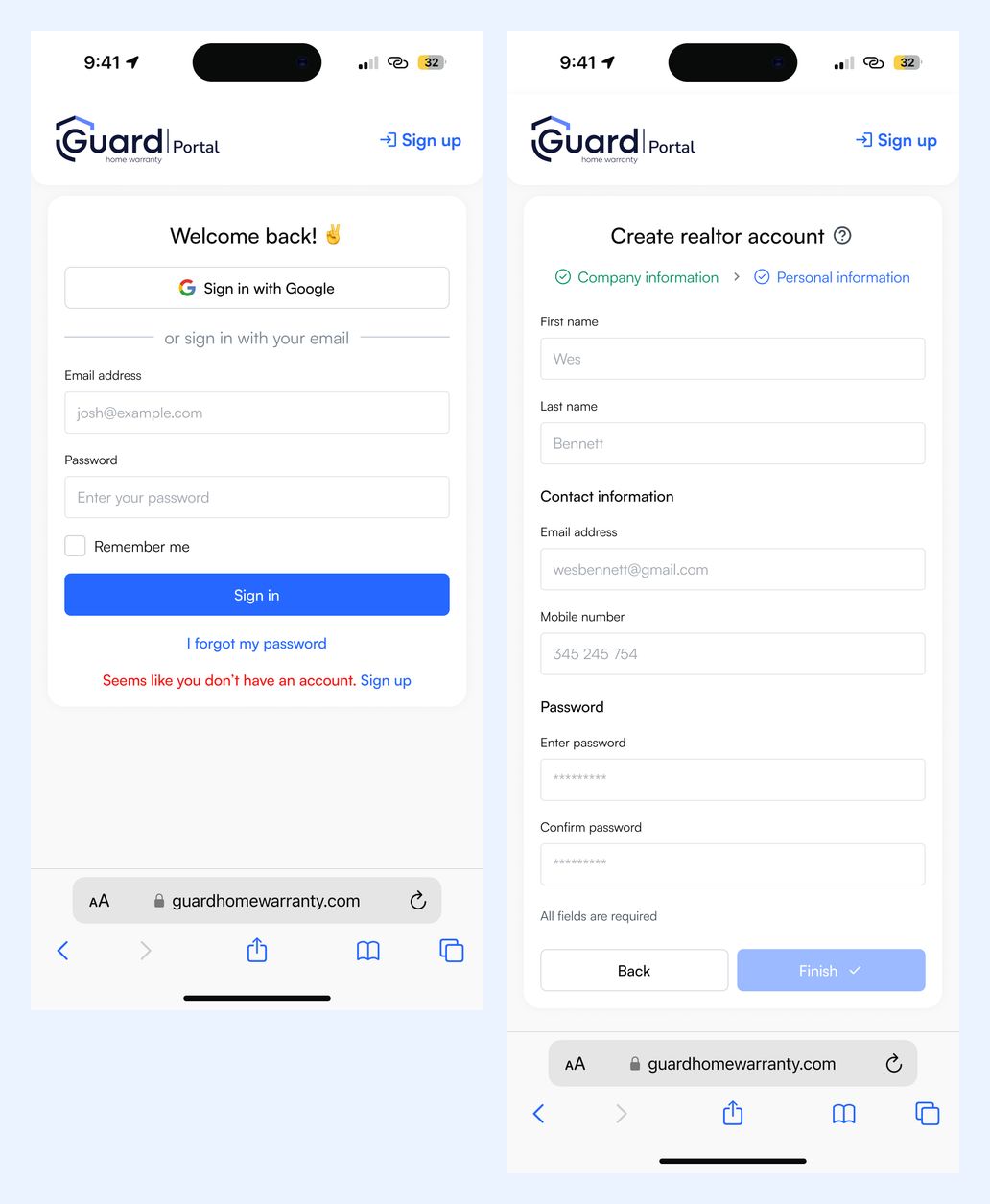
Mobile — sign-in state and registration
From role selection to daily tasks
The mobile gateway, navigation menu and submissions view are grouped together. Each complete screen keeps its original proportions and full content.
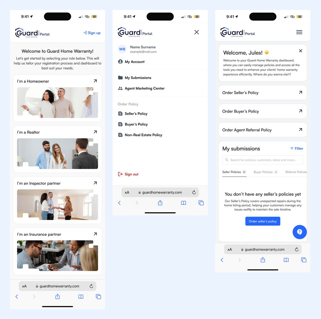
Mobile — role selection, navigation and submissions
Our approach
Make protection visible
The roof and shield-like G create a recognisable foundation for the logo, while the guidelines document consistent use across backgrounds and applications.
Show the complete interaction
Authentication, validation, empty and populated states remain distinct, alongside the policy and account-management screens.
Carry the system across contexts
Blue accents, rounded cards and clear type connect the website, multi-role portal, mobile layouts and printed materials.