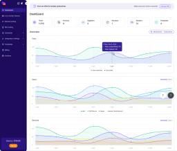
Jupiter
Brand identity and a collaborative decision-making interface
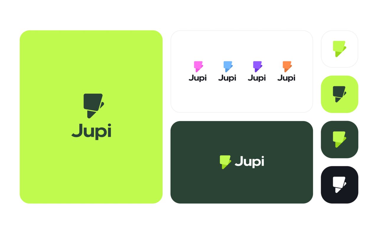
The concept shows Jupiter, a collaborative decision-making app, through its Jupi visual identity, eagle mascot, onboarding flows and shared decision workspaces.
A recognisable identity for shared decisions
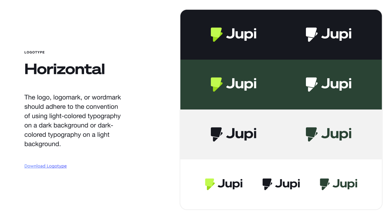
The concept shows Jupiter as a collaborative decision-making app. Its Jupi identity combines a compact folded mark with a horizontal wordmark, defined colour variants and clear-space rules.
Colour and typography
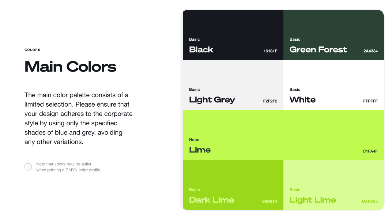
Lime and forest green anchor the palette, with raspberry, sky, grape and orange accents. Gilroy provides the type system, shown alongside examples of hierarchy in use.
Taking the identity into different formats
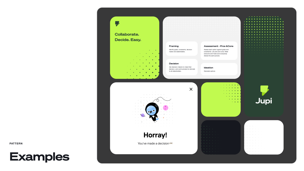
Patterns, photography and the logo silhouette carry the same visual language into digital cards, social layouts, an outdoor poster and a presentation cover.
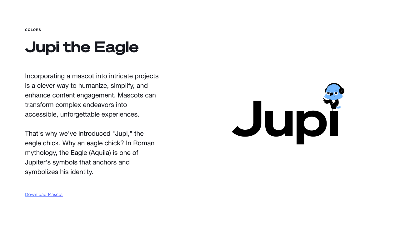
Jupi the Eagle
The blue eagle mascot appears in several expressive states. The interface examples use it in sign-in prompts, contextual guidance and a decision-completion message.
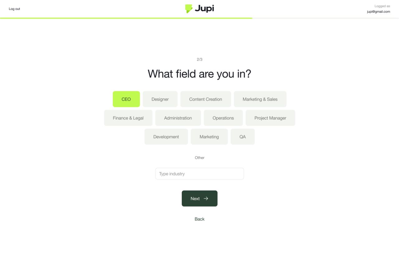
A focused start
The onboarding sequence asks users about their role and industry, then presents a team invitation step. Compact choices and a progress indicator keep the sequence visually focused.
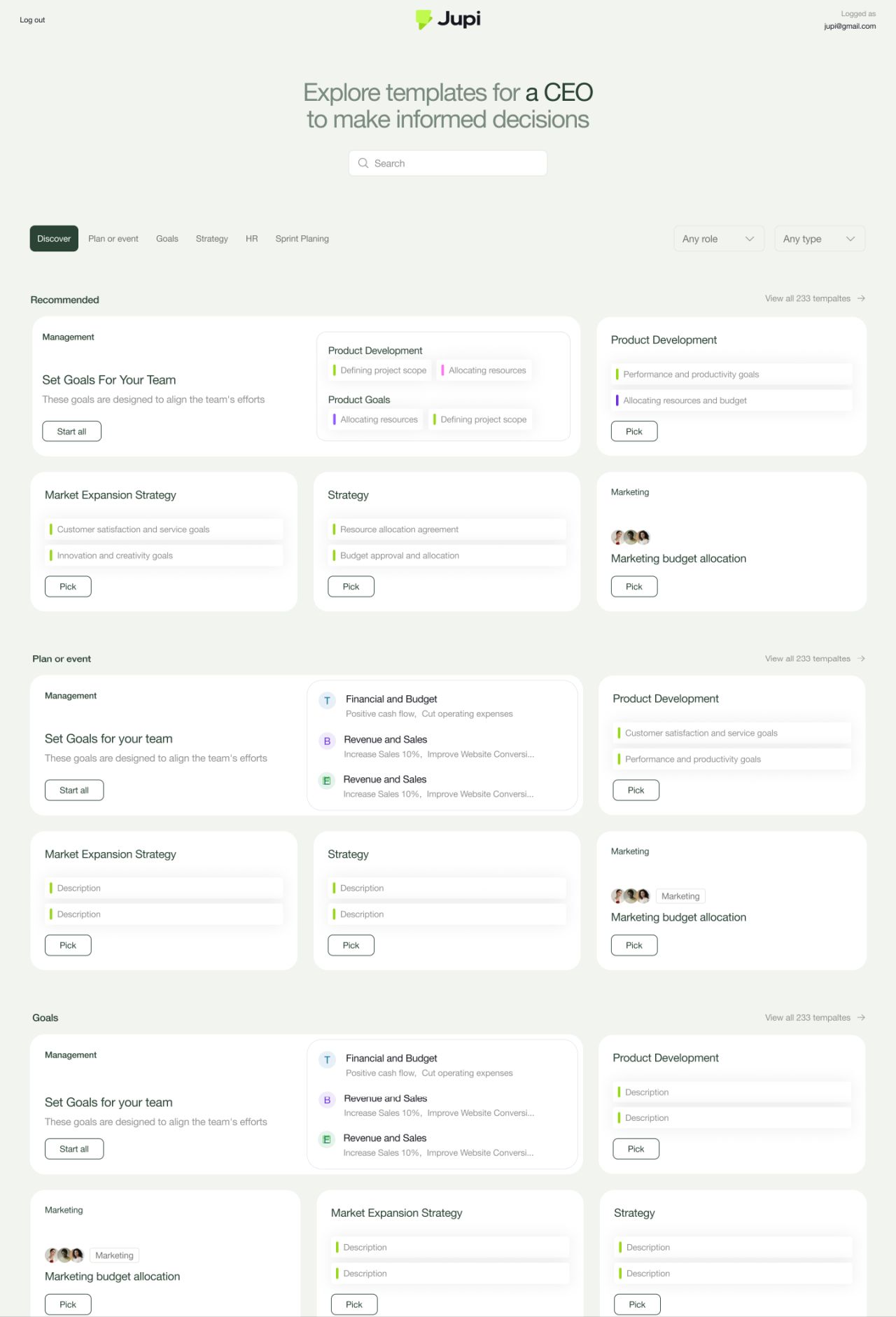
From templates to a shared overview
The template catalogue groups starting points by purpose. The home dashboard brings together recommended templates, team navigation and recent decisions.
Decision template catalogue
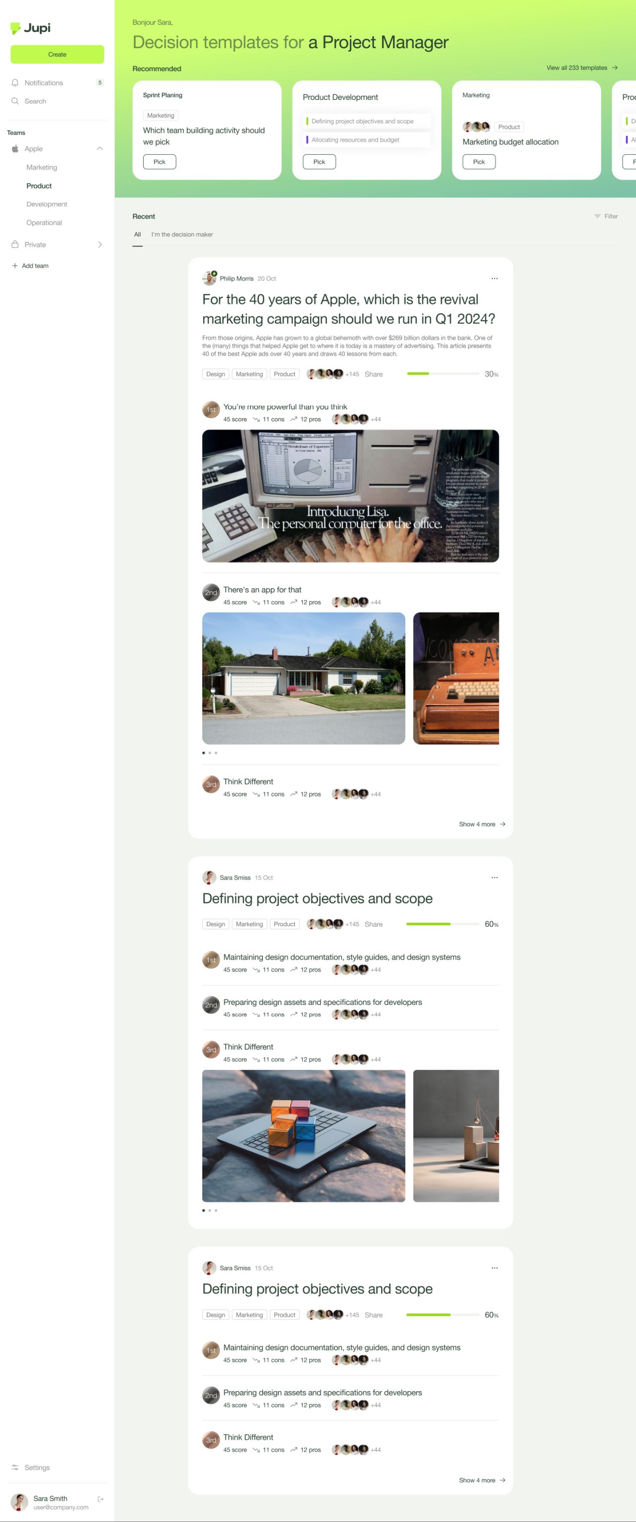
Home dashboard
Comparing options together
The decision views arrange options, scores, contributors, pros and cons in a shared structure. Expanded lists preserve room for supporting images and discussion.
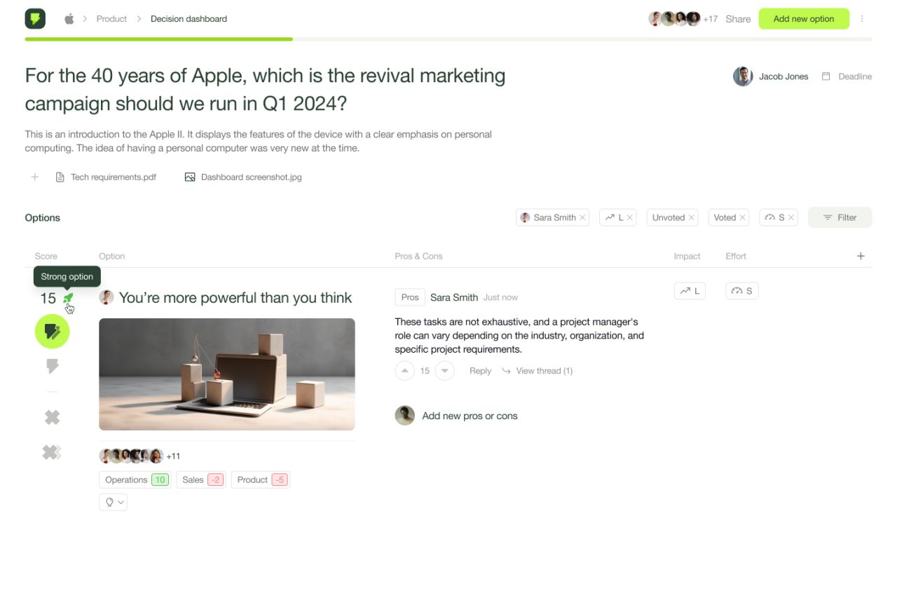
Decision dashboard — default
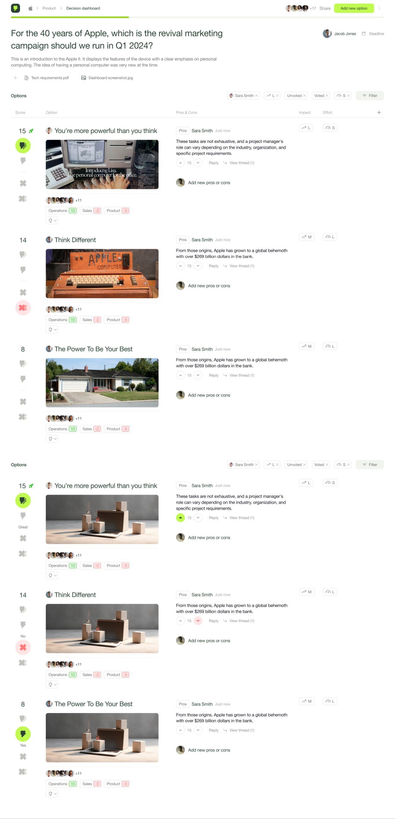
Decision dashboard — expanded option list
Keeping the current state visible
A calendar makes the deadline-editing state explicit, while the closed-decision view switches to a compact result list. A separate expanded discussion state exposes the detail behind an option.
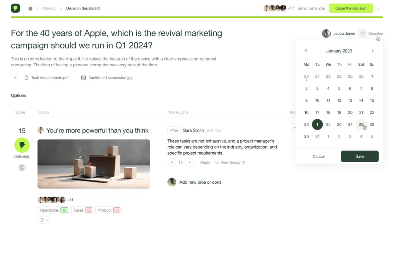
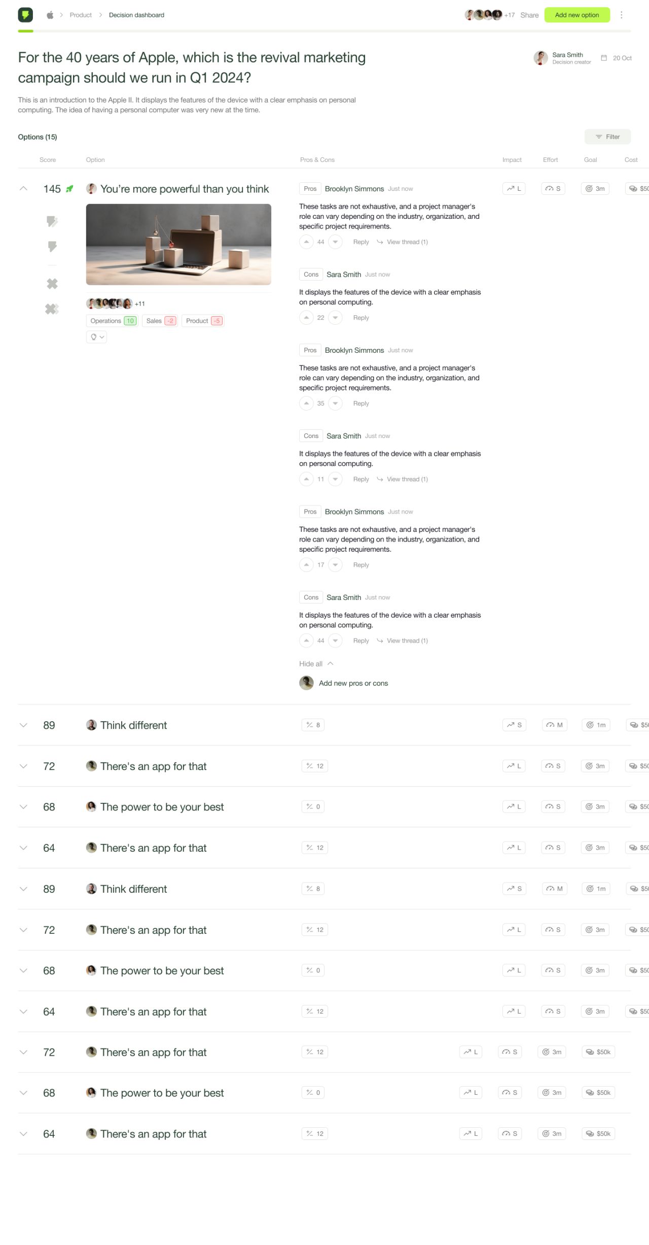
Decision dashboard — expanded discussion and hover state
Supporting the shared workspace
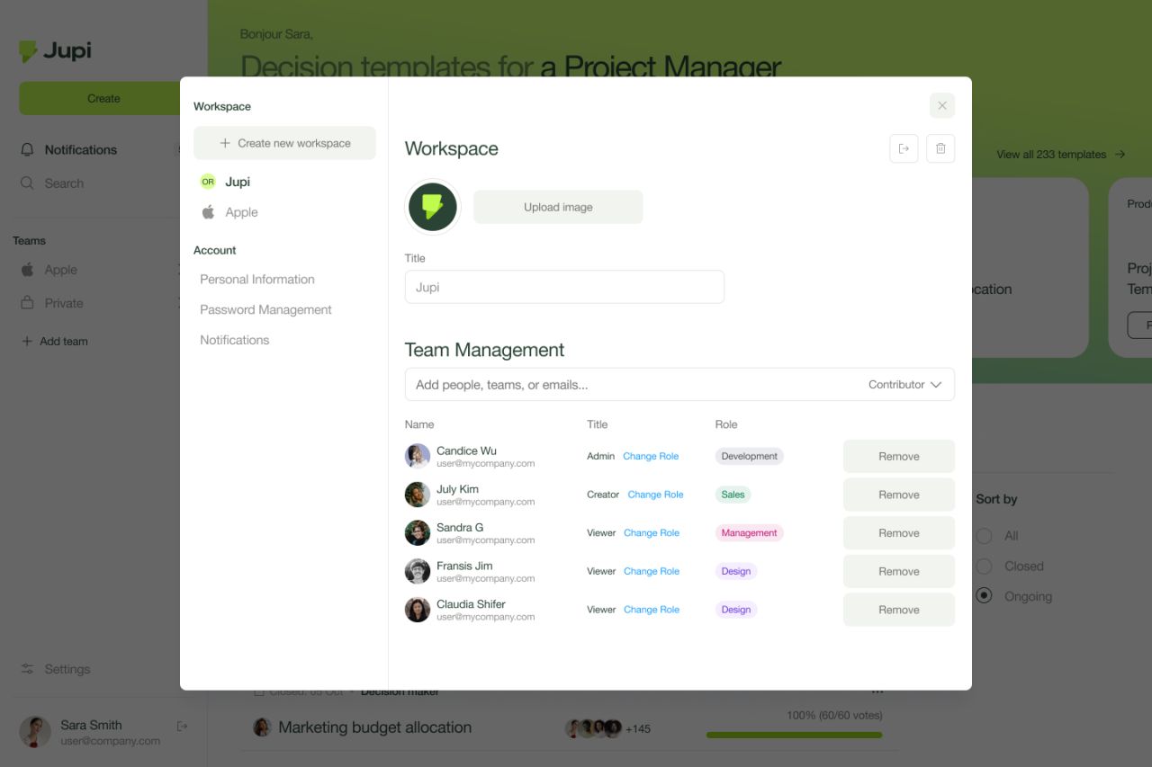
Workspace settings bring team membership and invitations into a modal. The inbox presents recent activity over the same dashboard, retaining the surrounding context.
Our approach
Connect the identity
The Jupi mark, lime-and-green palette and typography connect brand guidelines, communication layouts and interface screens.
Make decisions readable
Consistent option rows, scores and pros-and-cons columns give the decision views a clear visual structure.
Show the interaction states
Onboarding choices, expanded discussions, deadline editing and closed decisions each have a distinct visible state.