Quantango
A mint-accented identity and responsive website for trading technology
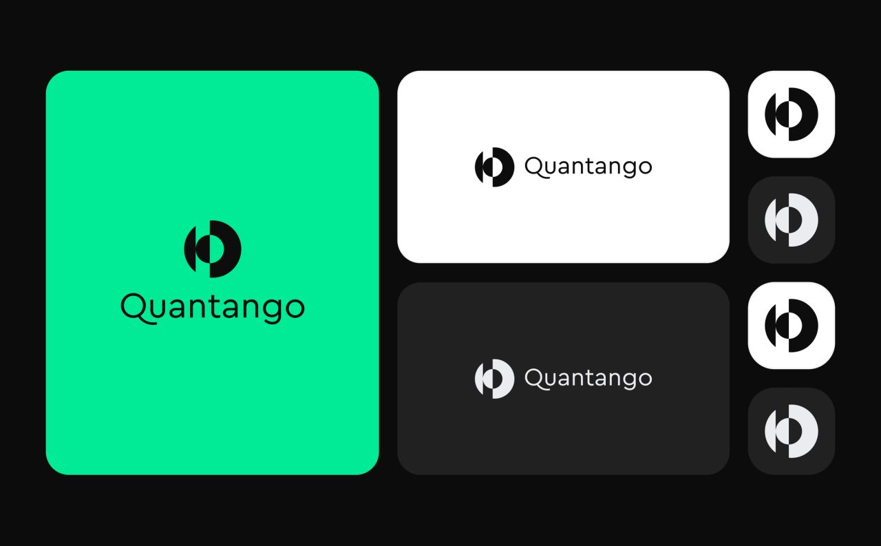
Quantango develops trading technology for the tech and crypto landscape. The branding and website designs connect a high-contrast identity with product explanations and recruitment pages.
A high-contrast identity for trading technology
The identity combines a circular symbol with horizontal and vertical wordmarks. Mint and neon-mint accents sit against black, white and light-grey surfaces, with Cera Pro typography carrying the same visual language across the guidelines.
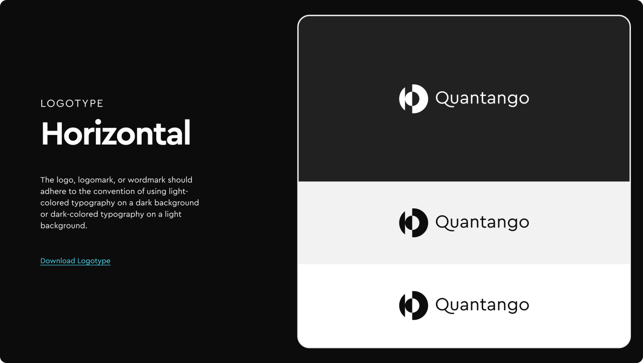
From brand guidelines to everyday applications
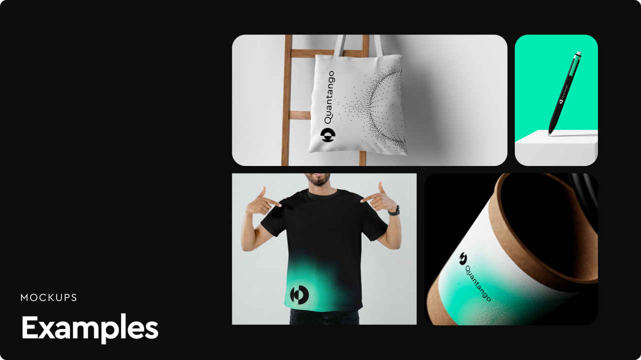
The mockups carry the mark across apparel, bags, stationery and accessories. Business cards pair the wordmark with fine green lines on a dark background.
Introducing the trading technology
The homepage introduces Quantango through a dark layout, mint highlights and flowing graphic lines. Product cards lead into the team and recruitment content, with complete layouts for two desktop widths.
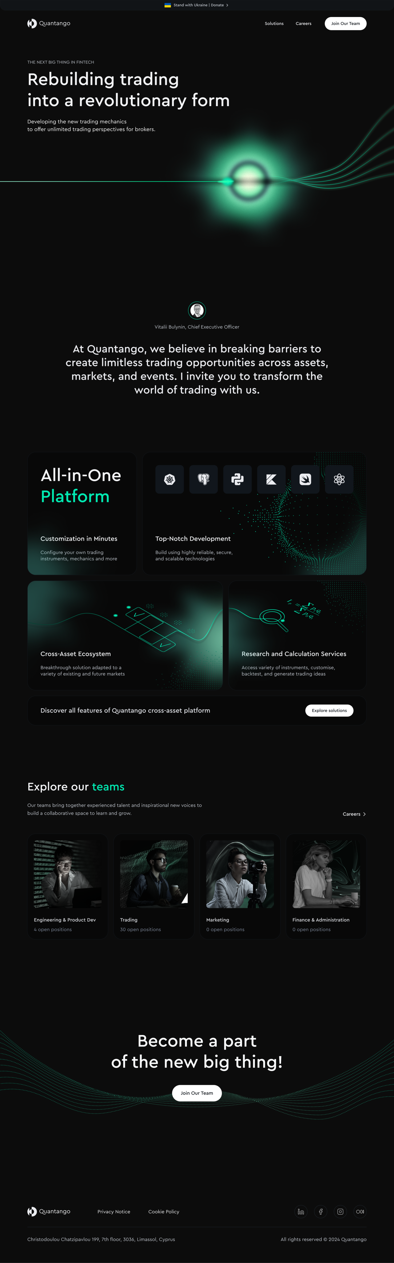
Homepage — 1440 layout
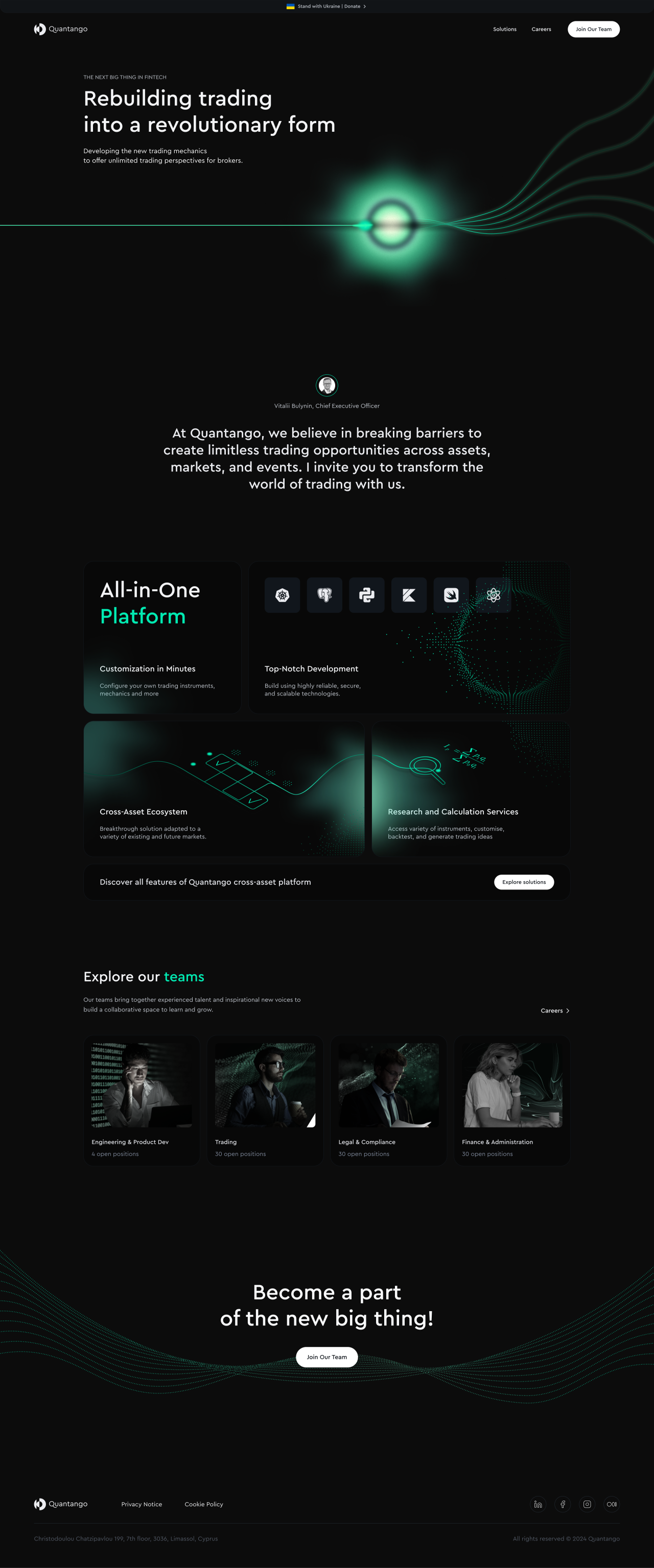
Homepage — 1920 layout
Explaining the offering in layers
The solutions layouts organise the platform, cross-asset ecosystem, APIs and research services into illustrated sections, followed by a technology grid and contact prompt.
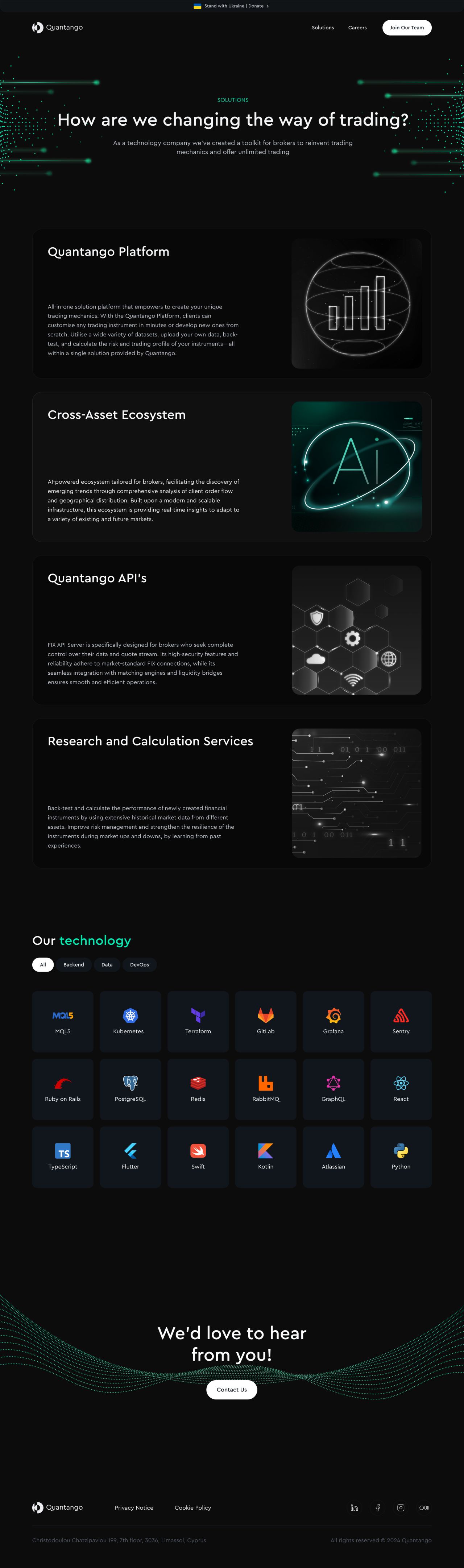
Solutions — 1440 layout
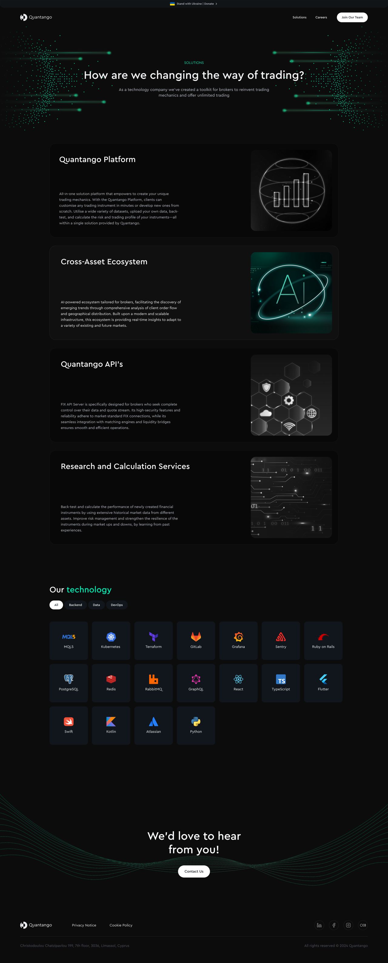
Solutions — 1920 layout
A clear path into the team
The careers designs bring together principles, open positions, search and filtering, then introduce the working environment through a benefits section.
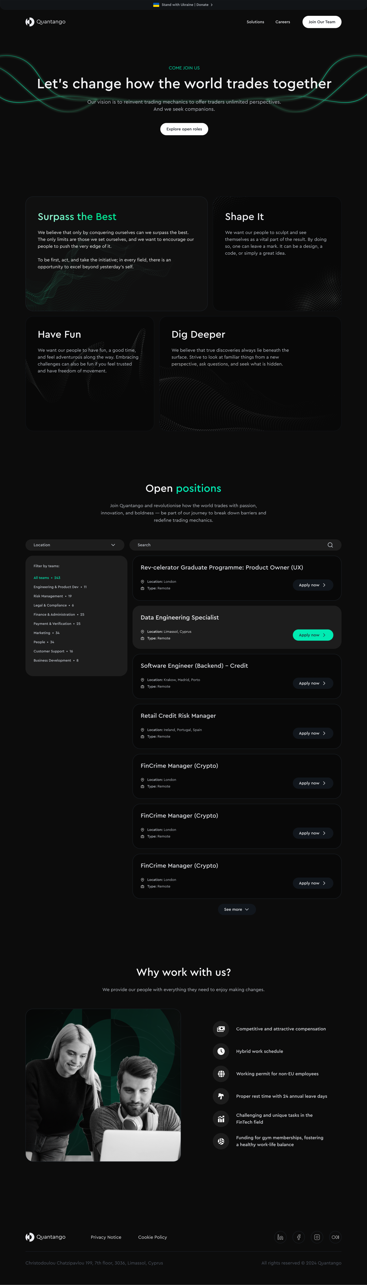
Careers — 1440 layout
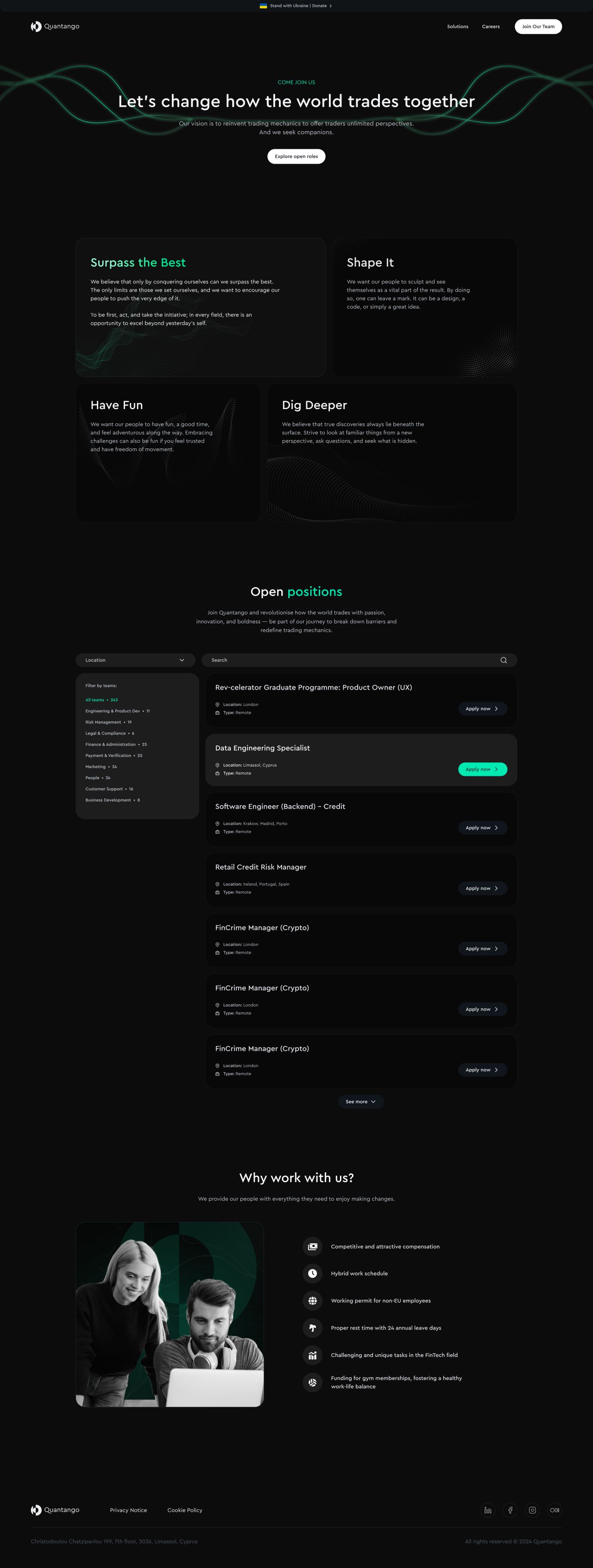
Careers — 1920 layout
From an open role to an application
The role pages separate the introduction, requirements and responsibilities before the application form. The two desktop widths retain the same sequence with different spacing and content proportions.
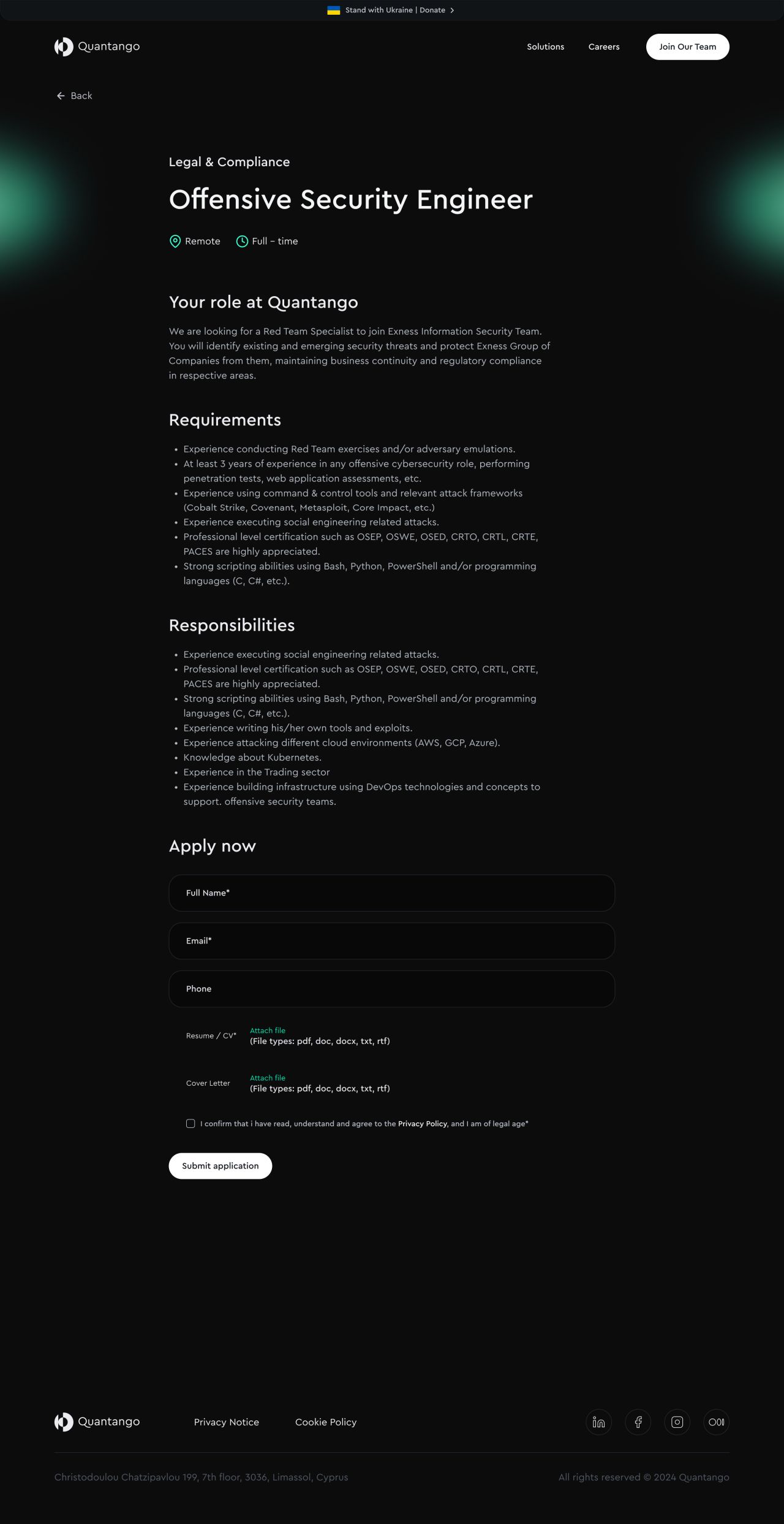
Open position — 1440 layout
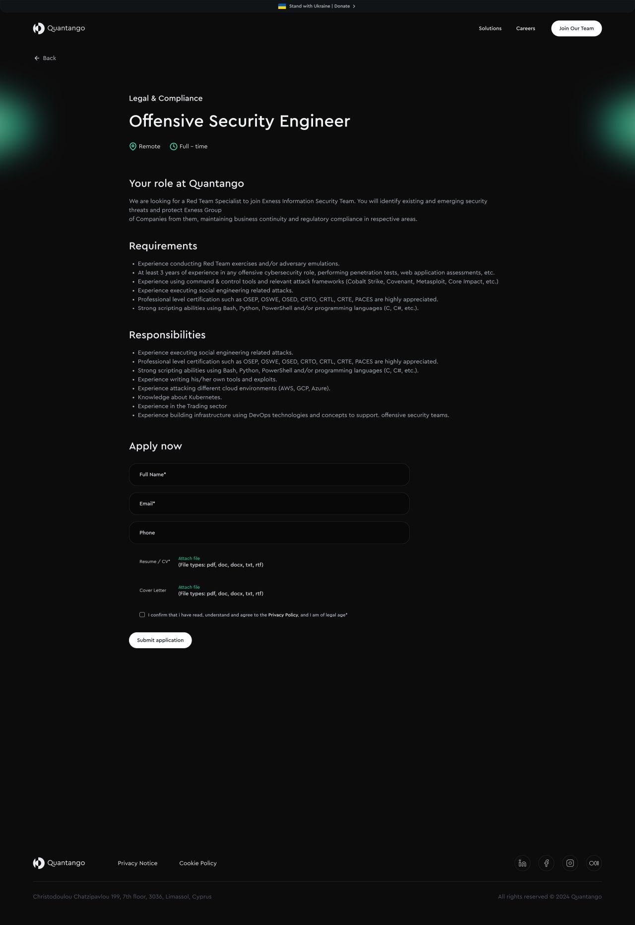
Open position — 1920 layout
Confirming the application
A distinct success state confirms the submitted application and offers a return to the careers page.
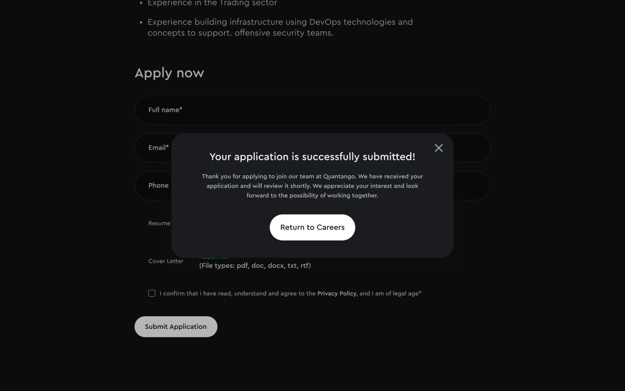
Application form — success state
Complete pages, adapted to mobile
The mobile homepage and solutions page retain their full content in a single column. Careers and open-position layouts carry the same recruitment journey through narrower cards, lists and form controls.

Mobile homepage and solutions

Mobile careers and open position
Navigation and search states
The mobile menu, empty-results layout and expanded location dropdown show the supporting navigation and filtering states.
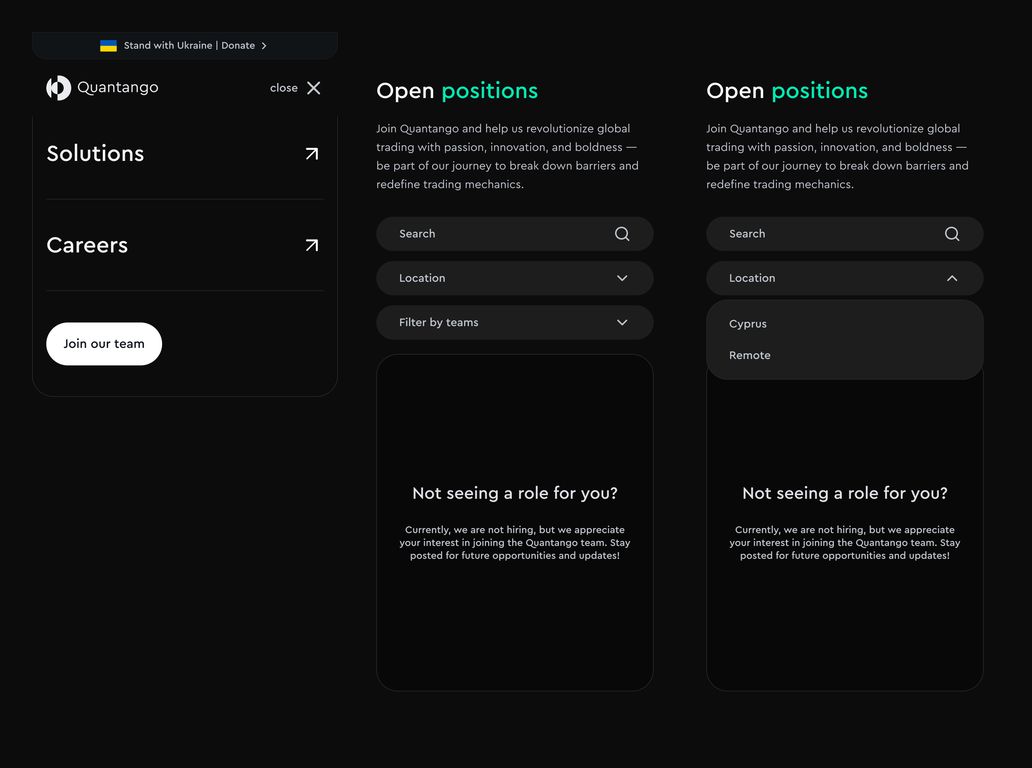
Mobile menu, empty results and expanded dropdown
Our approach
Keep a recognisable visual language
Circular marks, mint accents and shared typography connect the brand guidelines, applications and website.
Structure the product story
Illustrated product sections and a technology grid divide the offering into readable parts.
Carry the journey across sizes
Desktop and mobile layouts retain the product information, recruitment flow and supporting interface states.

