Zell
A geometric identity and responsive website for an entrepreneurship program
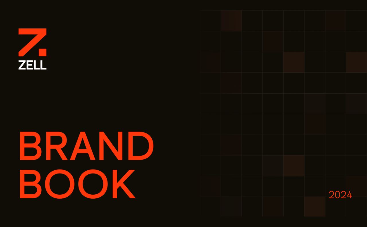
Zell is an entrepreneurship program at Reichman University. These designs bring its visual identity and website together through an arrow-based mark, a dark-and-orange palette, and layouts for the program and its community.
Logo foundations
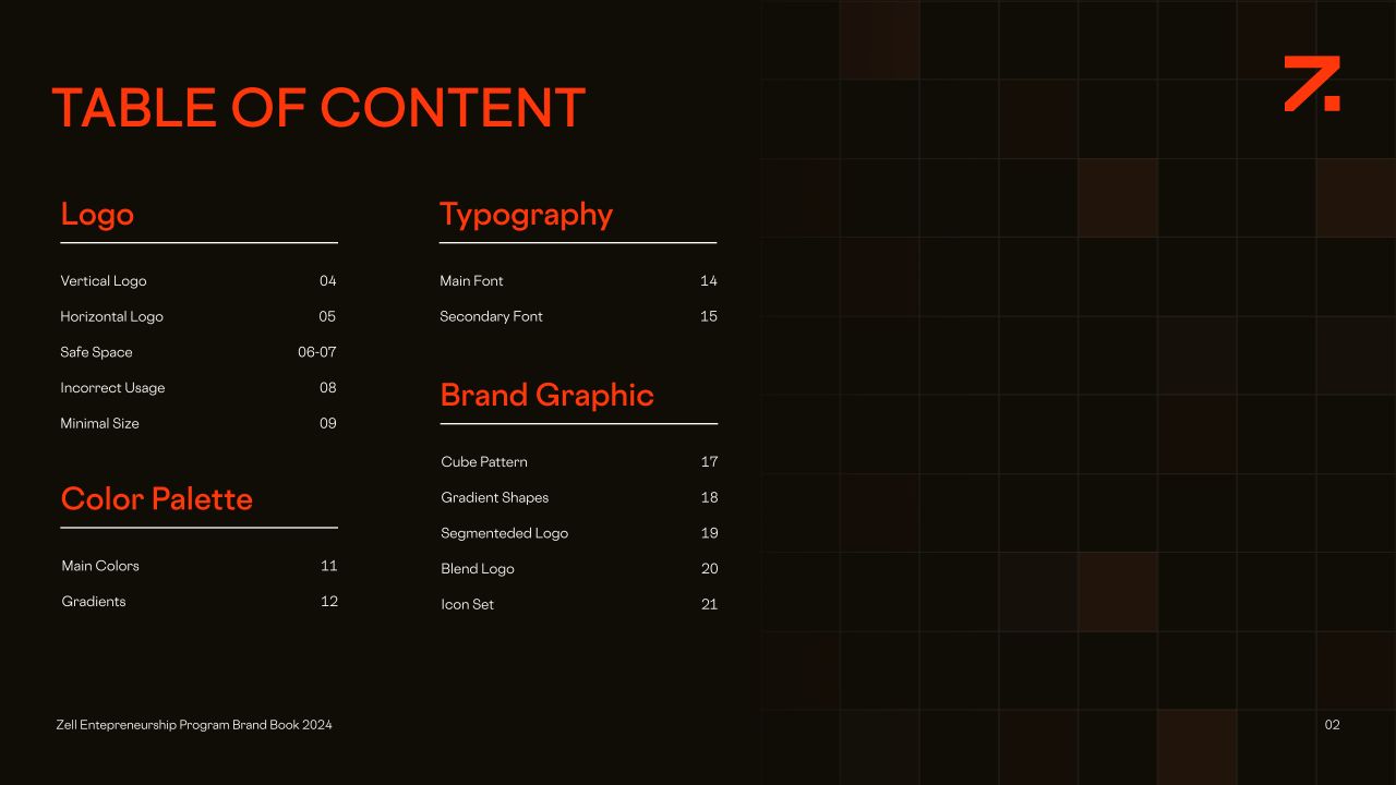
Zell is an entrepreneurship program at Reichman University. The supplied brand book presents an arrow-based Z mark, vertical and horizontal lockups, and guidance for clear space, minimum size and incorrect use.
Colour and contrast
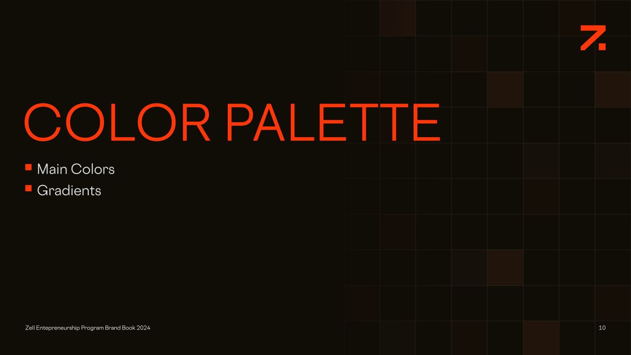
Near-black and orange lead the palette, balanced by light neutrals. The guidelines also introduce gradients for the graphic elements.
Typography and graphic language
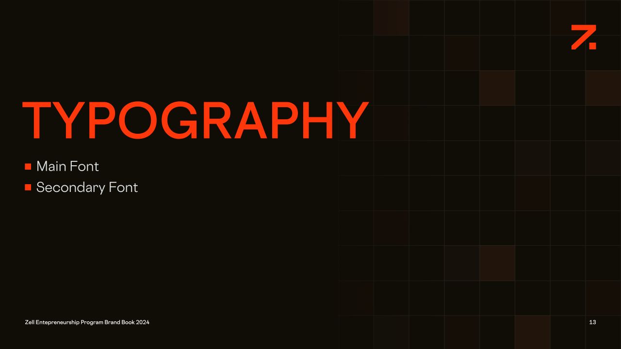
Sohne Breit and Cosmica are paired with a square grid, gradient shapes, dimensional lettering and line-based icons. The remaining boards show this visual language across the identity system.
A home for the program
The homepage design introduces Zell through oversized typography and the arrow motif. It then moves through an impact overview, program pathways, portfolio cards and editorial content.

Desktop — homepage
Values in a graphic system
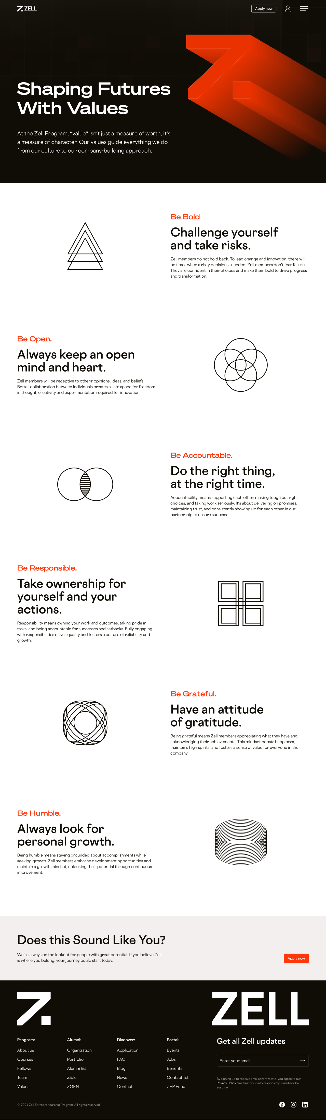
The values page pairs short statements with individual geometric symbols. Alternating compositions give each principle its own space.
Desktop — values
A portrait-led team page
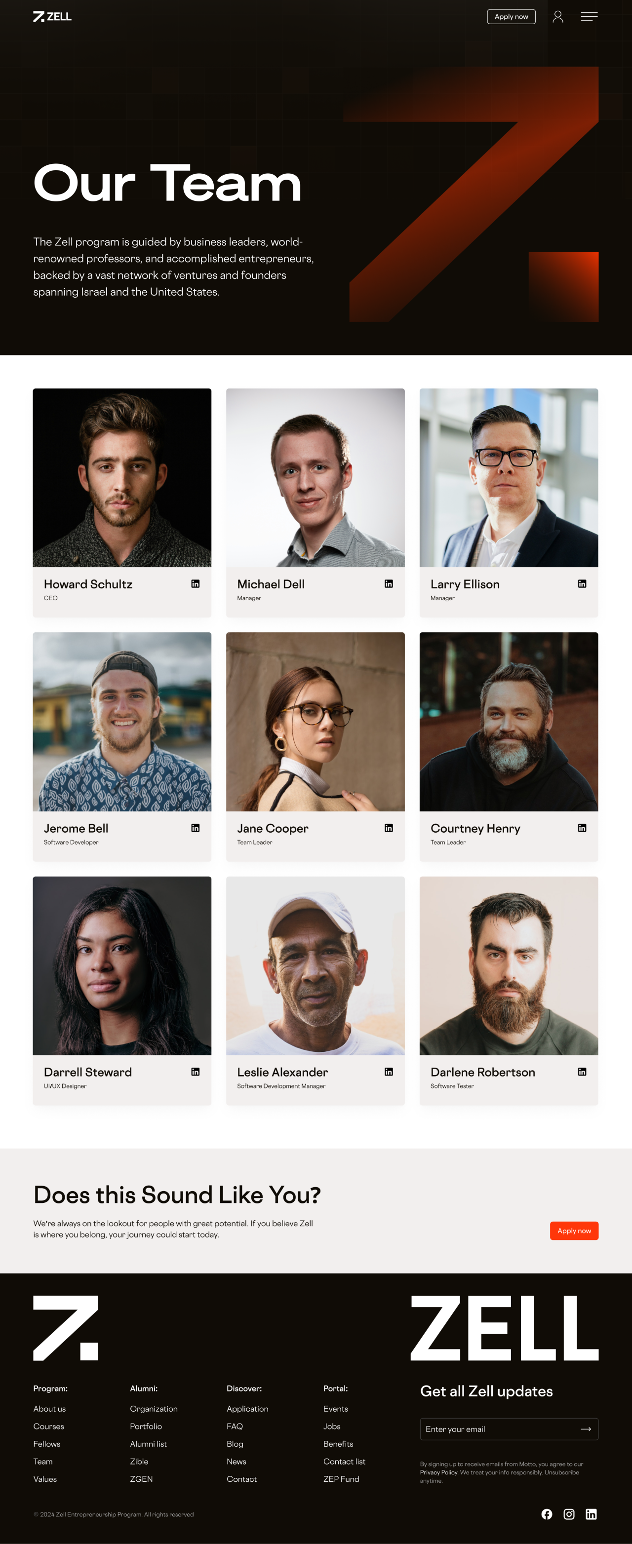
A repeated card layout combines portraits, names, roles and profile links beneath a large branded introduction.
Desktop — team
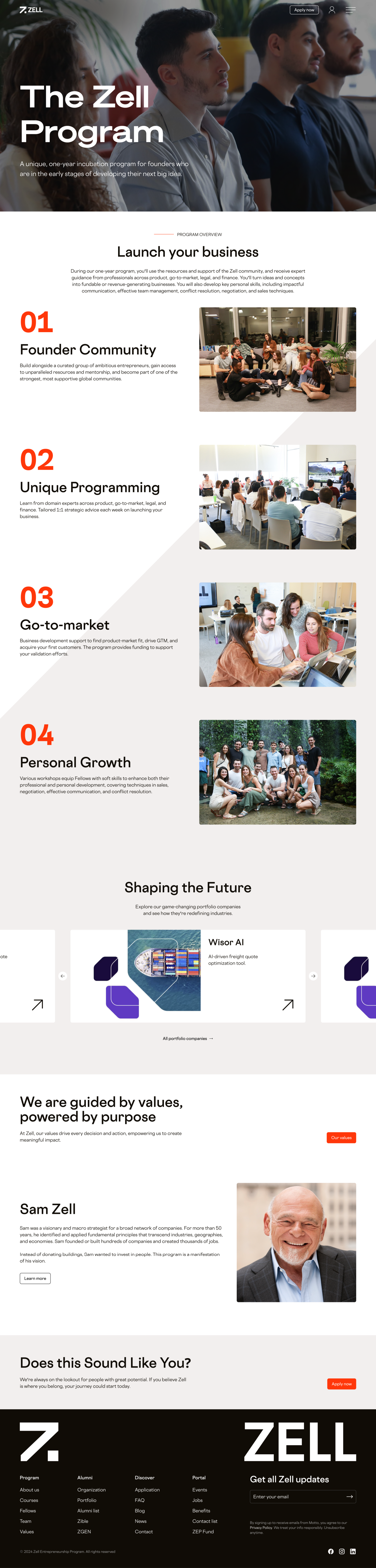
Inside the Zell Program
Numbered sections and photography explain the program in the supplied design. Portfolio cards and a founder profile continue the story further down the page.
Desktop — program
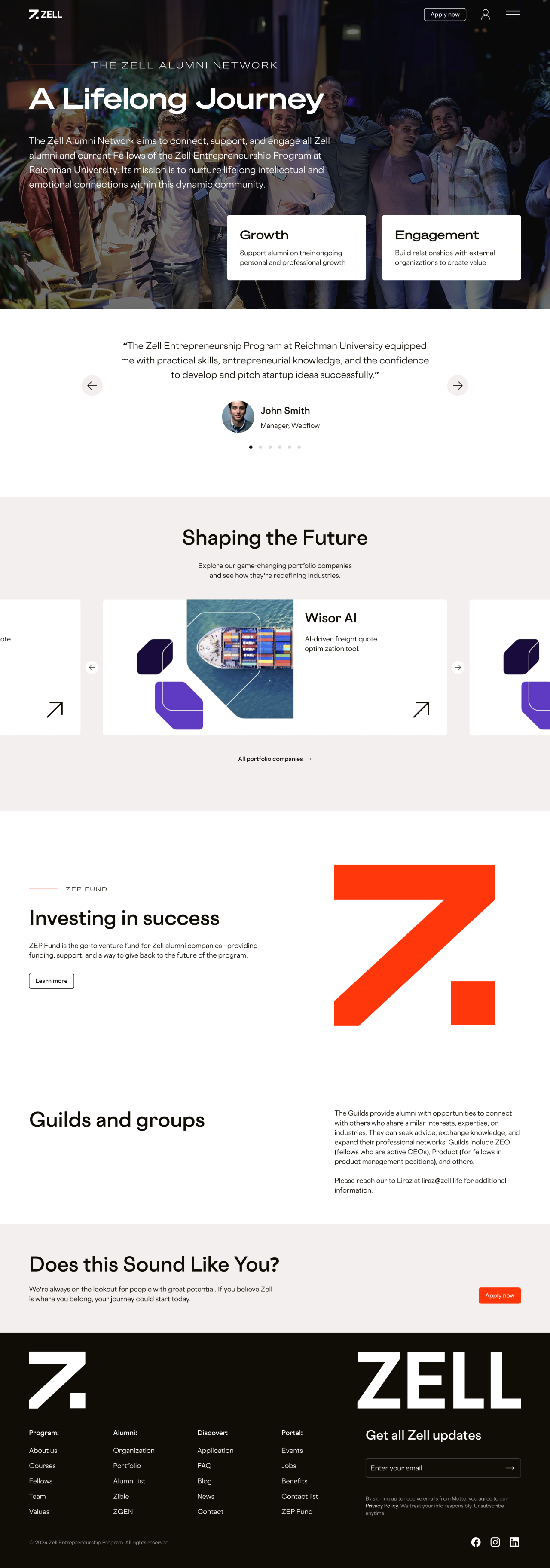
A place for the alumni community
The alumni layout brings together a community introduction, a testimonial area, portfolio cards and sections for funding and professional groups.
Desktop — alumni network
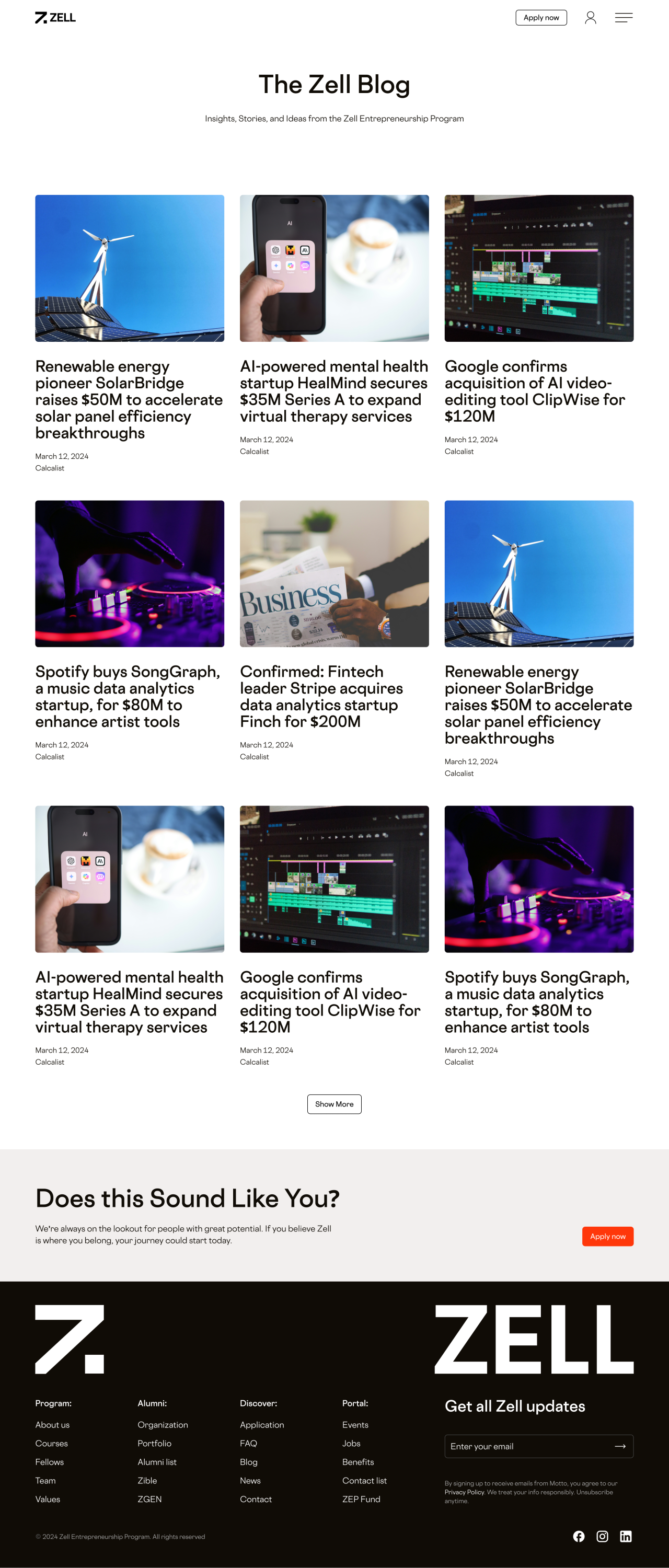
An editorial grid
The blog design uses image-led cards with article titles, dates and sources. A consistent grid separates the stories while retaining the wider visual identity.
Desktop — blog
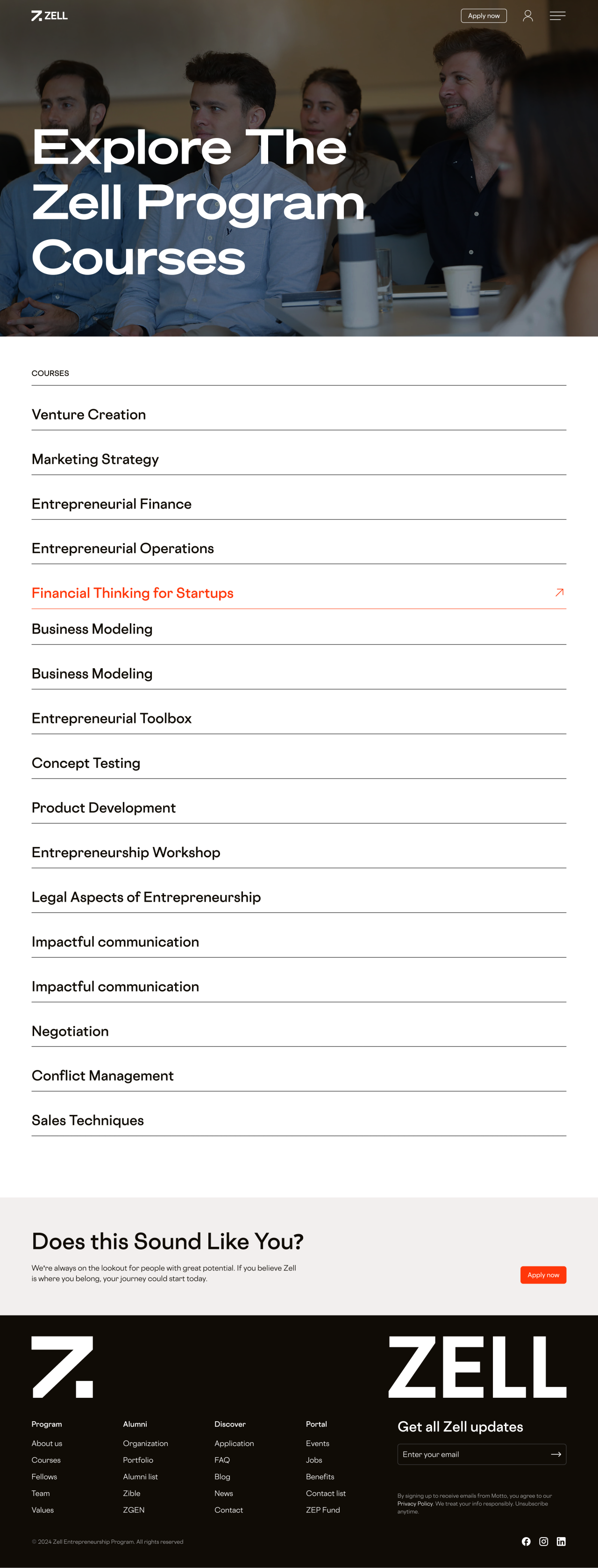
Courses at a glance
The course page uses a compact list with clear horizontal separators. An expanded course state introduces a contrasting orange accent.
Desktop — courses
Introducing the fellows
A photographic opening leads into profile cards for the current fellows shown in the design, followed by the shared application prompt and footer.
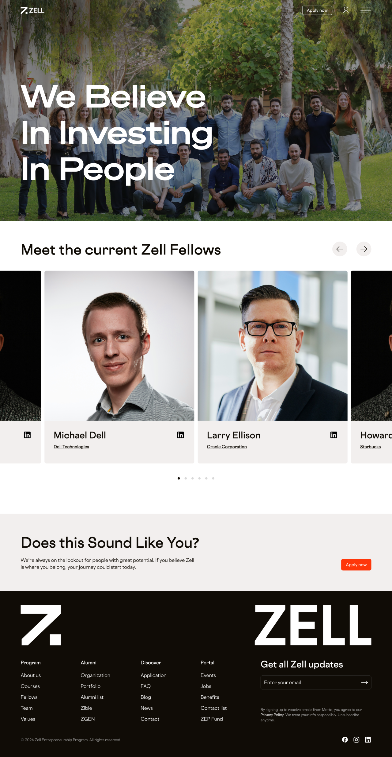
Desktop — fellows
The complete website on mobile
The homepage and program pages retain their full content in single-column layouts. The two complete pages are presented side by side.

Mobile — homepage and program
Values and people
The mobile values and team layouts stack their graphic statements and portrait cards while keeping a consistent page width.

Mobile — values and team
Community and stories
The alumni and blog pages adapt portfolio, testimonial and editorial content to a narrow column without removing the lower sections.

Mobile — alumni network and blog
Courses and fellows
The course list preserves its dividers on mobile, while the fellows page shows a large profile card. Both complete designs retain their application area and footer.
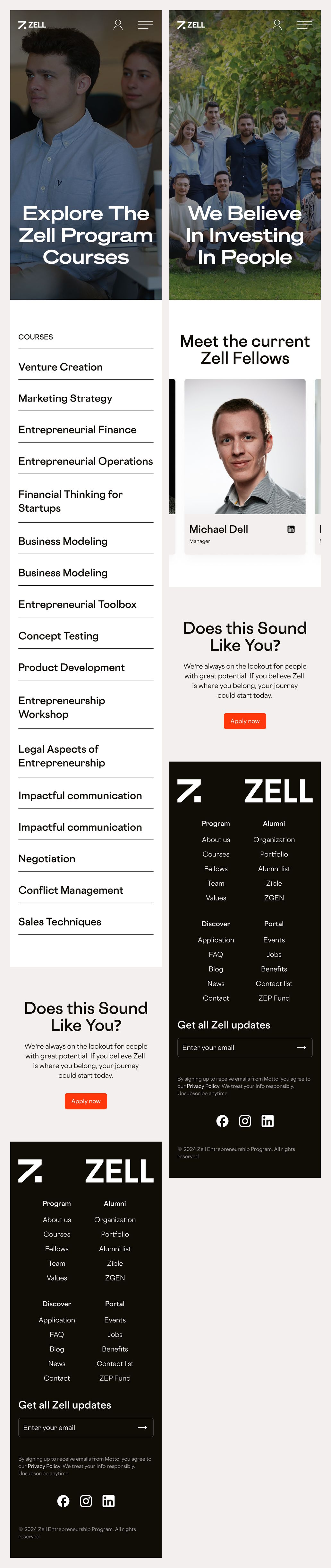
Mobile — courses and fellows
Our approach
Build around the mark
Arrow forms, square grids and gradient lettering connect the logo guidelines with the website's graphic language.
Give content a clear hierarchy
Large headings introduce each page, while repeated cards, lists and separators organise the program, people and editorial content.
Carry the system across sizes
Desktop and mobile versions retain the same visual identity while adapting card arrangements and text flow to the available width.