Insure+
Insurance applications and policy management, from mobile to desktop.
Insure+ brings insurance applications, coverage choices, policies, and claims into one product experience. A conversational mobile assistant guides customers, while a desktop workspace organizes policy reviews, documents, and administrative tasks.
A clear start
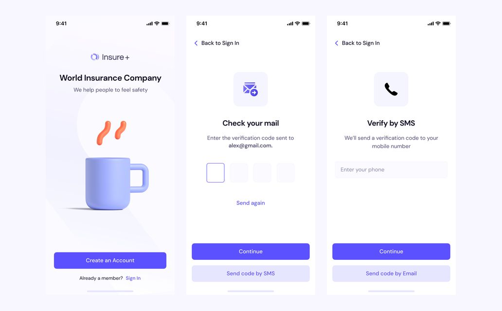
Insure+ brings insurance applications, coverage choices, policies, and claims into a mobile experience. Email and SMS verification lead into a conversational application flow, with dedicated states for checking account access.
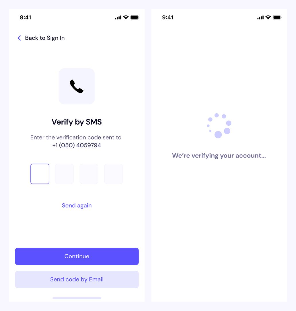
Account verification — SMS code and confirmation in progress
Make verification explicit
A focused code-entry screen keeps verification separate from the insurance application. A dedicated progress state tells users when their account is being checked.
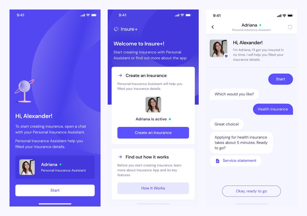
Insurance application — introduction and personal assistant
Start with a conversation
The application begins with a choice between exploring the product and creating insurance. A personal assistant introduces the process and asks for the type of coverage through a familiar chat interface.
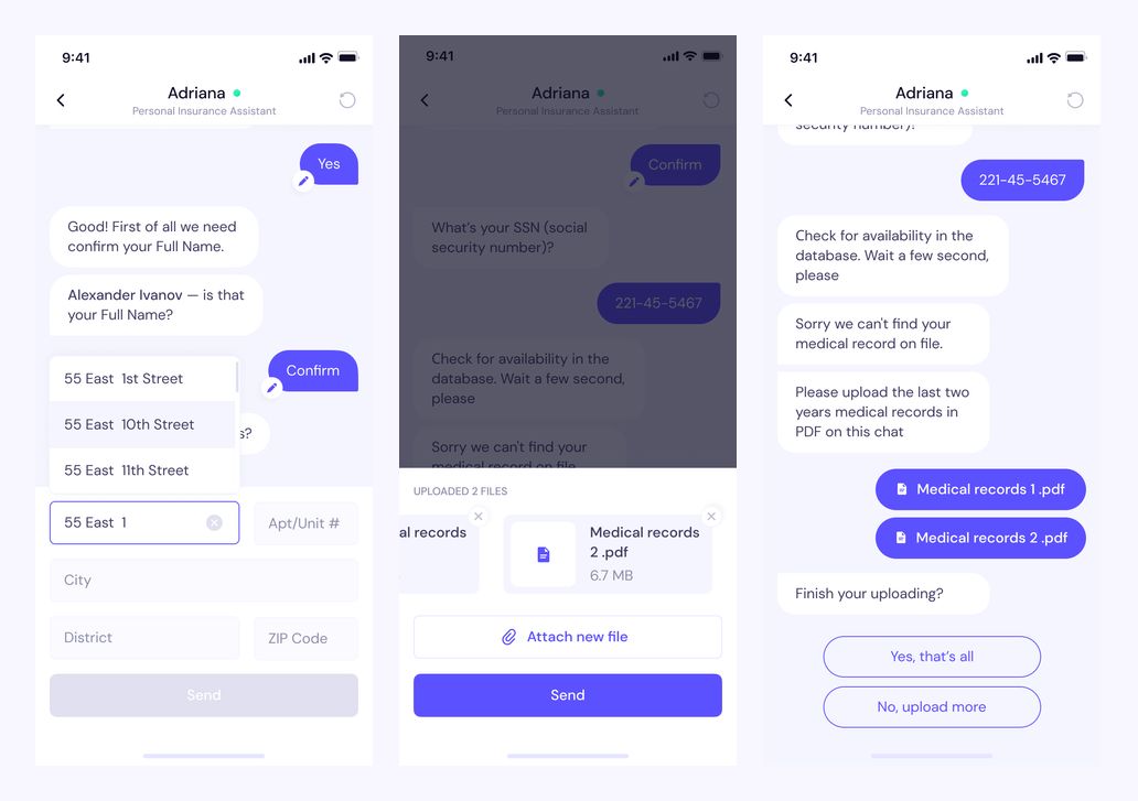
Insurance application — personal details and document uploads
Collect information in context
Personal details and supporting records are collected within the conversation. Structured fields, file attachments, and confirmation messages give each request a clear place in the application flow.
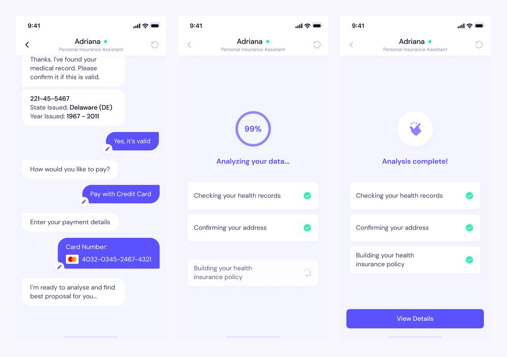
Insurance application — payment details and analysis status
Show what happens next
Payment details appear as a step in the conversation. The analysis screens then show the checks in progress and the completed state before users continue to their insurance details.
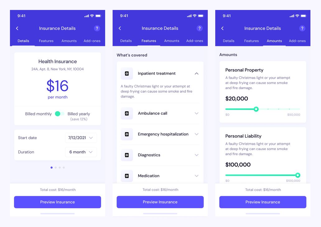
Coverage — policy details, benefits, and insured amounts
Make coverage easy to review
Tabbed insurance details separate the policy summary, covered benefits, and insured amounts. Expandable lists and amount sliders let users review the options without placing every detail on one screen.
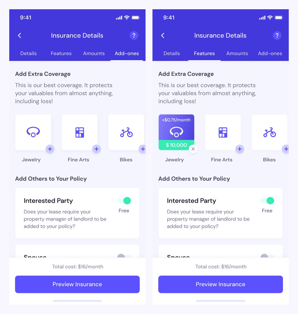
Coverage — optional protection and additional policy participants
Keep optional coverage visible
Add-ons use distinct cards for jewellery, fine art, and bikes. Selected options show their additional cost and coverage amount, while switches handle other people or parties included in the policy.
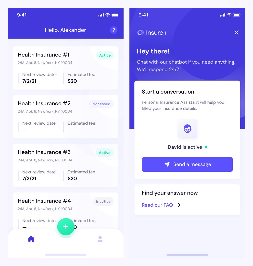
Home and support — policy statuses, review dates, and chat
Bring policies and support together
The home screen lists policies with their status, next review date, and estimated fee. A separate support screen offers a conversation with an assistant and a direct route to frequently asked questions.
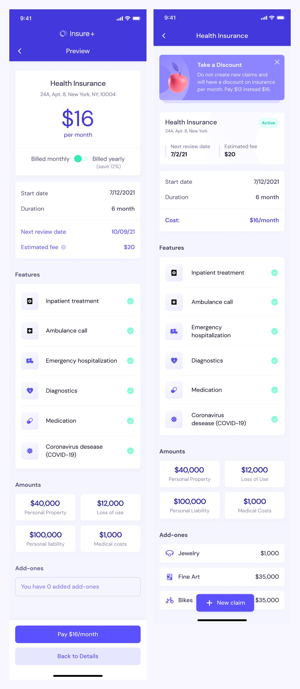
Policy preview and details — benefits, amounts, add-ons, and claims
Keep the full policy in one place
The preview brings the price, billing schedule, benefits, insured amounts, and add-ons into a complete policy summary. The active policy view follows the same hierarchy and provides an action to create a claim.
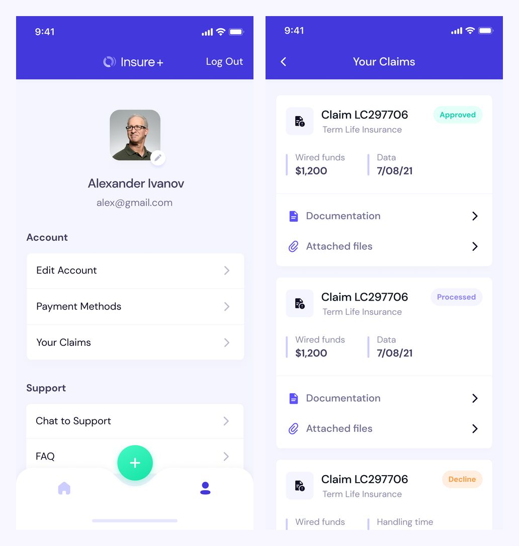
Profile and claims — account settings, payment methods, and claim statuses
Manage the account and follow claims
The profile groups account settings, payment methods, claims, and support into clear lists. Claim cards display their status alongside documentation and attached files, making each record easy to find.
An overview for administrators
The dashboard presents policy and claim activity through summary cards, trend charts, and a breakdown of insurance types. A persistent sidebar keeps the overview close to policy records and settings.
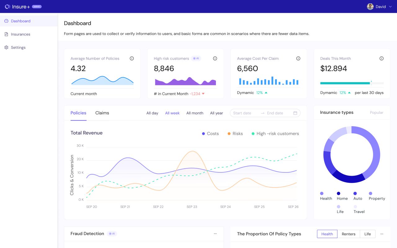
Admin dashboard — summary cards, revenue trends, and insurance types
Review the policy list
A searchable policy table brings together the applicant, insurance type, application date, score, and review status. Color-coded labels distinguish records awaiting review from approved, updated, and cancelled entries.
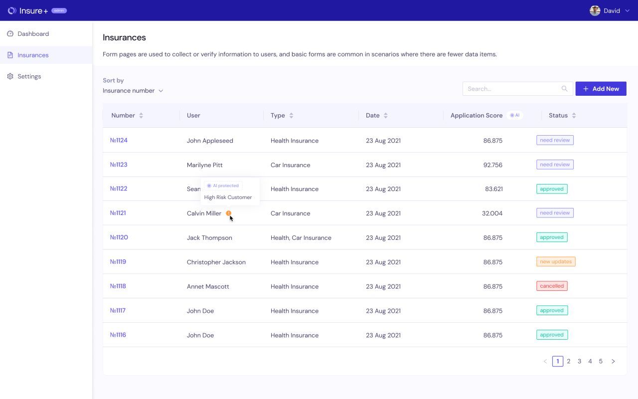
Policy list — search, application scores, and review statuses
Bring review information together
The policy record groups general information, payment details, customer information, claims, and a document checklist. Approval and rejection actions remain visible at the top of the page.
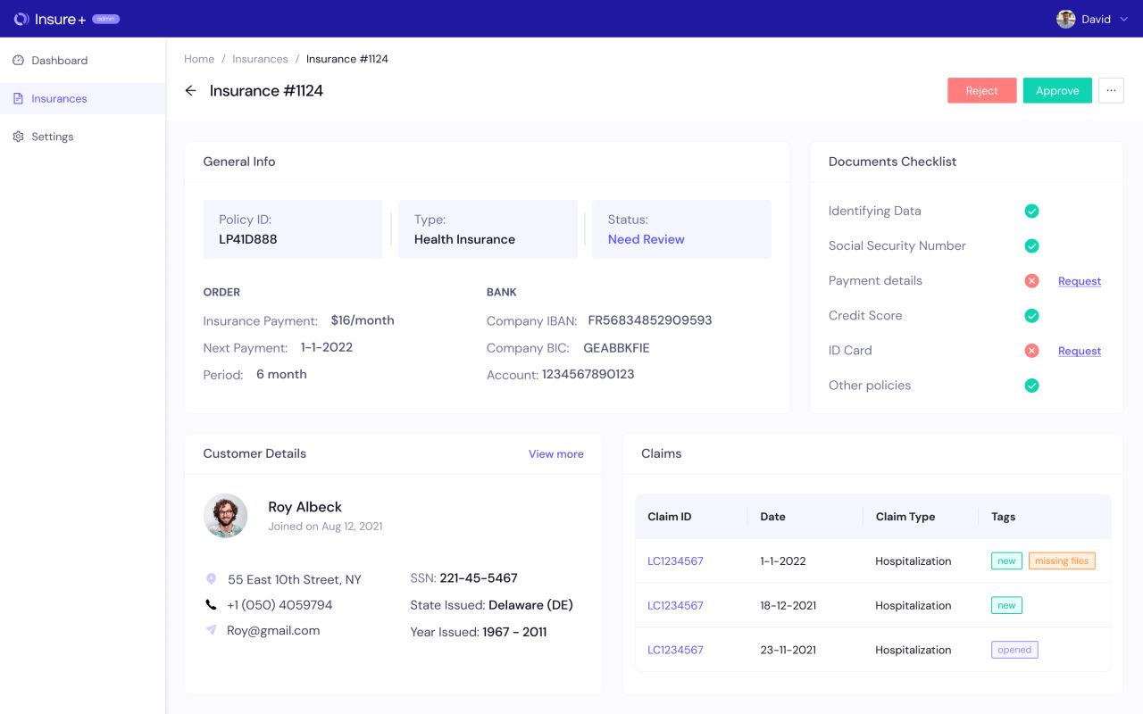
Policy review — general information, checklist, customer, and claims
Follow a claim in context
The claim view combines approval details, a missing-report notice, an incident video area, and a timeline. Tabs separate claim details, history, documents, and chat.
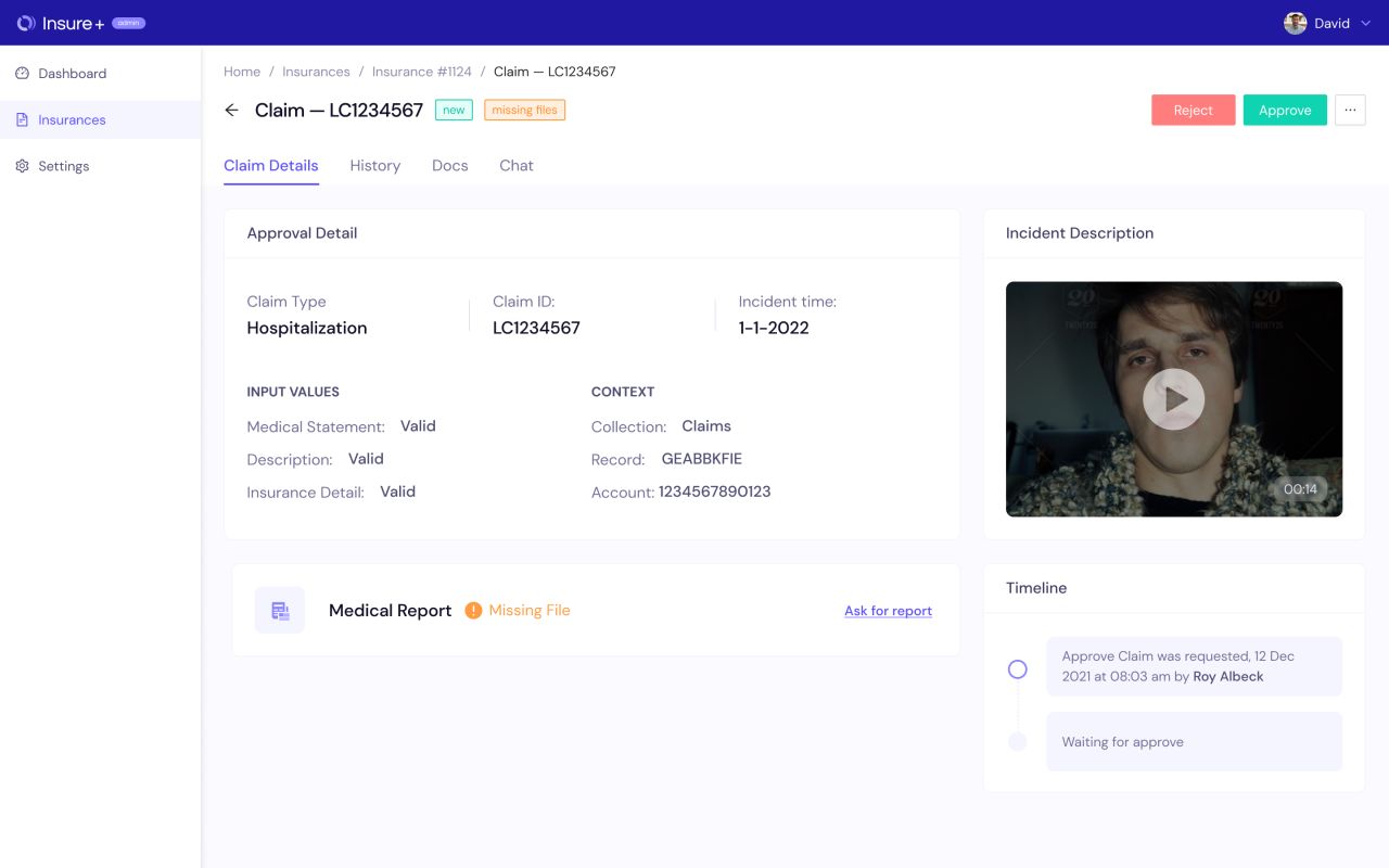
Claim review — incident details, missing report, and timeline
Organize data settings
The settings screen groups data-collection choices, integrations, and connected-device options. Tabs separate AI configuration, documents, and payments within the same workspace.
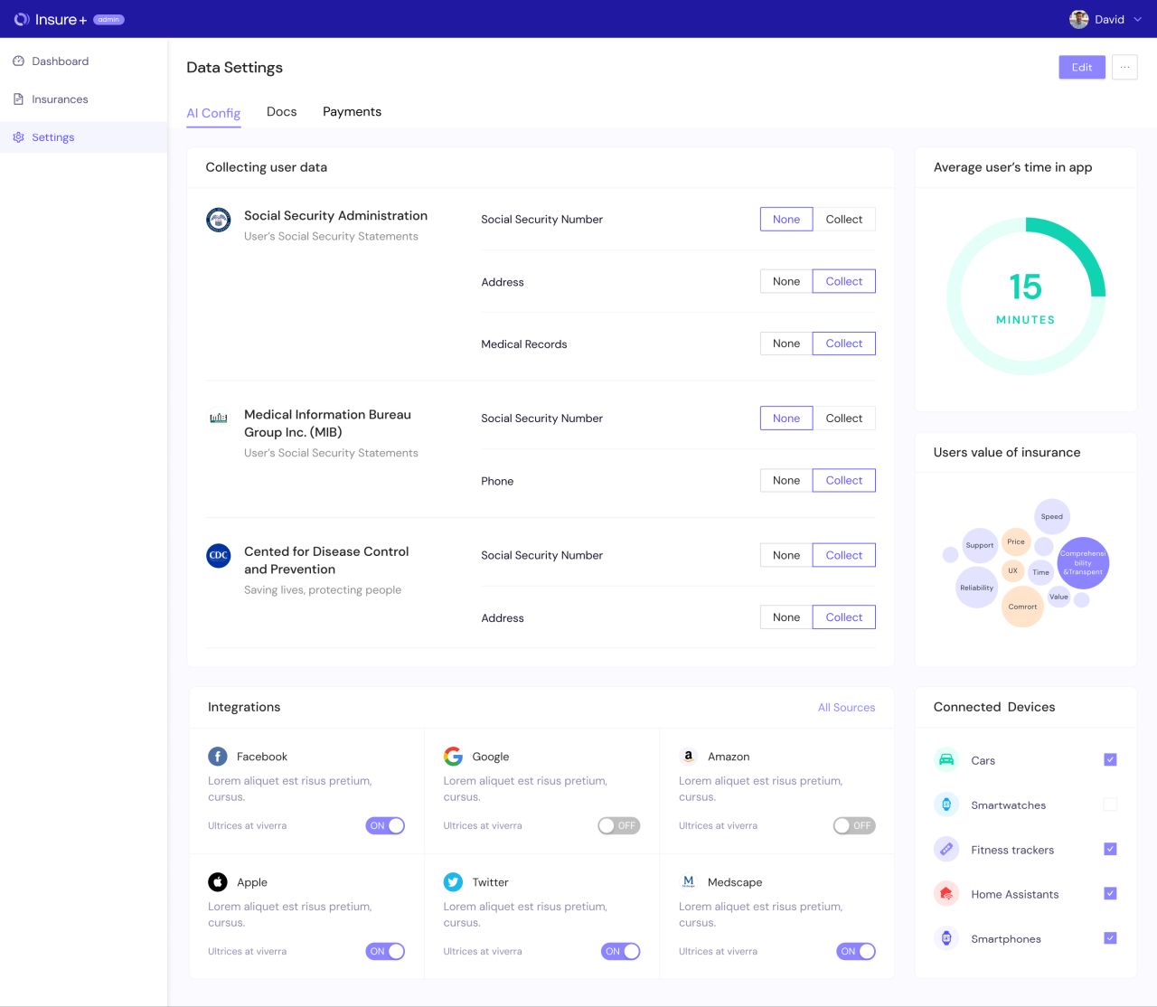
Data settings — collection options, integrations, and connected devices
An alternative policy layout
A second policy-detail layout arranges general information and customer details side by side, with claims and the document checklist below. The same information remains grouped into clearly titled panels.
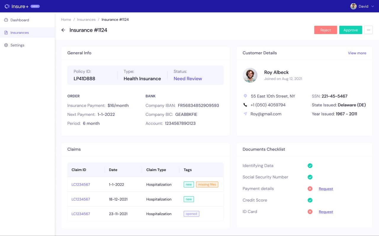
Alternative policy review — two-column information layout
A structured administration table
The Users screen explores a table-based administration view with query fields, status indicators, timestamps, and row actions. Its placeholder records illustrate the layout rather than verified product data.
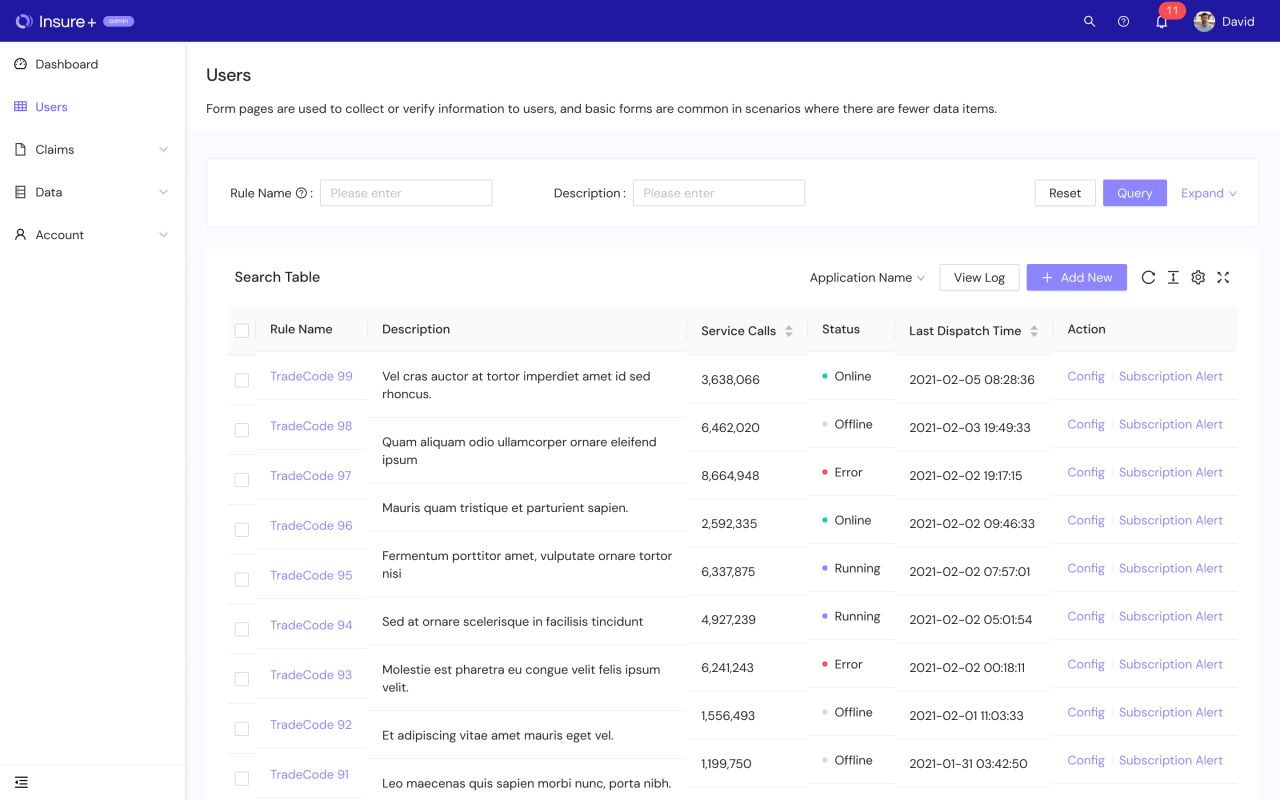
Users screen — filters, status indicators, and row actions
Our approach
Guide the application
Conversational prompts, focused verification steps, and visible progress states give the mobile application a clear sequence.
Structure complex information
Coverage tabs, complete policy summaries, and titled desktop panels organize detailed insurance information into manageable groups.
Connect customer and admin views
Policy statuses, claim records, document checklists, and support entry points carry a consistent information hierarchy across mobile and desktop.