Playbook Huddle
A fitness concept connecting workout discovery with creator-led coaching and session booking.
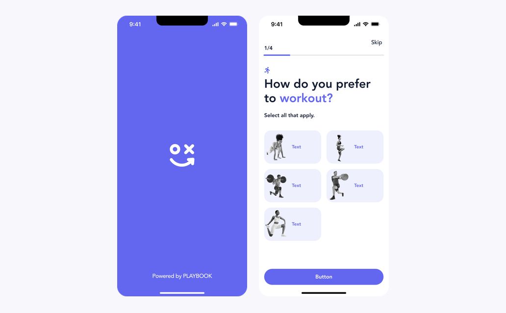
The concept shows a fitness experience across mobile workout discovery and a desktop coaching workspace. Personal preferences, creator profiles, and searchable content sit alongside session bookings, availability, and profile settings.
Choose a starting point
Selected workout preferences lead into a focused set of goal choices. A progress line and a consistent primary action connect the onboarding steps.
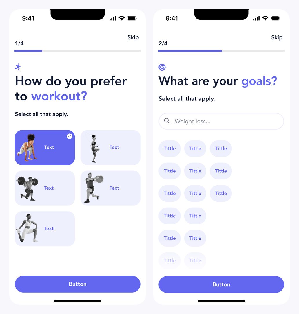
Selected workout preference and goal choices
Set goals and interests
Compact goal chips make multiple selections visible. The next screen introduces interests through image-led cards, keeping the same navigation and purple accent.
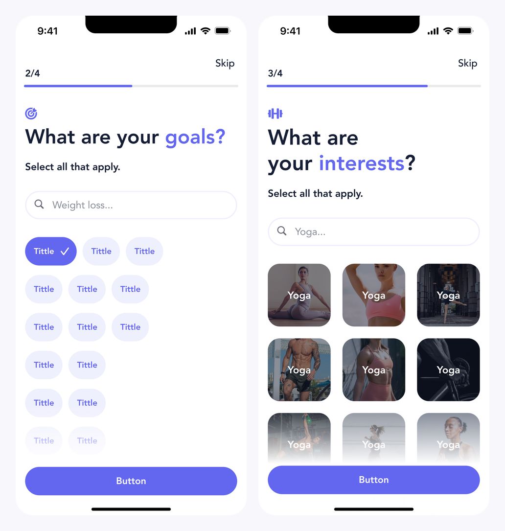
Selected goals and interest categories
Make selections visible
Single and multiple interest selections use a clear contrasting treatment. The underlying card layout stays unchanged as more choices are added.
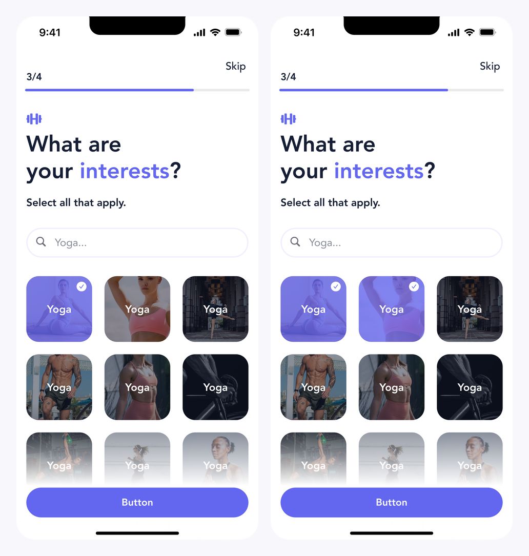
Single and multiple selected interests
Show progress clearly
The recommendation screen keeps its message and circular progress indicator central. The 14%, 75%, and 99% states show the transition without introducing a different layout.
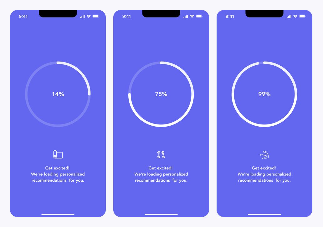
Recommendation progress at 14%, 75%, and 99%
A home for content and updates
The home screen brings content categories and creator-led recommendations together. Notifications use a compact list, with the same bottom navigation connecting both views.
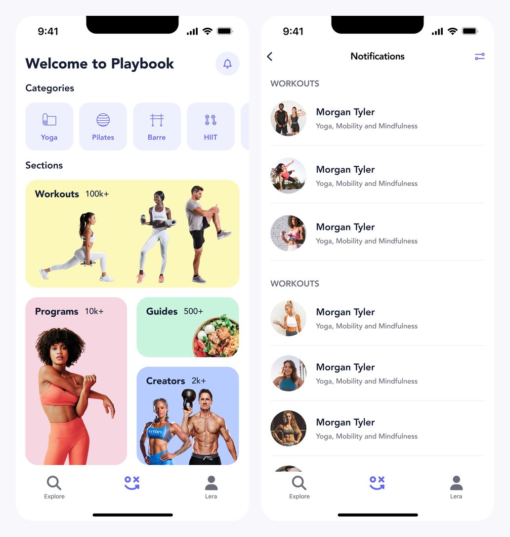
Home and creator notifications
Explore the library
Content tabs separate the available formats while visual cards introduce workouts and programs. The workout grid keeps thumbnails and key details close together.
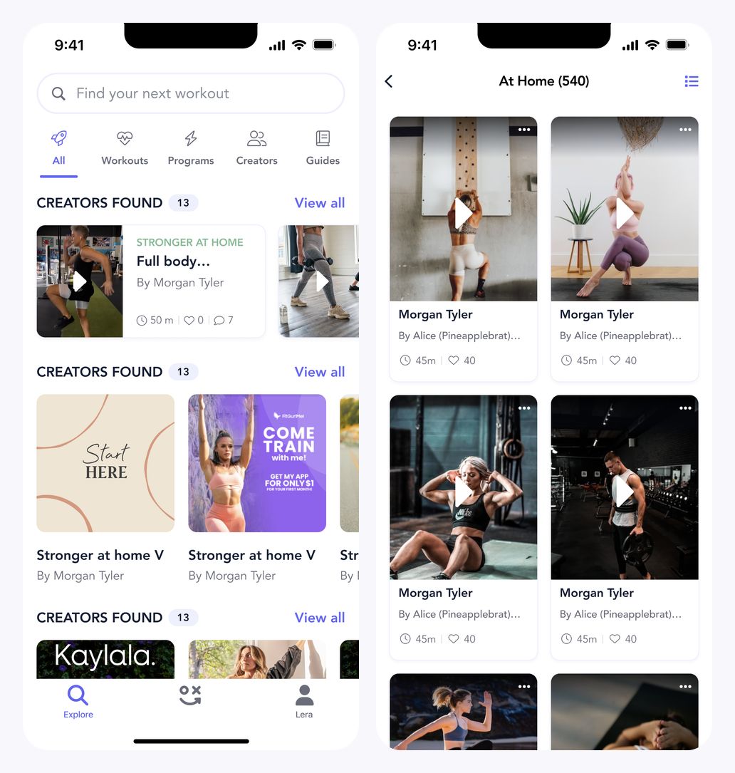
Explore overview and workout grid
Browse in different formats
A workout list provides a compact alternative to image-led browsing. Program covers use a larger visual format while preserving the familiar search and content navigation.
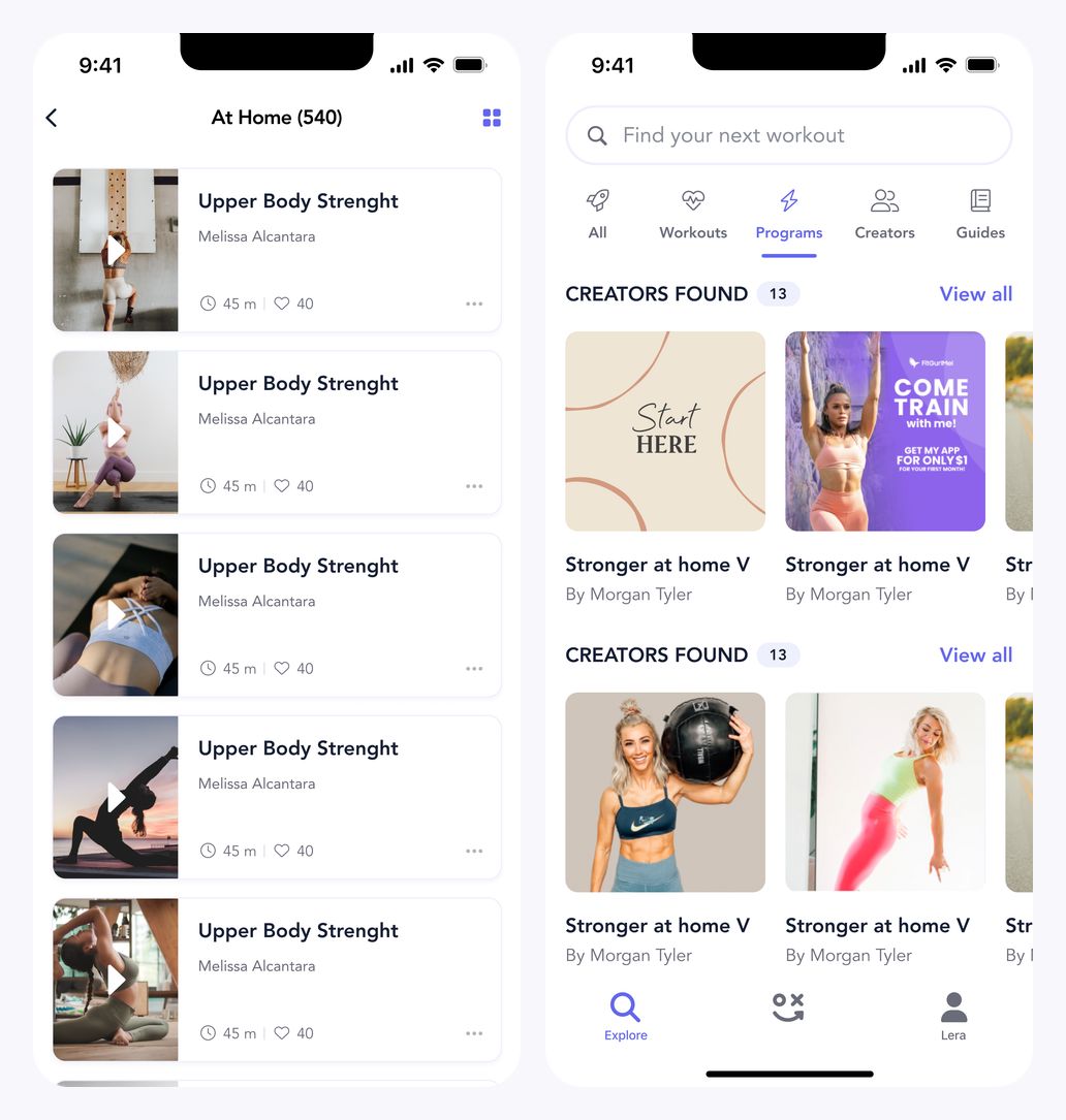
Workout list and program library
Browse guides and collections
Guide covers lead from a category overview into a compact nutrition-guide grid. Distinct imagery and clear labels organise the content within the same browsing pattern.
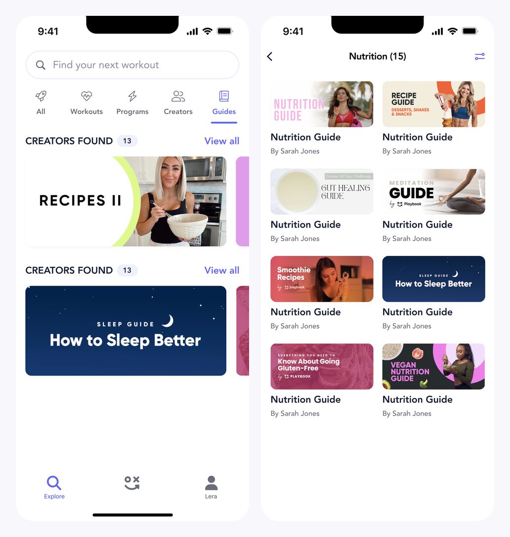
Guide overview and nutrition-guide grid
Keep results organised
Keyword chips sit alongside the search field, above program and workout results. Separate result groups preserve the distinction between a program and an individual workout.
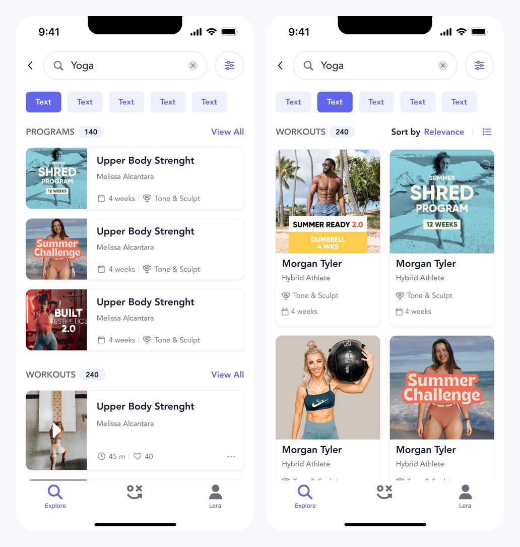
Program and workout search results
Reveal filtering choices
Expandable rows organise filter options into manageable groups. The two visible states show icon-based choices and compact selection pills, with clear actions at the bottom.
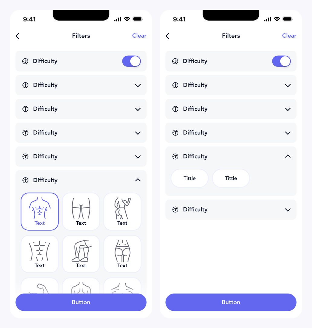
Expanded filter option states
Give each creator a recognisable space
The creator profile combines a coloured header, following controls, content tabs, and a workout list. A bottom sheet introduces a creator list while retaining the profile behind it.
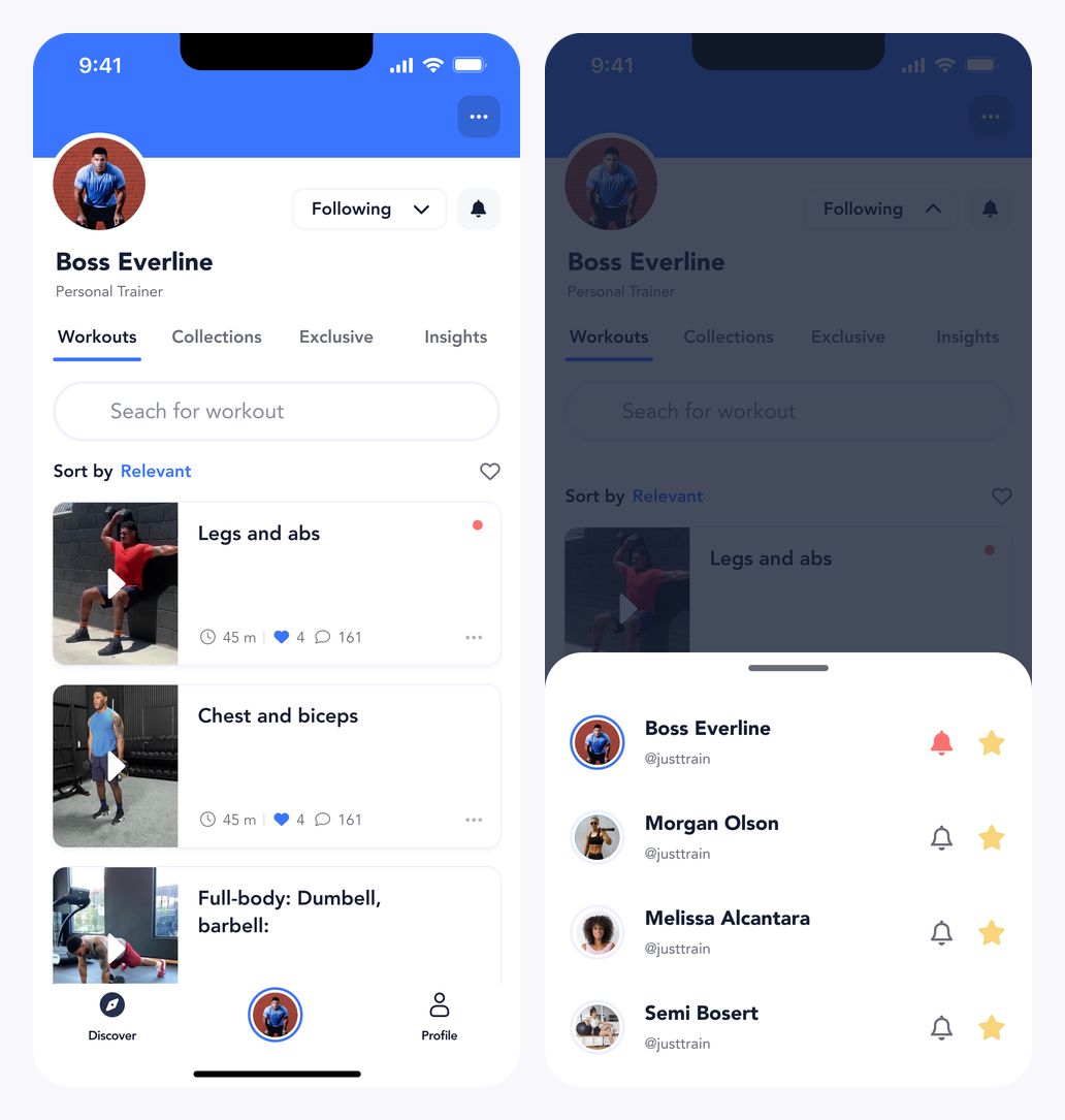
Boss Everline profile and creator bottom sheet
Keep profiles consistent
A second creator uses the same profile structure with different imagery and colour. Its bottom-sheet state repeats the navigation pattern without replacing the surrounding context.
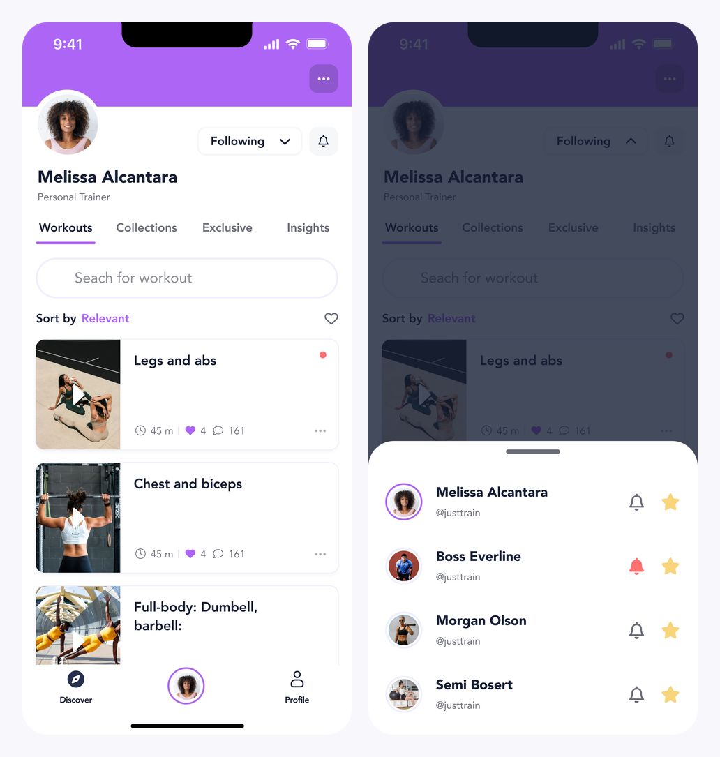
Melissa Alcantara profile and creator bottom sheet
Support the search interaction
The keyboard remains visible while suggestions and typed results appear beneath the input. Both states keep the query and available content in the same focused view.
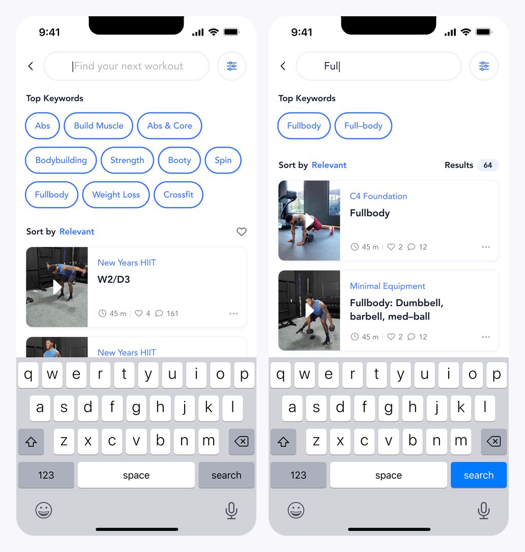
Search suggestions and typed results with keyboard
A workspace for coaching
The desktop concept introduces a creator directory with search, booking counts, and row-level actions. A persistent sidebar separates creator management from the rest of the workspace.
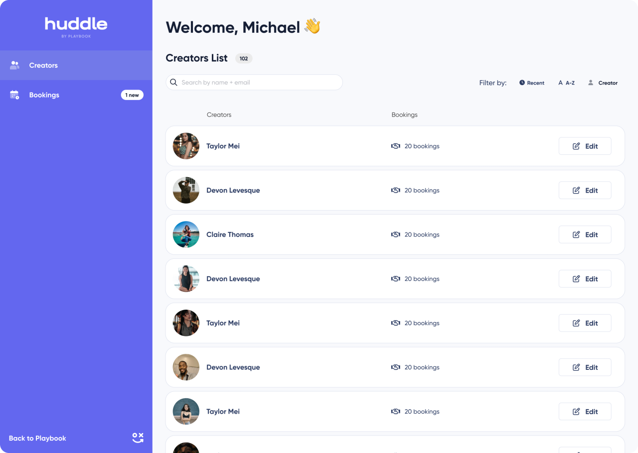
Desktop creator directory
Configure coaching sessions
Call settings group session durations, prices, conditions, and working hours into a structured form. Labels and section boundaries distinguish the different decisions.
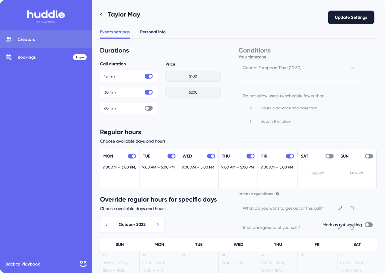
Creator call settings
Manage a creator profile
Profile editing places personal details, images, and account controls within one workspace. The form keeps editable information separate from the persistent navigation.
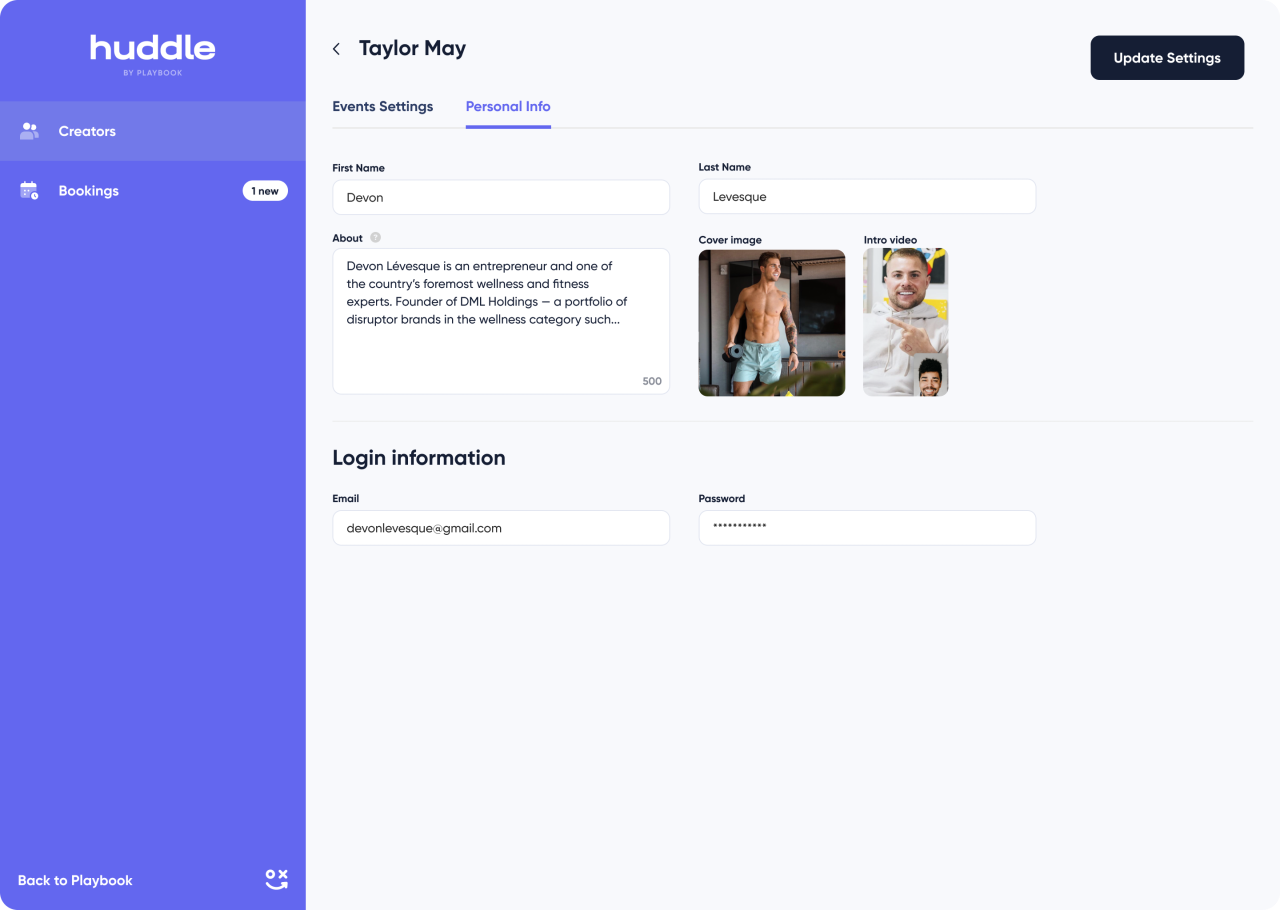
Creator profile editing
Review upcoming bookings
The bookings table brings client and session information into aligned columns. Filters and row actions sit close to the list they affect.
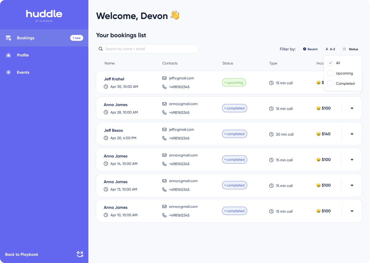
Bookings list
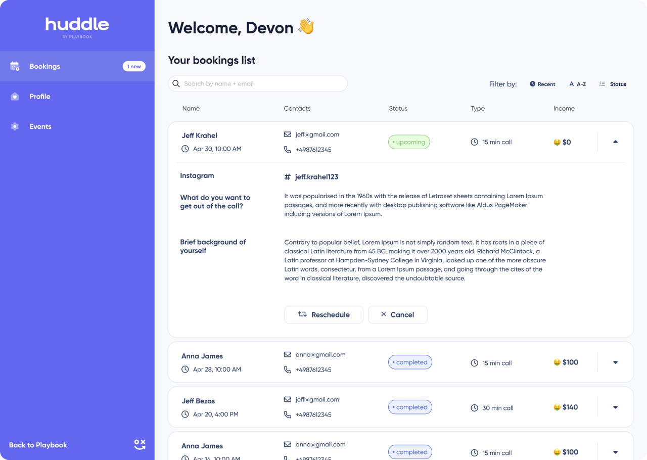
Inspect booking details
An expanded booking state reveals additional information within the same list context. The surrounding rows remain visible so the detail view stays connected to the schedule.
Expanded booking details
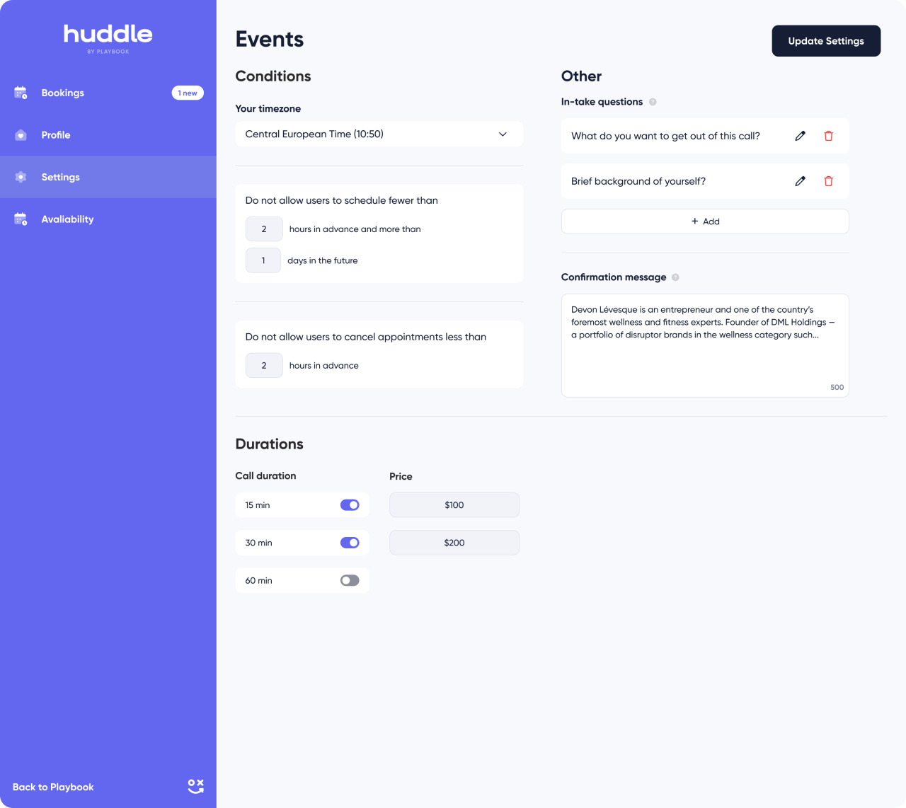
Structure the event setup
The settings view separates booking conditions, questions, and session options. Repeated form patterns keep the longer configuration page organised.
Event settings and booking questions
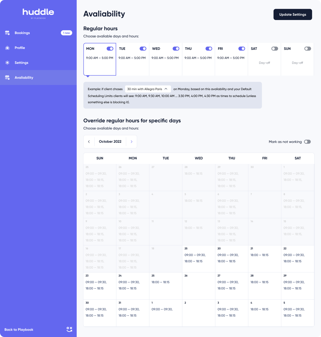
Define availability
Weekly working hours and a calendar share the availability page. The two views distinguish recurring time windows from date-specific scheduling.
Weekly hours and availability calendar
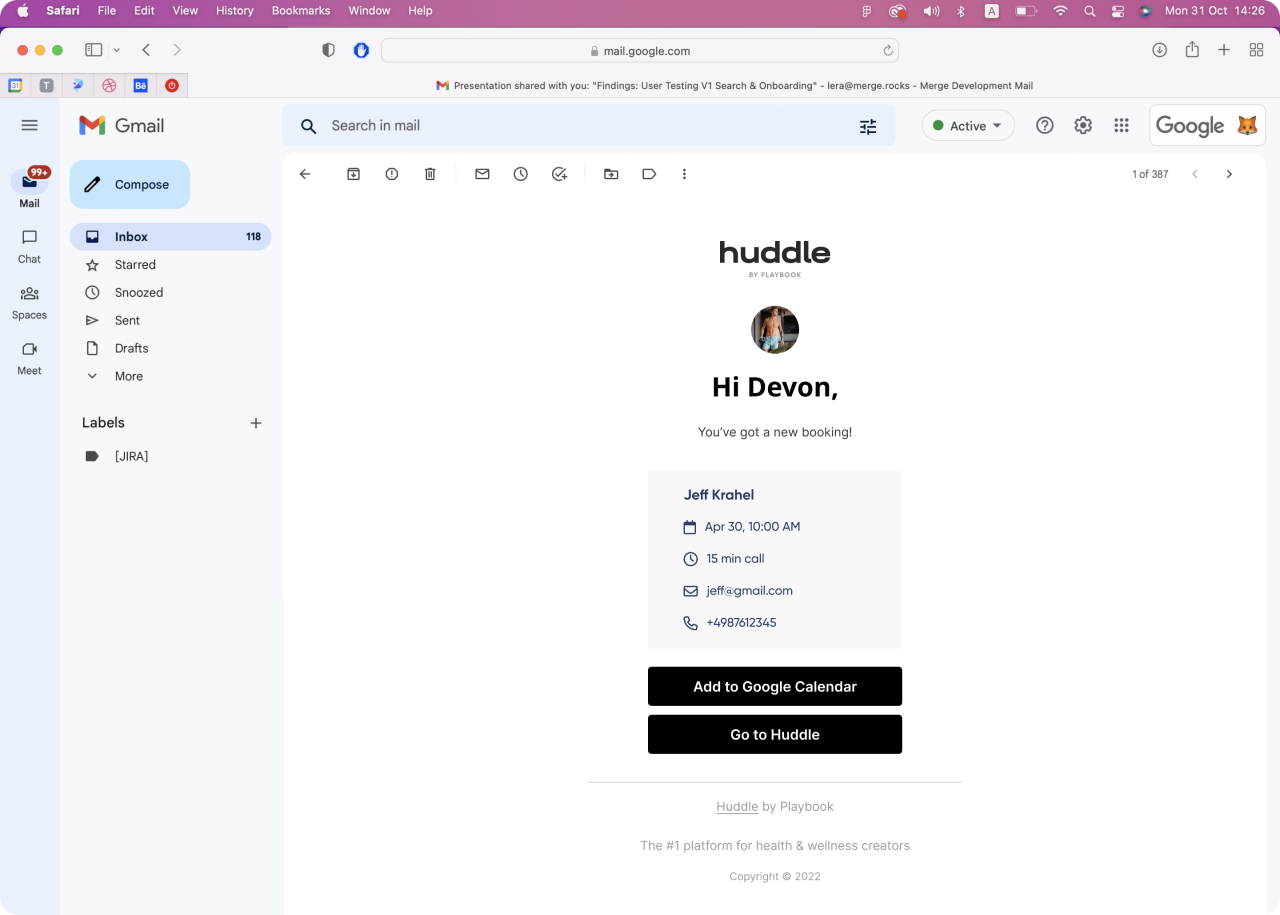
Confirm the booking
The supplied email design presents the session confirmation inside an inbox view. Booking information and the next actions are grouped into a focused message.
Booking confirmation email in the supplied inbox view
Choose a session time
The customer-facing booking page combines session options, pricing, a calendar, available times, and supporting questions. The complete page preserves the connection between choosing a session and selecting a slot.
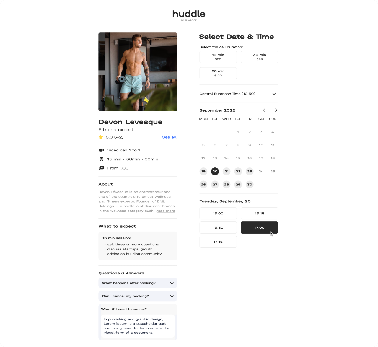
Customer session booking page
Edit the public-facing page
The page-builder workspace groups headline text, images, logo, colours, and testimonial controls into expandable sections. Desktop and mobile preview options sit beside the save action.
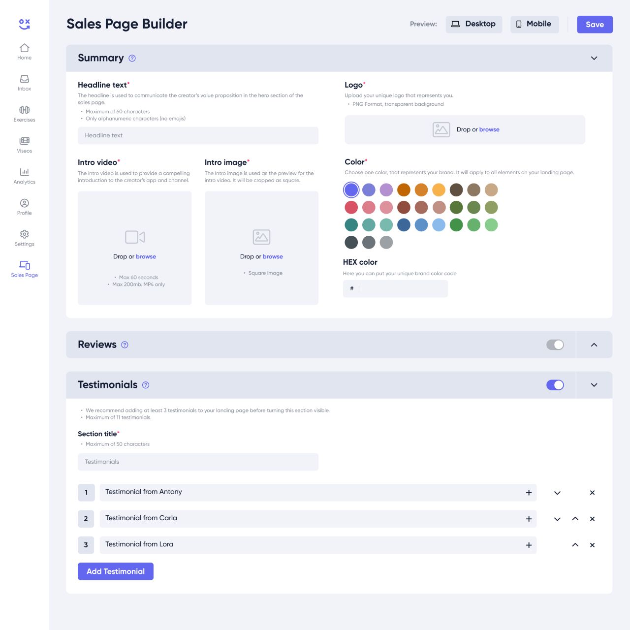
Sales page builder
Our approach
Make choices legible
Use clear selection states, short prompts, and consistent progress indicators to organise the onboarding sequence.
Connect discovery and creators
Carry shared cards, search controls, filters, and profile patterns across the mobile content library.
Keep scheduling structured
Separate session settings, availability, booking details, and customer-facing choices into clearly labelled views.