Siren
A mobile security app for understanding protection status and spotting suspicious messages.
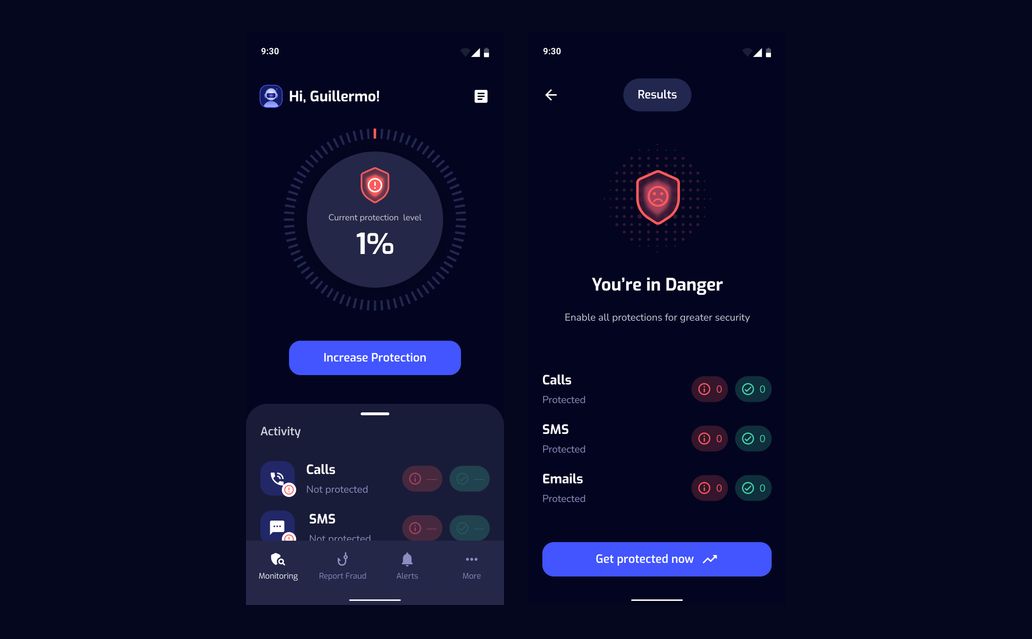
Siren is a digital security application that alerts users to potential risks in incoming messages. Its mobile interface brings protection status, account settings, a guided questionnaire, and fraud alerts into a dark, approachable experience.
Protection status
A circular protection indicator gives the monitoring screen a clear focal point. The 25% state and its results view show which channels are protected and where attention is still needed.
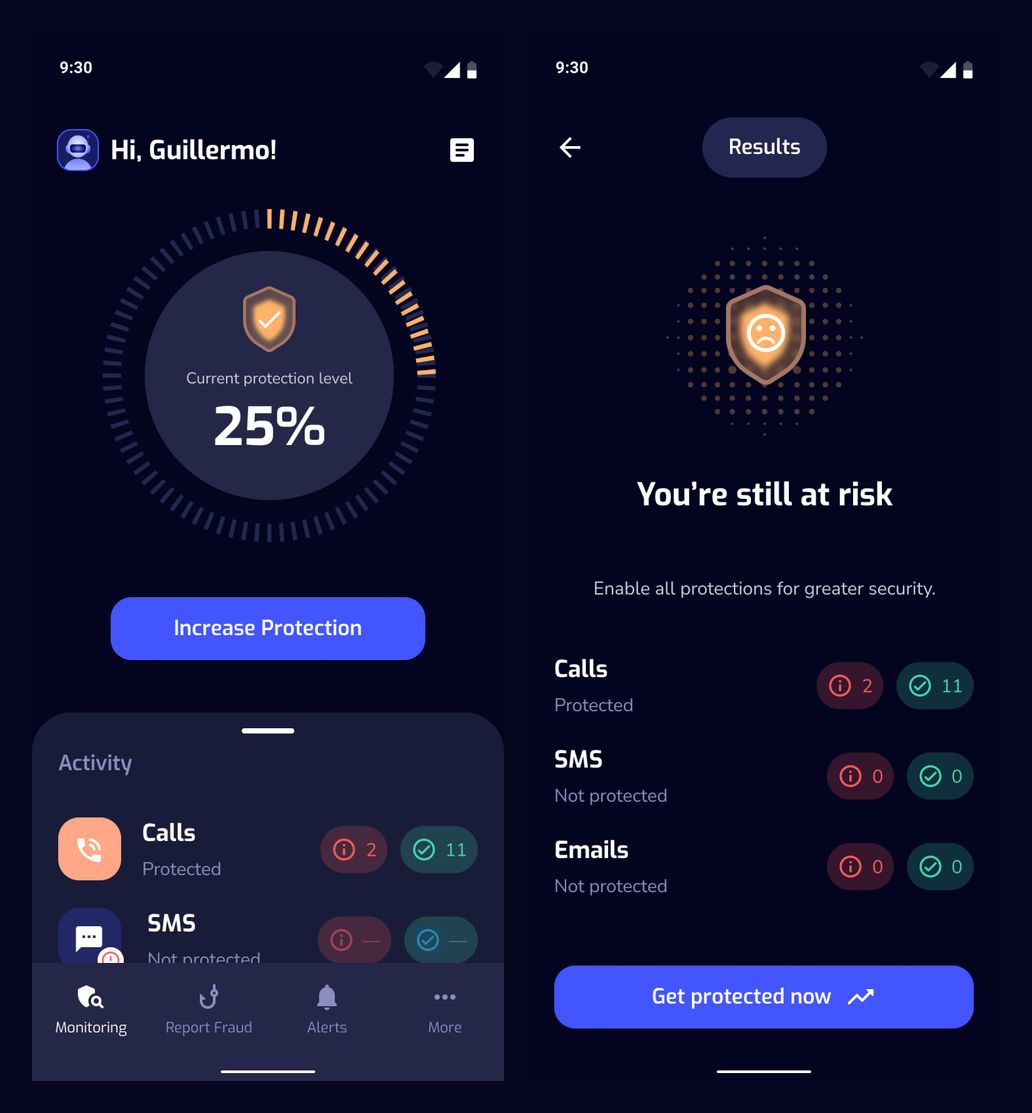
25% protection: monitoring and results
Protection across channels
Calls, SMS, and email are presented as separate activity rows. The 50% state pairs the overall score with channel-level counts and a clear next action.
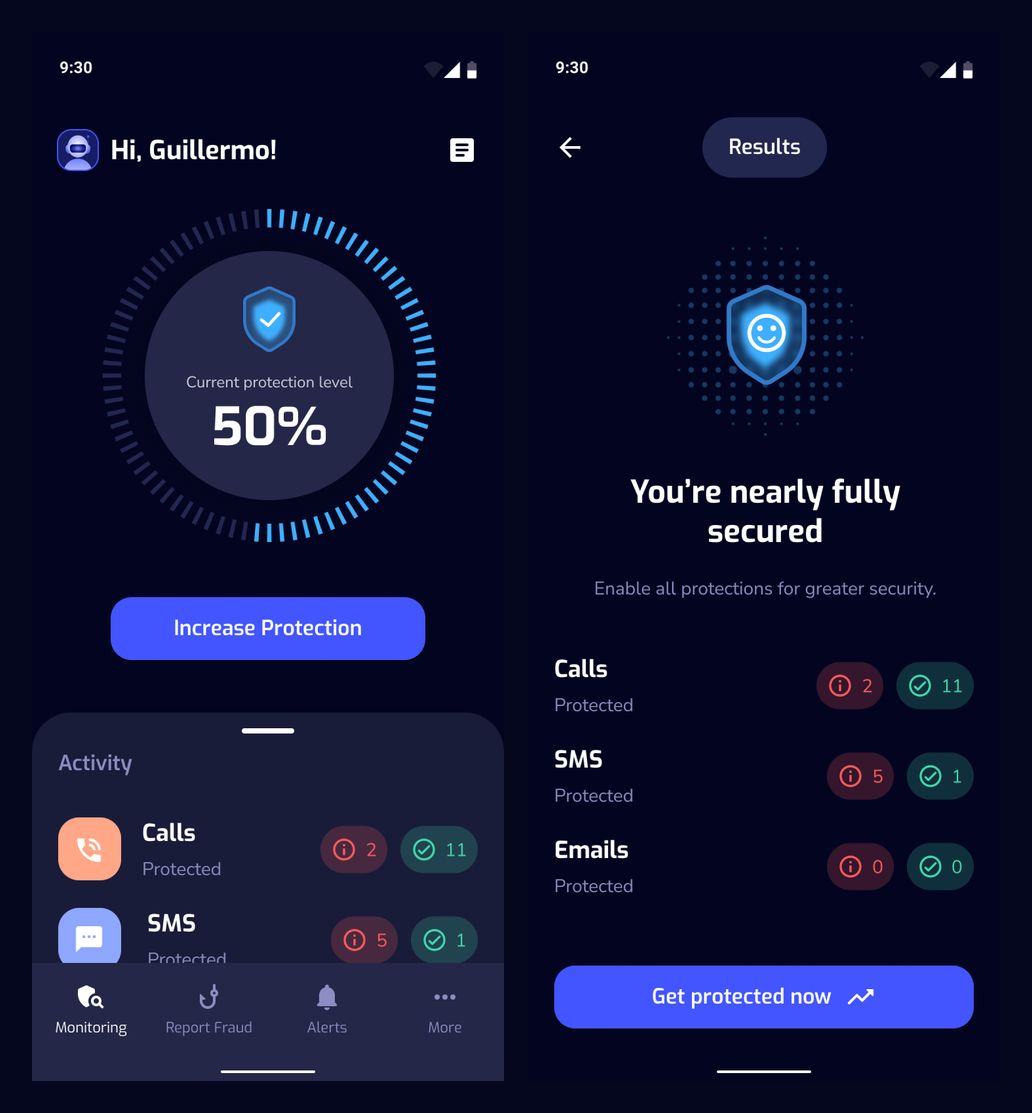
50% protection: monitoring and results
Closing the gaps
As protection progresses, the indicator and results message change together. The 75% screens retain the same layout so the changing status remains easy to compare.
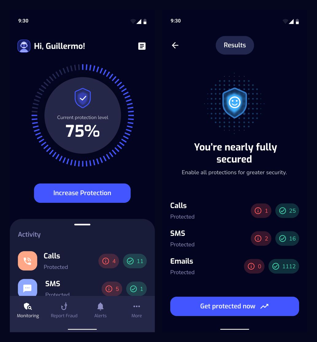
75% protection: monitoring and results
Full protection and activity
The completed state introduces renewal messaging alongside the protection overview. A separate scrolled state brings more of the activity list into view without changing the bottom navigation.
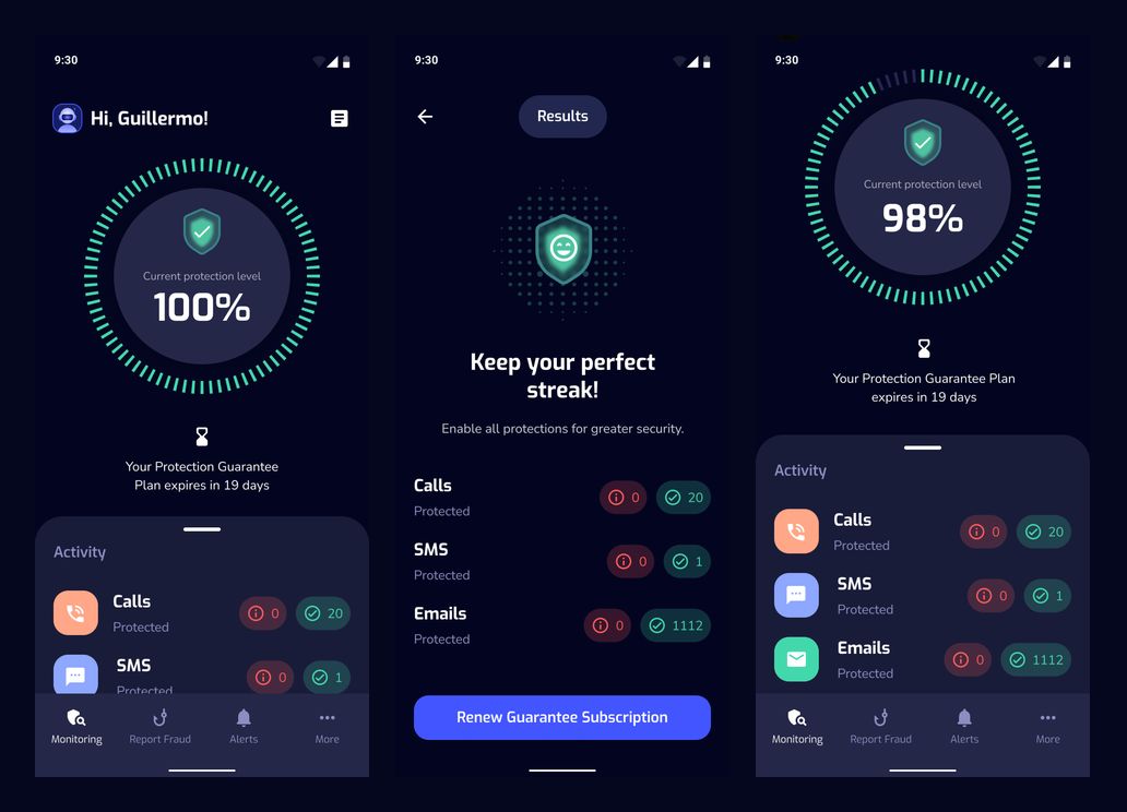
100% status, completed results, and the separate 98% scrolled state
Personal details
The account flow separates viewing personal information from editing it. Field labels, validation marks, and a dedicated save action make the two modes distinct.
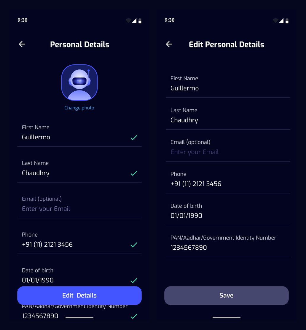
Personal details and edit mode
Photo and profile controls
A populated profile shows the chosen photo and contact details. The photo action opens a focused choice between taking a new picture and selecting one from the gallery.
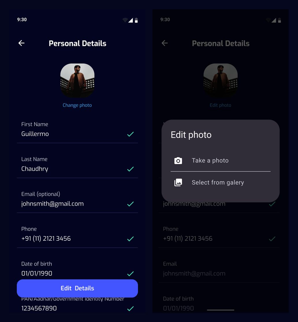
Populated profile and photo selection
Recovery and risk messages
The error state offers a direct retry action. A separate warning explains that a phone number is at risk and points toward call protection, keeping the message focused on the next step.
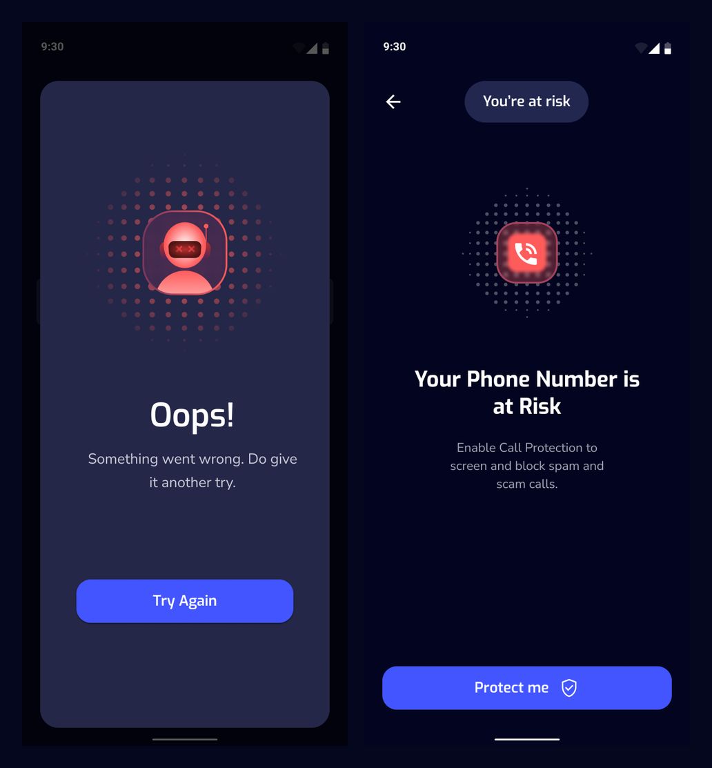
Retry error and compromised-number warning
Getting to know the user
A friendly character introduces a short questionnaire. The first screens ask about age and investments, with progress markers and a skip option visible throughout the questions.
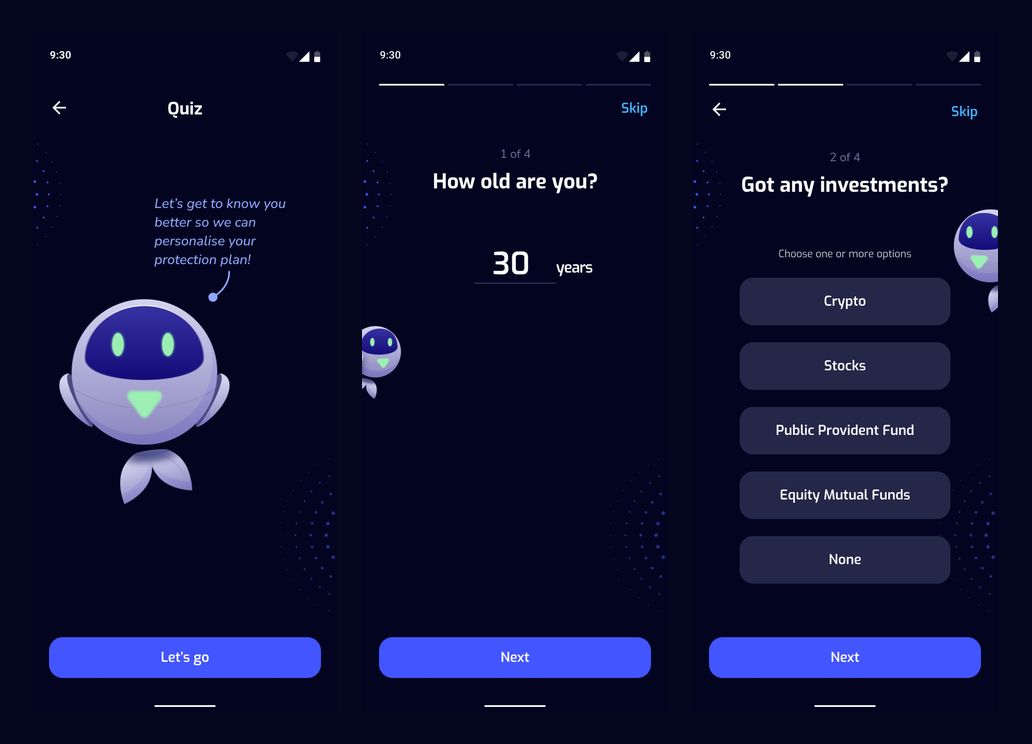
Quiz introduction, age question, and investment choices
Choices that guide the journey
Selected answers use a contrasting light treatment against the dark interface. The sequence moves from investment choices to statements about everyday security habits.
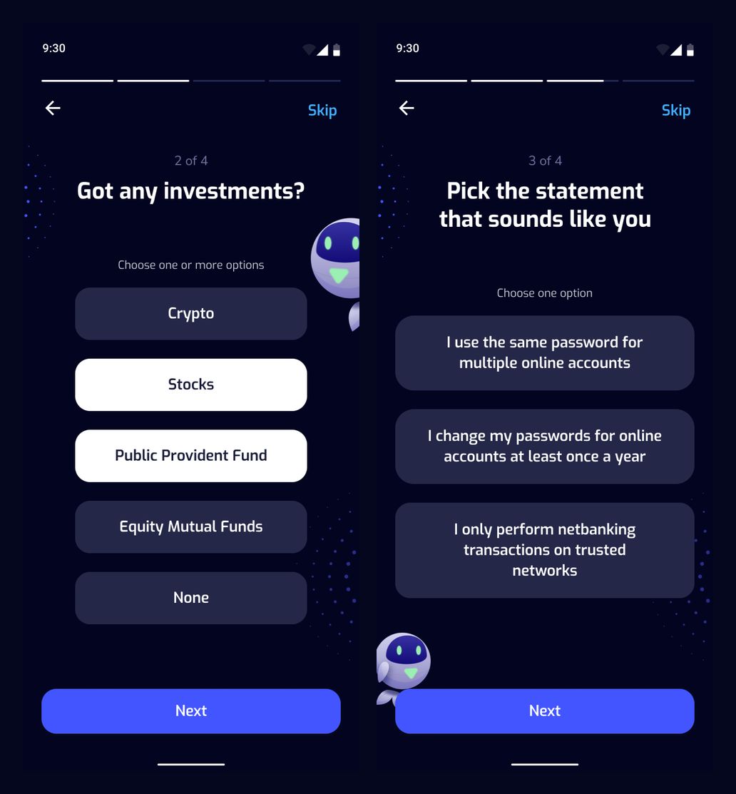
Selected investment answers and security-habit question
Everyday security habits
The questionnaire continues with password and banking habits, followed by a question about suspicious calls. Consistent answer cards and navigation keep the interaction familiar.
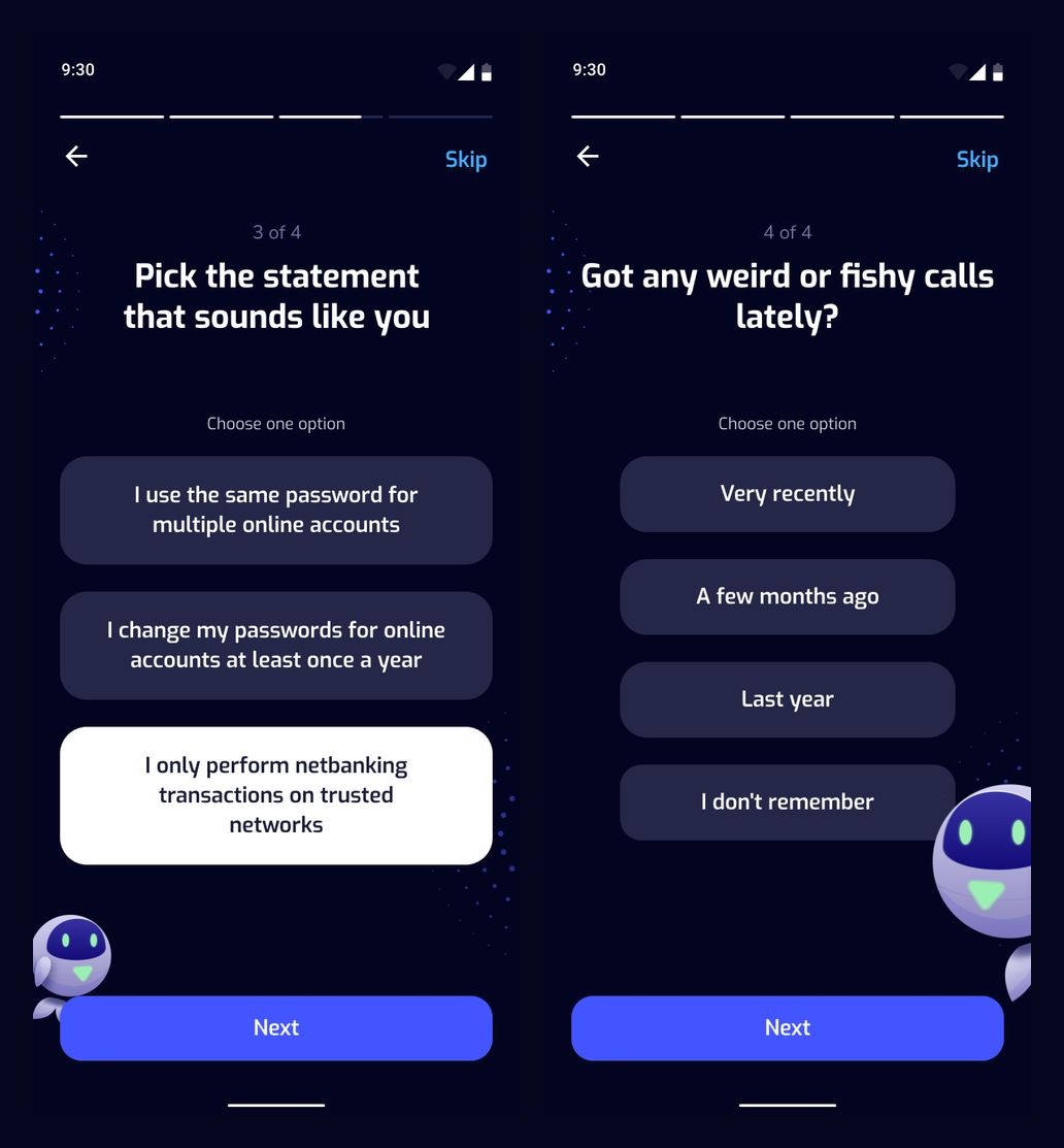
Selected security habit and suspicious-call question
From answers to a plan
The final answer state leads to a preparation screen with the same character. This closes the questionnaire with a clear transition toward a personalized plan.
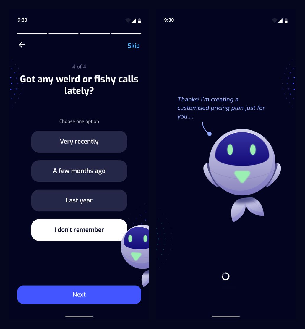
Final selected answer and plan-preparation screen
Alerts and fraud reports
Unsorted and risky tabs help distinguish incoming items. The reporting flow uses a bottom sheet to select the specific suspicious message connected to a fraud report.
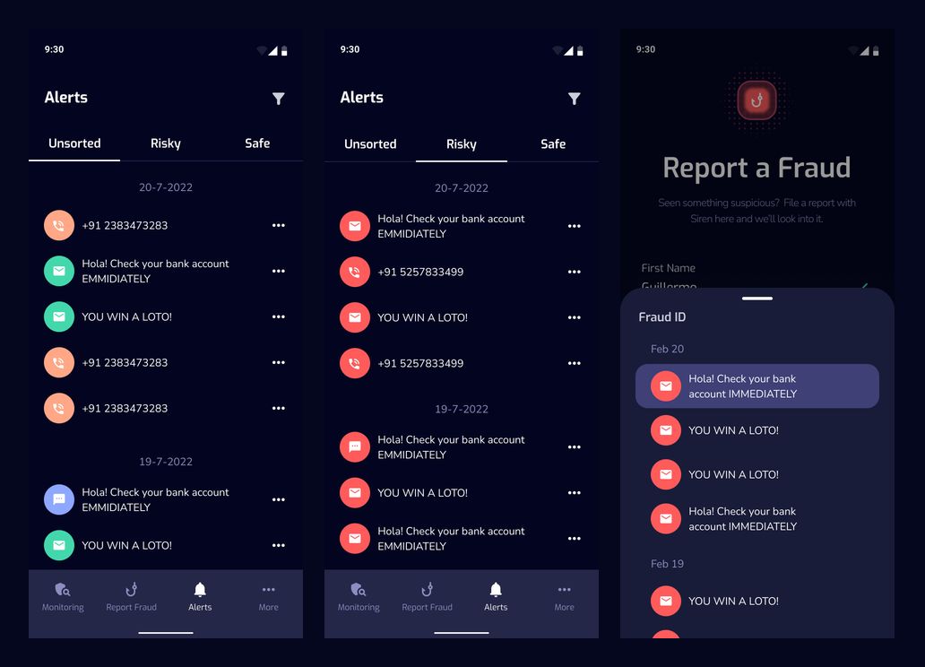
Unsorted alerts, risky alerts, and fraud-message selection
Cyber Guarantee
The plan screen presents a subscription card with its included benefits and a trial action. A separate terms screen gives the guarantee details their own space and provides a PDF download action.
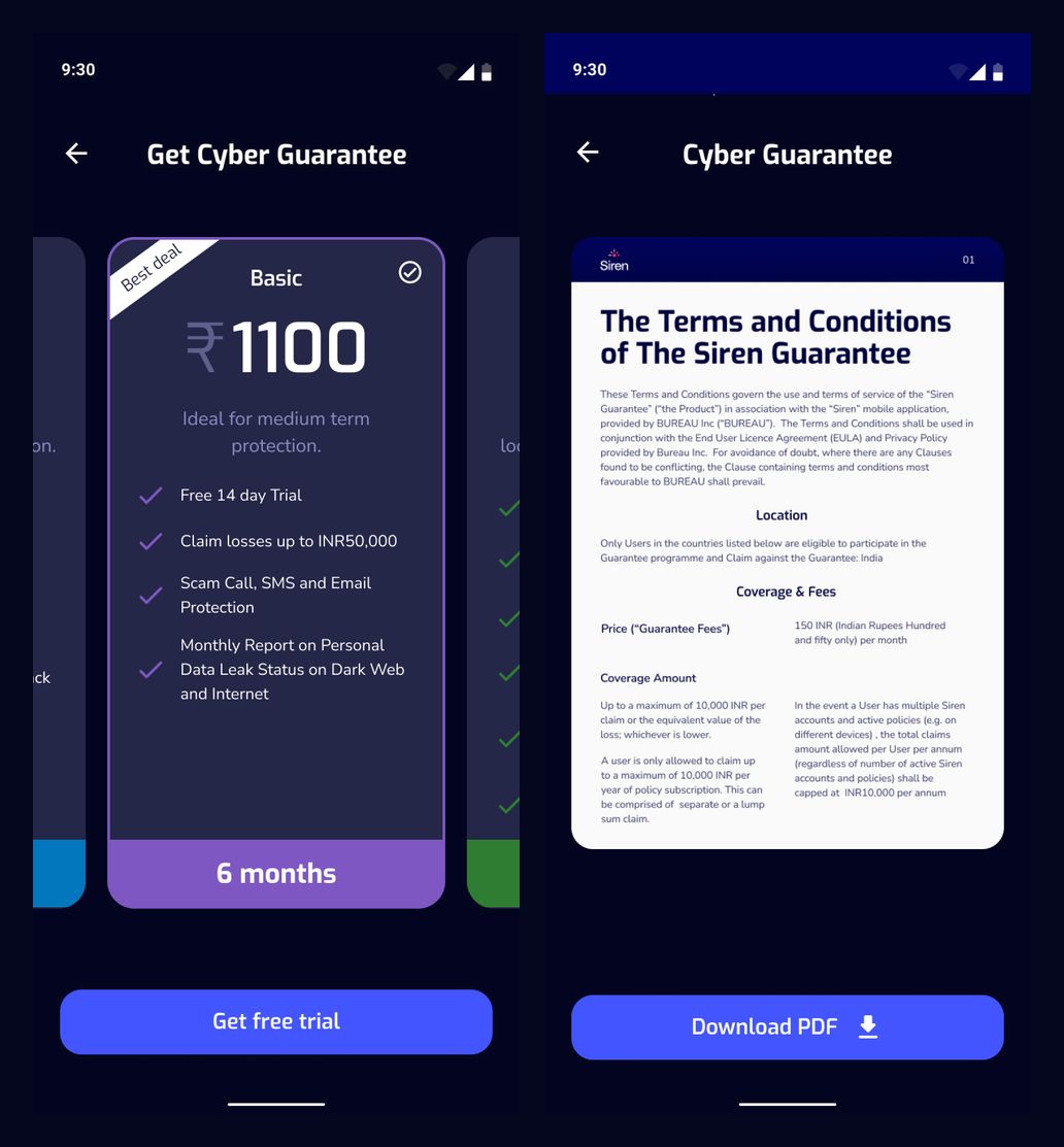
Plan selection and guarantee terms
Our approach
Make status visible
Pair the protection score with recognizable colors, channel-level details, and a clear next action.
Guide without overwhelming
Use short questions, consistent controls, and a friendly character to make security-related decisions approachable.
Design the complete flow
Keep profile edits, selected answers, warnings, recovery messages, and plan details within one coherent visual language.