Quiet Time
A daily space for Bible study, reflection, and prayer.
Quiet Time is a digital devotional platform for Bible study, personal reflection, and prayer. These desktop and mobile designs bring daily reading, interactive questions, journaling, prayer lists, and reading plans into a shared visual system.
A welcoming start
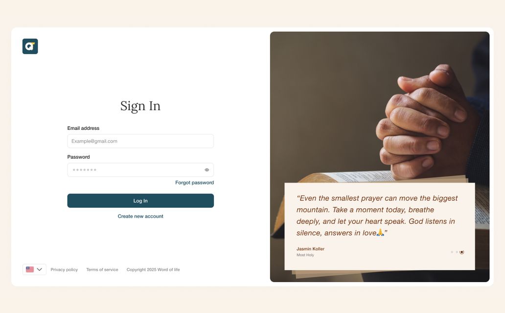
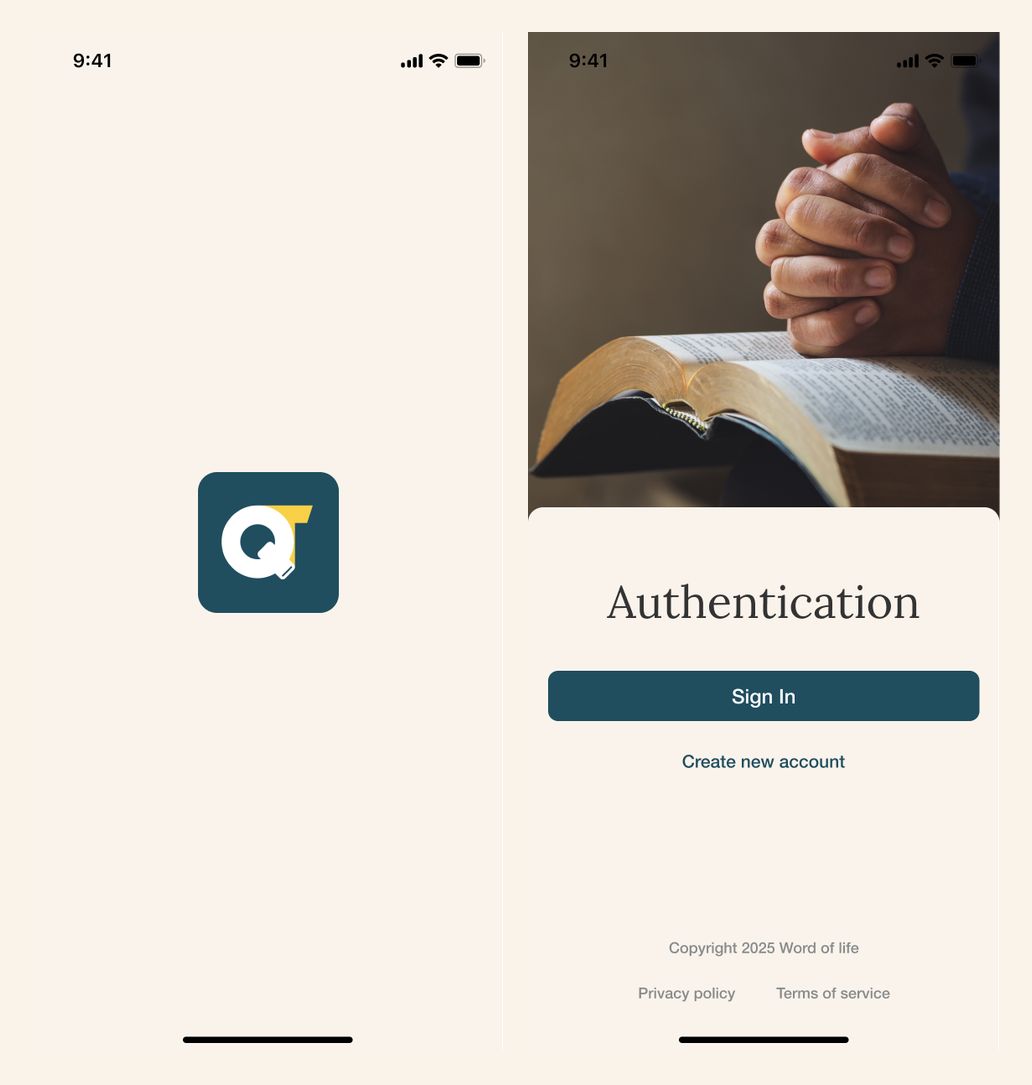
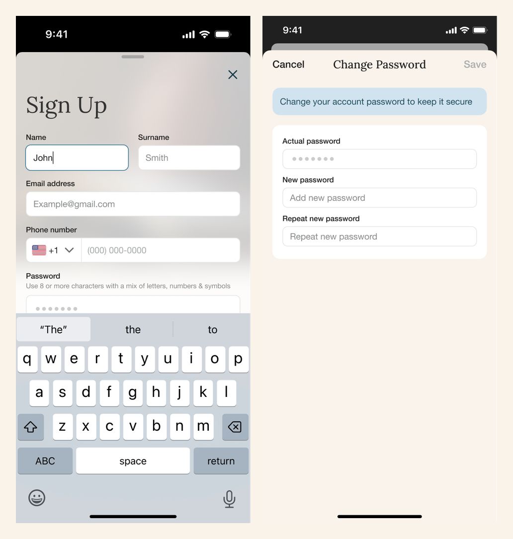
The entry flow pairs simple account forms with warm photography and a calm cream-and-teal palette. Sign-in, registration, verification, and password recovery each have a dedicated screen.
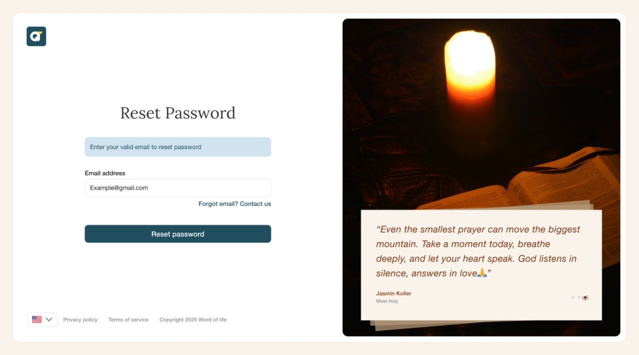
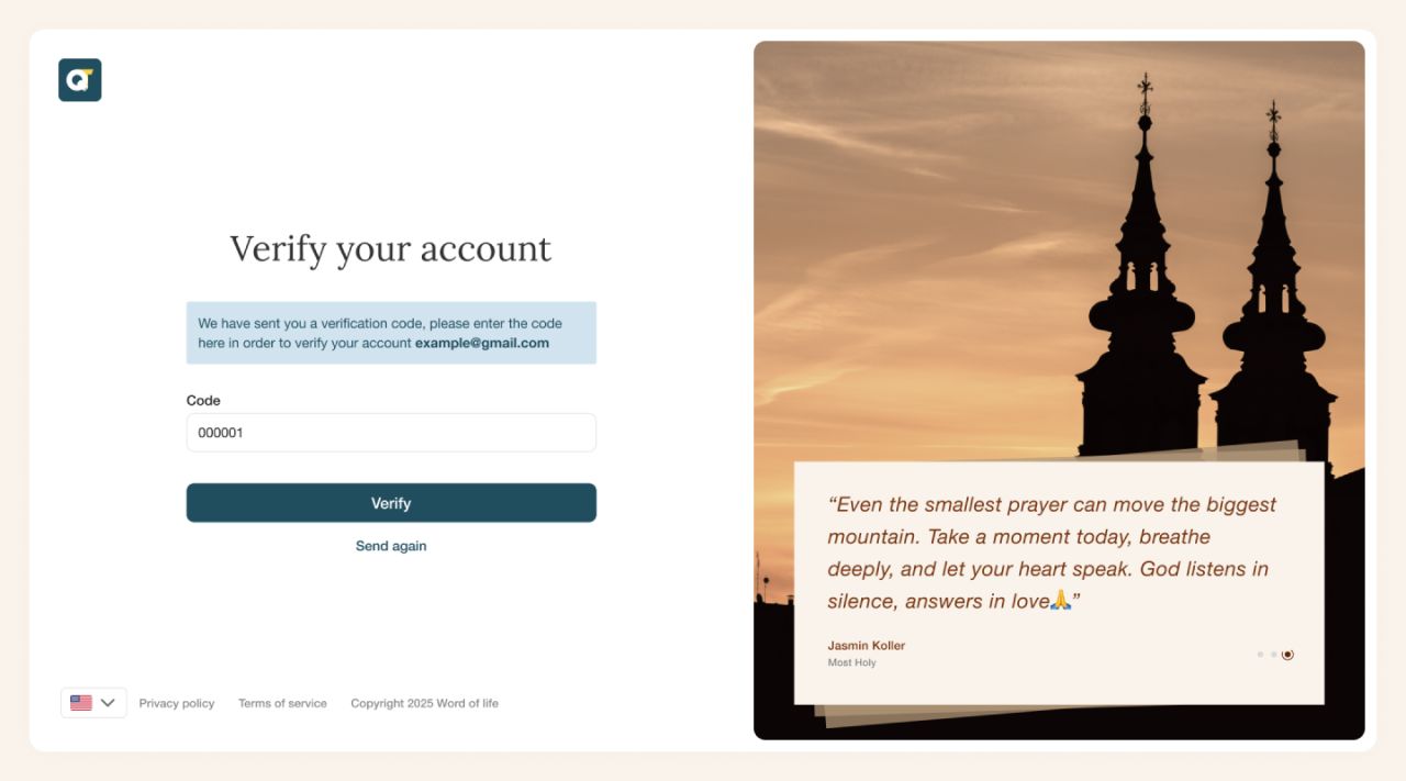
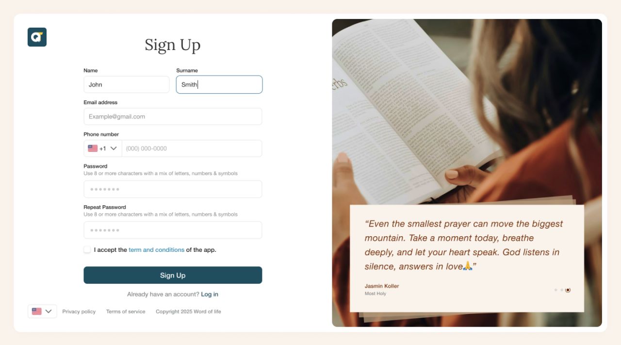
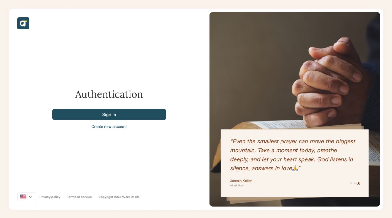
The mobile flow carries the same visual language from the launch screen into authentication, registration, and password management.
Make the routine personal
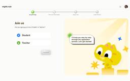
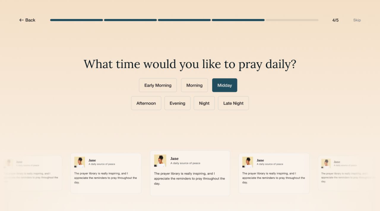
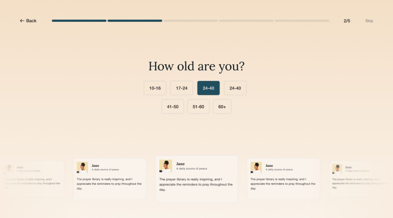
Short onboarding questions collect an age range and a preferred time for daily prayer. A visible progress indicator keeps the sequence easy to follow on desktop and mobile.
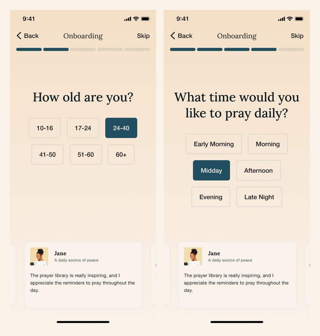
On mobile, each question occupies one focused screen, with large choices and a consistent Back and Skip pattern.
The day at a glance
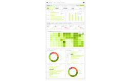
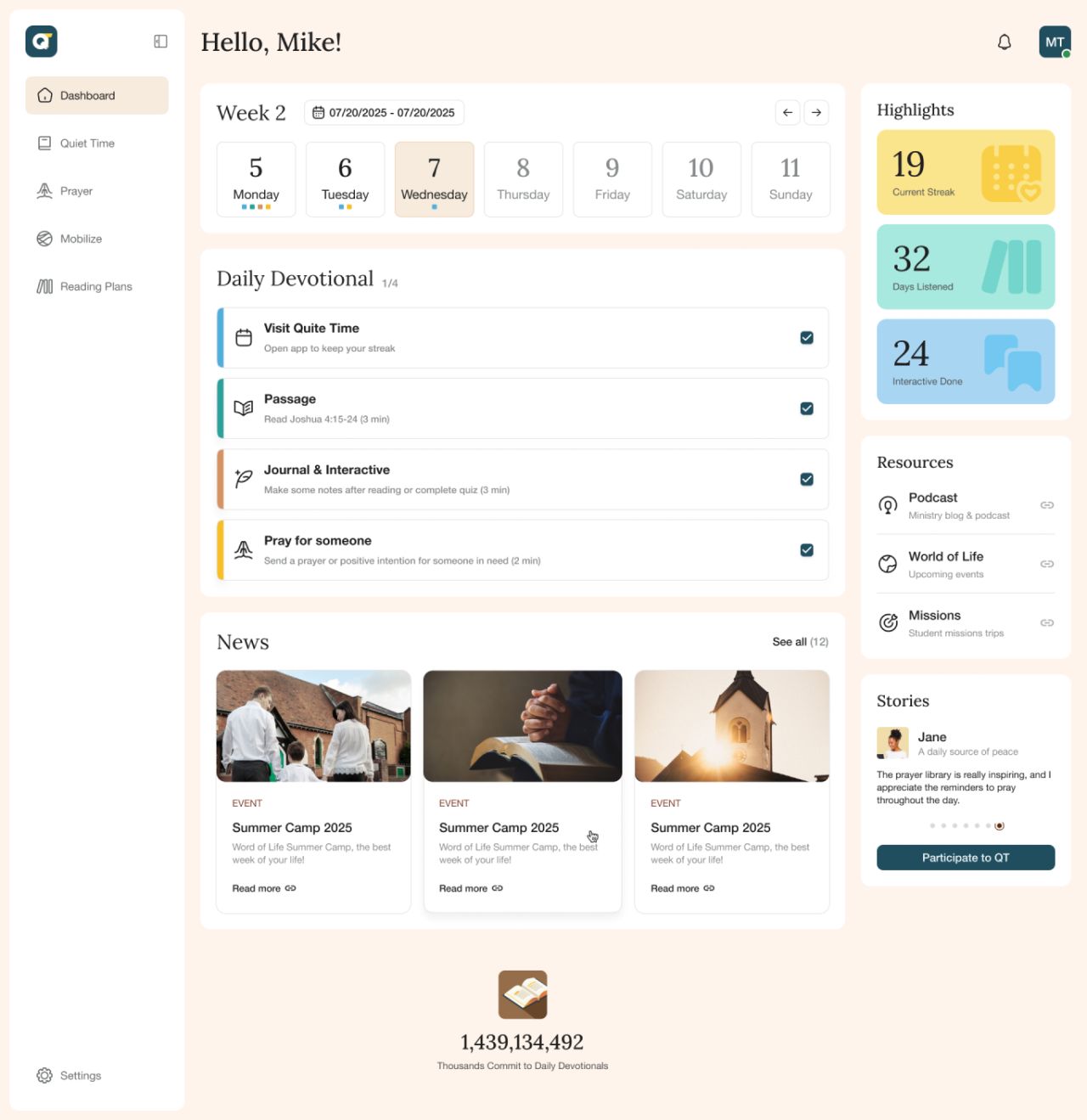
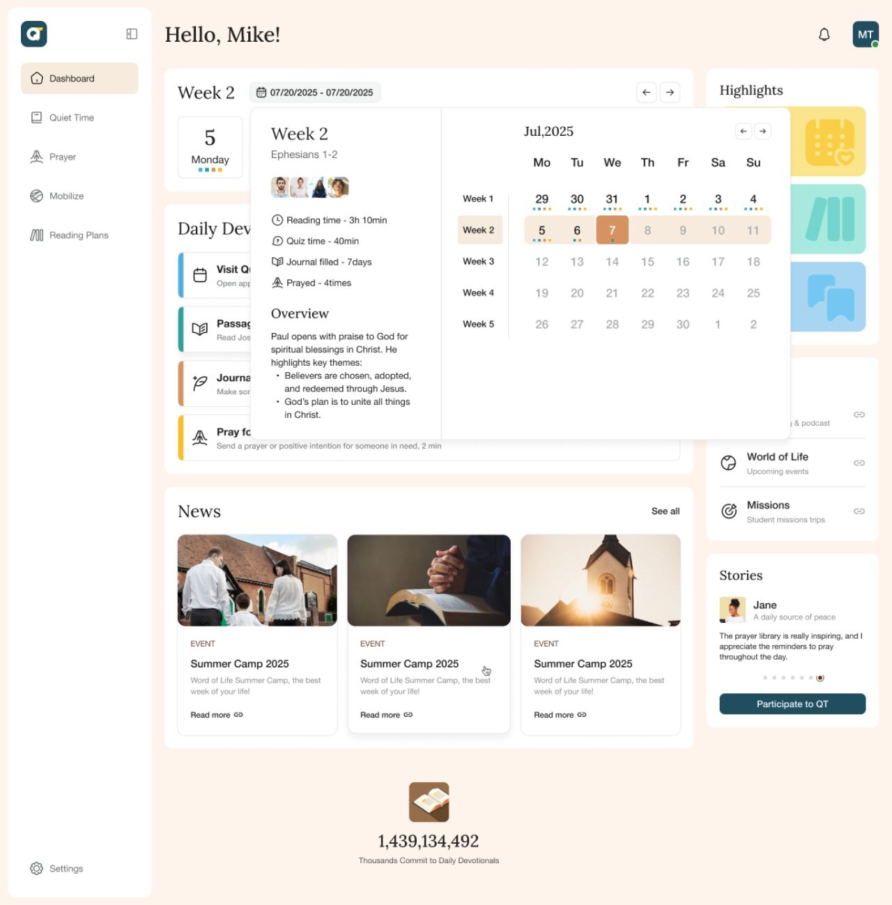
The dashboard brings the weekly calendar, daily devotional checklist, activity highlights, news, and resources together. Calendar and article views let readers move from an overview into the details.

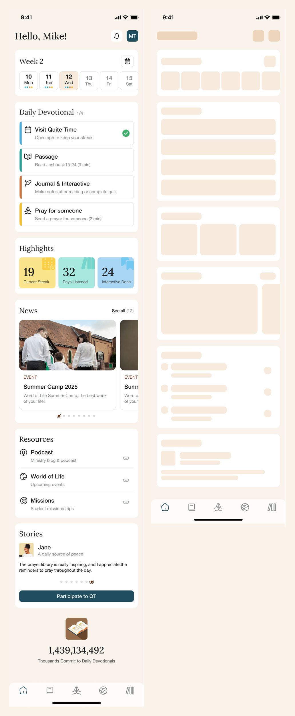
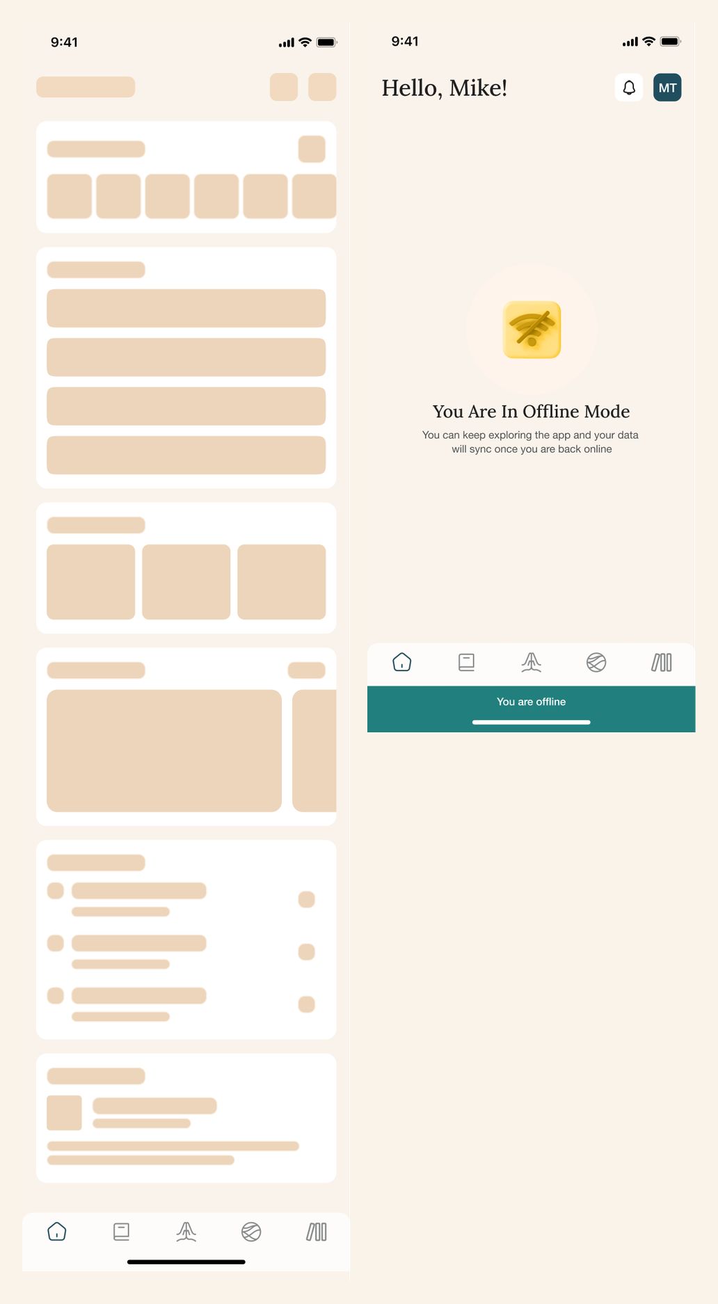
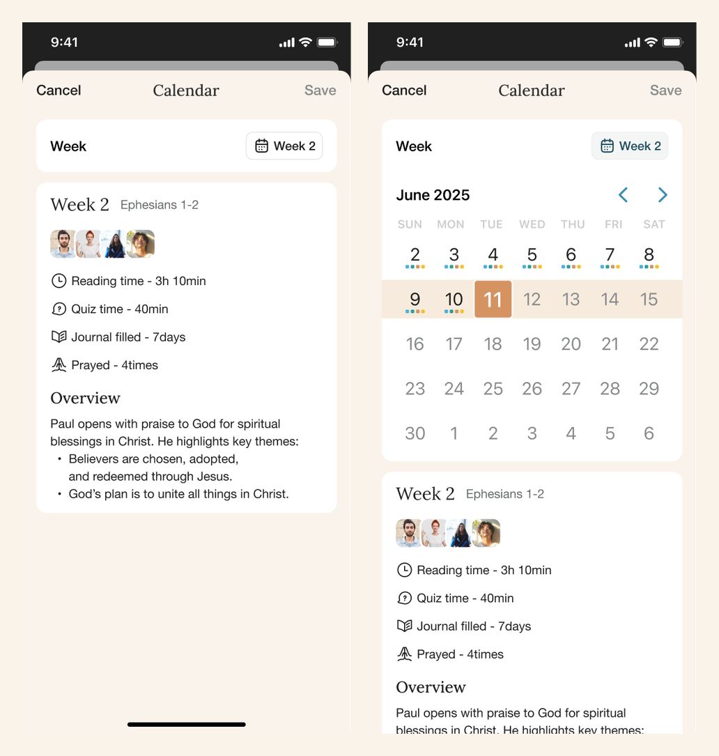
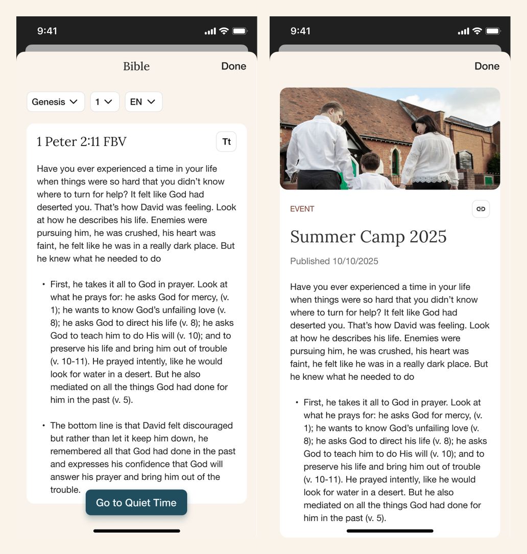
The mobile layouts include the complete dashboard, two loading-state variants, an offline state, calendar sheets, and full-screen reading and news views.
Read, reflect, and respond
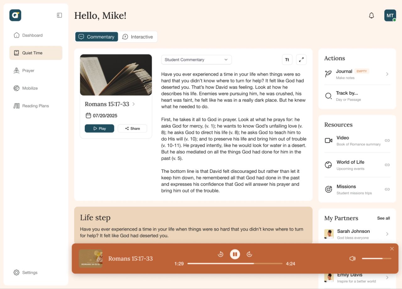
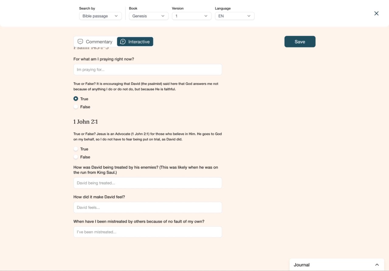
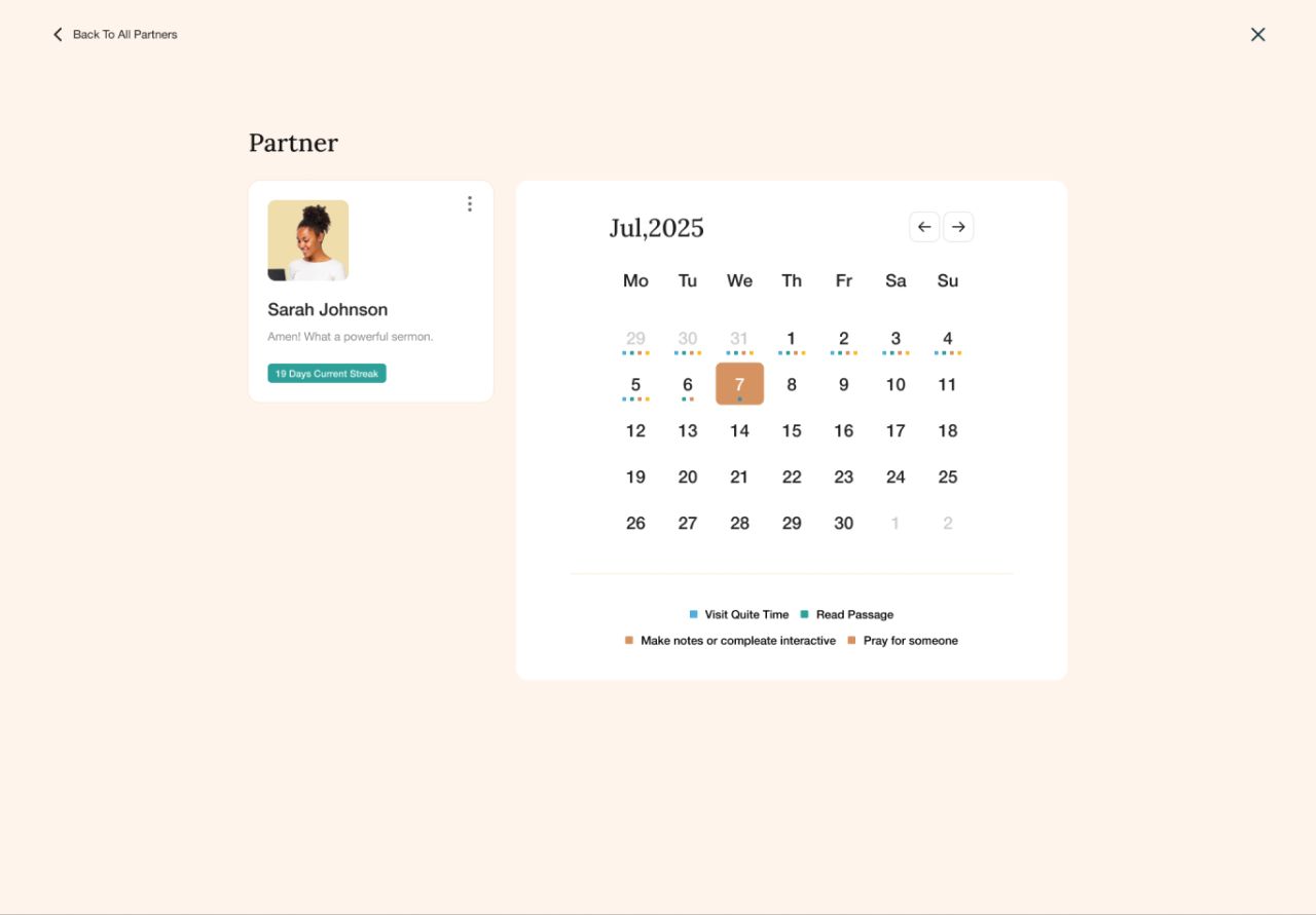
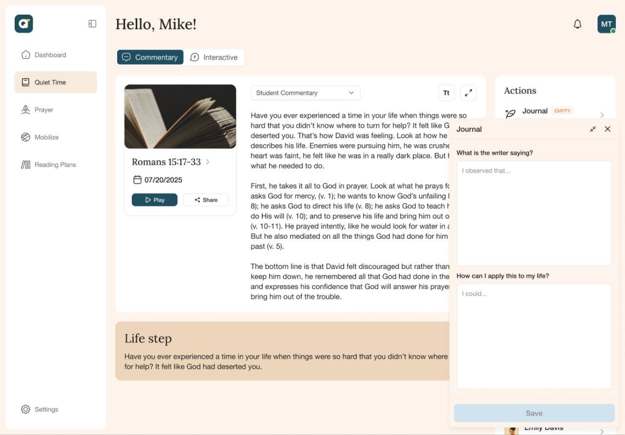
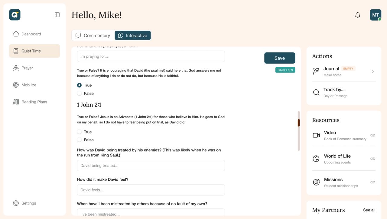
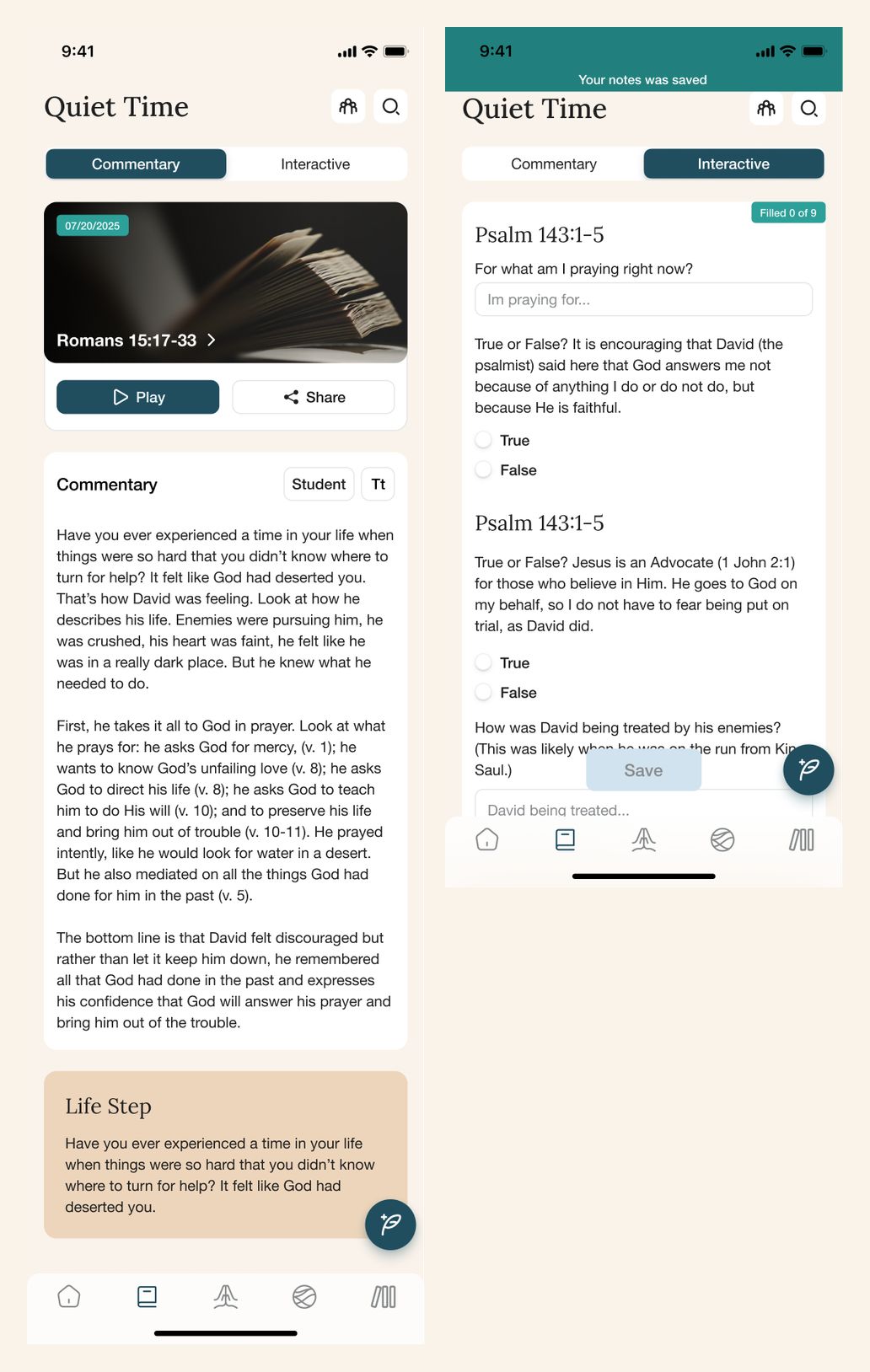
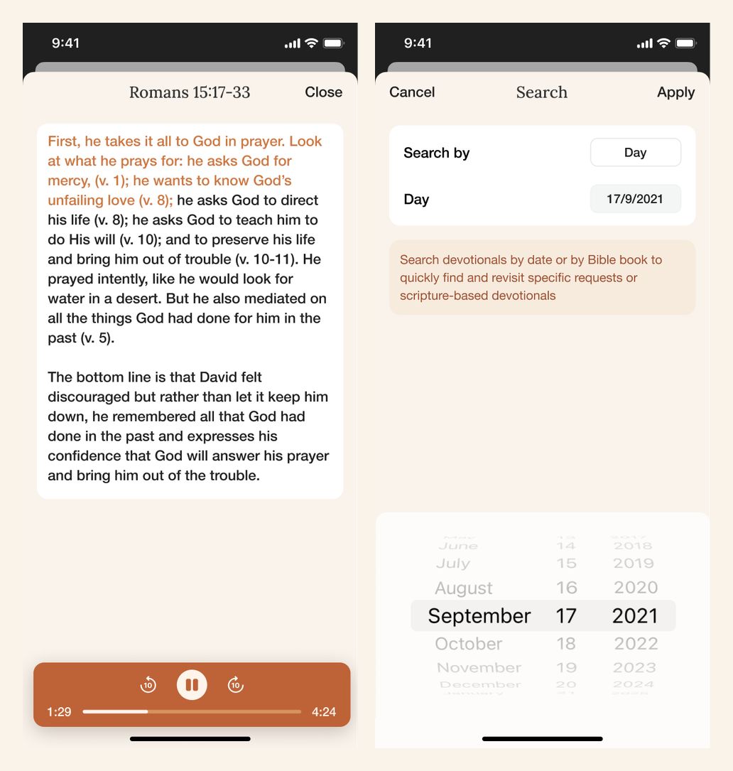
Commentary, audio controls, interactive questions, and journal entries sit within the Quiet Time reading flow. Partner views and progress feedback appear alongside the reading experience without replacing the main text.
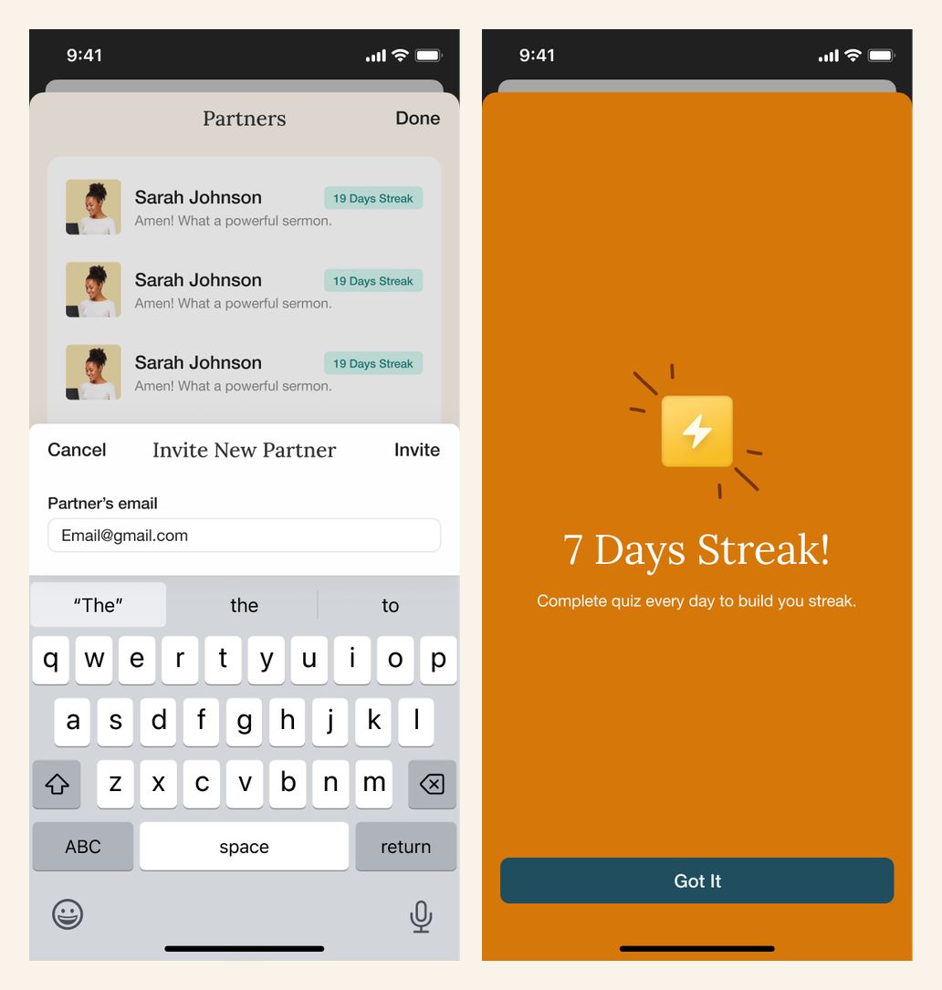
Mobile screens show the reading page, interactive responses, audio playback, partner invitations, a streak celebration, and date-based search.
Keep prayer requests together
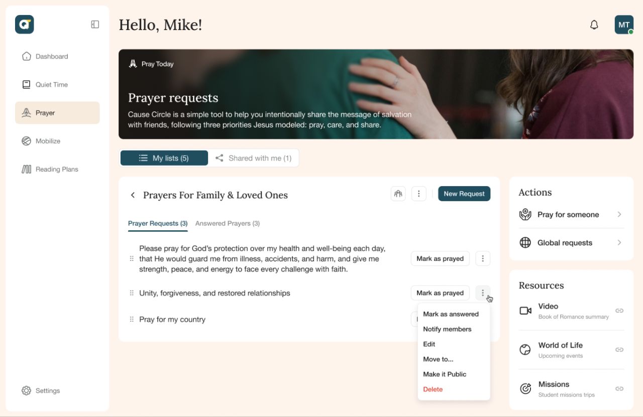
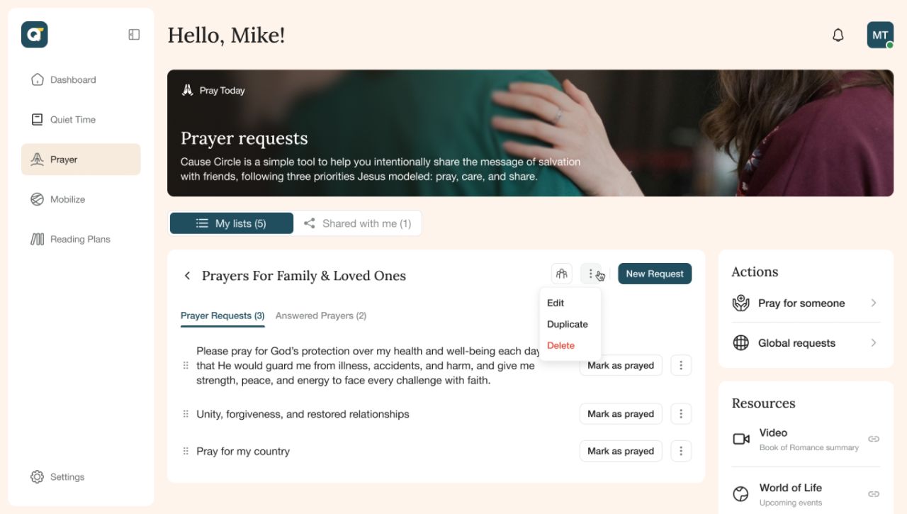
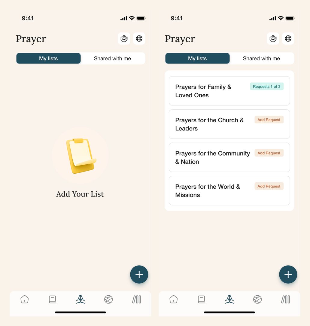
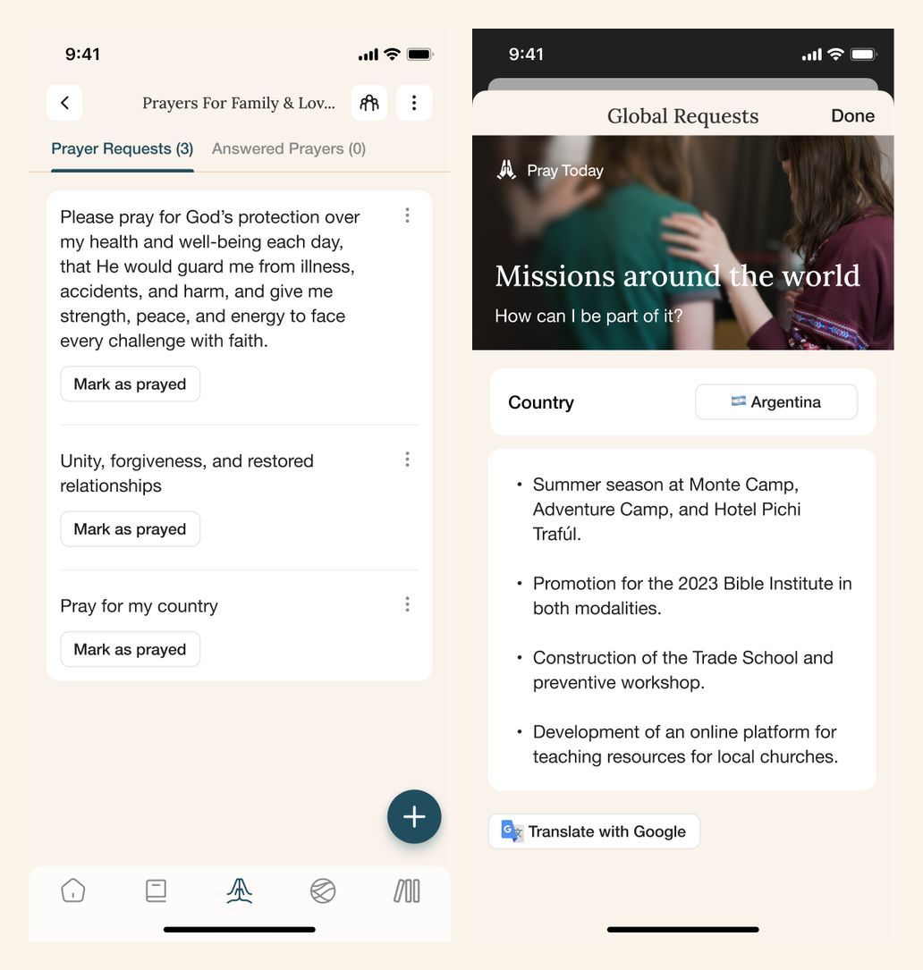
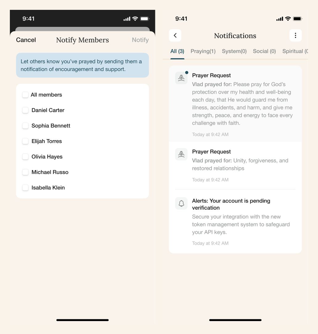
Prayer lists separate personal requests, shared lists, and answered prayers. Contextual actions support marking a request as prayed, while a dedicated view presents global requests.
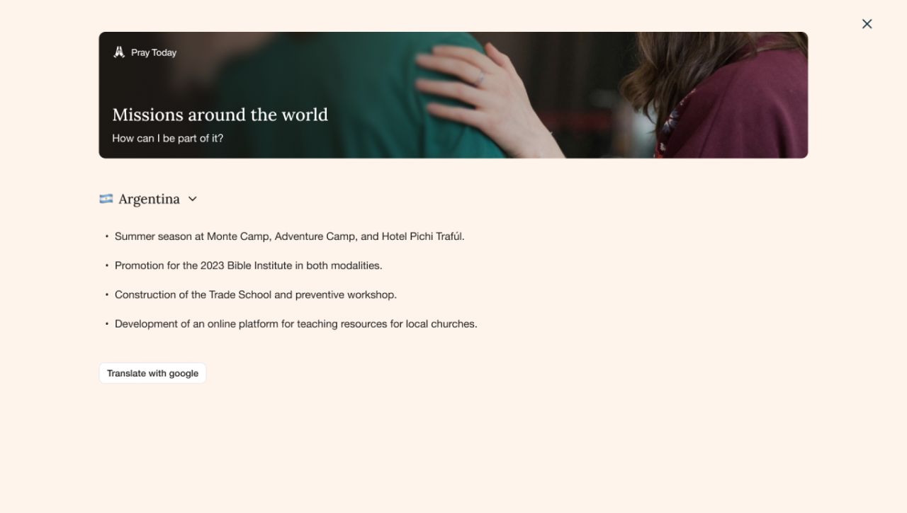
The mobile sequence includes empty and populated lists, request details, global requests, a member-notification sheet, and the notification feed.
Turn reading into reflection
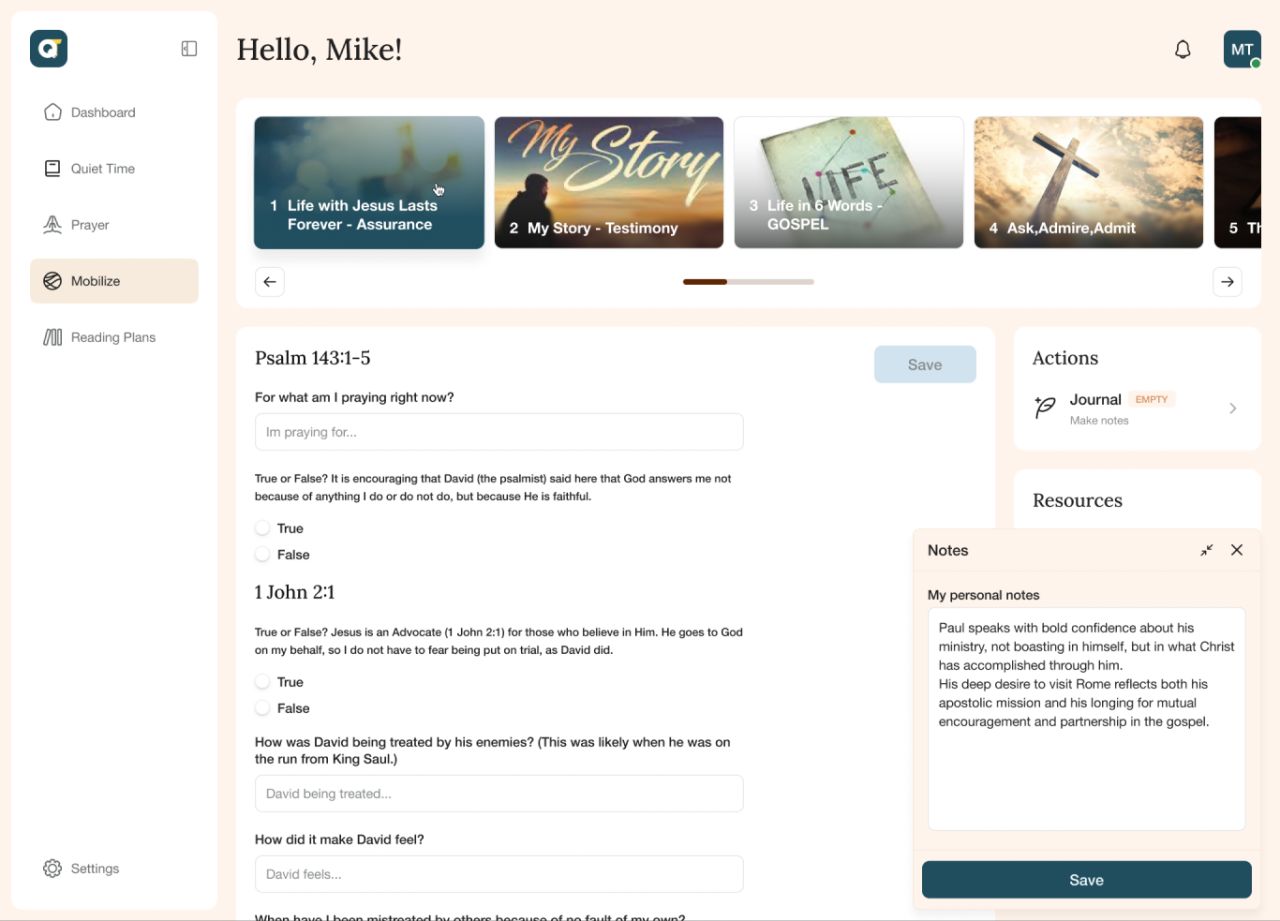
The Mobilize area presents themed material with questions and a space for personal notes. Desktop keeps the material and notes in one workspace; mobile uses focused screens for the topic, responses, and writing.
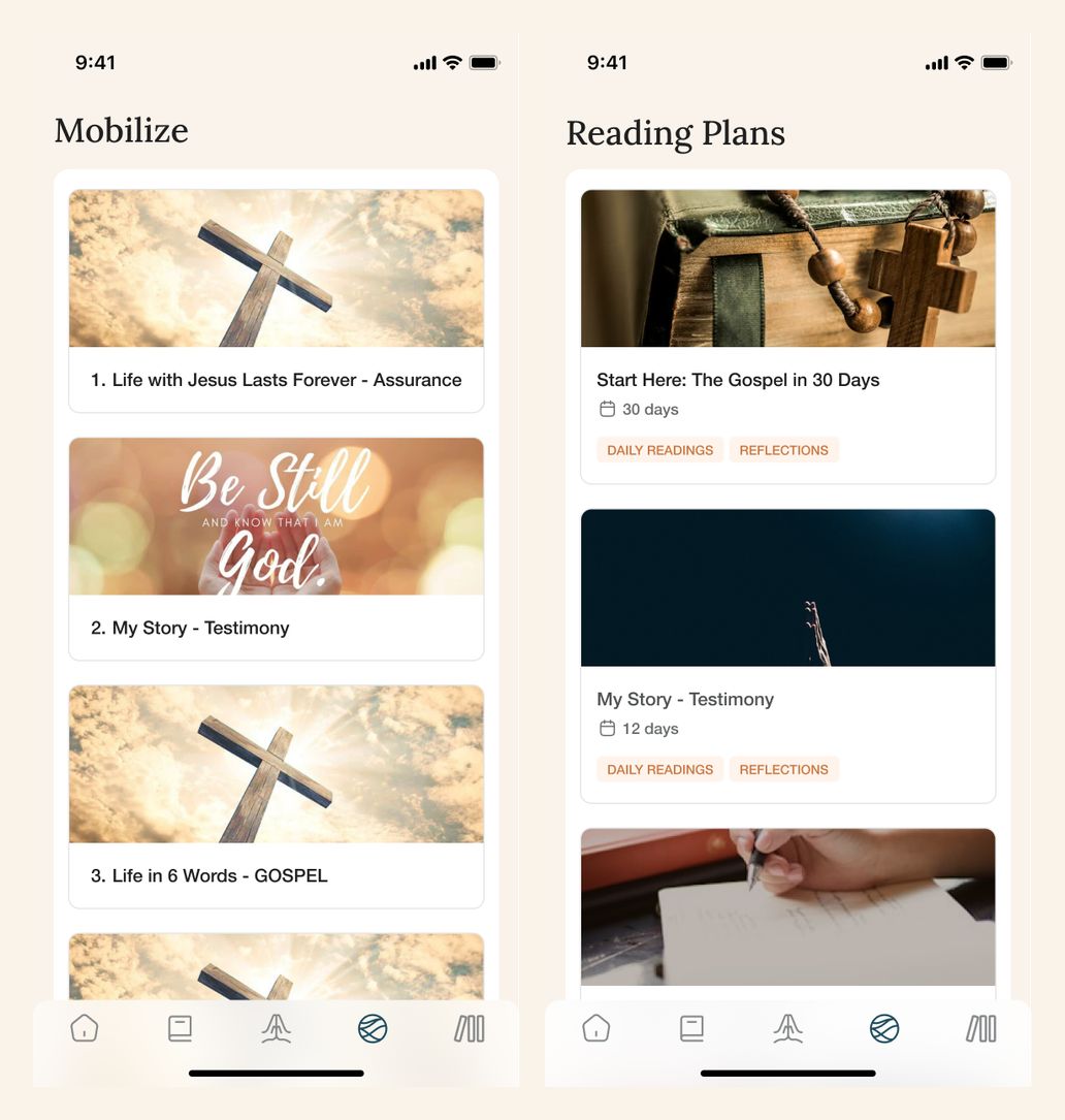
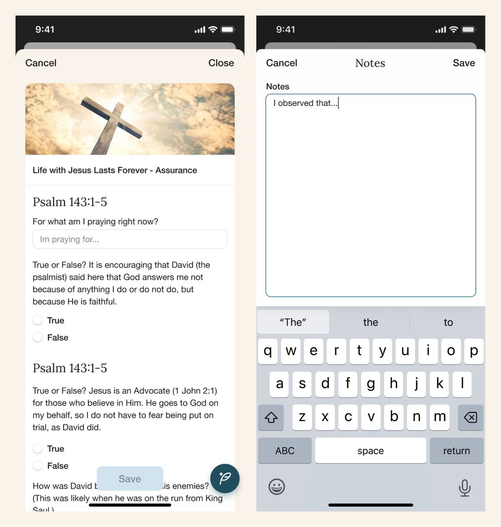
The mobile layouts compare the Mobilize and reading-plan libraries, then show an interactive exercise and its dedicated notes editor.
Follow a reading plan
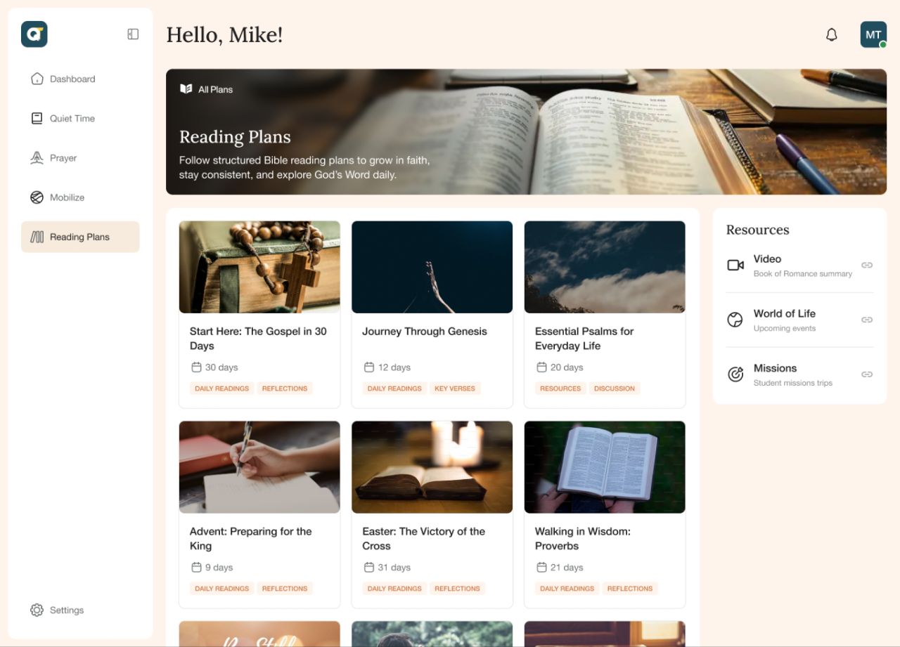
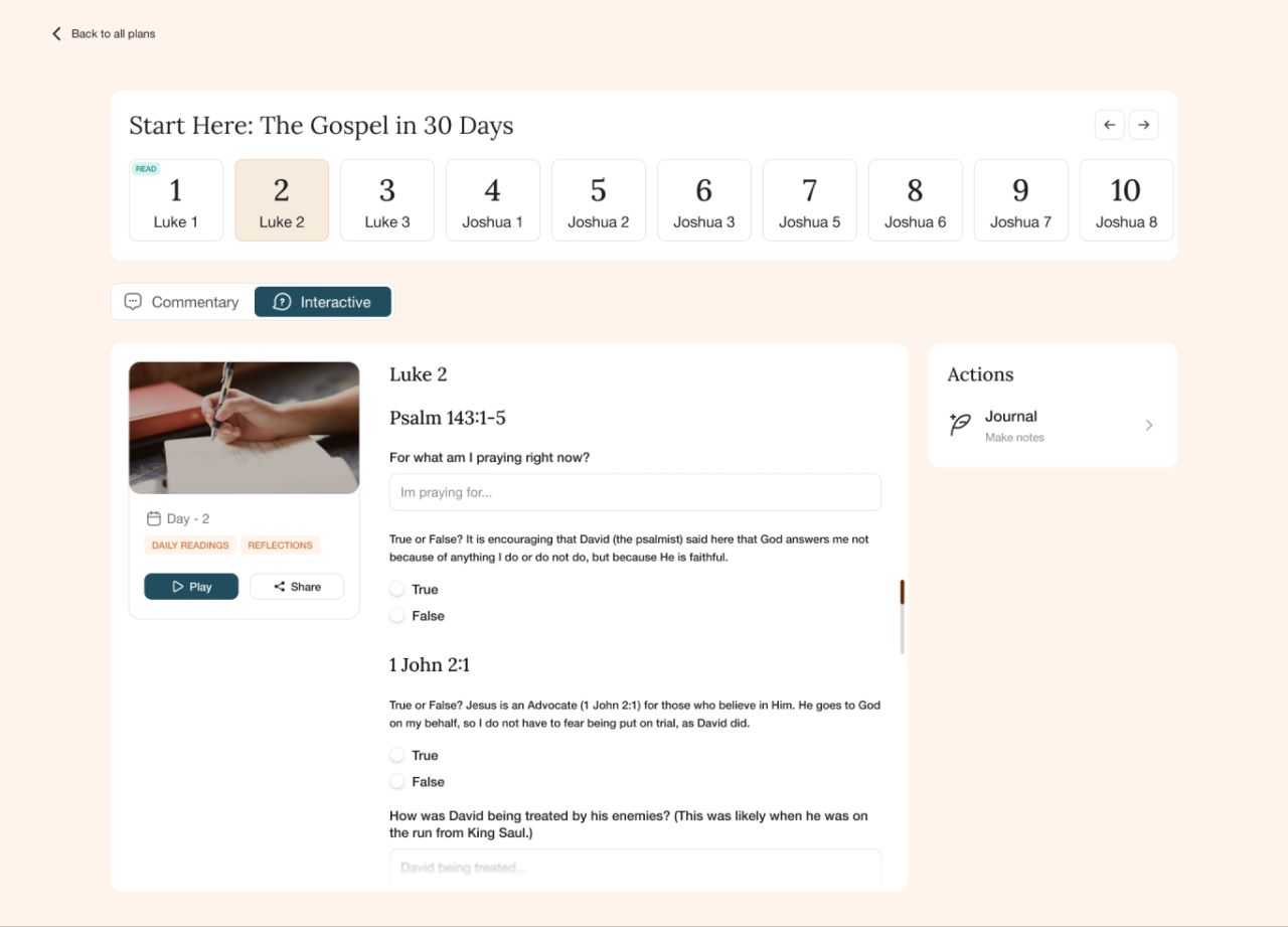
A visual plan library leads into a day-by-day reading experience. The selected plan combines a daily sequence with commentary, interactive content, and playback controls.
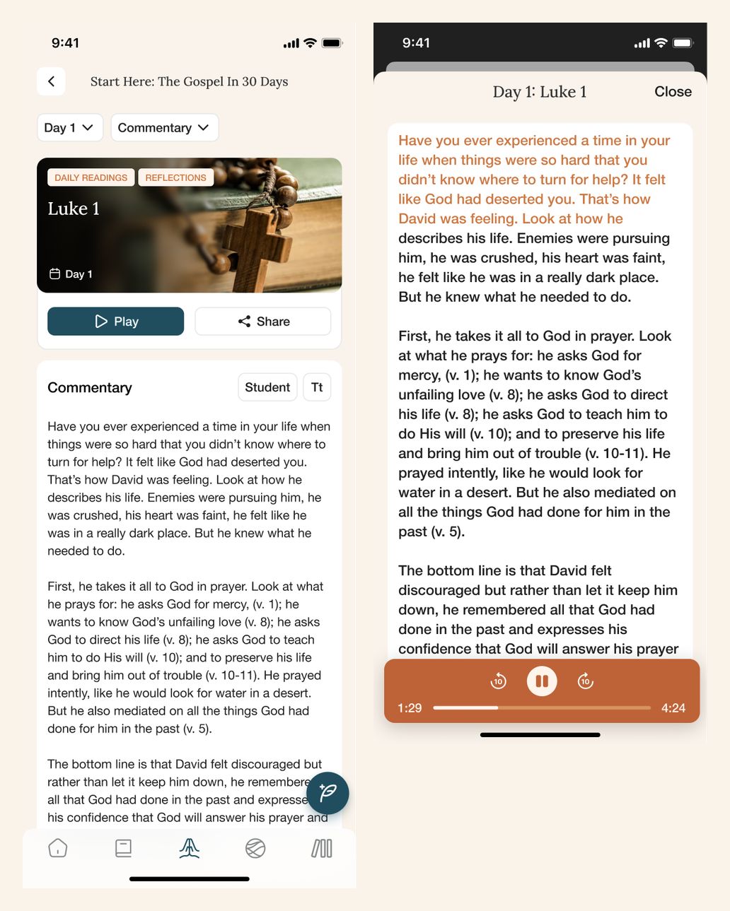
The mobile pair presents a daily reading and its audio view, retaining the full source content. The reading-plan library appears alongside Mobilize in the preceding section.
A consistent account space
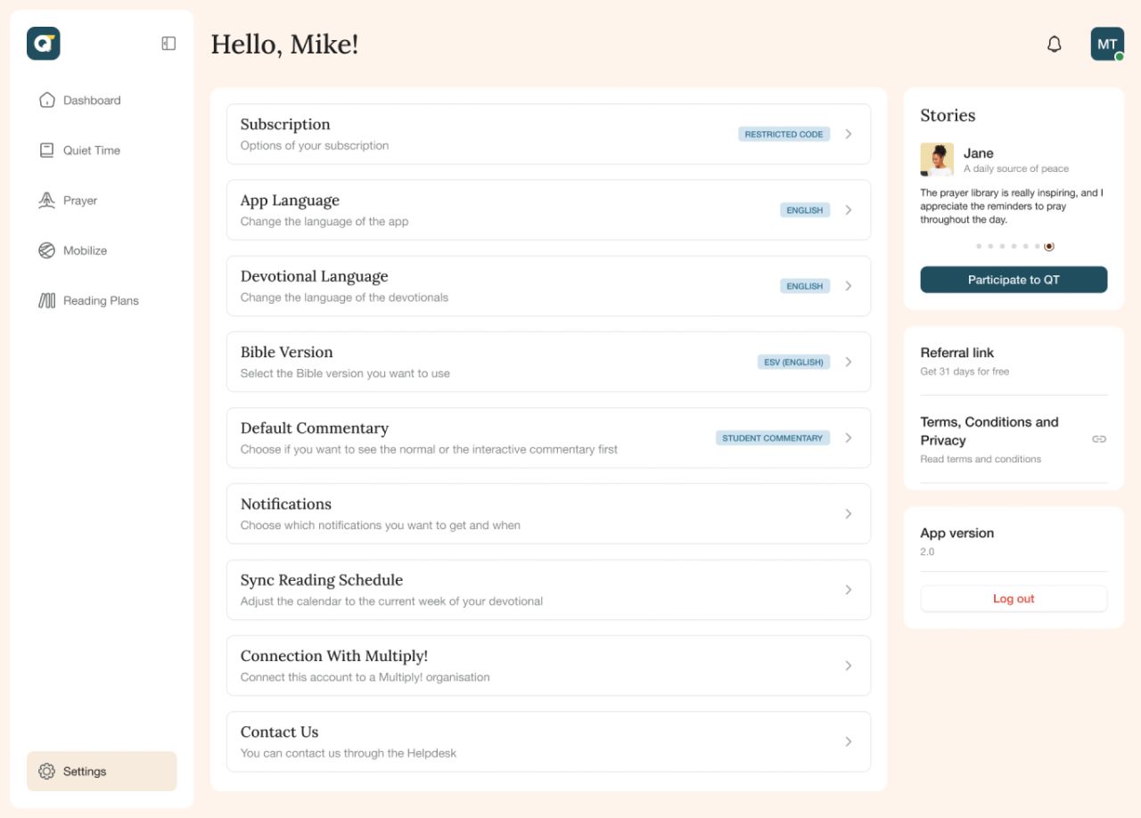
Profile details, subscription and reading preferences, notifications, and account controls are collected in the settings area. Desktop overlays keep these actions connected to the wider application.
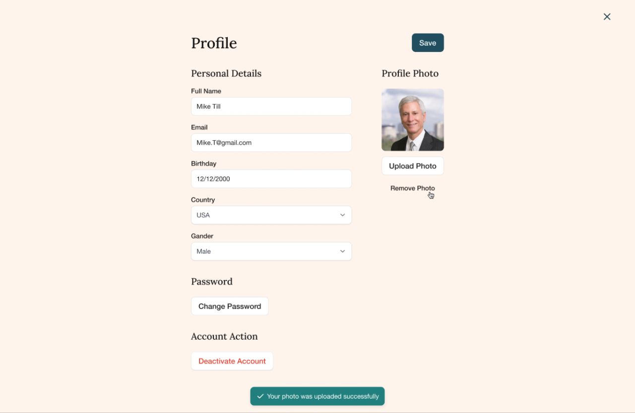
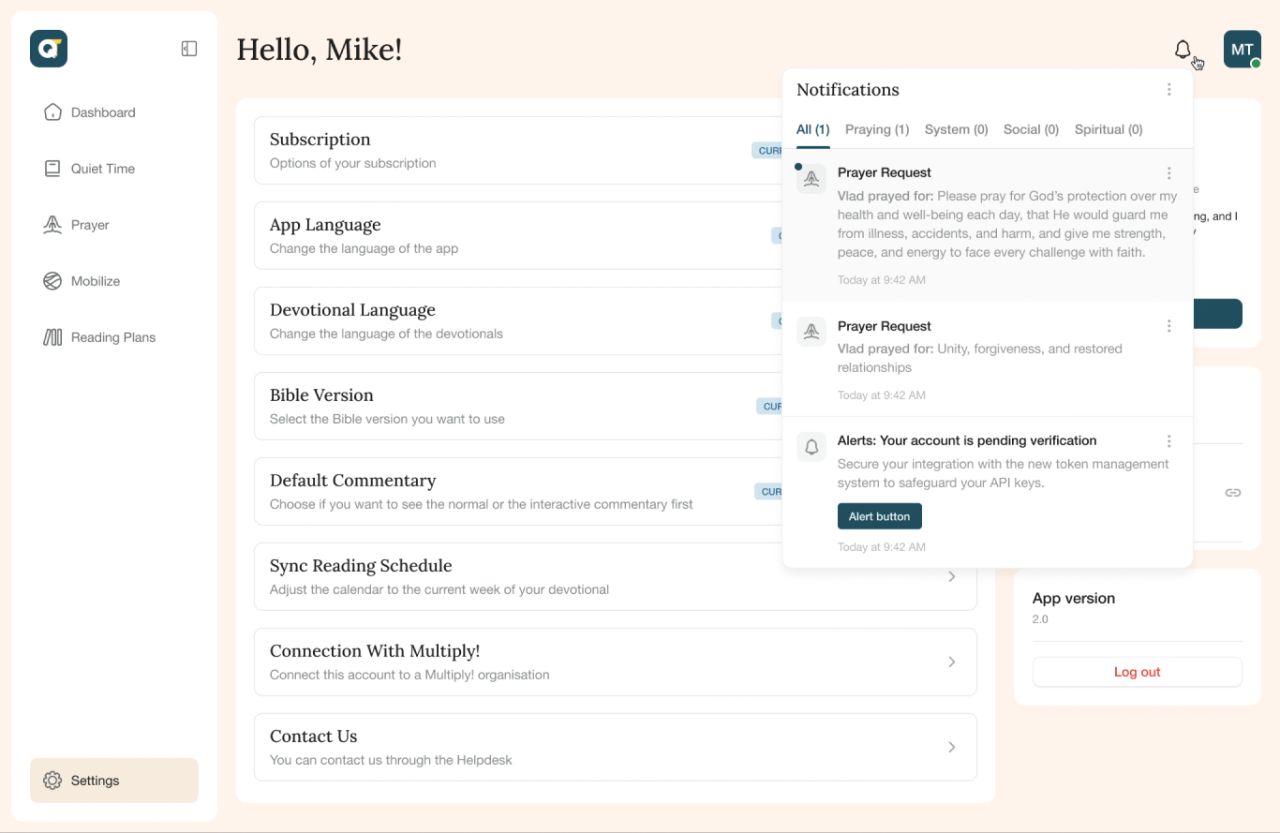
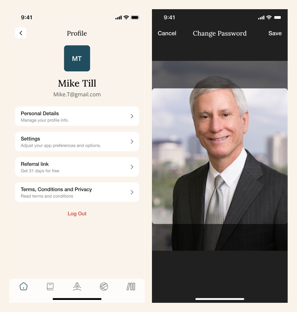
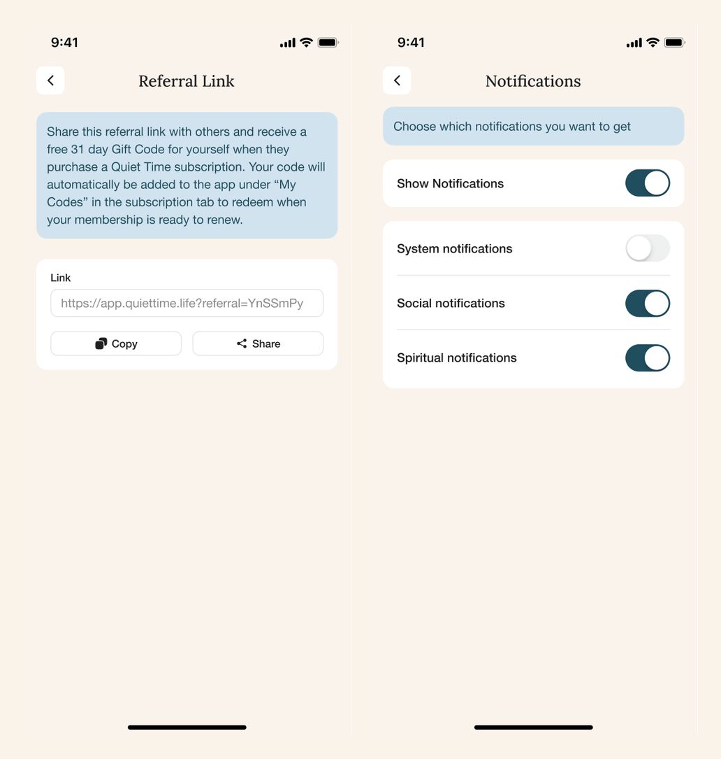
Mobile views cover the profile, referral link, image selection, and notification preferences.
Our approach
A calm visual language
Warm cream backgrounds, teal controls, and serif headings connect the reading, prayer, and account screens.
A clear daily structure
Calendars, checklists, and focused reading views give each activity a distinct place in the interface.
Continuity across screen sizes
Desktop workspaces and mobile sheets share recognizable navigation, content, and interaction patterns.
Visible states and feedback
Empty lists, loading layouts, saved-note feedback, and offline messaging make the different interface states explicit.