Versus Trade
Client and partner trading interfaces, responsive websites and brand identity.
Versus Trade is an asset-versus-asset CFD broker with client and partner products. The design brings together data-rich trading interfaces, responsive websites and a bold visual identity for audiences in Asia and MENA.
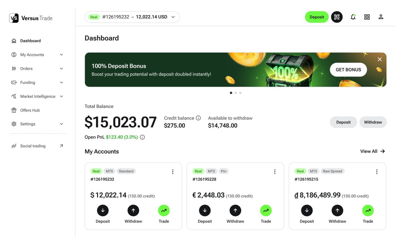
A clear account overview
The client interface brings balances, trading accounts and performance into one dashboard. Light and dark themes carry the same hierarchy into the mobile view.
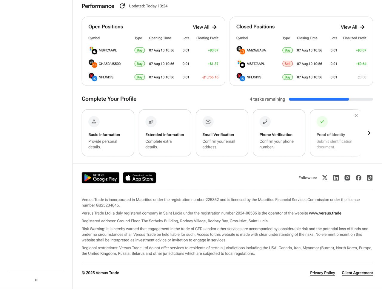
Account overview — performance and profile details, light theme
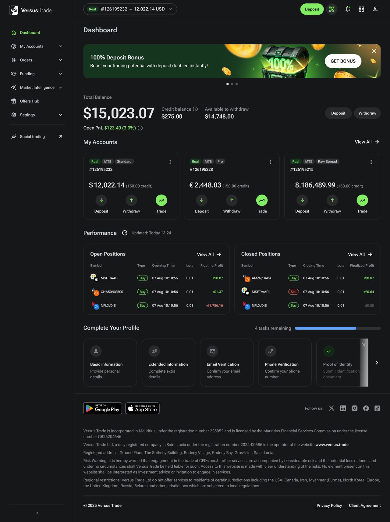
A clear account overview — desktop, dark theme
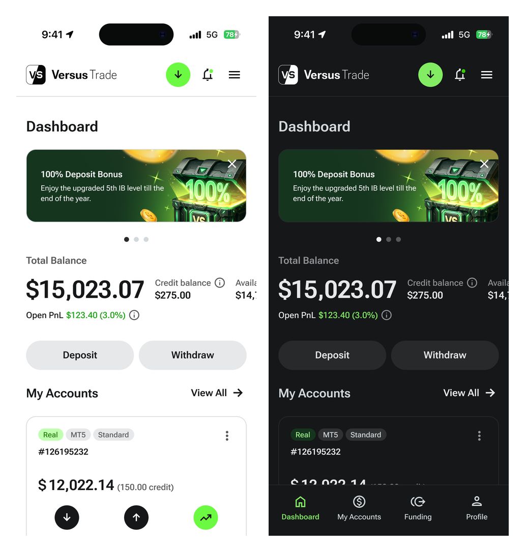
A clear account overview — mobile light and dark themes
Partner dashboard
The partner dashboard uses summary cards and data tables to organise account activity. Matching desktop and mobile layouts preserve the same navigation across light and dark themes.
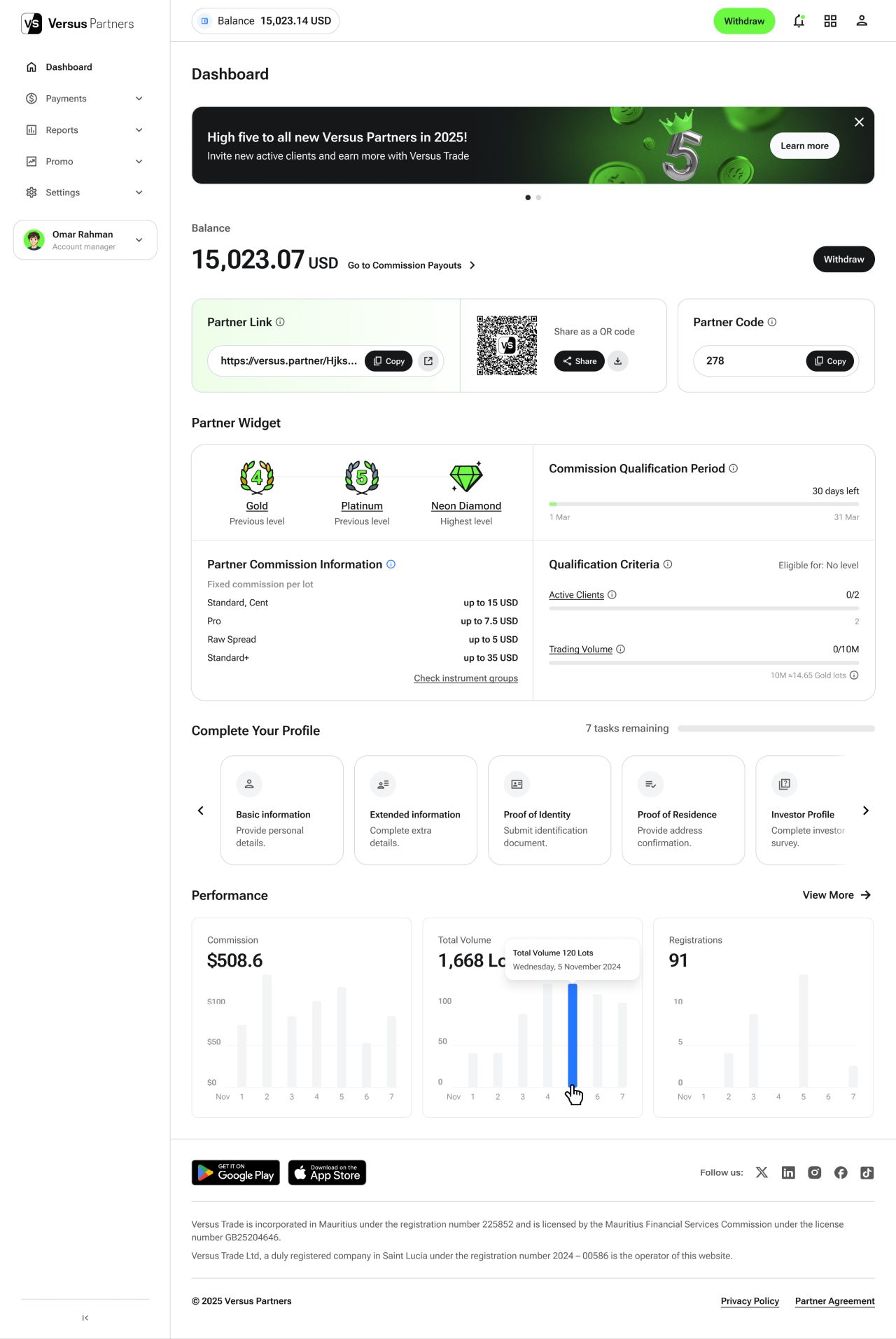
Partner dashboard — desktop, light theme
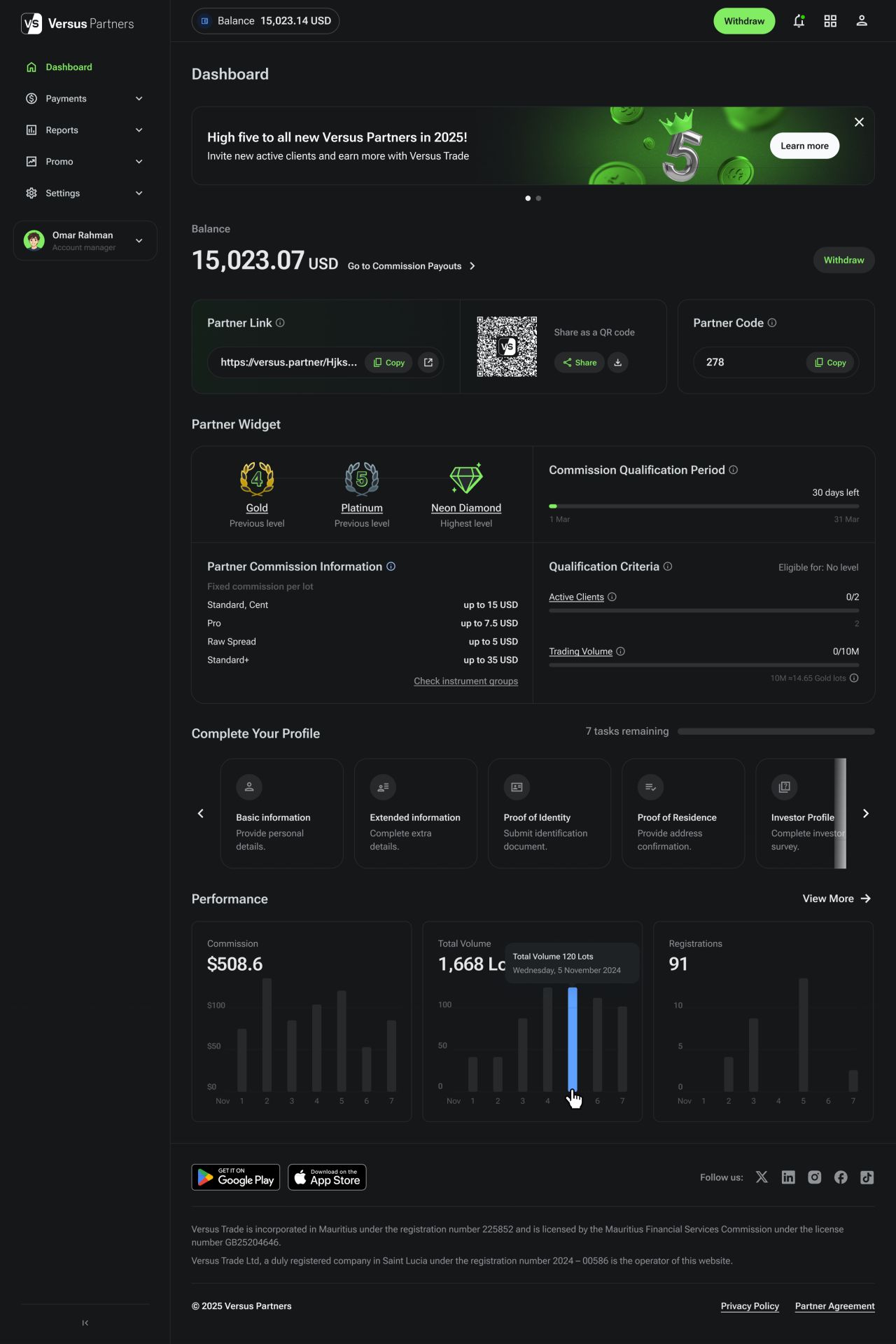
Partner dashboard — desktop, dark theme
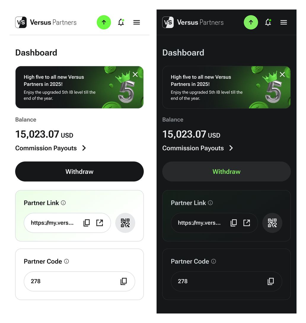
Partner dashboard — mobile light and dark themes
Choosing a deposit method
Deposit options are presented as a focused selection screen. The available methods remain visible across desktop and mobile layouts.
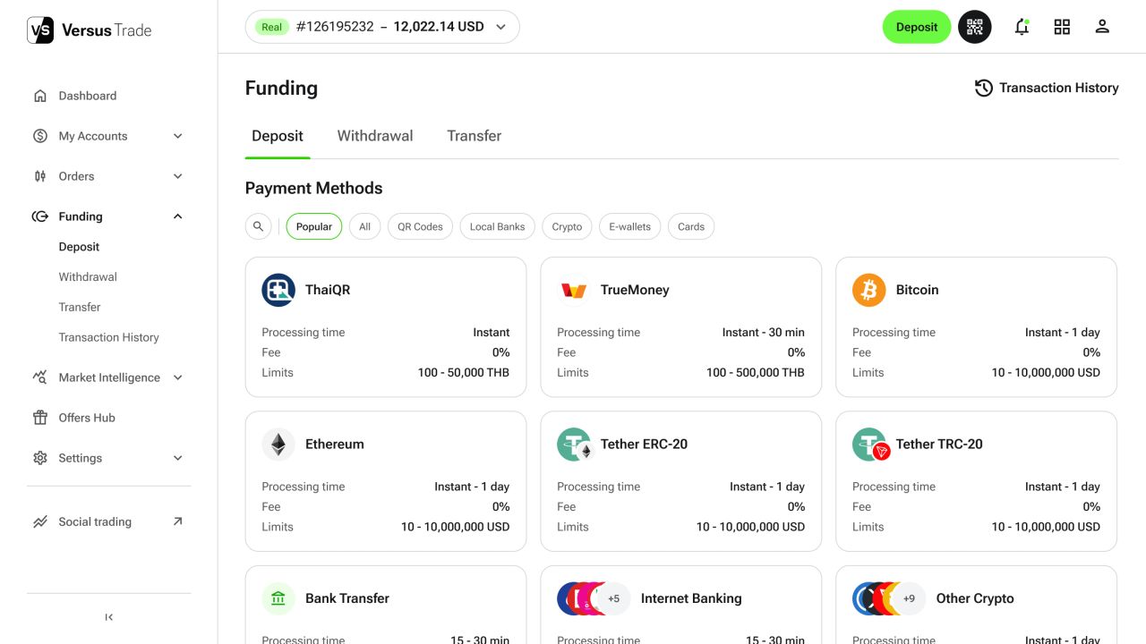
Choosing a deposit method — desktop, light theme
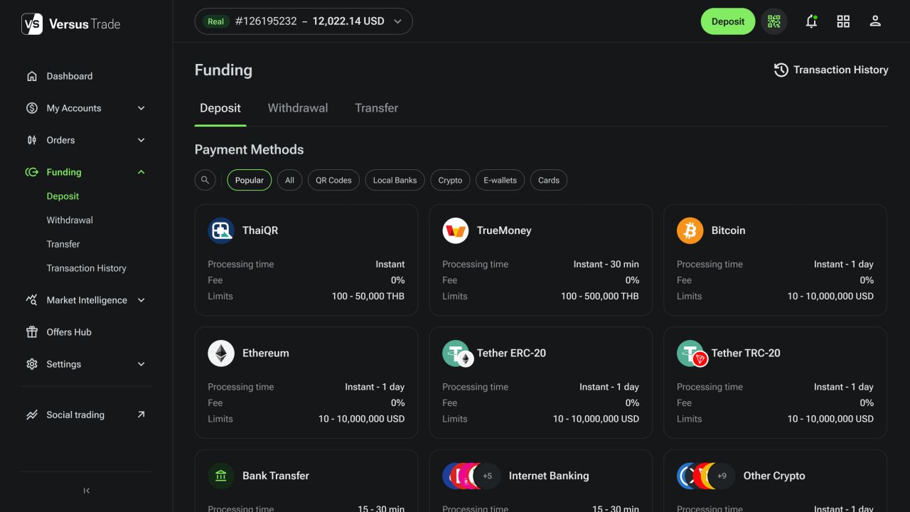
Choosing a deposit method — desktop, dark theme
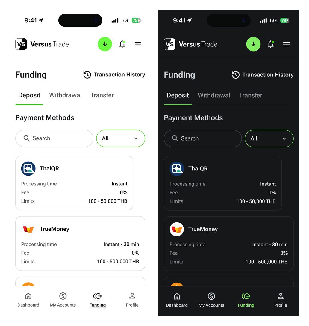
Choosing a deposit method — mobile light and dark themes
Account commission
Commission views organise account information into a compact table with filtering controls. The mobile versions adapt the same content to a narrow viewport.
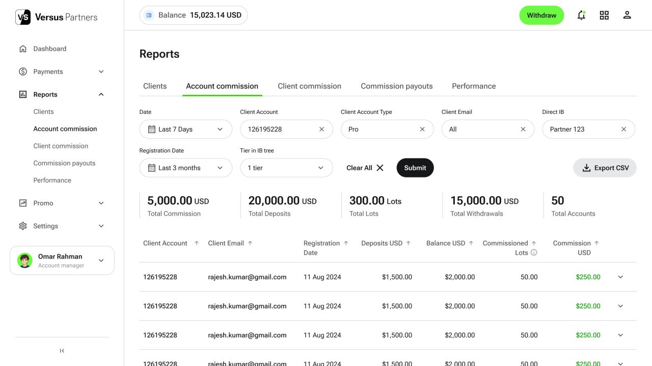
Account commission — desktop, light theme
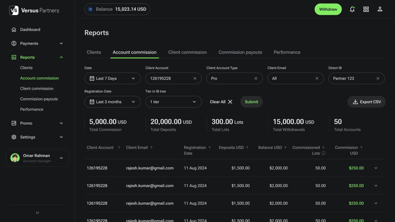
Account commission — desktop, dark theme
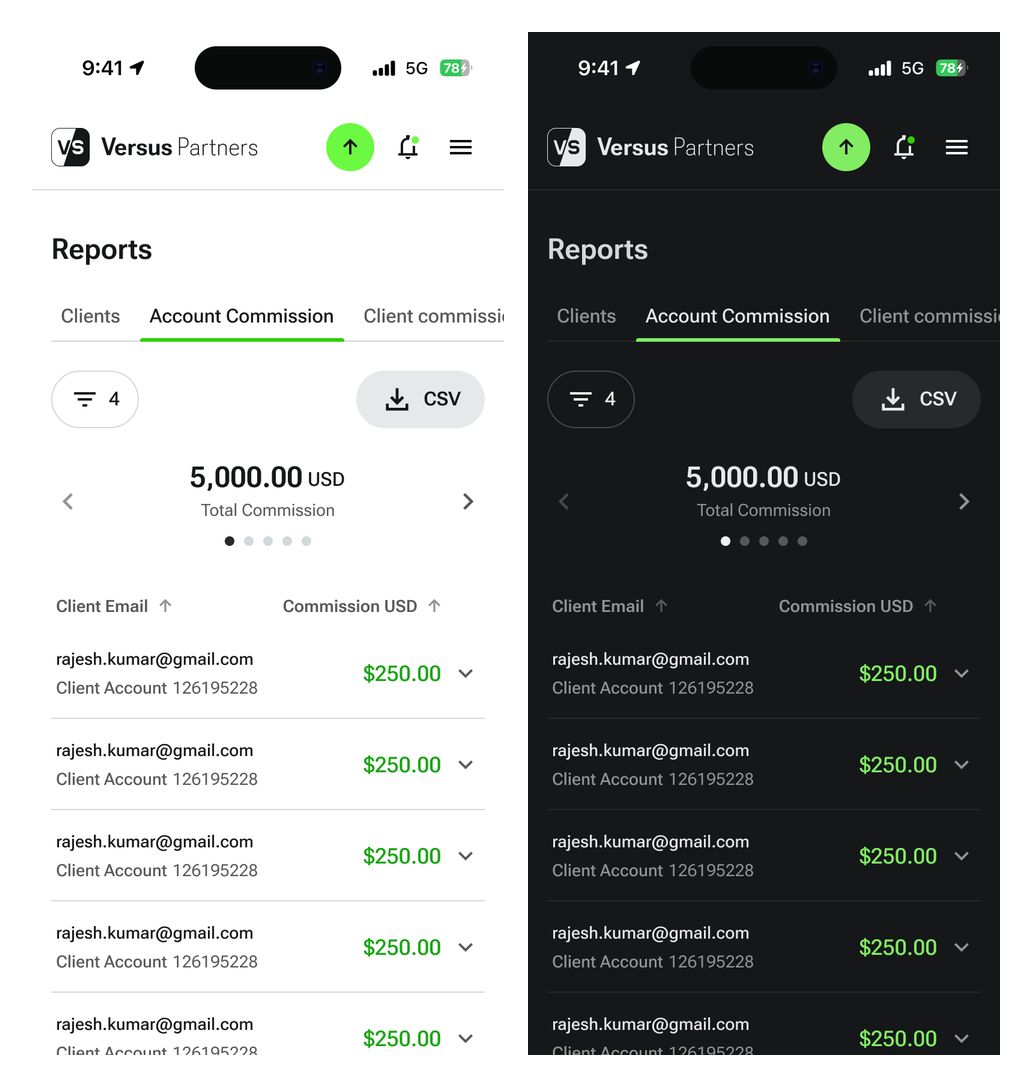
Account commission — mobile light and dark themes
A local-bank deposit flow
The filled deposit form keeps the transfer amount and bank details together. Desktop and mobile states use a consistent hierarchy for reviewing the entered information.
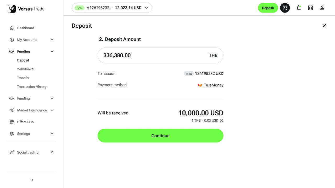
A local-bank deposit flow — desktop, light theme
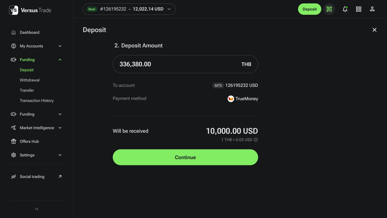
A local-bank deposit flow — desktop, dark theme
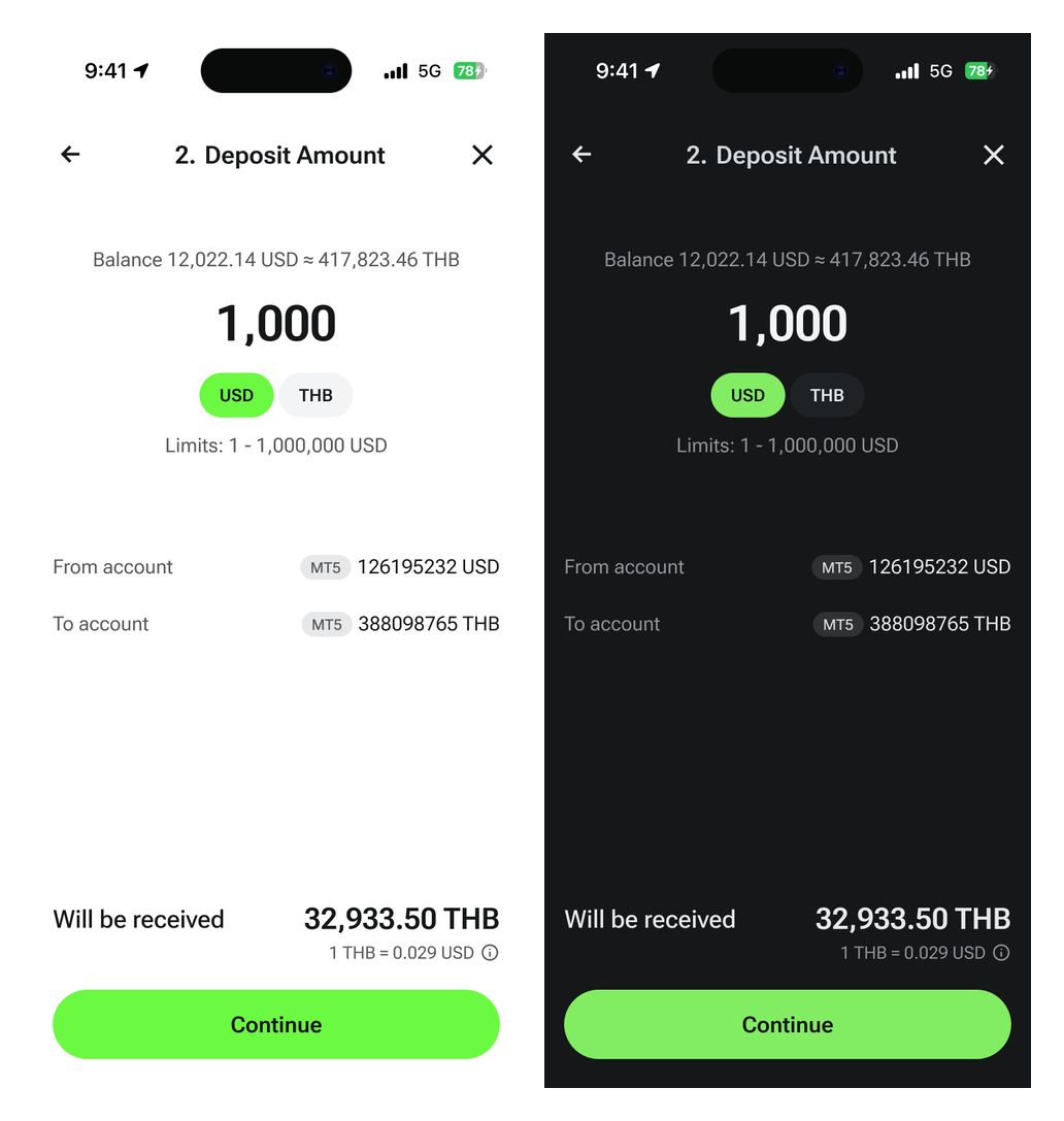
A local-bank deposit flow — mobile light and dark themes
Trading accounts and open orders
Account detail screens bring open-order information into a structured workspace. The mobile layouts show the corresponding account-management views in both themes.
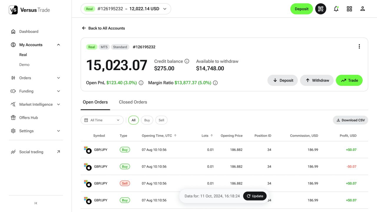
Trading accounts and open orders — desktop, light theme
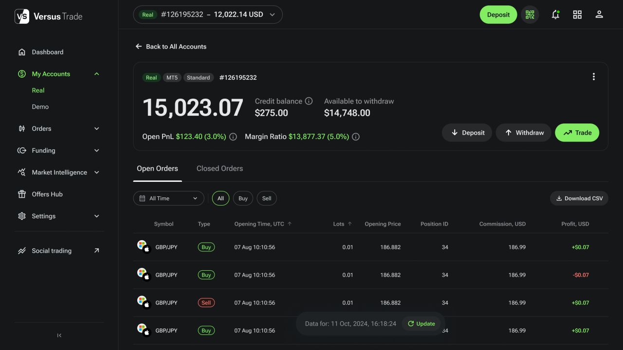
Trading accounts and open orders — desktop, dark theme
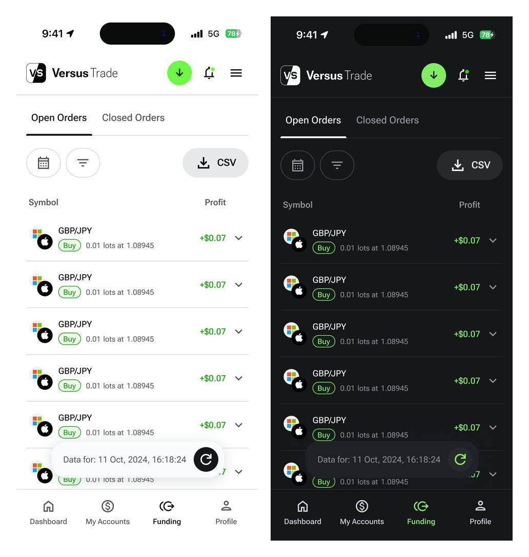
Trading accounts and open orders — mobile light and dark themes
Responsive client and partner websites
The websites explain versus trading and introduce the client and partner offers. Their layouts combine product information, market content and clear registration paths.

Client website — complete desktop page

Partner website — complete desktop page
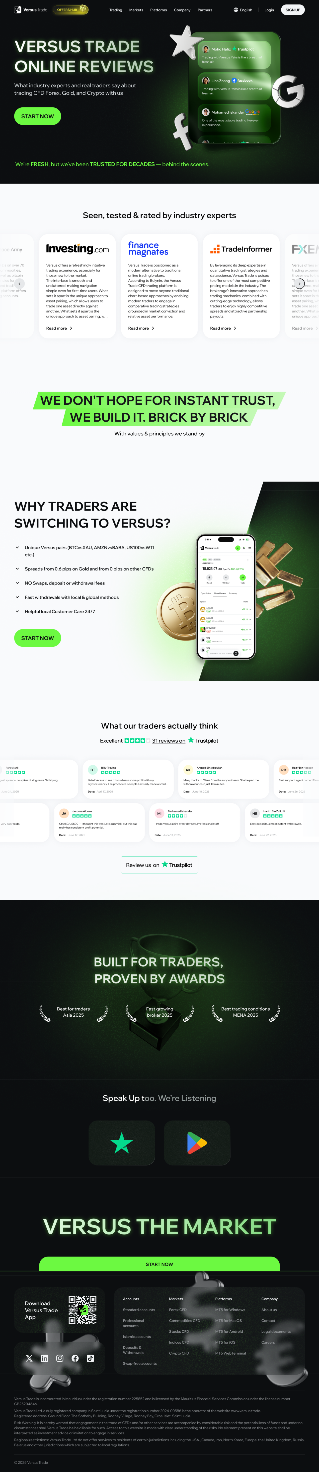
Reviews page — complete desktop page
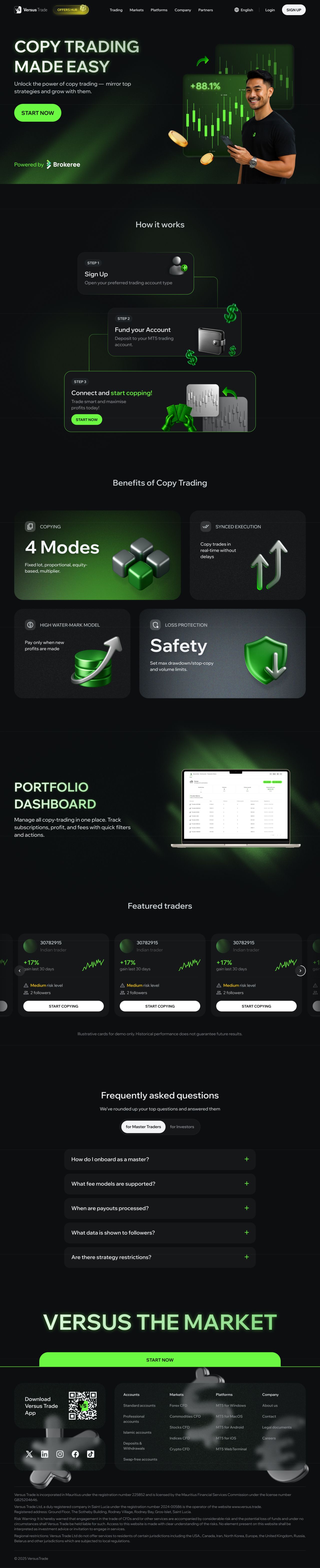
Copy trading page — complete desktop page
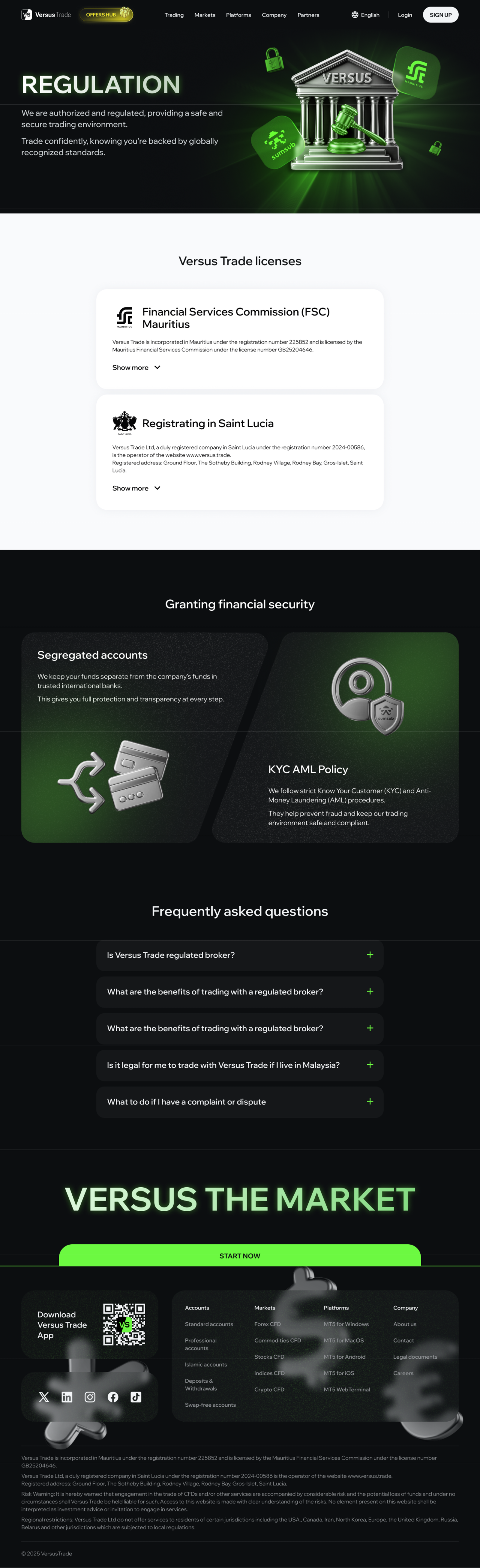
Regulation page — complete desktop page
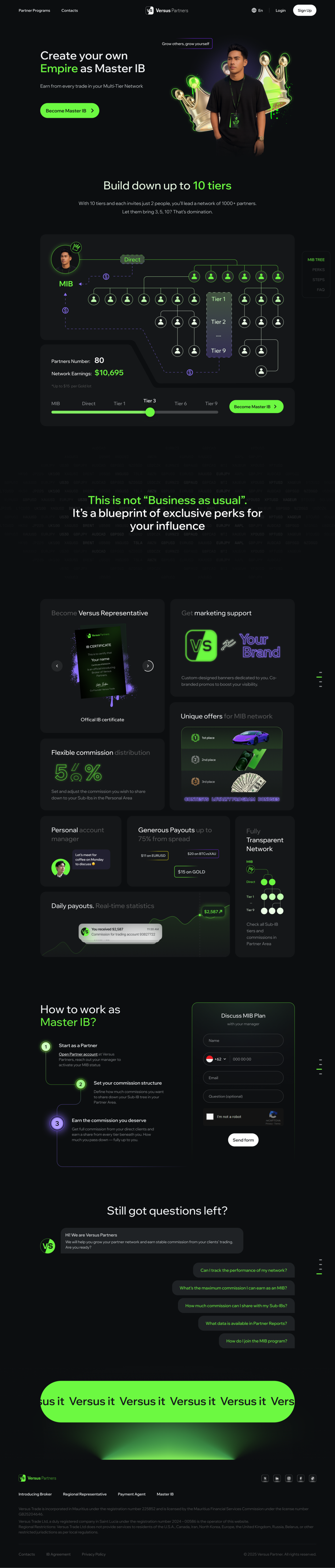
Master introducing broker page — complete desktop page
The websites on mobile
The mobile layouts carry the same information into a narrow format, with each complete page shown alongside related pages.

Client, partner and reviews pages — complete mobile layouts

Copy trading, regulation and master introducing broker pages — complete mobile layouts
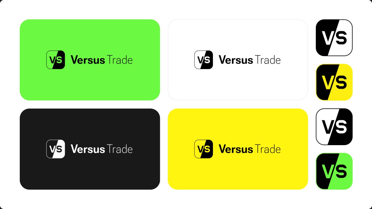
Logo forms and proportions
Horizontal lockups, compact marks and minimum-size rules establish a consistent set of logo forms.
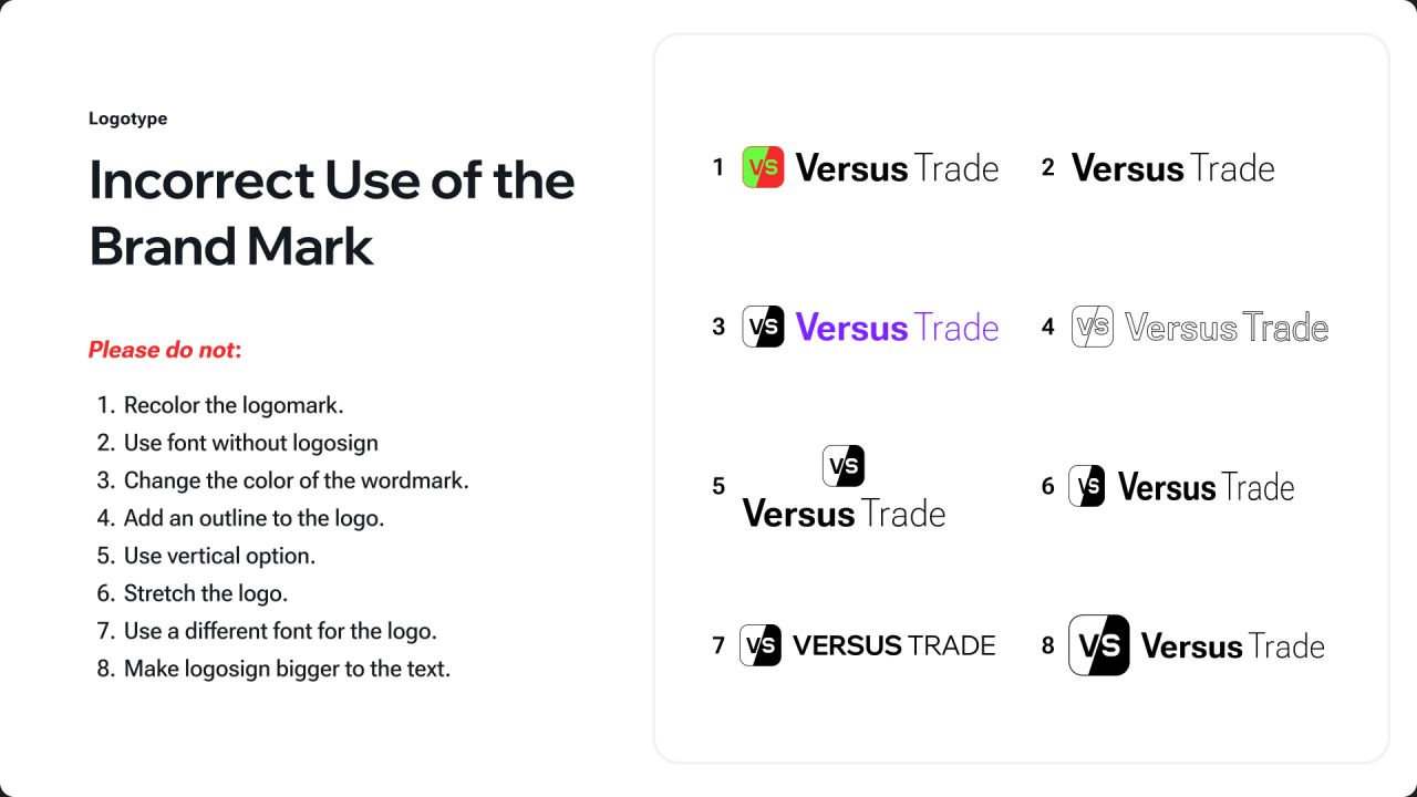
Keeping the mark consistent
Colour combinations, clear space and examples of incorrect use define how the logo is applied.
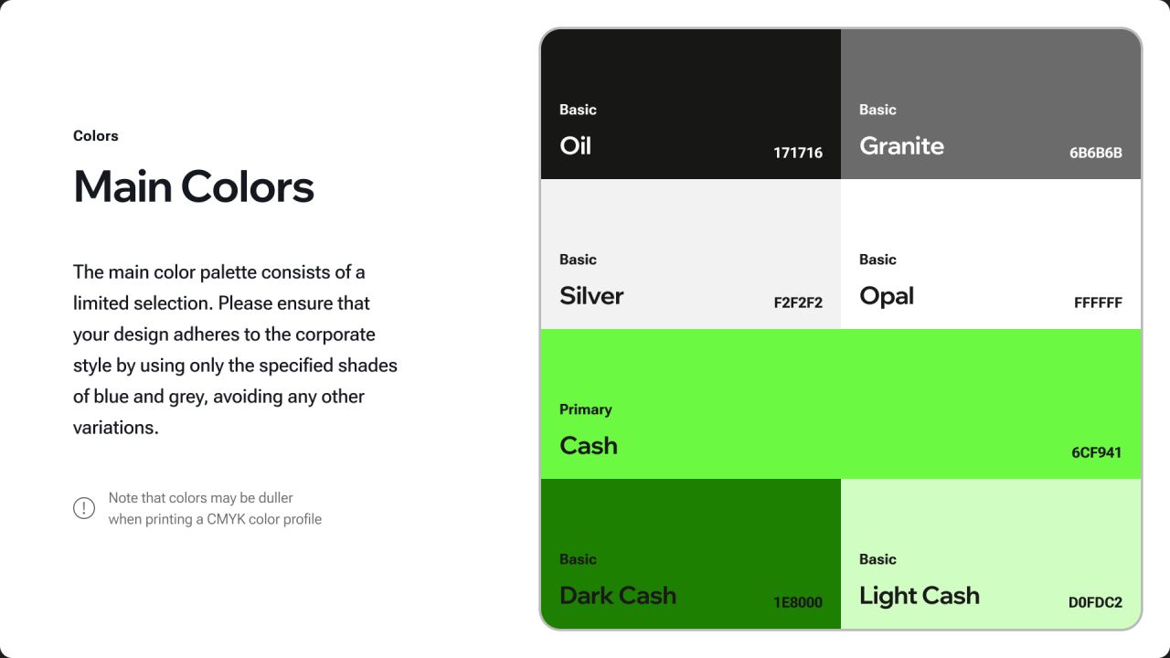
A contrasting colour palette
Neon green, dark neutrals and supporting colours create contrast across the identity.
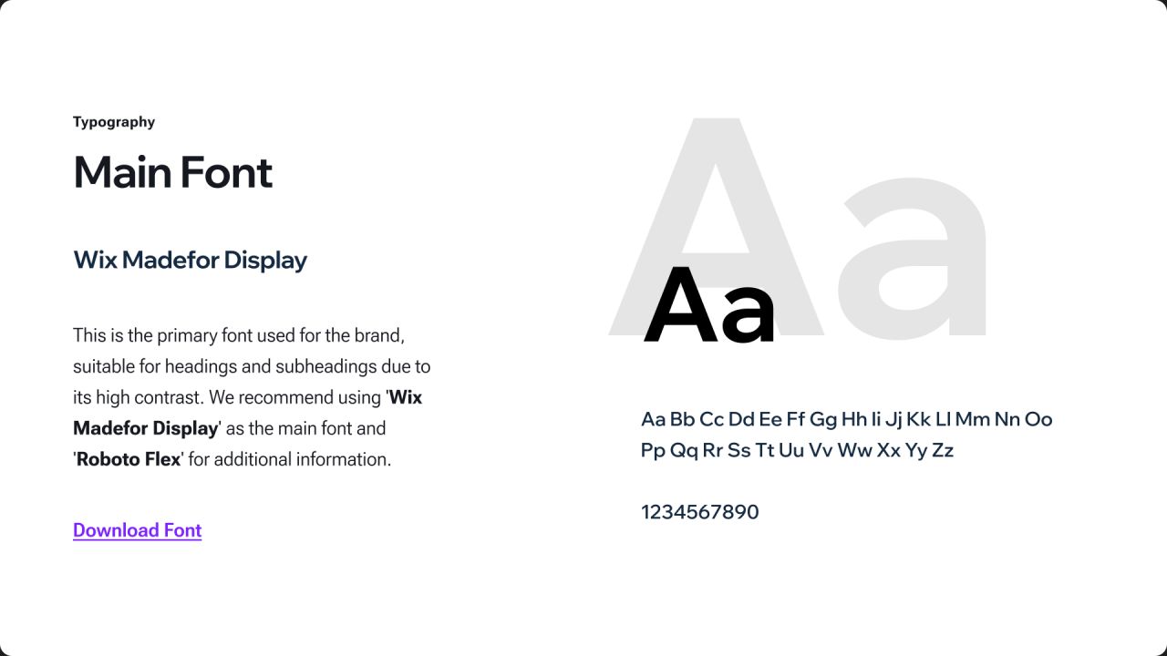
Typography across the identity
Wix Madefor Display and Roboto Flex are documented alongside examples of the type system in use.
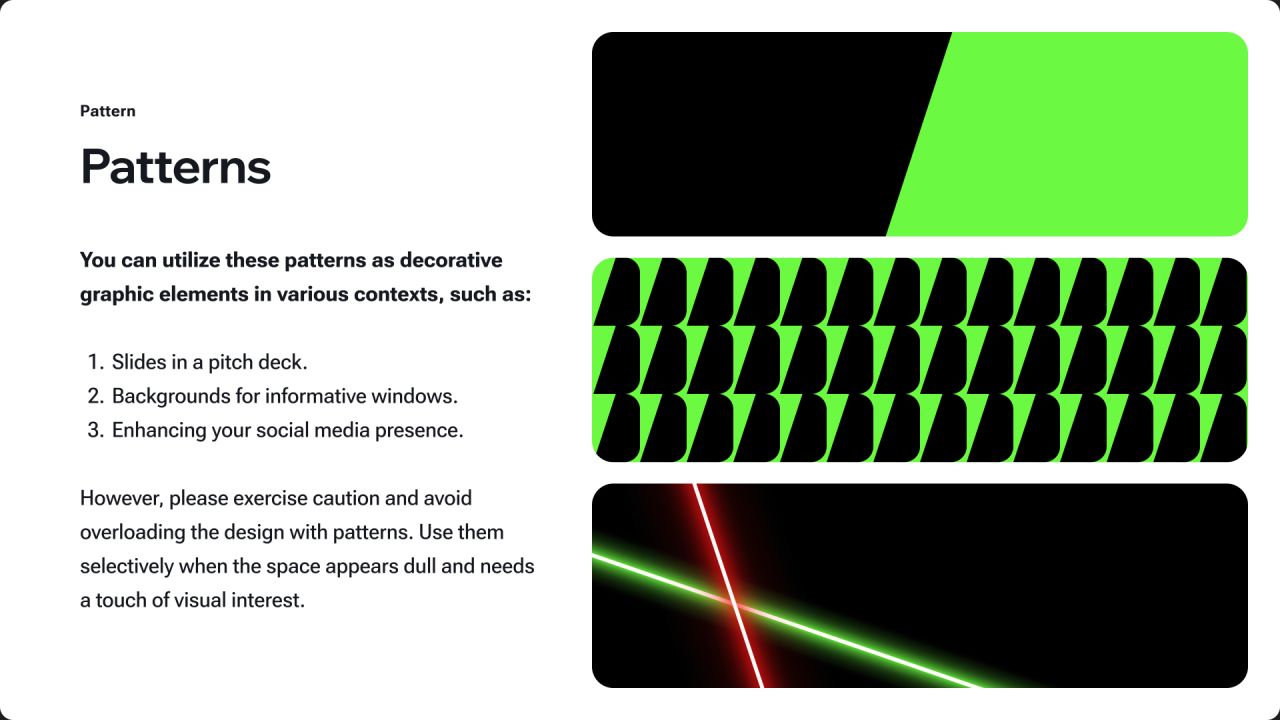
Graphic patterns
Repeating forms, triangular motifs and laser-like graphics extend the identity beyond the logo.
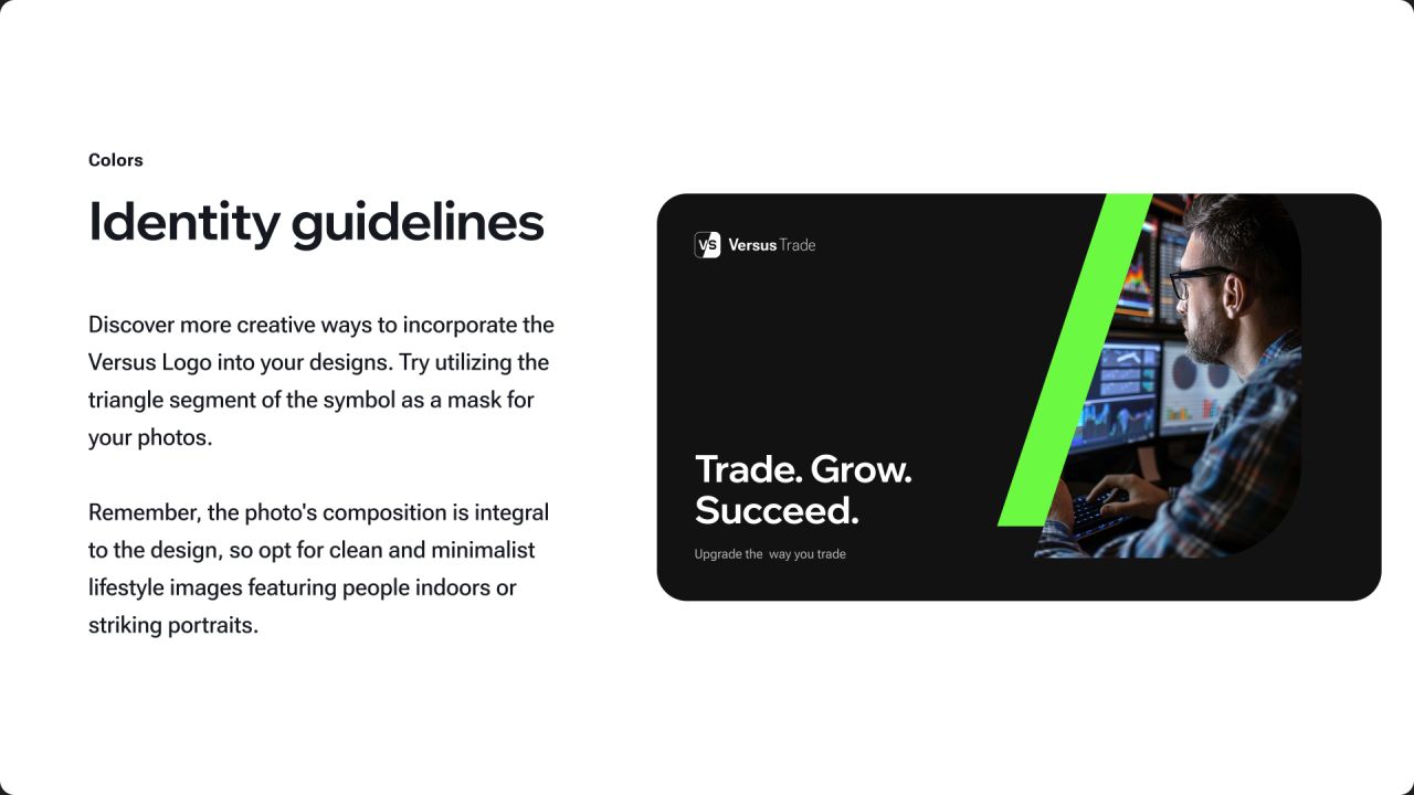
The identity in context
Website, presentation and outdoor mockups show the logo, typography and graphic elements working together.
Our approach
Product structure
Client and partner journeys organise data-rich views and account actions across desktop and mobile.
Responsive communication
Website page architecture and messaging explain the offer through responsive layouts tied to the brand.
A consistent visual system
Logo variations, colour, typography and graphic applications connect the product interfaces and marketing pages.