Zeebu
A non-custodial wallet and responsive staking experience for Zeebu.
Zeebu’s designs bring a decentralized B2B settlement platform to desktop and mobile. The case combines responsive staking dashboards with a non-custodial wallet MVP, covering onboarding, asset management, rewards and distinct interface states.
Getting into the wallet
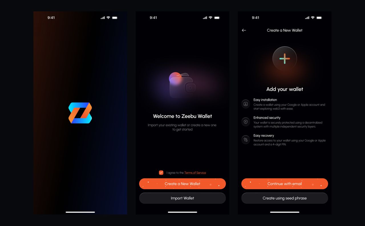
Zeebu’s mobile wallet introduces account creation and returning access through a focused onboarding flow. Password, email-provider and username screens keep each decision on its own screen.
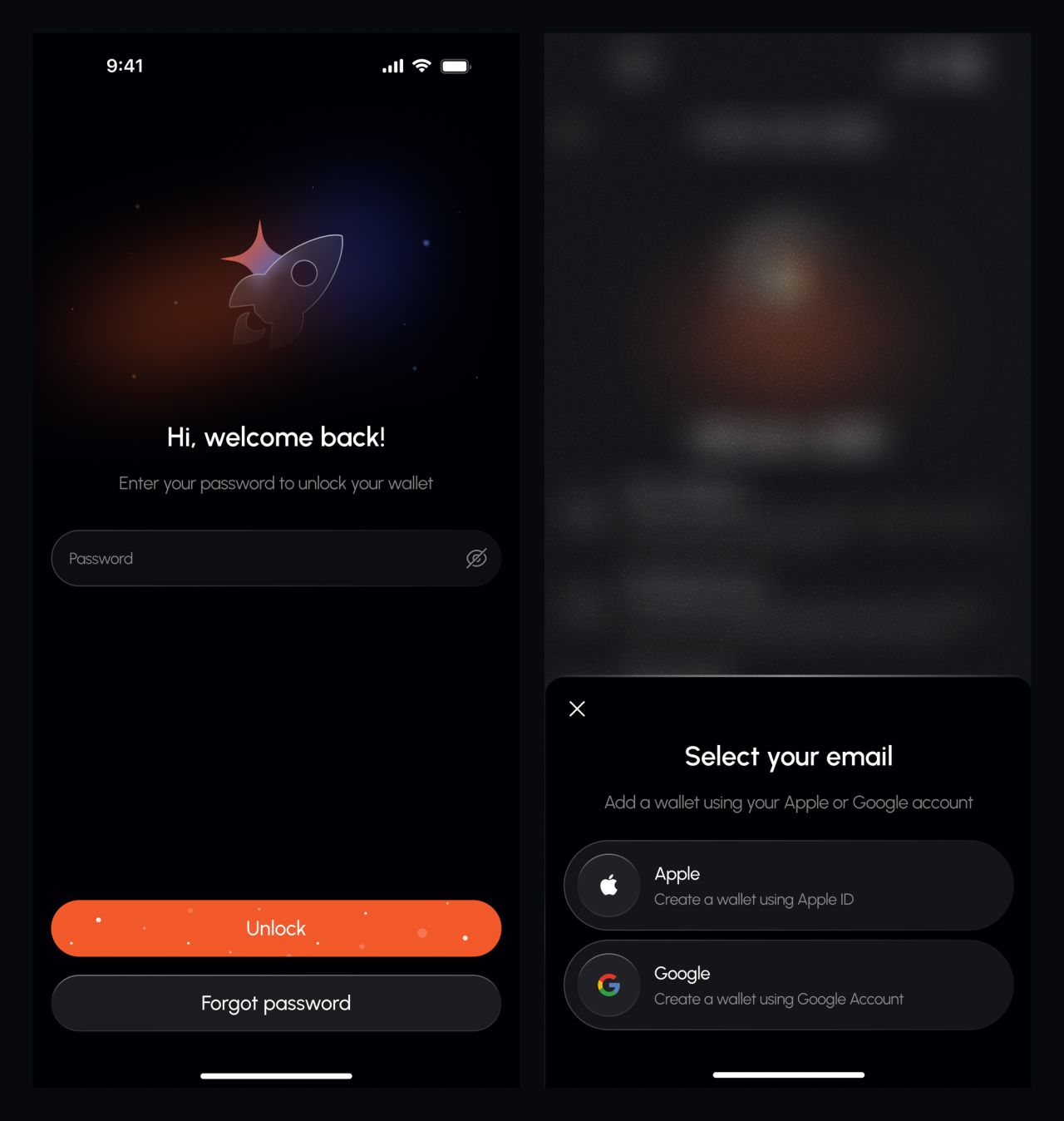
Returning access and email-provider selection
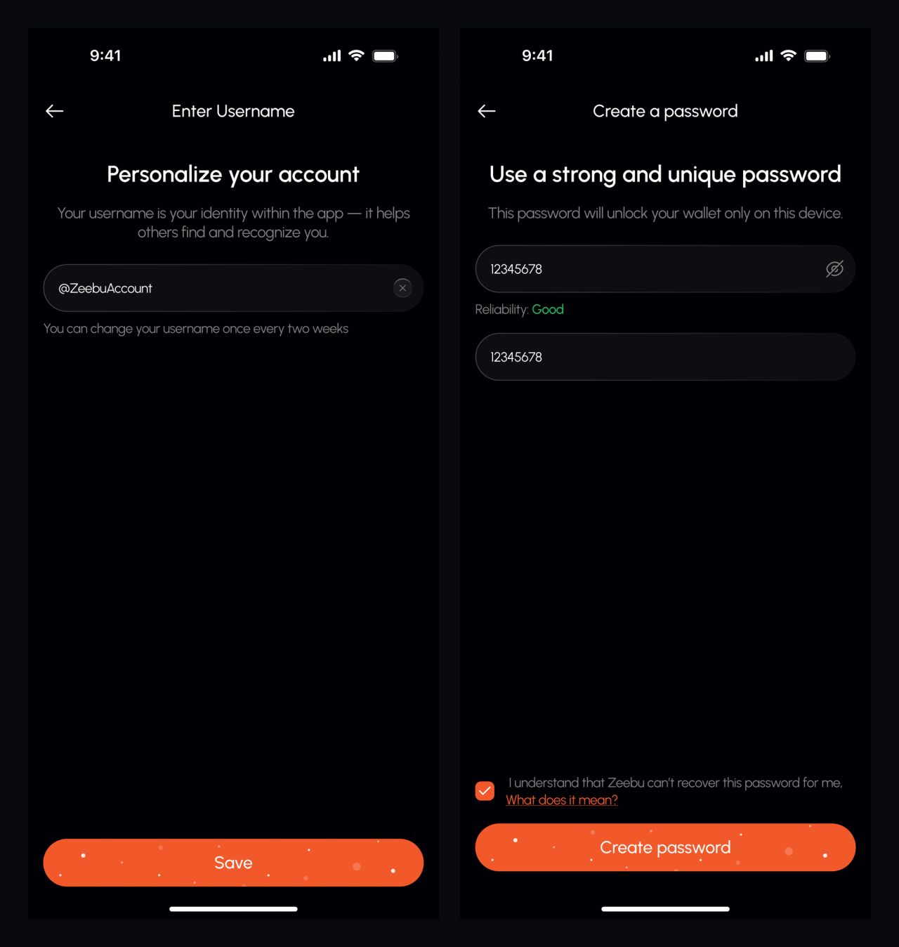
Username and password setup
Security, one step at a time
Biometric setup and a completion state finish the initial setup. Recovery screens place a warning before the phrase itself, with clear actions for revealing and saving it.
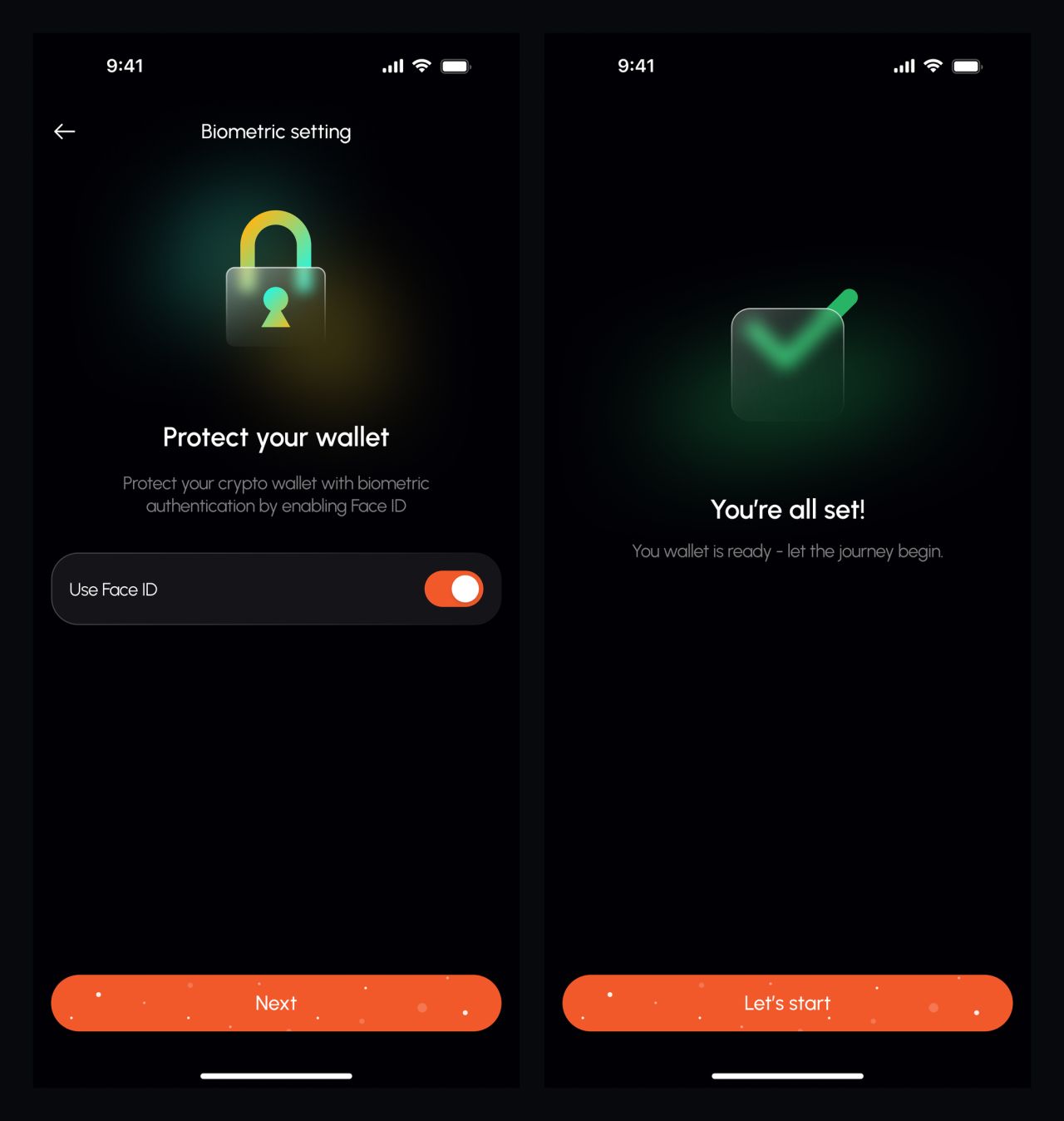
Biometric setup and wallet-ready confirmation
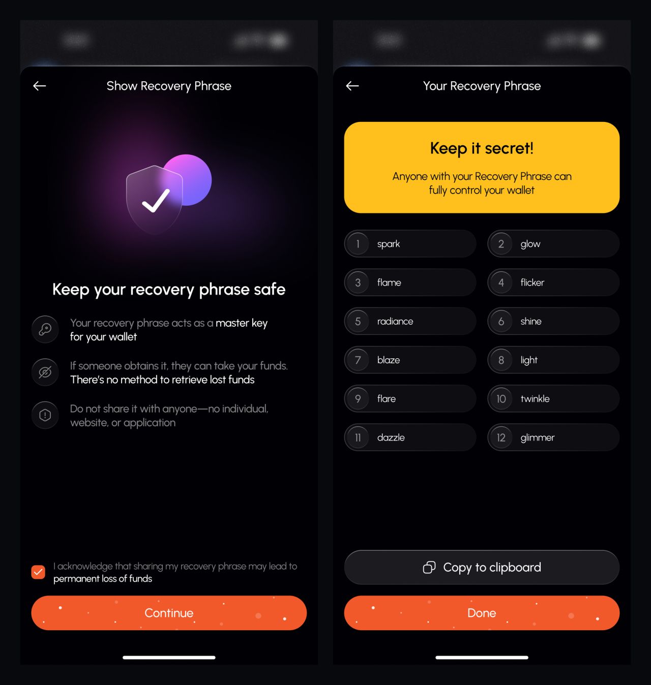
Recovery warning and phrase display
A clear home for assets
The home screen brings balances and token activity together. Receiving addresses and preferences use the same compact navigation, while collectible screens separate browsing, detail and transfer confirmation.
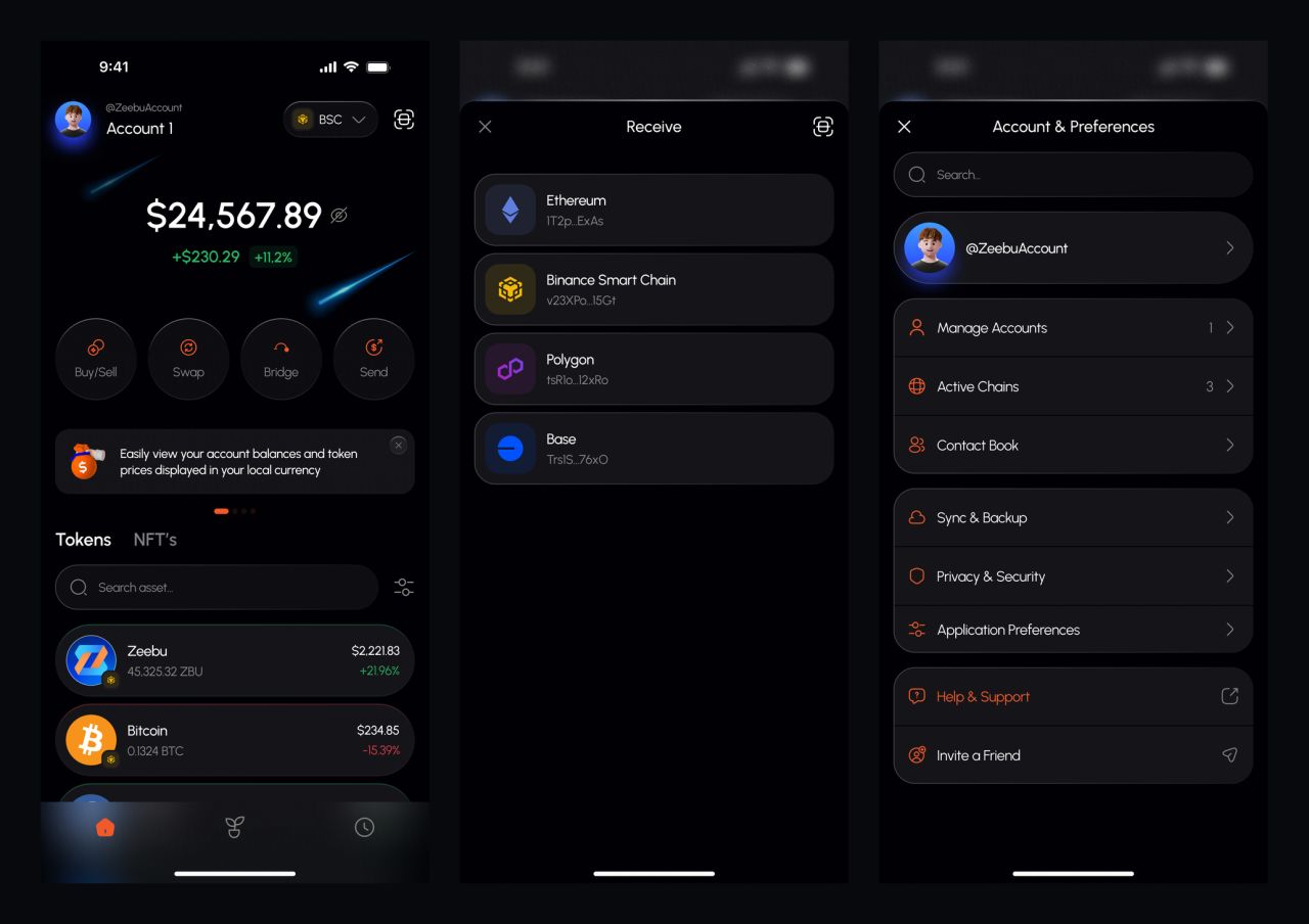
Wallet overview, receive addresses and settings
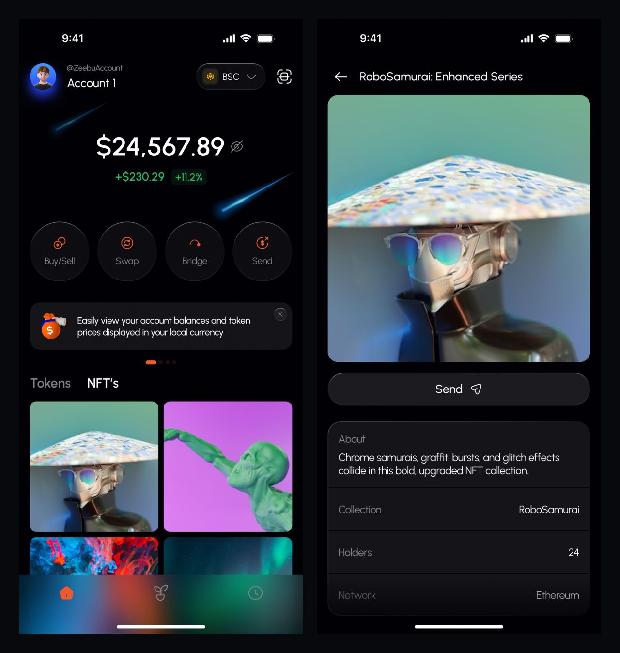
Collectible browsing and item detail
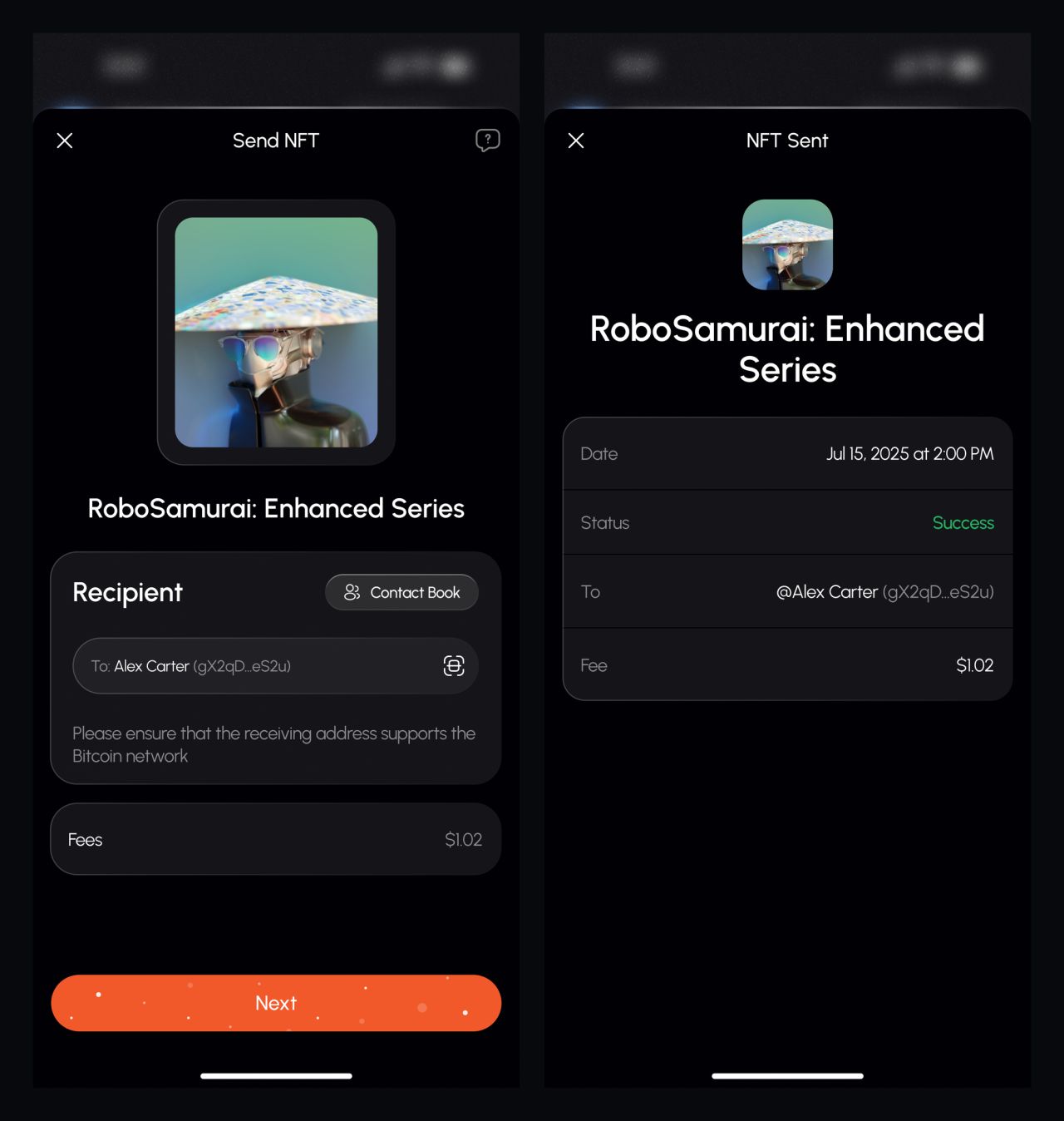
Collectible transfer and confirmation
From token details to staking
Token views combine balance information with activity and asset details. Provider selection and staking confirmation form a separate sequence, keeping the amount and next action visible.
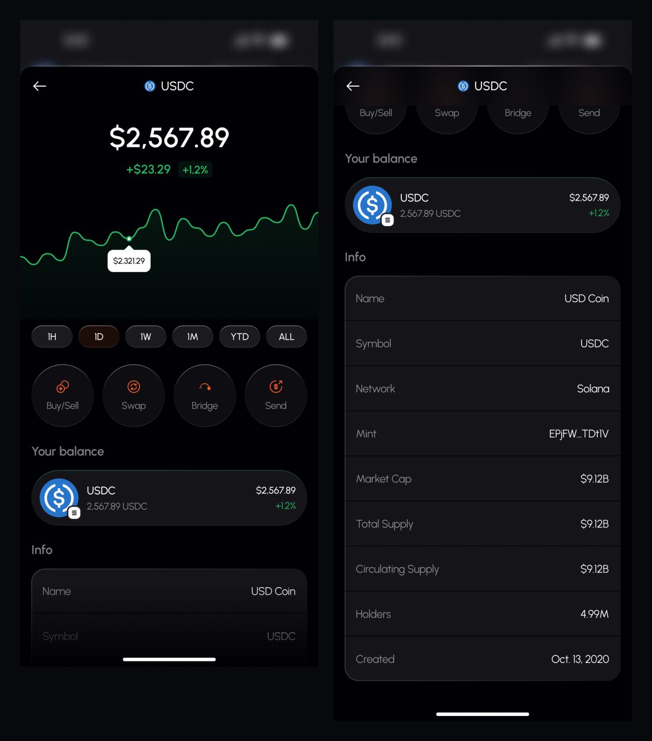
Token overview and extended detail state
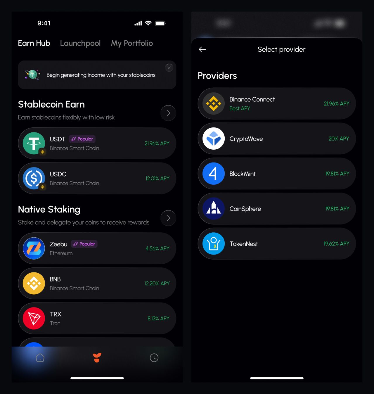
Earning options and provider selection
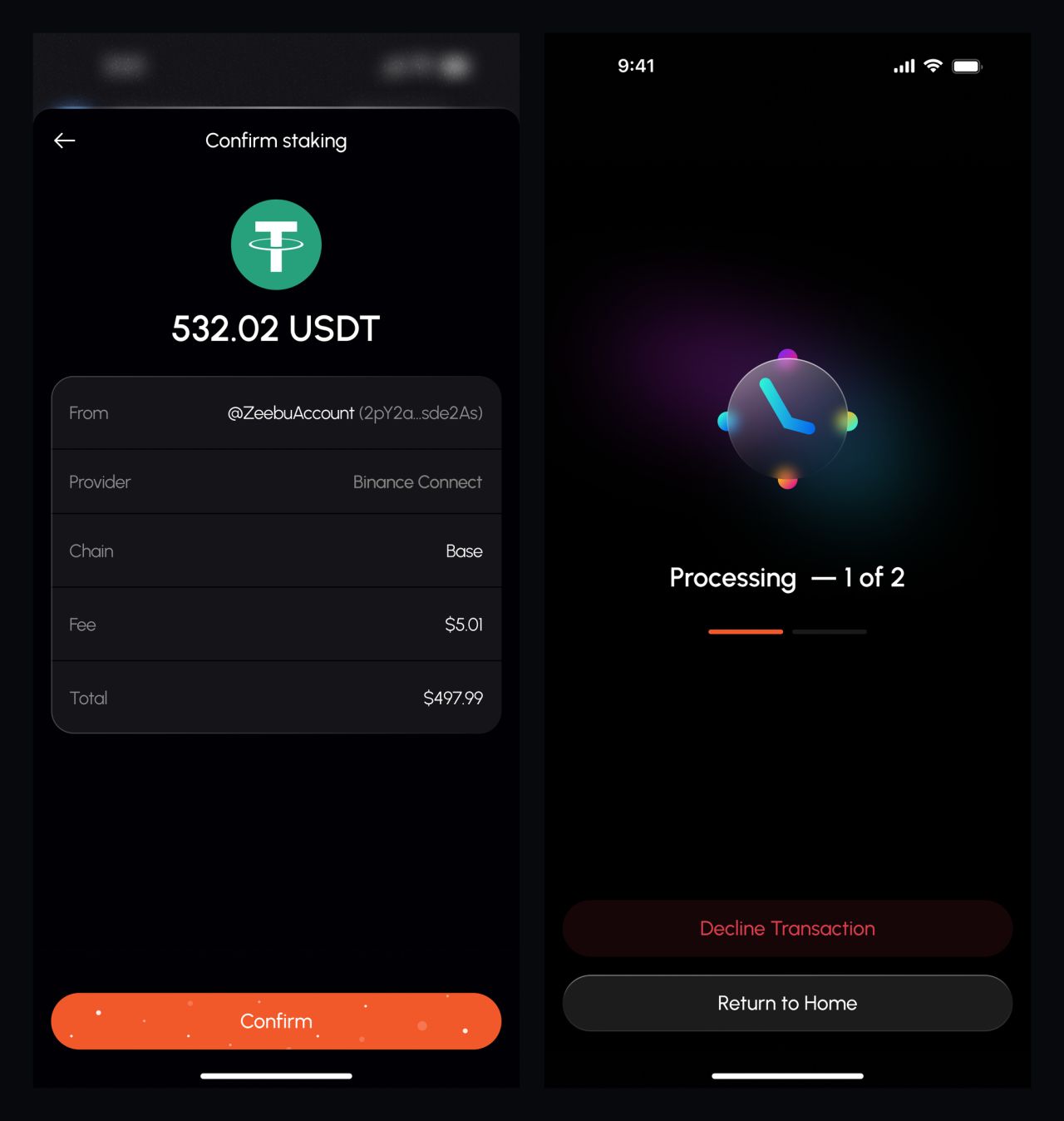
Stake setup and confirmation
Launchpools, locking and positions
The remaining wallet screens show launchpool participation, token locking and portfolio positions. Distinct states make it possible to follow each flow without repeating the onboarding screens.
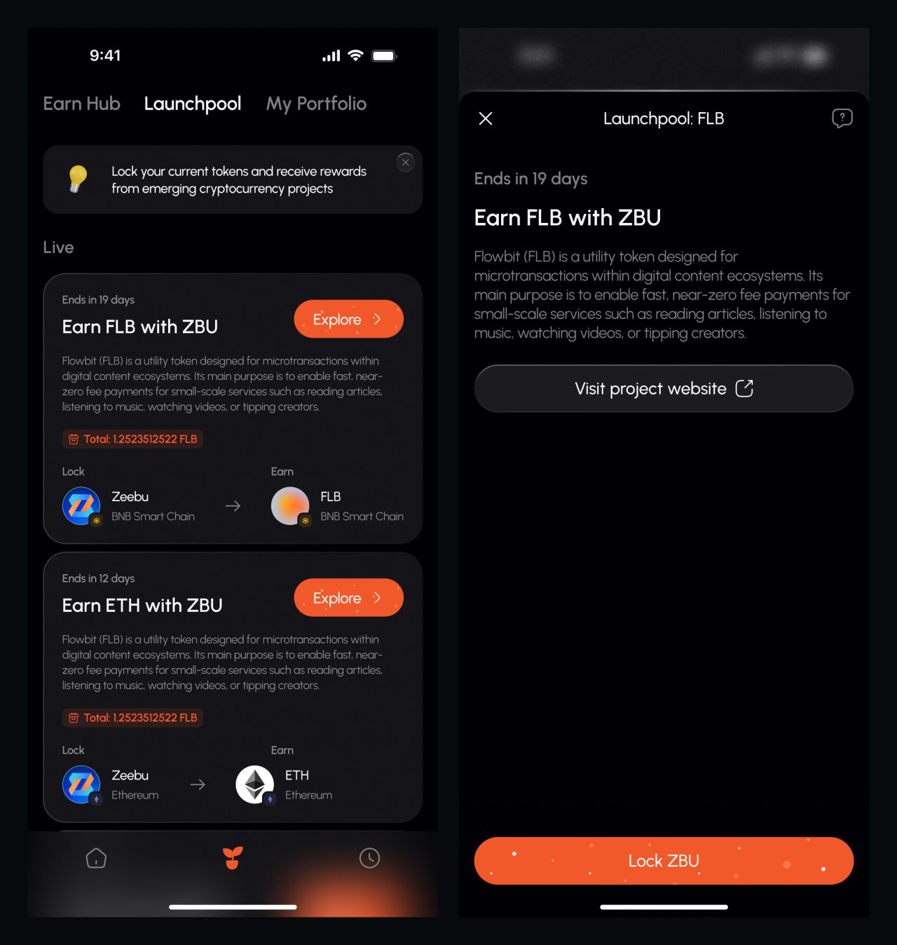
Launchpool overview and detail
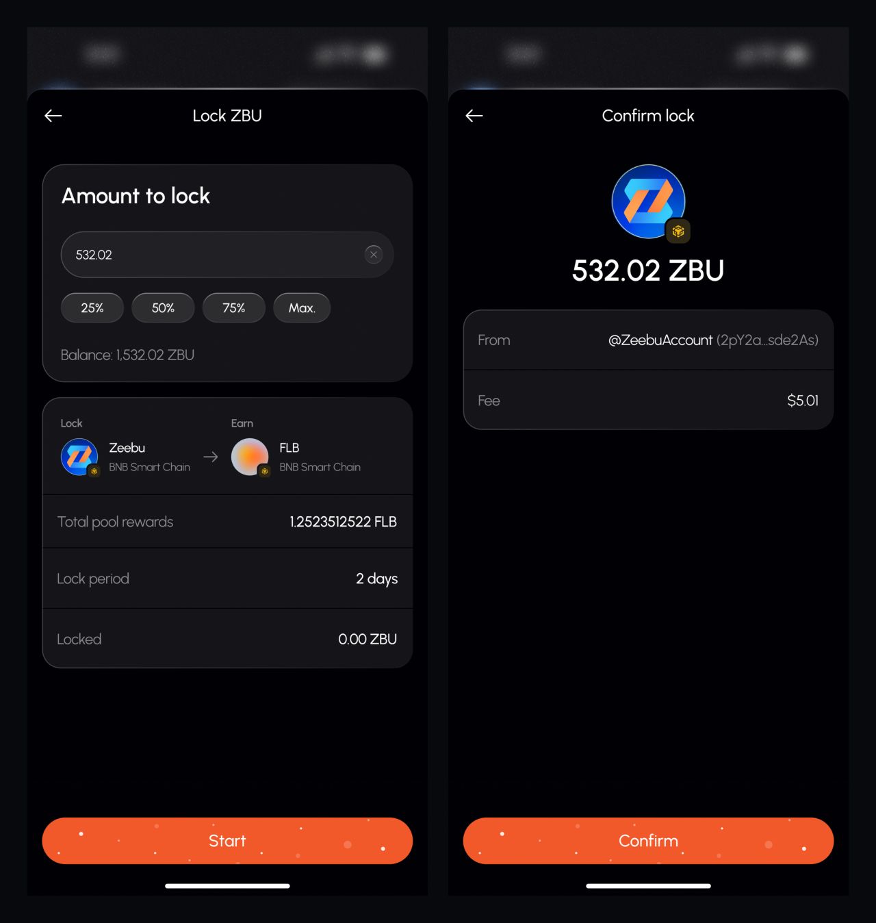
Token-lock setup and confirmation
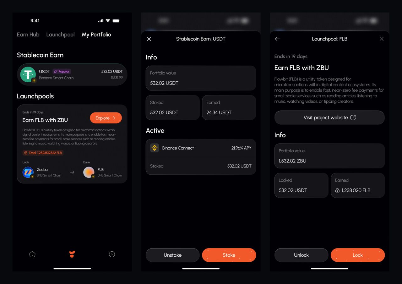
Portfolio views and position detail
The dashboard in different states
The web dashboard organizes balances, tier progress, invites and supporting information in a card-based layout. Empty, populated and reduced variants show how the same structure accommodates different amounts of data.
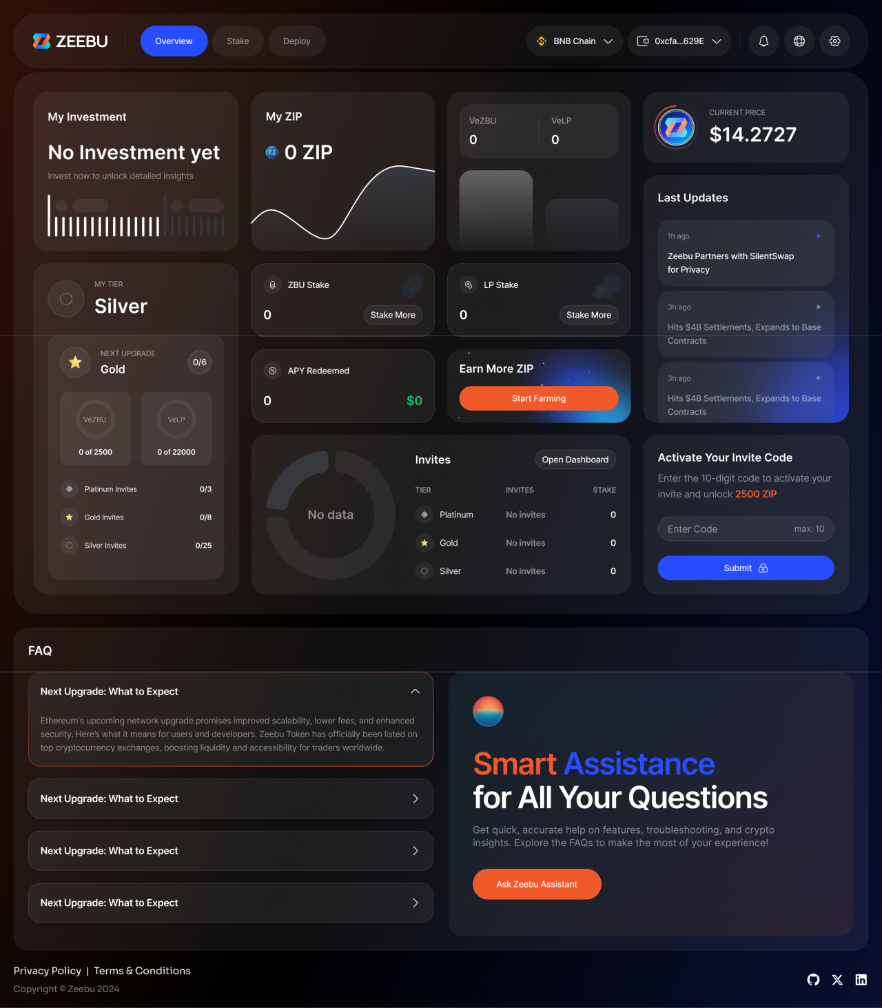
Web dashboard — empty state
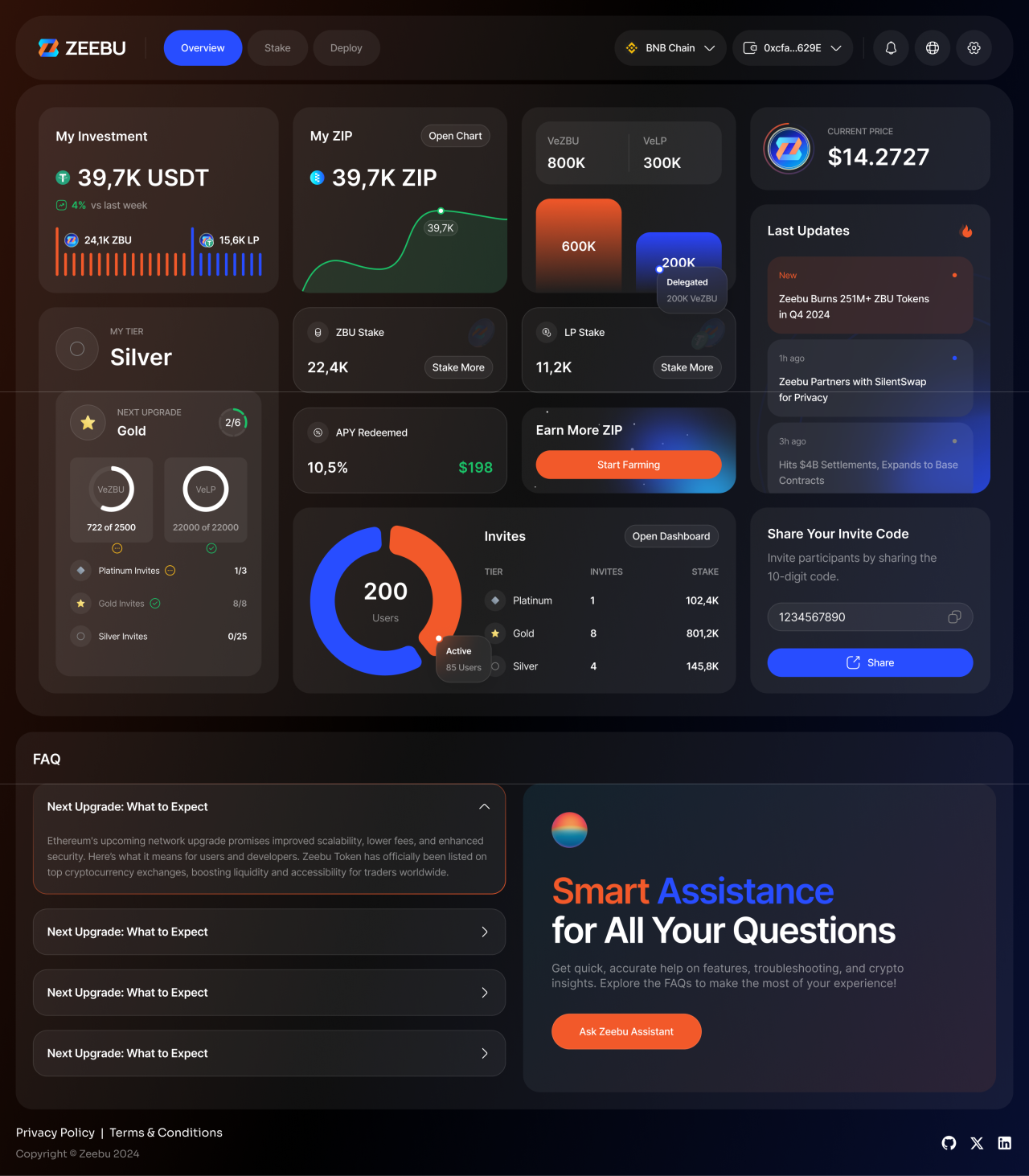
Web dashboard — populated state
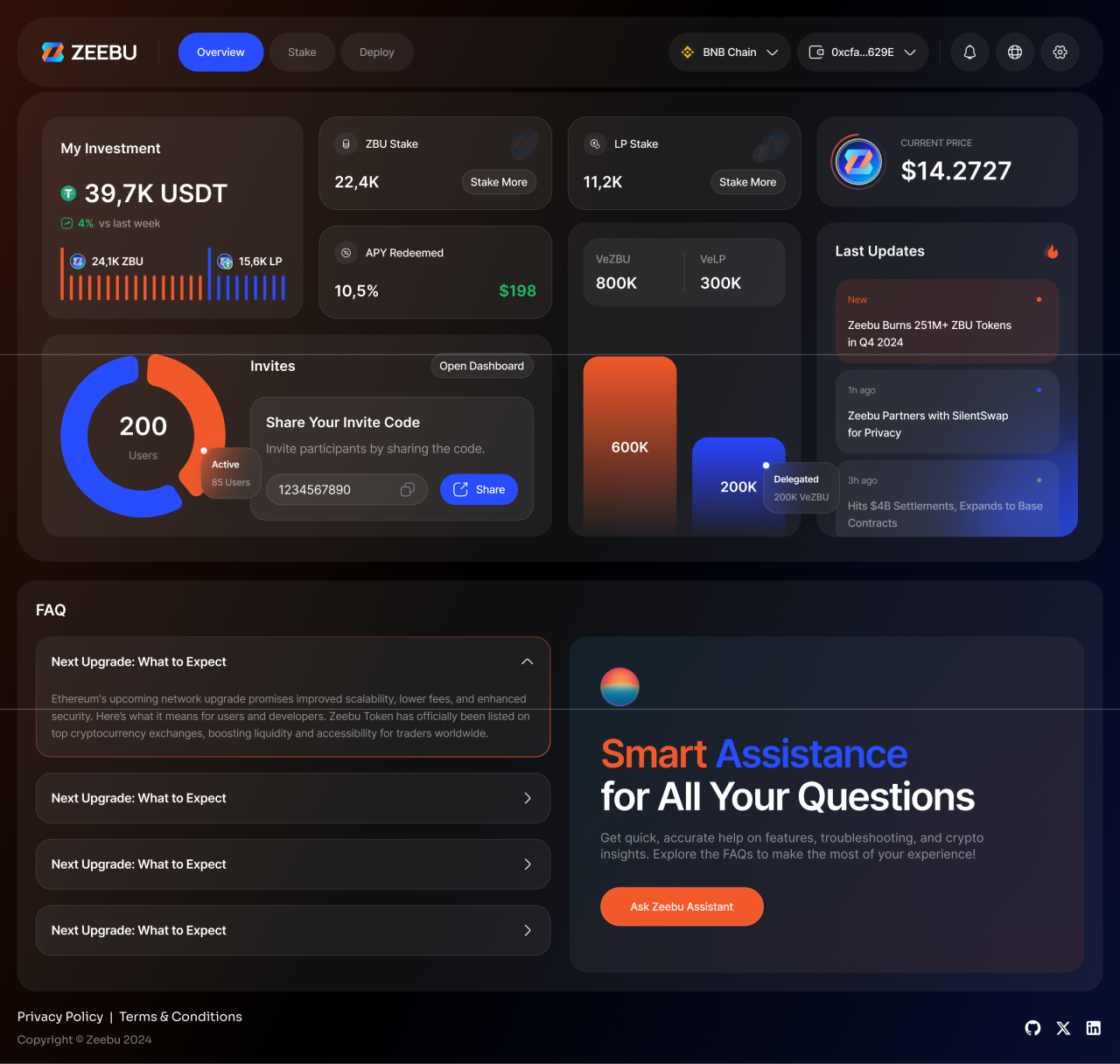
Web dashboard — variant without tiers and ZIP
ZIP activity and tasks
The My ZIP screens distinguish earned activity from the no-data state. A separate earning view groups available tasks and seasonal progress.
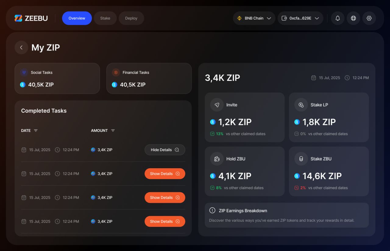
My ZIP — activity and claimed rewards
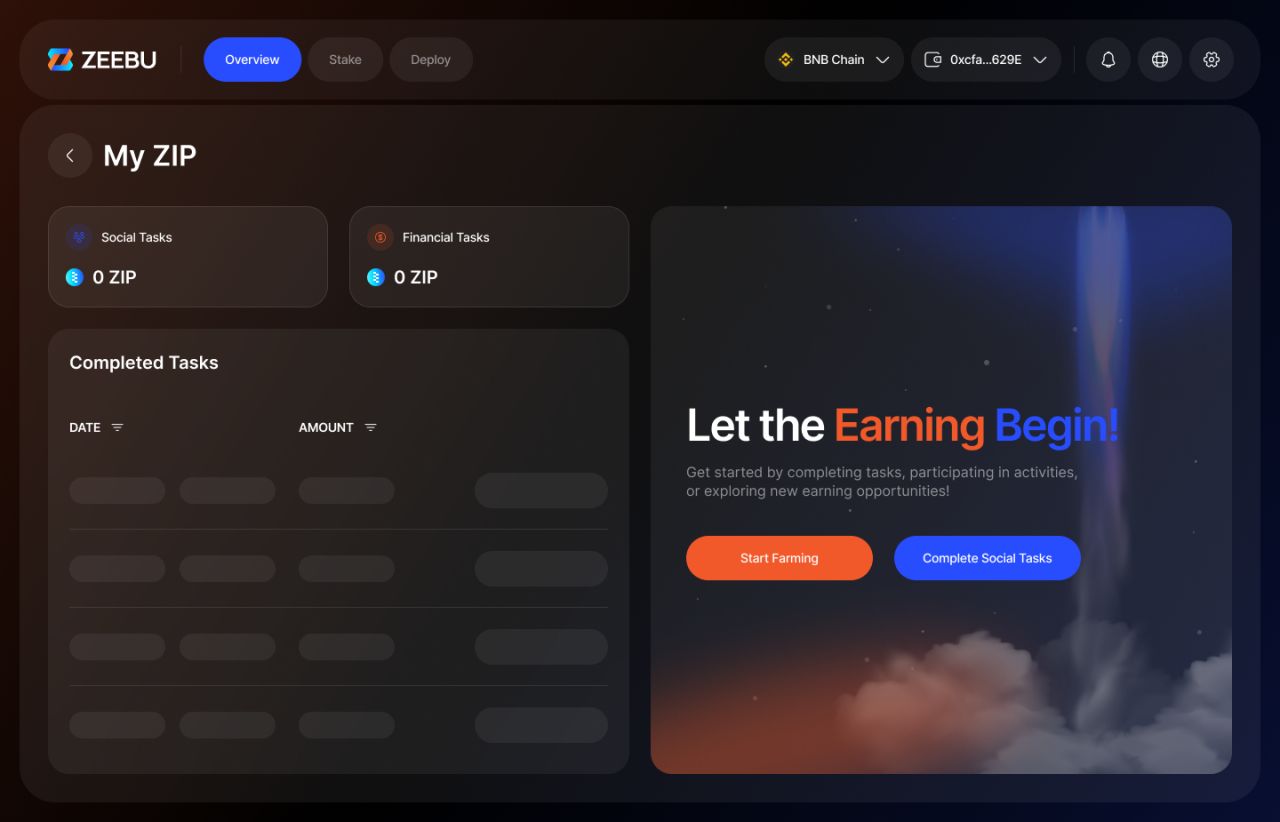
My ZIP — empty state
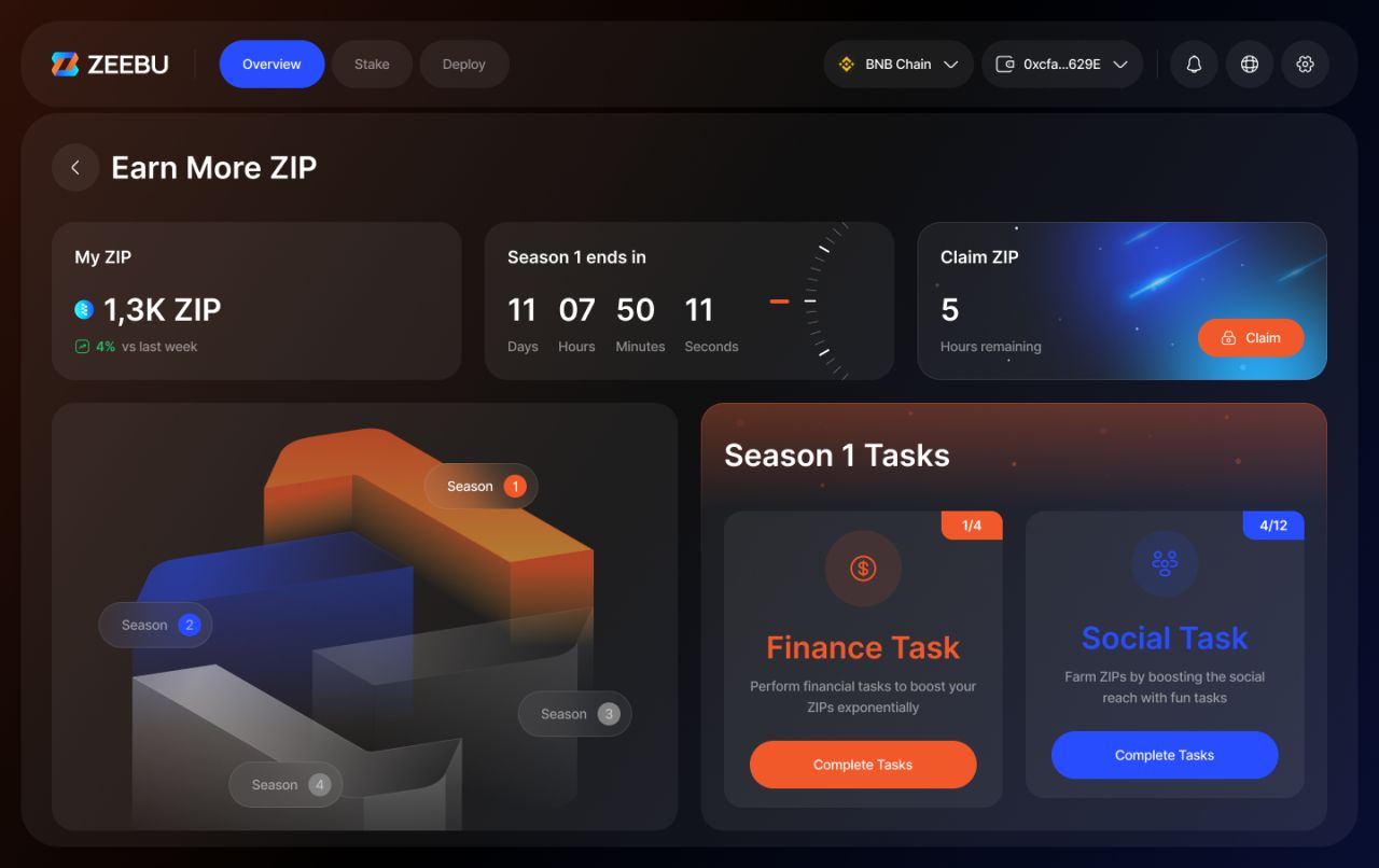
Earn ZIP — tasks and seasonal progress
Invites with and without activity
Invite screens retain the same hierarchy across populated and empty states, placing referral actions, tier information and reward status in recognizable positions.
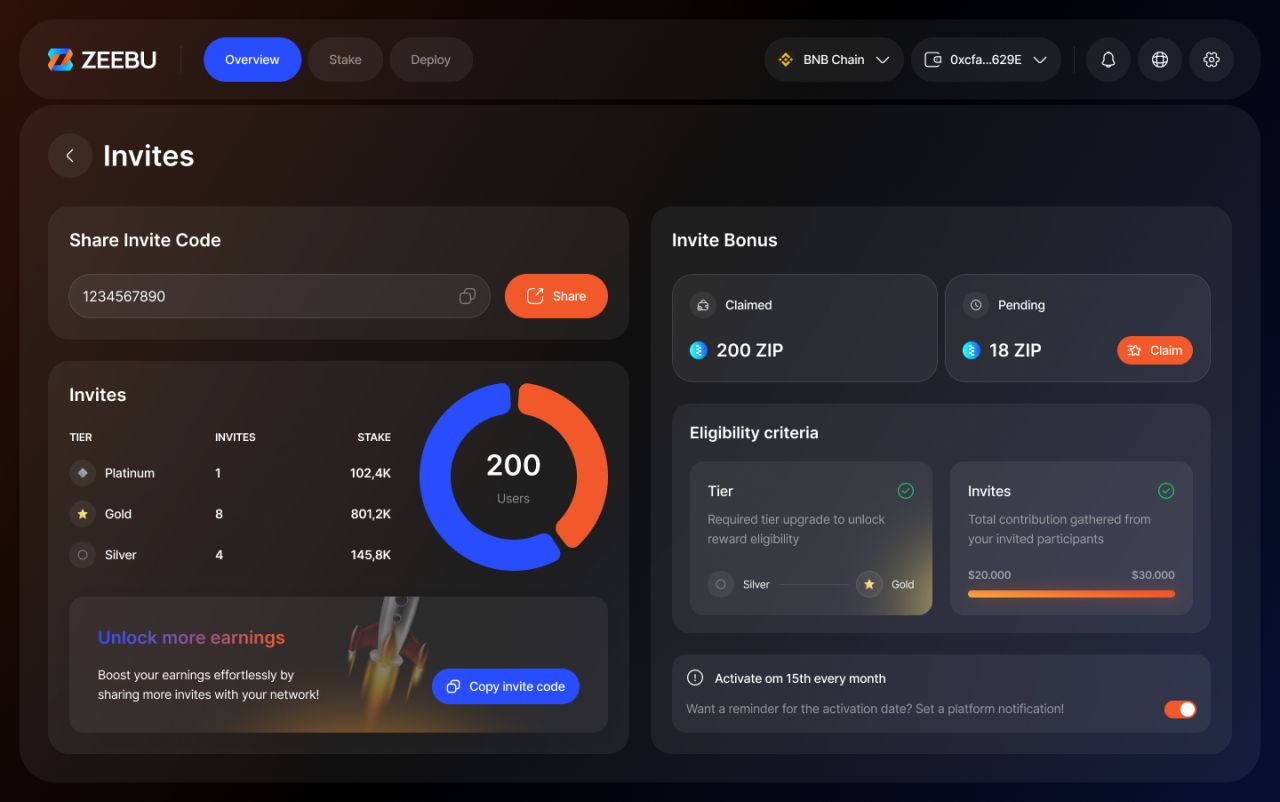
Invites — populated state
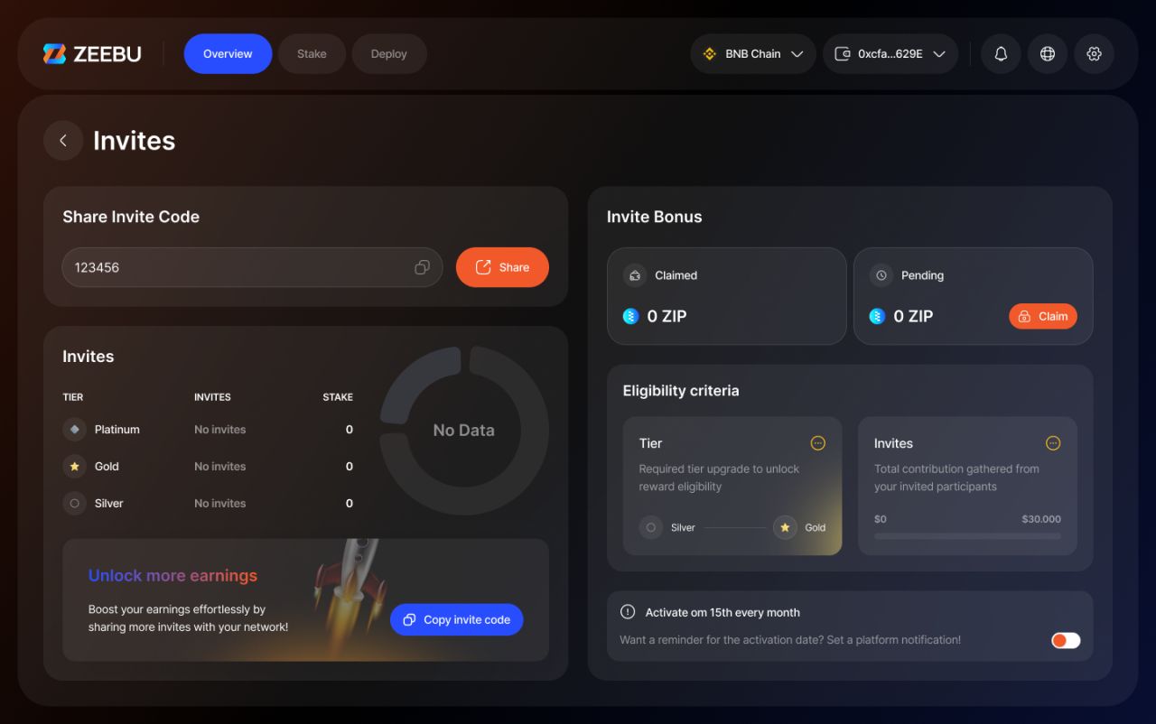
Invites — empty state
Three staking views, a shared structure
Liquidity Pool, Settlement Vault and Safety Vault use related navigation and summary patterns. Asset lists, manager cards and allocation summaries give each view its own focus without changing the overall visual language.
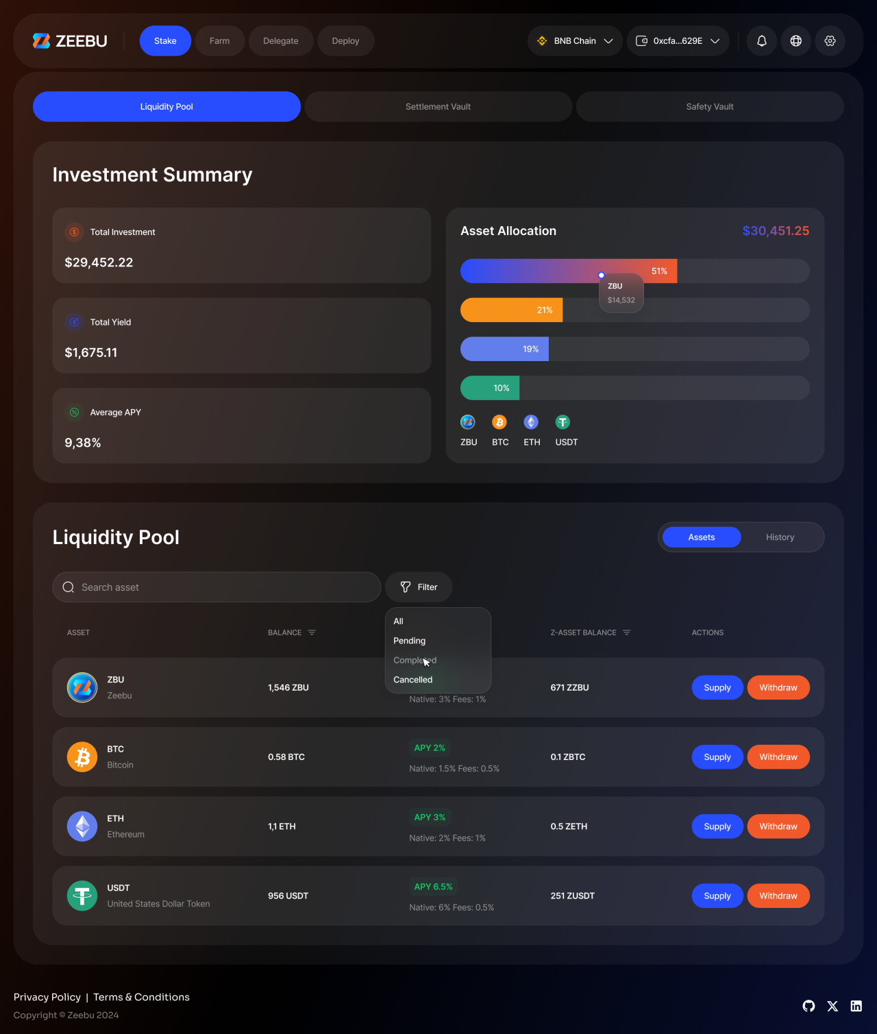
Liquidity Pool — asset allocation and supply/withdraw controls
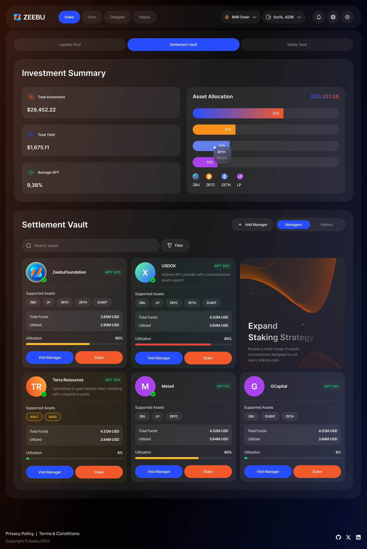
Settlement Vault — allocation summaries and manager cards
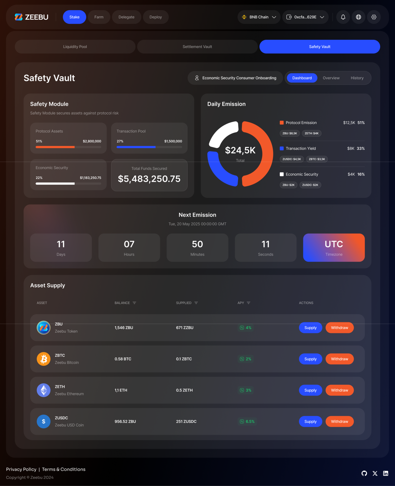
Safety Vault — coverage summary and asset list
The web experience on smaller screens
Responsive layouts stack the dashboard’s information into a single-column flow. These full-page designs preserve the populated, empty and reduced dashboard states alongside the Safety Vault view.
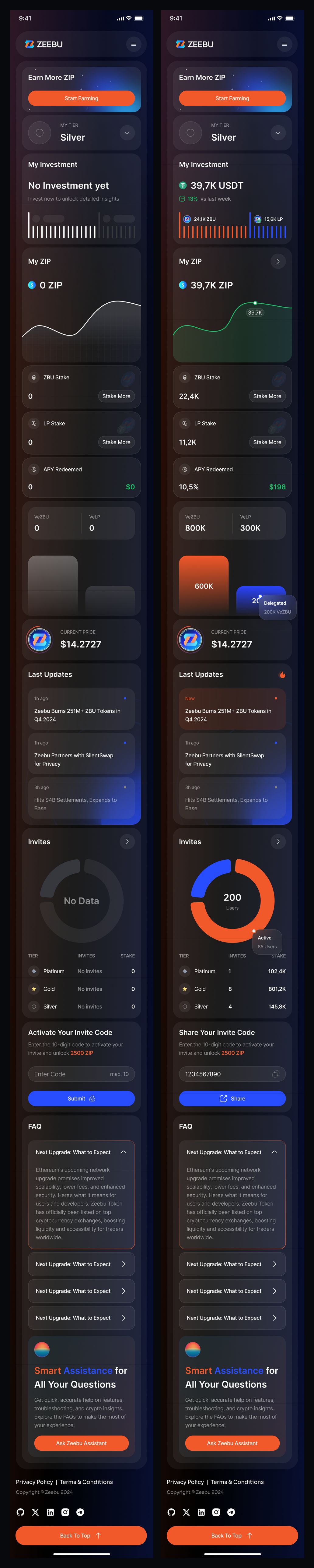
Responsive dashboards — empty and populated states
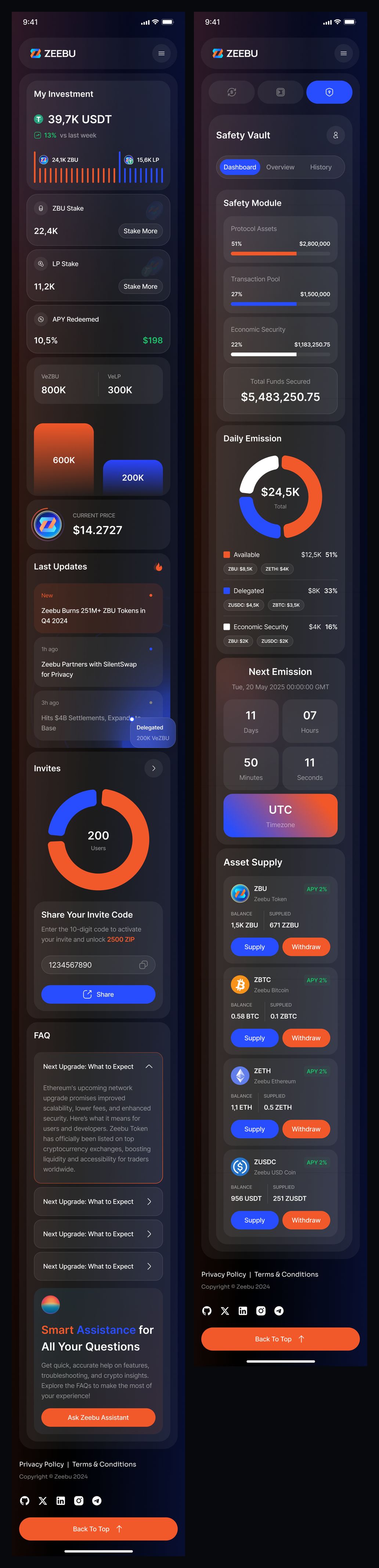
Responsive reduced dashboard and Safety Vault
Rewards and invites, reorganized
ZIP activity, an expanded tier state and earning tasks are arranged for a narrower viewport. The invite layouts keep their populated and empty variants distinct.
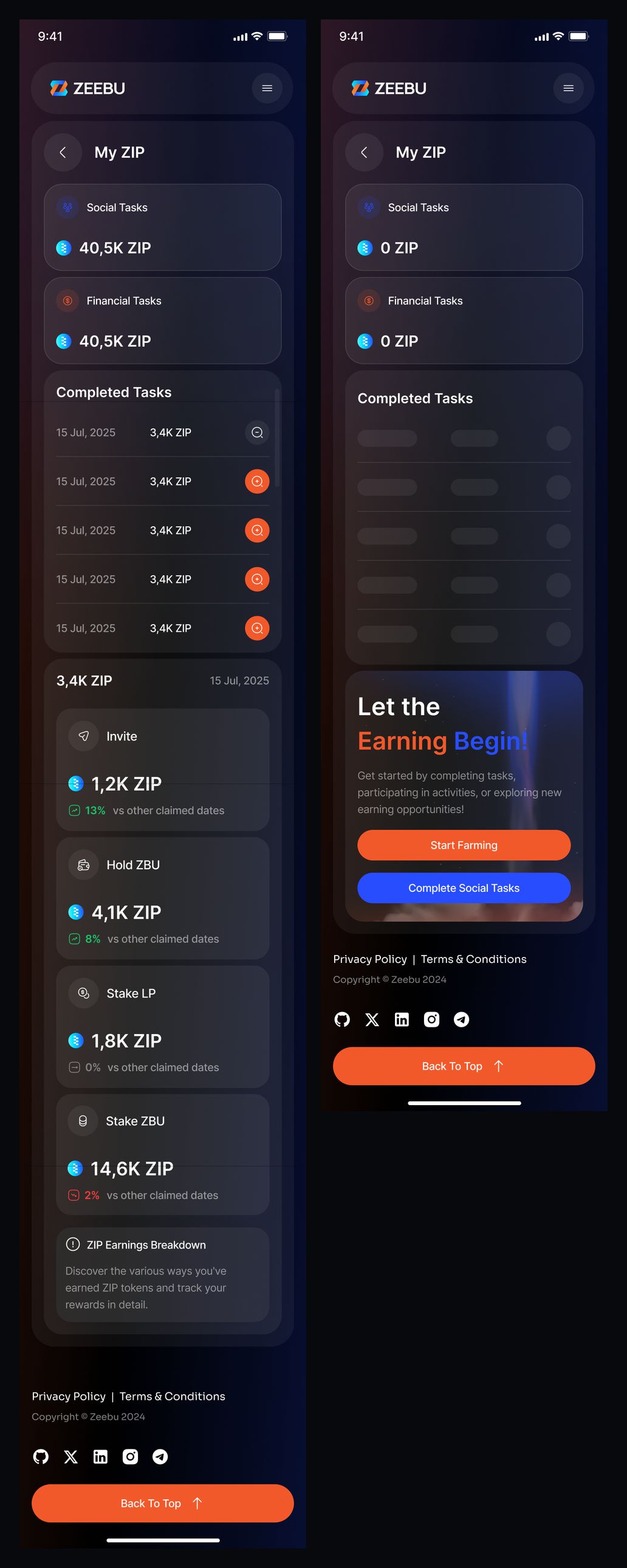
Responsive My ZIP — populated and empty states
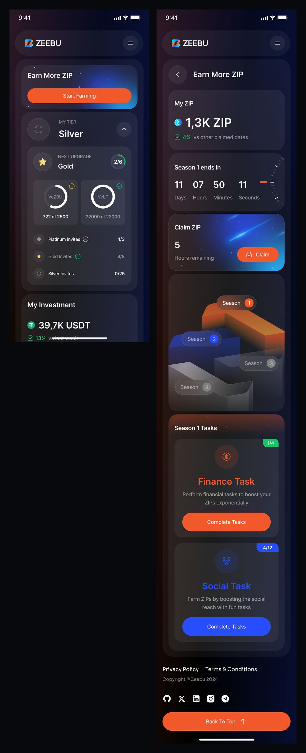
Responsive expanded tier state and Earn ZIP
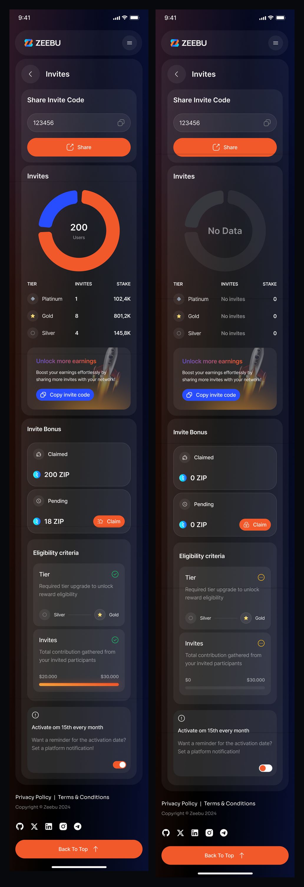
Responsive invites — populated and empty states
Complete vault pages
Liquidity Pool and Settlement Vault carry their summaries, assets and manager information through the full mobile layout. Both are shown together at the same screen width.

Responsive Liquidity Pool and Settlement Vault
Our approach
Make complex information scannable
Balances, charts and actions are grouped into clear cards, giving each dashboard and vault view a consistent information hierarchy.
Treat states as part of the design
Empty, populated and confirmation states are designed explicitly, so the interface remains understandable throughout each flow.
Adapt the layout, preserve the content
Wallet screens and responsive web pages use distinct layouts suited to smaller displays while retaining the information shown in the designs.