Equalayer.ai
A cybersecurity identity across brand, website and pitch materials
Equalayer.ai focuses on AI-supported, multi-layered cybersecurity for CISOs and their teams, combining consulting and professional services. The design work connects its visual identity with desktop and mobile website concepts and pitch materials.
A visual language for layered security
The identity pairs an arc-shaped symbol with a clean wordmark. The guidelines define logo anatomy, spacing, hierarchy and restrictions, followed by violet, lime and neutral colour combinations.
Typography and brand applications
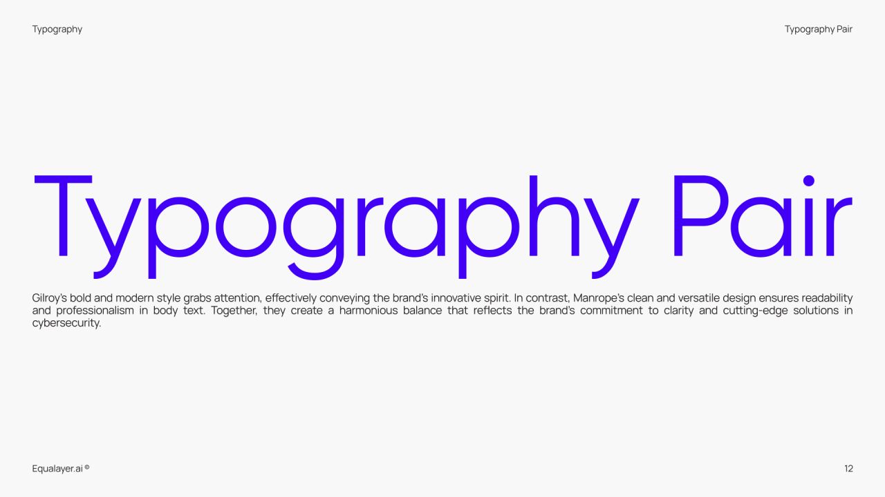
Gilroy, Manrope and Switzer appear in the typography guidance. The arc motif also carries into banners and example layouts, linking the identity to the wider communication system.
Introducing the cybersecurity platform
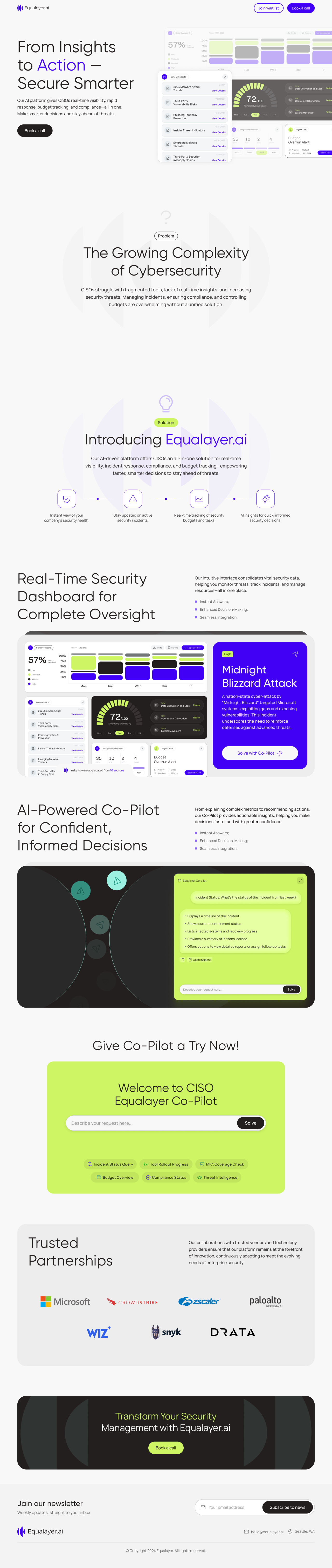
The desktop website concept moves from a product introduction into dashboard and co-pilot illustrations, a trial prompt, partnership logos and a closing contact area. Violet and lime accents connect the interface examples to the identity.
Complete desktop website concept
The complete story on mobile
The mobile page carries the same content into a single-column layout. The complete page and the open navigation state are shown together at equal screen widths.

Complete mobile website and open navigation
Presentation covers in several visual directions
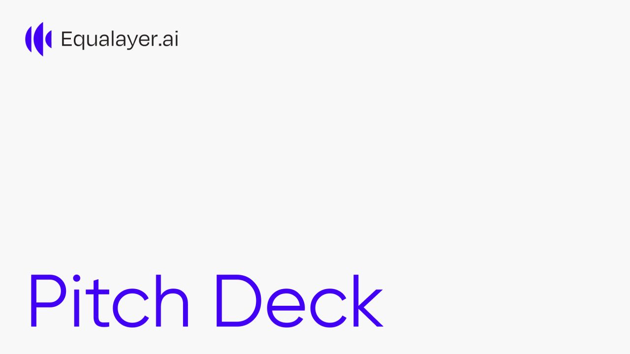
The pitch cover explorations use light, dark, violet and lime backgrounds. Arc-shaped graphics appear as flat shapes, translucent layers and architectural image crops.
Carrying the identity into presentation layouts
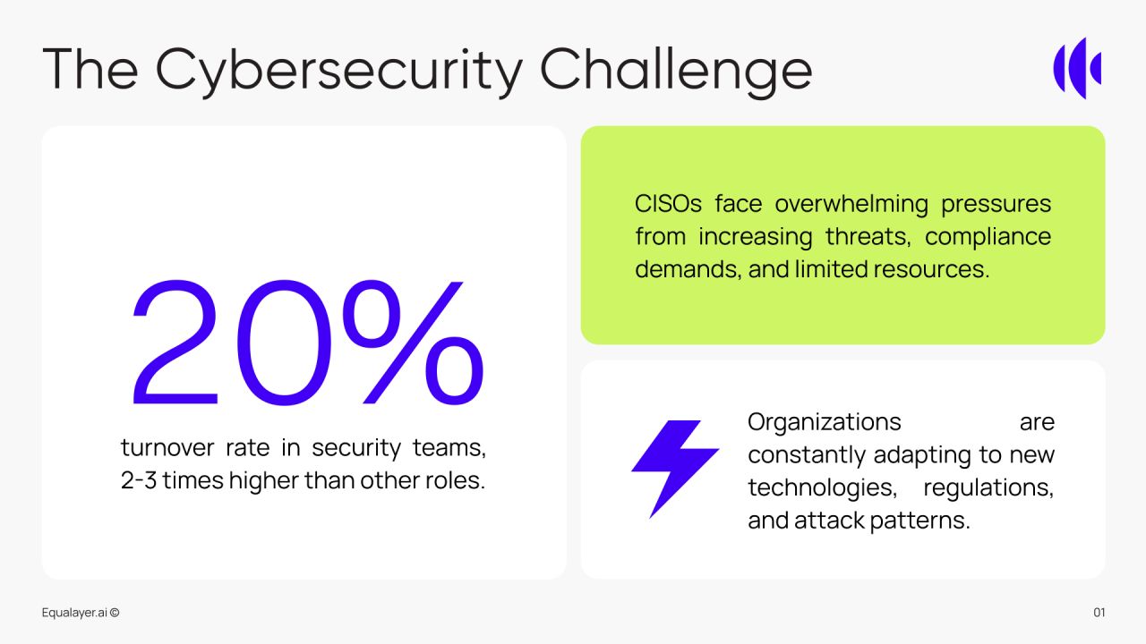
The content examples arrange a cybersecurity challenge, a service overview, reasons to choose the offering and a closing contact slide. These are presentation design examples; their figures and contact details are retained as part of the supplied artwork.
Our approach
Connect the visual system
The arc symbol, violet-and-lime palette and typography recur across the guidelines, website concepts and presentation materials.
Structure the product story
The website layouts move from an introduction to illustrated product sections, a trial prompt and contact content.
Preserve the mobile flow
The full mobile page retains the website content, while a separate open-menu state shows the compact navigation.