Truemed
Payments for health and wellness brands
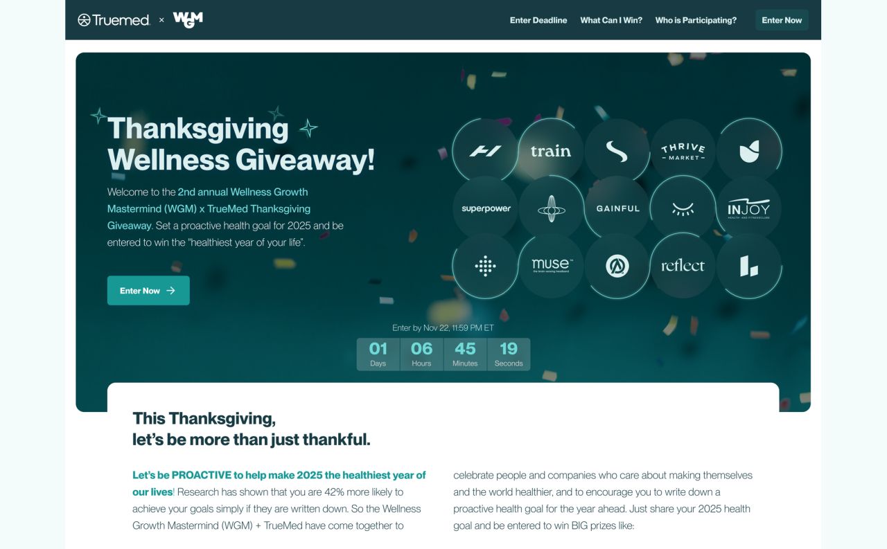
Truemed is a payments tool that allows health and wellness brands to accept HSA/FSA funds. The design work combines desktop and mobile websites, campaign graphics, and a teal-led visual identity.
A connected website for health and wellness
Truemed is a payments tool that allows health and wellness brands to accept HSA/FSA funds. The giveaway landing design combines an introduction, participating brands, an entry form, and prize details.
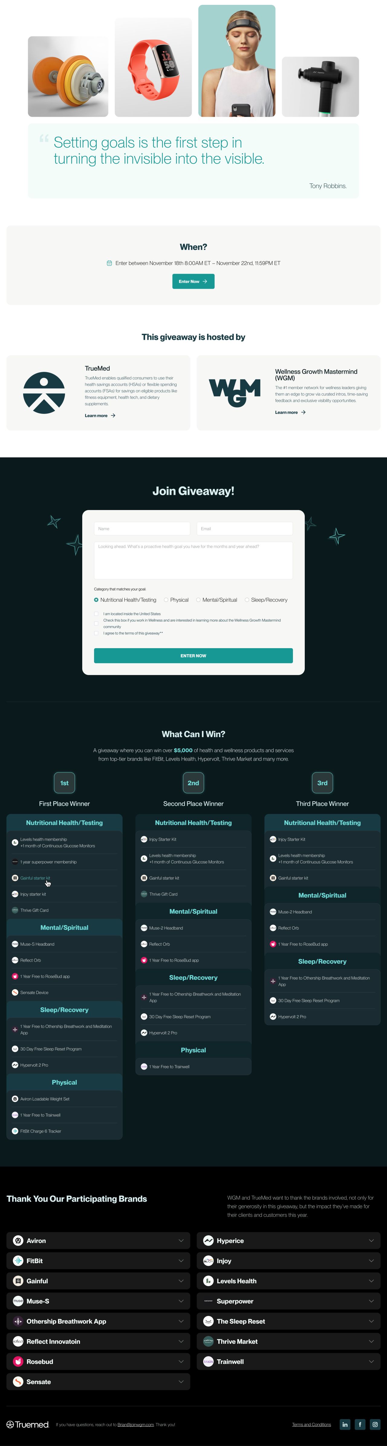
Giveaway landing — content following the hero
Introducing the merchant offer
The business and franchise pages pair a clear introduction with partner logos, explanatory steps, questions, and signup prompts. A separate merchant signup layout brings the explanation and form together.
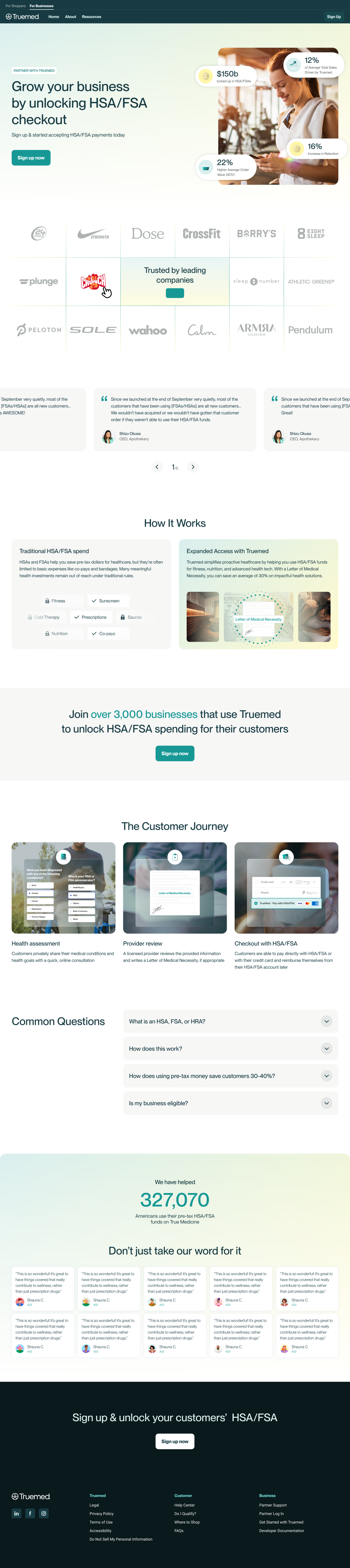
For businesses
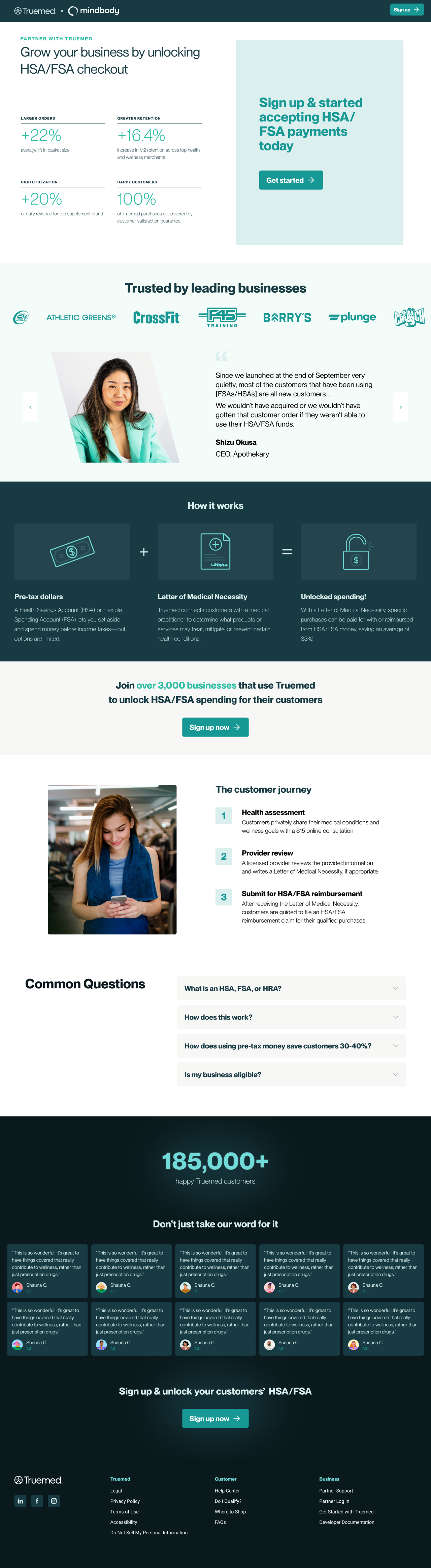
For franchise businesses
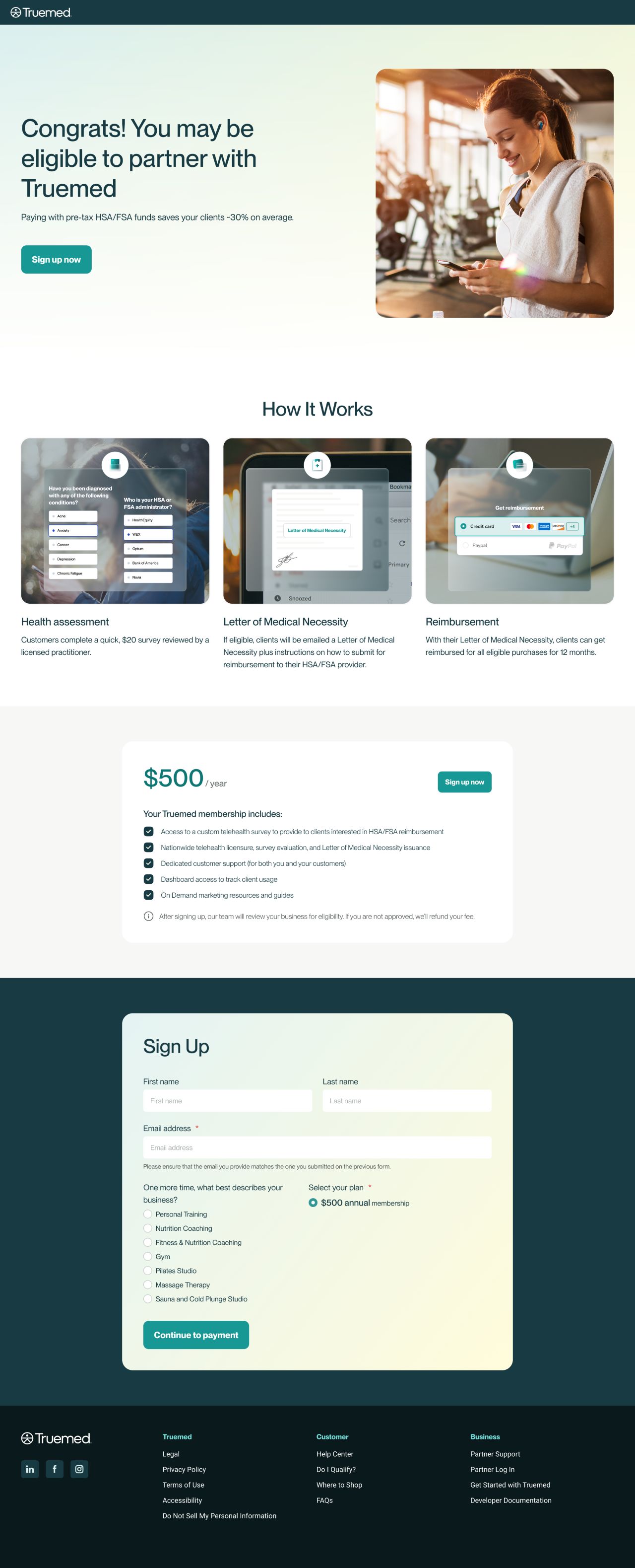
Merchant signup — educational content and form
Helping visitors explore brands
A case-study listing uses cards and filters to organise examples. The merchant detail design presents a selected brand and payment steps, while the category page combines featured businesses with a browsable directory.
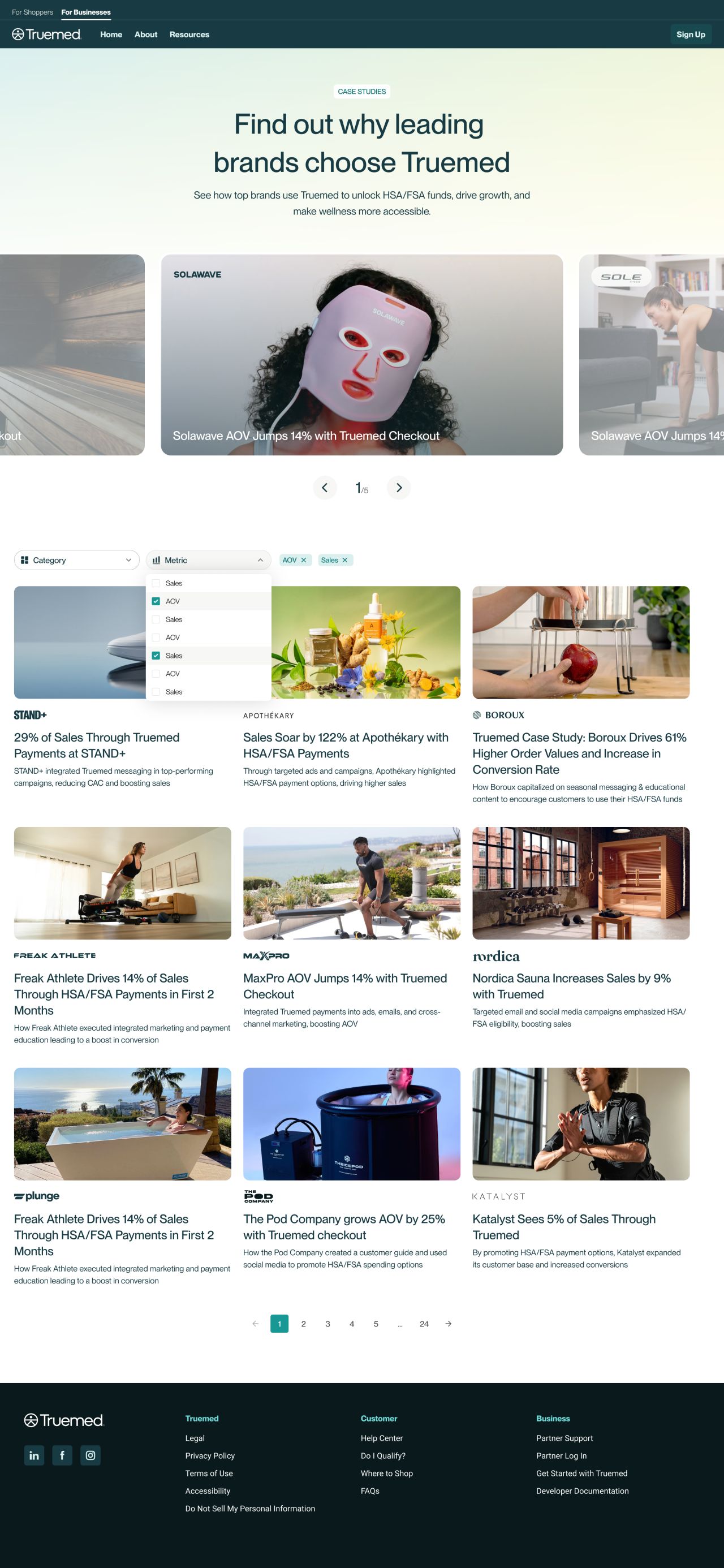
Case-study listing
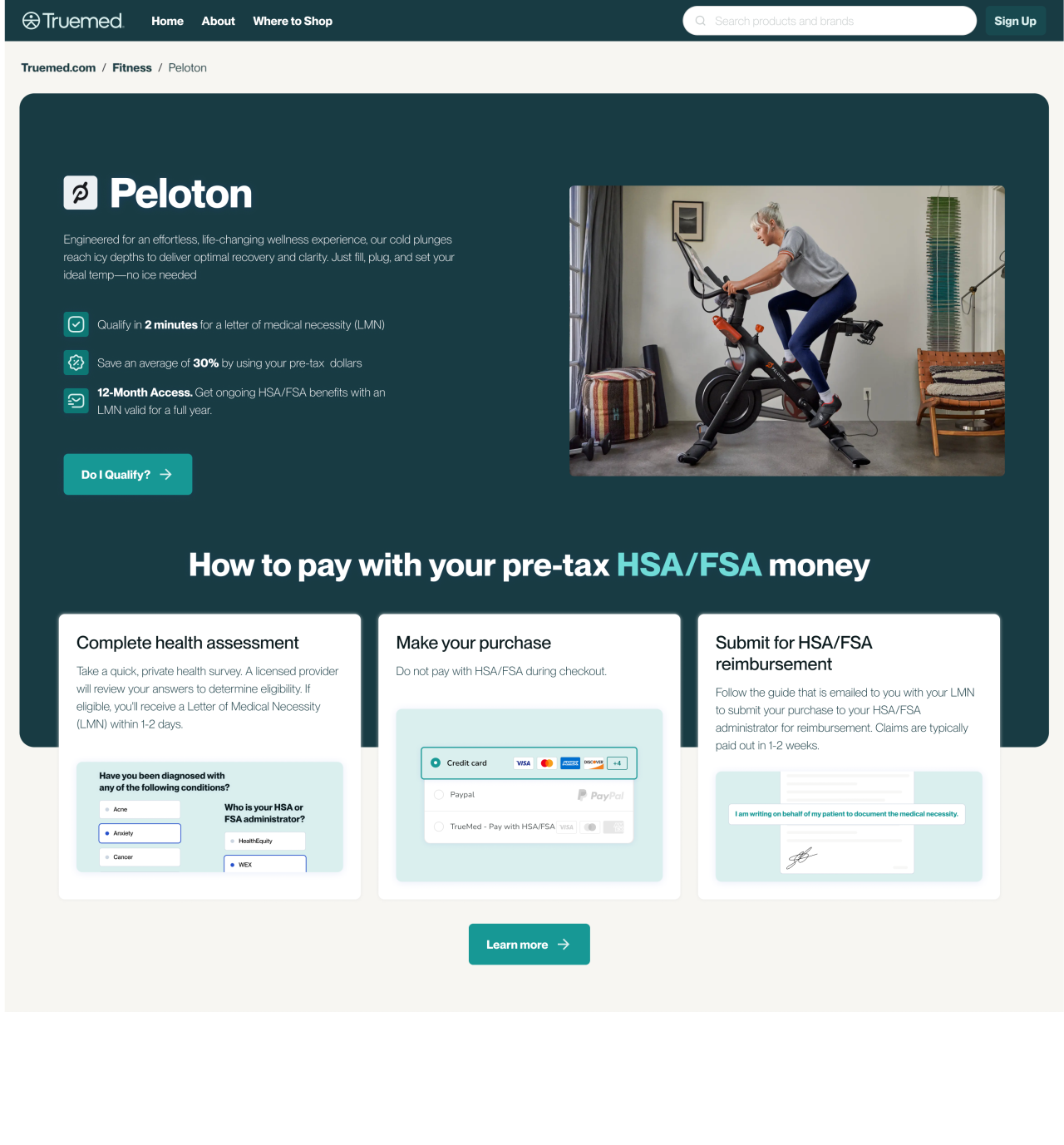
Merchant detail
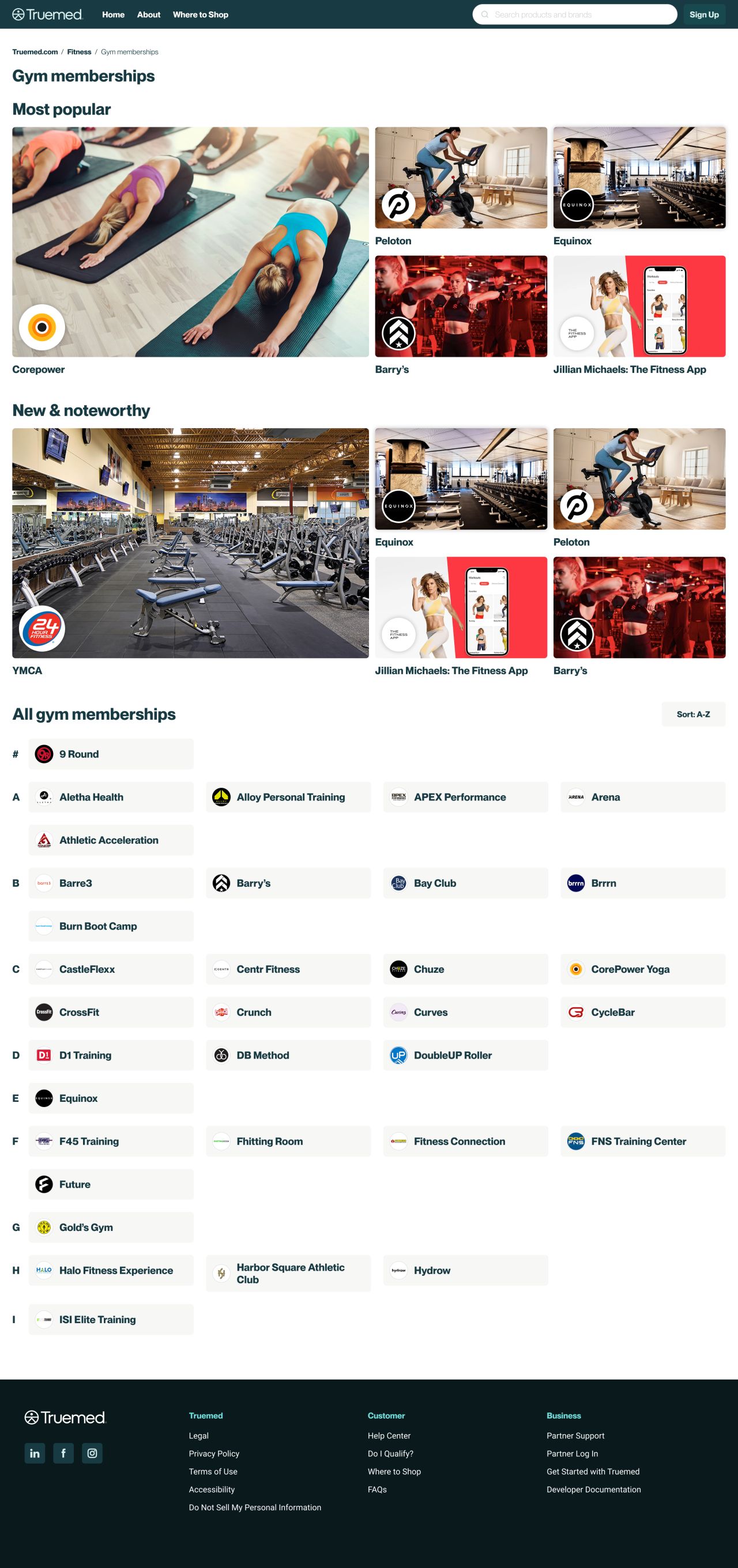
Gym membership category
The website on smaller screens
The mobile layouts retain the long-form content in single-column flows, with compact navigation, stacked cards, and full signup forms.

Mobile giveaway and business pages
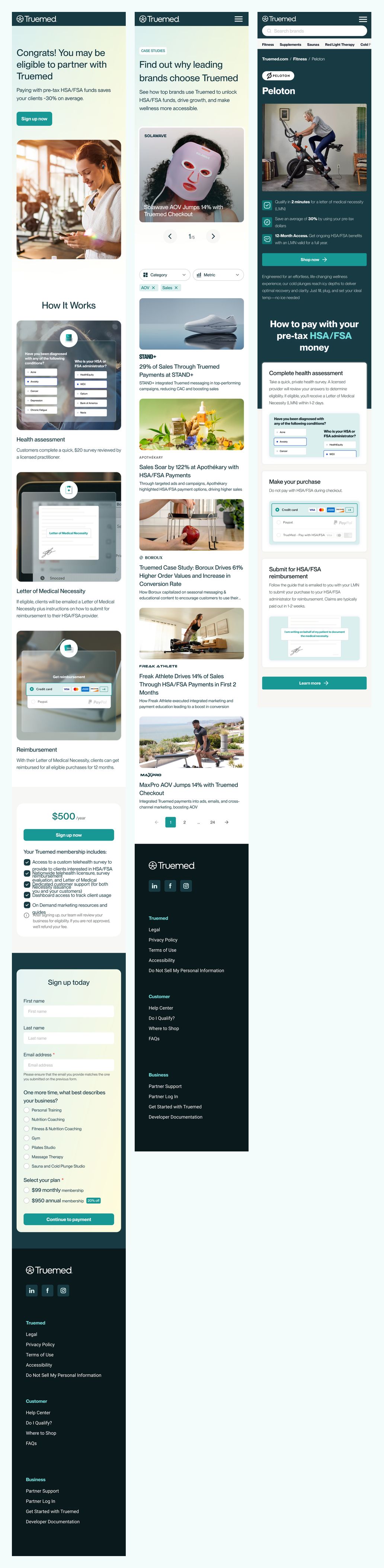
Mobile signup, case-study listing, and merchant detail
A consistent visual identity
The brand guidelines define wordmark variants, clear space, misuse examples, PP Neue Montreal typography, and a teal palette with pale and dark supporting colours.
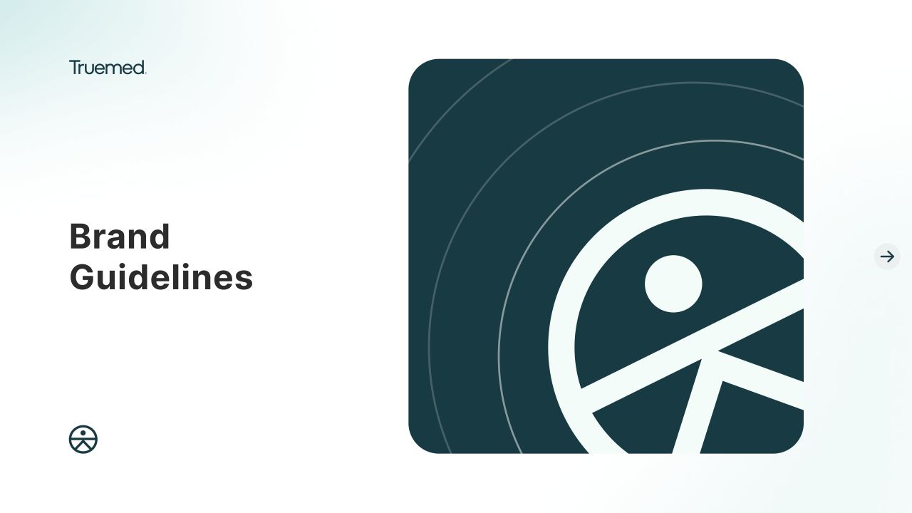
Seasonal campaign graphics
The square campaign layouts combine fitness photography, prominent headlines, and year-end messaging. Related designs use the same palette and wordmark in different photographic and typographic arrangements.
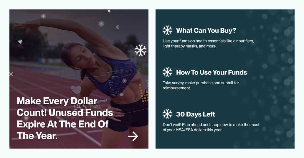
Seasonal campaign graphics — 1

Seasonal campaign graphics — 2
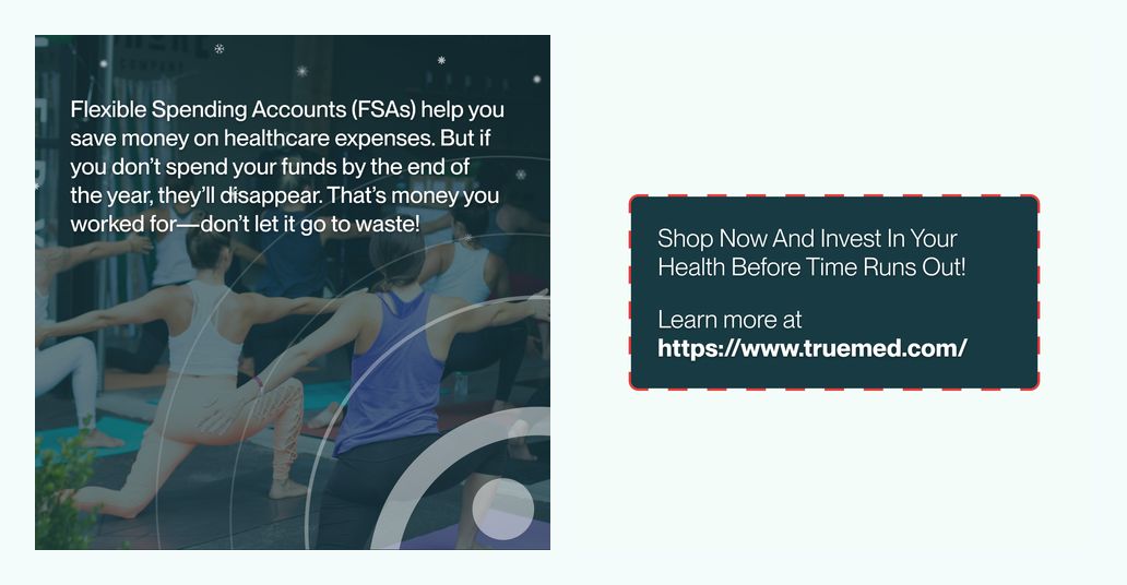
Seasonal campaign graphics — 3
Partner and lifestyle applications
The partner graphics explore co-branded compositions, product photography, and alternate light and dark treatments. Wide lifestyle banners extend the identity through a large wordmark over photography.
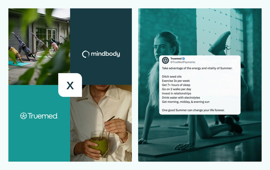
Partner campaign graphics — 1
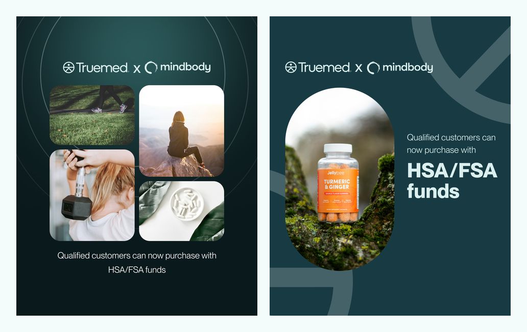
Partner campaign graphics — 2
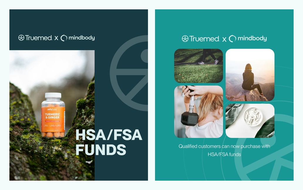
Partner campaign graphics — 3
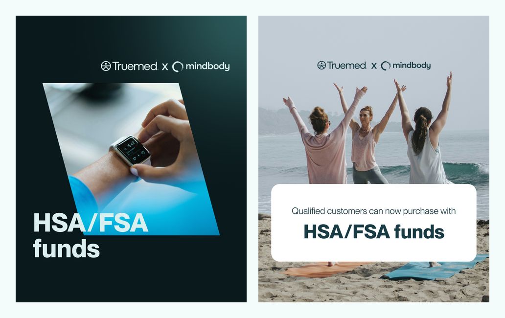
Partner campaign graphics — 4
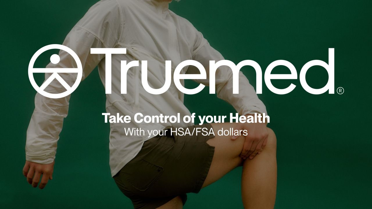
Lifestyle banner — running
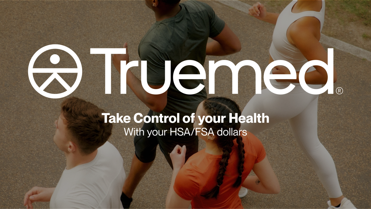
Lifestyle banner — community
Our approach
Give the content a clear structure
Introductions, explanatory steps, directories, and forms organise the website layouts around distinct visitor tasks.
Retain the story across sizes
The mobile designs carry the same content into compact navigation and single-column layouts.
Connect the visual language
Teal colours, the wordmark, typography, and photography connect the website with the campaign materials.